The History Behind Ford's Logo: A Look At The Evolution Of The Blue Oval Emblem
In the automotive arena, there are several ways a manufacturer can set themselves apart from competitors. As obvious as it may seem, a distinctive logo is arguably one of the best ways to do just that, and in the world of American automakers, there may not be a logo quite as recognizable as the blue oval badge from Ford Motor Company.
That is pretty fitting as the company founded by Henry Ford ushered in the era of the mass-produced automobile, literally breaking the automotive mold with the release of Ford Motor Company's first mass-production vehicle, the Model T. That vehicle, of course, first rolled off of Ford's manufacturing line in Detroit, Michigan, in 1908 and would go on to sell more than 15 million units between the vehicle's debut and its last year of production almost two decades later.
It may surprise you to learn that not a single one of those Ford Model Ts hit the streets of America bearing the company's famed blue oval logo. In fact, no Ford vehicle would wear that logo until the late 1920s, and in the years between, the company would badge its vehicles with several different variations. Ford has, of course, badged its vehicles with a dozen or so official logos since its founding in 1903. Here's an evolutionary look at a few of the key logo changes that led Ford towards its iconic blue oval emblem.
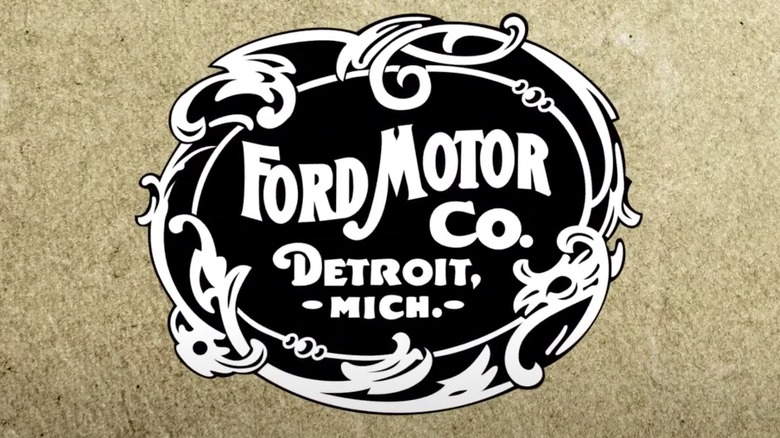
The original Ford Motor Co. logo
While the blue oval has become the most recognizable of Ford logos, it seems the company has long had an inclination to that particular shape in its branding. While the first logo to ever bear the Ford name was, in essence, more circular, arguments could be made that it does err on the side of oblong. Of course, that logo was far wordier than most Ford emblems that would follow, with the company's design team managing to fit the words "Ford Motor Co." and "Detroit, Mich." within the shape.
Those words are stylishly centered within an Art Nouveau-inspired border, as that style was still very much en vogue both in America and abroad in the early days of the 20th Century. The emblem was reportedly designed in-house by C. Harold Wills circa 1903, with the former letterpress printer opting to keep the color patterns to a basic white lettering on a black background.
Given the timeline, it should go without saying that Wills' artistically ornate logo did not find its way onto the Model T, as Ford didn't release that car until 1908. Rather, the logo was used larger as company letterhead for official correspondence and was used on the Ford Model A in 1903, not to be confused with the Model A that was produced between 1927-1931. However, the Nouveau-styled logo would not last long as Ford's official emblem, with the company having already debuted a new logo in 1906 that would come to influence every logo thereafter.
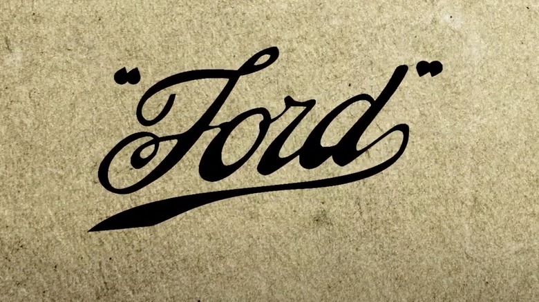
The first glimpse of the classic Ford script
It was indeed the 1906 logo that, perhaps even more so than its slightly oblong predecessor, laid the groundwork for the classic logo we see badging the various Ford cars, trucks, and SUVs on the road today. Interestingly enough, said logo was arguably pretty un-logo-like, bearing no oval shape or borders. Instead, the Ford team opted for a simpler approach, using a script-only design where the word Ford is laid out in the style of human handwriting and enclosed in what appear to be quotation marks.
It appears that C. Harold Wills was also responsible for this particular design, and one has to admire his no-nonsense approach, which puts Henry Ford's by-then-famous last name front and center. However, rumors that Wills matched the script to Ford's actual signature may be suspect, with samples from The Henry Ford Museum likely proving otherwise. The bare-bones logo would reportedly come to be known as the "script with wings," and boasted a stylishly rendered "Ford" that was elegantly underscored by an elongated tail on the "d."
Like its predecessor, Ford's "script with wings" emblem was only utilized for a relatively brief period. As for its influential style, the elongated underlining from the "d" and curled tail in the "f" would disappear with every other variation of the script lettering. However, virtually every single Ford logo since has maintained the handwritten look displayed here, a look Ford officially patented the same year the emblem debuted.
The Ford script starts to come into shape
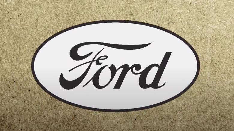
Ford would continue to experiment with variations of its logo in the following years. That includes a take bearing the words "The Famous Motor Cars" that appears to be one of the company's first oval-shaped logos — apart from one reportedly used in the U.K. by Ford Motor Company Limited of Great Britain circa 1907 – and another design that enclosed the scripted Ford name in actual wings with the words "The Universal Car" underneath. The latter design is worth mentioning largely as it appears to be the first Ford logo to bring the signature Royal Blue to the background. However, it was later replaced by an emblem that, despite its lack of color, bears a shape and style more in line with the modern Ford logo than anything that preceded it.
Said emblem boasted black lettering on a white background and was, perhaps, an attempt by Ford to re-simplify its branding. In doing so, the marketing team opted to once again focus on the company's name, with Ford directly centered in the white background. It is, admittedly, not the most eye-catching emblem Ford has ever conjured. However, this logo is noteworthy because it may mark the first time Ford opted to go with only its founder's last name set inside of an oval shape. Despite the obvious appeal of the minimalist approach, it would still be several more years before Ford would front the brand's beloved blue oval.
The Ford emblem goes full blue oval
It was, in fact, the late 1920s before Ford delivered the first variation of its iconic blue oval logo, with the automaker finally bringing that badge into the picture in 1927. As it was, the brand also released its second production vehicle that year in the Ford Model A, with those vehicles becoming some of the first Fords to front the distinctive new emblem.
In its first iteration, the minimalist blue oval design appears just a tad rounder compared to many of the variants that would follow and boasted only a couple of changes from the white oval that preceded it. However, changing the color of the lettering to white and the background to blue arguably helps this re-design pop more than its predecessor, with Henry Ford's white signature far more prominent set within the colored oval. Likewise, the inner image is brought into closer focus by the addition of a two-tone frame in both white and blue.
Ford surely saw the potential in the simplified blue and white logo and, in turn, continued to use this emblem to badge its production vehicles for the better part of the next 30 years, save for a stretch in the 1960s and early '1970s when it was largely absent from Ford grills. Yes, this emblem also served as the template for every variation that came after, with Ford making minimal changes to the blue oval over the ensuing years. In fact, the timeless emblem didn't see a dramatic touch-up until 1976, when Ford first introduced the shadowed blue elongated ovals with silvered lettering and outline that have adorned some of the company's best-selling vehicles over the ensuing decades.
