The History Behind Honda's Logo: Why Are There Two Different Ones & What Was The OG?
For fans of the Japanese auto manufacturer, Honda is a ubiquitous brand that means craftsmanship, consistency, and reliability. With over 75 years of history under its belt, Honda has come a long way since it launched in the Land of the Rising Sun in 1948. In the past, Honda has launched several innovative solutions, like the Valve Timing and Lift Electronic Control (VTEC) engine, which has improved car performance in unprecedented ways. Not to mention, Honda has solidified its place in pop culture with many of its vehicles gracing TV shows and movies alike. In fact, a notable example of one of its cars, the Honda Civic, was used in the very first movie in the long-running "The Fast and The Furious" franchise.
One of Honda's designs that has truly stood the test of time has been its iconic "H" symbol in its logo. An initial of not only the brand's name, but also the name of its founder Soichiro Honda, the "H" icon has graced millions of vehicles across categories in various corners of the world. But did it always look that way, and why is there another version of the logo with wings?
Honda's logo through the years
Surprisingly, Honda's logo has stayed largely consistent with every iteration using a stylized version of the letter "H." In 1961, the first Honda automotive logo had an H with a longer crossbar and thicker left and right stems that leaned outward a little more. It was also surrounded by a trapezoid shape that followed the shape of the H. By 1969, the H had taller proportions and a compressed crossbar.
However, it was the 1981 version of the Honda logo that truly stuck, which combined a smaller, square-like shift to the H icon and its outline and added the accompanying "Honda" brand name text. Although it did get a bit of an update in the 2000s, when Honda adjusted the H icon and brand name to be closer in size.
Although the Honda text on the logo is a custom font, 1000logos.net cites that it does share similarities to two fonts: Clarendon Bold and the Colt Family. To this today, the Honda brand name logo without the H icon is still widely used by Honda's parent company, as well as in its other product lines such as its power and marine equipment.
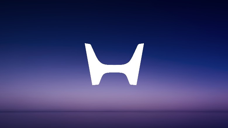
Interestingly, the latest 2024 version of the Honda logo for its new electric car line looks even closer to the original 1960's logo. Not only does it have that same minimalist H, albeit lacking the trapezoid-like outline around it, but it is also wider and sharper than the version before it. Set to appear alongside the Honda 0 Series line, it's an interesting callback to the design that started everything. So, how does the version with wings fit into the picture?
[Featured Image by TTTNIS via Wikimedia Commons | Cropped and scaled | Public Domain ]
The tale of two Honda logos
When you say Honda, most people will probably be thinking of one of their successful car models, like the Honda Civic, Honda Accord, and Honda CR-V. However, Honda manufactures a lot of other things under its group of companies, including power tools, generators, and robots. In fact, it's even part of our list for top private jet manufacturers in the world. But, while many of these businesses share the same logo as their parent company, only one other business gets its own: motorcycles.
While the automobile version of the Honda logo has been around for over 60 years, you'd be surprised to know that the winged version of the Honda logo, as well as the motorcycle business that it was made for, actually predates it by over a decade. In 1947, Honda launched its first product, the Honda A-Type motor-bicycle. Two years later, it released the Dream D-type, a full-fledged motorcycle that helped propel the company into greater heights. Soon after, it became the largest motorcycle brand in Japan and began its rise as a globally acclaimed automotive manufacturer.
Since then, Honda has produced a lot of successful motorcycles across categories, which include superbikes like the Honda Gold Wing and the Honda CR500 monster dirt bike. To this day, Honda motorcycles are still very much in demand across categories. And as an ode to its winged logo of the past, Honda still produces some pretty fast motorcycles for both on and off the track.
The evolution of the Honda Wing logo
Surprisingly, the inspiration for the Honda motorcycle logo is a Greek goddess, whose name is now synonymous to another global empire in the fitness category, Nike. Honda Classics shares that Soichiro Honda based the winged element of the original Honda logo on the goddess of victory's wings.
In its earliest 1947 version, Soichiro Honda used the rough appearance of wings in tandem with a handwritten-like font for the words "Honda Motor." A year later, another version of the logo appeared, wherein the font was more legible with cleaner uppercase sans-serif letters, and the goddess Nike was prominently featured. Although exclusive to its Benly line, Honda motorcycles also released its most graphic logo in 1953 that featured hand-drawn wings.
In the 1960s, the wing icon took center stage on the logo for the first time. However, instead of two, the logo only used a single wing that was displayed from the side and used bold, dark outlines. Additionally, the "Honda" text took a step back and was replaced with the letters "HM" instead. This is the earliest version of the Honda motorcycle logo that closely reflects the iconic winged icon that would remain until today.
By 1973, Honda released another version of the winged icon, but this time, it returned the "Honda" brand name to the logo as shown in the image above. Since then, the winged Honda logo has undergone shifts in proportions, colors, and a few elements. Despite this, the wing icon and the brand name has largely stayed the same.