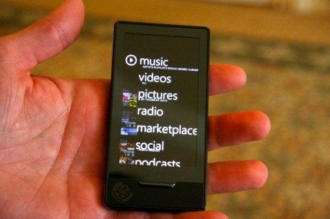
Zune HD Gets Hands-On
Gizmodo got their hands on Microsoft's answer to the iPod Touch: the Zune HD. So far, they've only had a few minutes to play with the device, but their impressions are favorable. Giz claims that the UI is nicer than the iPod Touch (and the iPhone) and the overall design and "beauty" of the device is much nicer than that iPod Touch.
The physical differences are a large rectangular "Home" button rather than the small circular one on the iPod Touch. The device is lightweight and feels good in the hand. Using the device is enjoyable and the accelerometer responds quicker than the Apple counterpart as well.
The only problem is that there won't be the thousands of applications for the Zune HD like there are the iPod Touch, giving the device a very large disadvantage. Hit up the link for some video and more photos.
[Via Gizmodo]
