YouTube Unveils Major Redesign, Gets Social, Adds Algorithmic Feeds
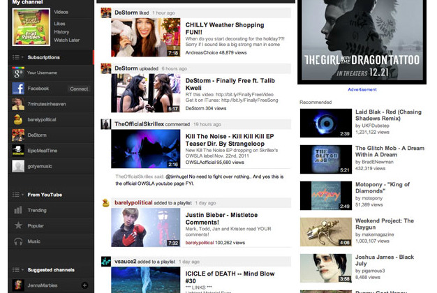
YouTube unveiled today the biggest redesign of its homepage in history. The revamped interface appears to be part of Google's move to introduce a social layer to all its products, adding a new emphasis on integrations with social networks like Google+ and Facebook, as well as bringing in new algorithmic channel feeds. The emphasis on channel subscriptions also makes it easy to navigate and watch YouTube as if you were watching TV.
The new design focuses on channel subscriptions that are listed in the left-hand column, with Google+ and Facebook feeds listed at the top that when clicked show videos shared by any of your friends or circles. This column also features other ways to filter your feed, curated feeds, suchas Trending channels, and also lets you pin any specific channel subscriptions to the list.
When a subscription or filter in the left column is clicked on, the corresponding videos show up in the center column, with the latest videos from the feed showing up first. The right column then features recommendations and ads. This layout is similar to what we've seen in both Google+ and Facebook.
Additionally, YouTube introduced new templates for these homepages, including Blogger, Creator, Network, and Everything templates that let you customize your page to best present your video content. YouTube will likely be introducing more social features that will further enhance discovery options and possibly even tighter integration with Google+.
[via TechCrunch]
