YouTube TV "Now Playing" Update Makes UI Smaller, Fast-Forward Faster
When you're watching videos, no matter if it's on TV or on your phone, you probably don't want to be distracted by anything else. On streaming media, in particular, user interfaces should get out of the way when not needed and be as unobtrusive as possible when they do get summoned. At the same time, however, they should also offer as much information necessary that viewers might want to quickly see at a glance. It's a very delicate balancing act and YouTube TV's latest update tries to achieve that.
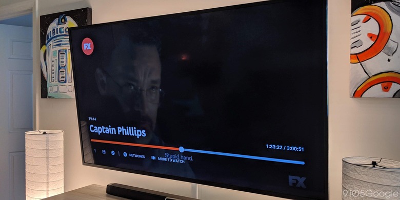
YouTube TV's unannounced and unexpected update mostly focuses on the "Now Playing" screen, the user interfaces that appear when you're actually playing a video. According to users who have reported the surprising changes, the changes seemed to be geared to minimize the real estate those controls take up.
The seek bar, for example, is noted to be thinner and there is less information visible all at once. They didn't get removed, however, and details about the current video and other videos available from the network are just a scroll up away.

The update does have one change under the hood in the form of progressive fast-forward. This basically means that the longer you press the fast-forward button, the greater the increments it skips, from 10 seconds to 15 seconds to a full minute. This should make skipping commercials easier, even if you're not actually skipping it all at once.
The YouTube TV update has reportedly been received by about 50% of users. It's being made available on all platforms including Android TV, Roku, Apple TV, and consoles.
