YouTube Rolling Out New Layout Starting Tonight
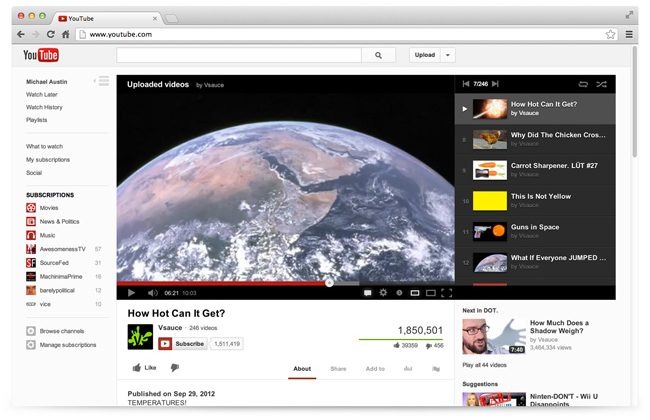
Starting tonight, YouTube will begin rolling out a new and updated web interface. They say the new design will be "cleaner and simpler" and will also include an improvement to the Guide, which is a feature that makes it easier to subscribe to the channels. This time around, the Guide will be available across all devices.
In the new layout, YouTube has focused on putting the most important elements at the forefront, with the video right at the top of the page, and the subscribe button, as well as share buttons and video information show up right below the video. Playlists will also now appear directly to the right of the video.
Overall, the new design is definitely a lot cleaner and simpler, and the way that the playlist almost looks like it's part of the video box is pretty clever. However, it looks like related videos are still located below the video box, requiring that you scroll down further in order to browse them. We almost would prefer that related videos go where the new Playlist sidebar is.
Either way, the new look is definitely an improvement, and you should start seeing it sometime tonight, if not already. YouTube has already rolled out the new look to a select number of users as a beta of sorts, and they say that users are subscribing to 50% more channels overall because of the new design.
