YouTube Homepage Redesign Brings Useful Features To Desktop And Tablets
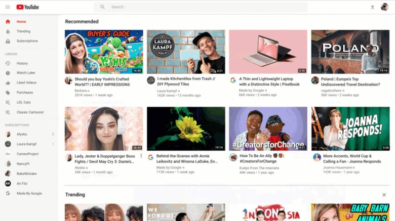
YouTube is rolling out a redesigned homepage on desktop and tablets, offering what it says is a UI that makes it easier for users to discover new videos to watch. Among other things, users will note the arrival of 'richer' thumbnails, as well as longer video titles that help the user see what, exactly, they're about to watch. As well, channel icons are easier to see, some content shelves have been removed, and more.
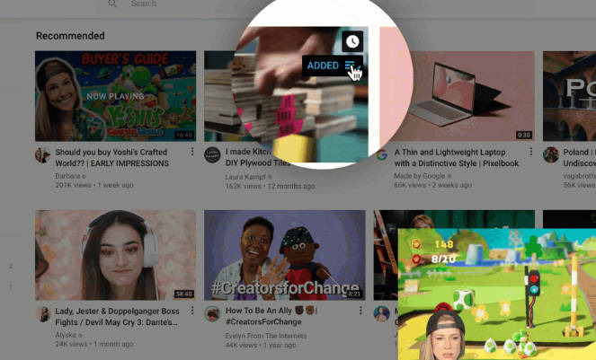
In addition to showing larger titles with video thumbnails, YouTube is now also showing the channel's avatar next to the titles, making it easier for users to see which channel the content comes from. In addition, desktop users are now seeing a new 'Add to queue' option that enables them to directly add a video to their playlist.

This can be done while the current video remains live in a smaller window on the screen, making it possible to browse and queue up content while watching a video. Beyond that, YouTube is also bringing its 'Don't recommend channel' option to videos on desktop, mirroring the feature that has been available on the mobile platform for a while.
YouTube will stop showing the user these channels after they select this option, helping tailor the homepage content to the channels and topics they're actually interested in. The company has also teased users with some details on a future update, namely bringing another feature from Android to desktop and tablets.
Starting 'soon,' users on either platform will be able to 'favorite' topics so that videos related to them will show up in the Home feed. This update is the result of months of work, one that ultimately results in 'dozens' of improvements to the existing homepage UI on tablets and desktop.
