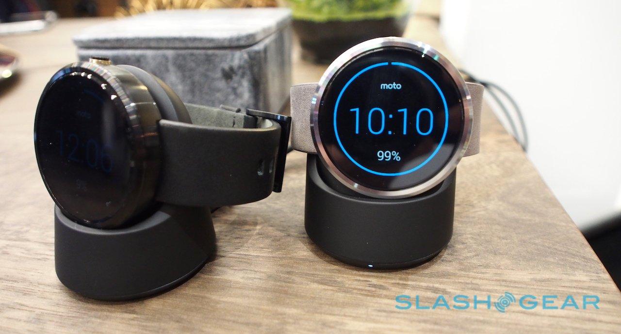
You Can Buy The Moto 360 Today: We Go Hands-On
Has there been a Motorola product so coveted, so eagerly desired, since the original RAZR as the Moto 360? Teased at Google I/O several months ago, but only now reaching the market, the round-faced Android Wear watch has been blamed for stalling sales of squared-off rivals as would-be buyers hold out for the eye catching form factor. The time has come, then: the Moto 360 is on sale today, and I caught up with Motorola to find out all the details.
First off, what you've probably been waiting to find out, namely how much the Moto 360 will cost. Priced at $249.99, it comes in at the top end of the (admittedly small) Android Wear line-up, though the margin between it and the LG G Watch is small.
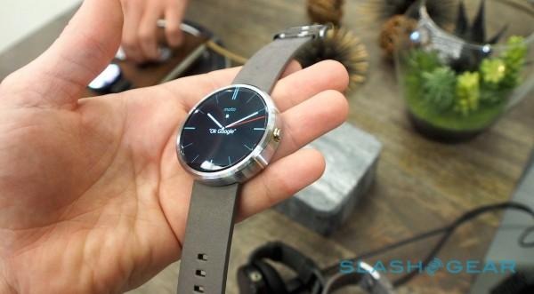
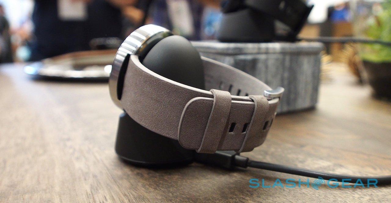
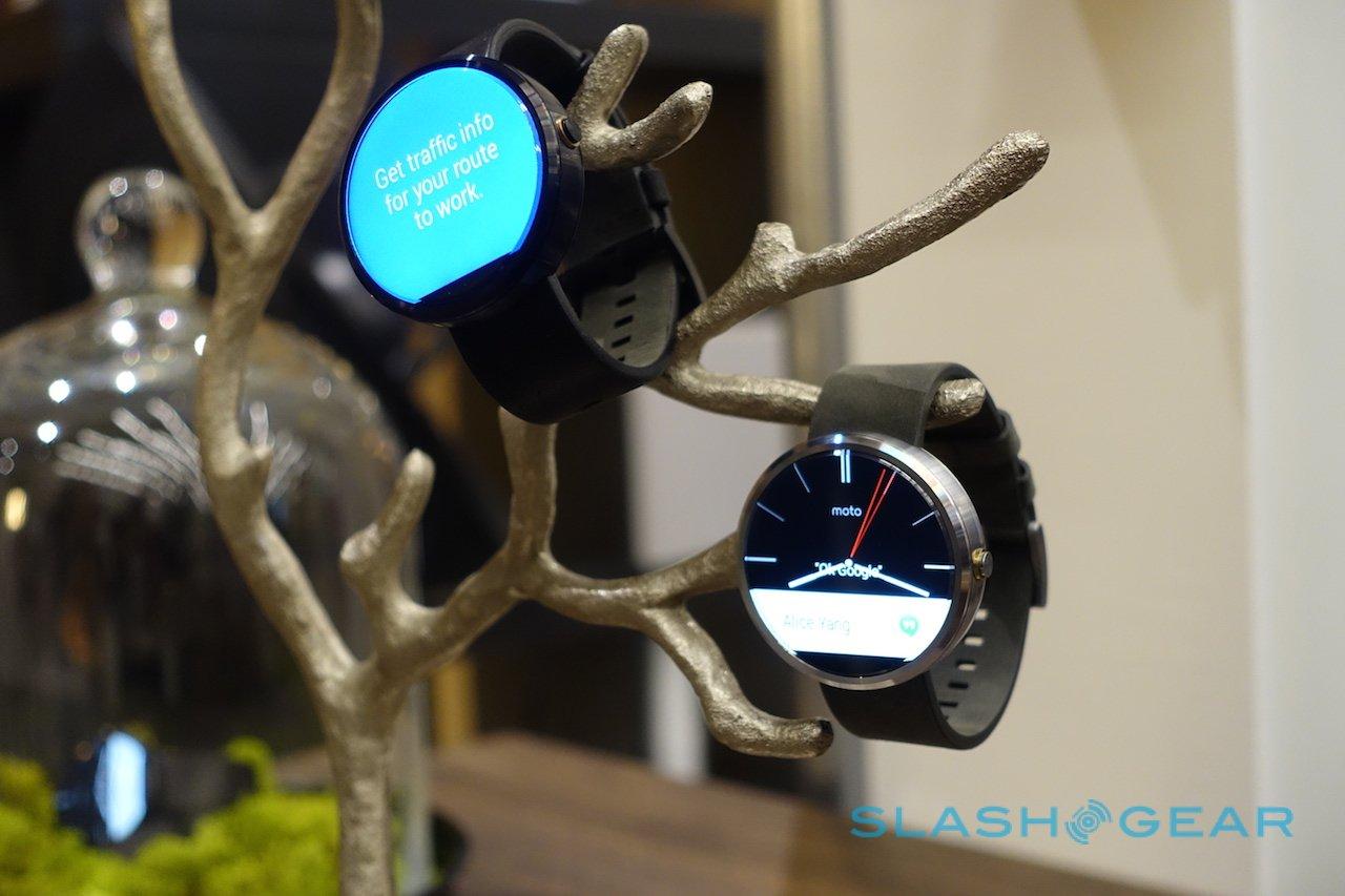
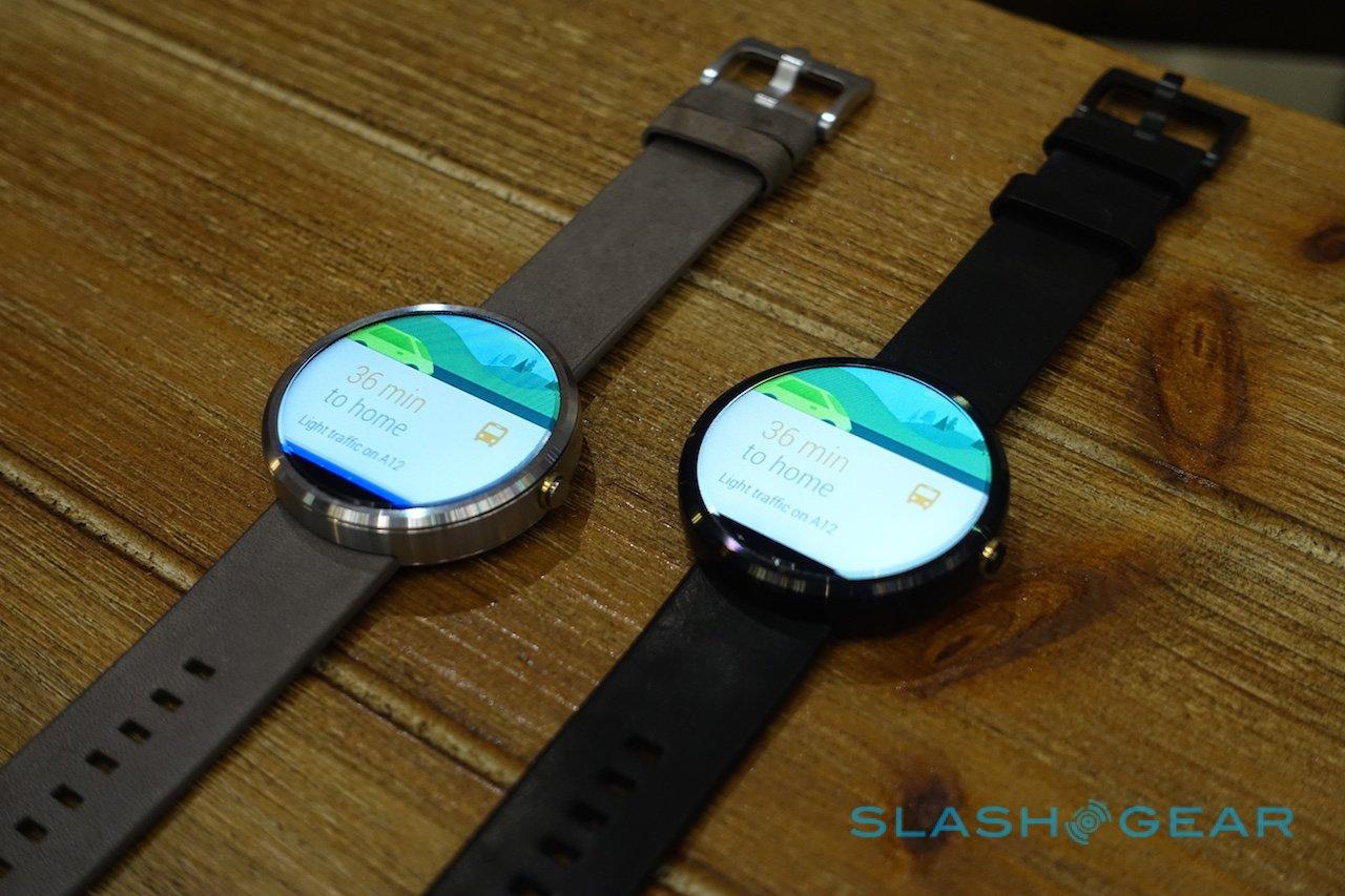
US sales kick off today at midday Eastern (9am Pacific), with the black and silver versions (with black and stone grey leather straps, respectively) offered from Motorola's online store, through Google Play, Best Buy's online store, and in select Best Buy locations.
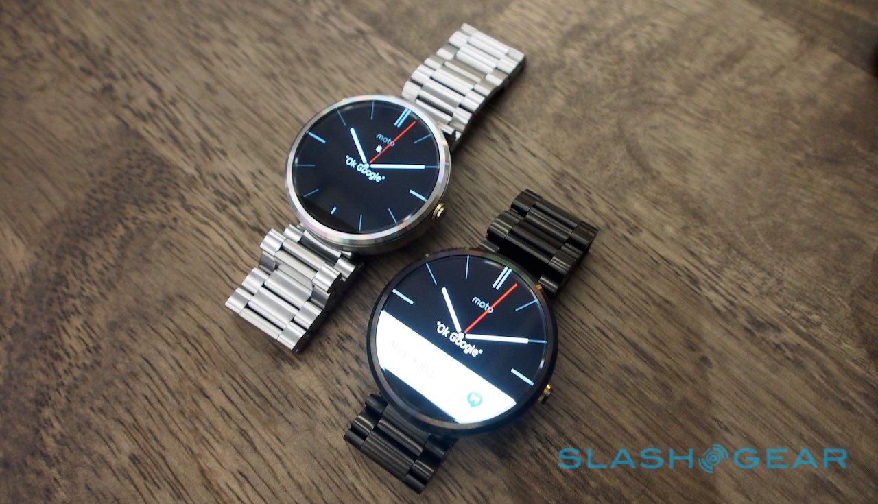
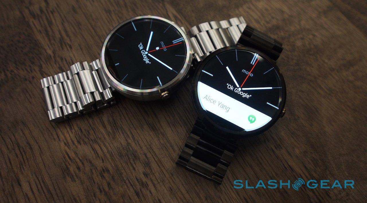
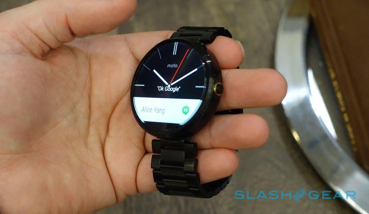
Best Buy will also be the only place to find a limited edition with a grey, suede-effect strap, though later in the fall there'll be versions with metal bracelets – again, in black or silver, priced at $299 each – and Motorola will begin offering its own interchangeable straps. The metal bracelets will be $79 to buy individually, while the leather straps will come in cheaper, at $29 apiece.
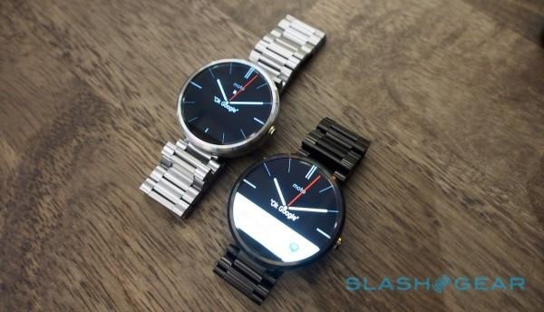
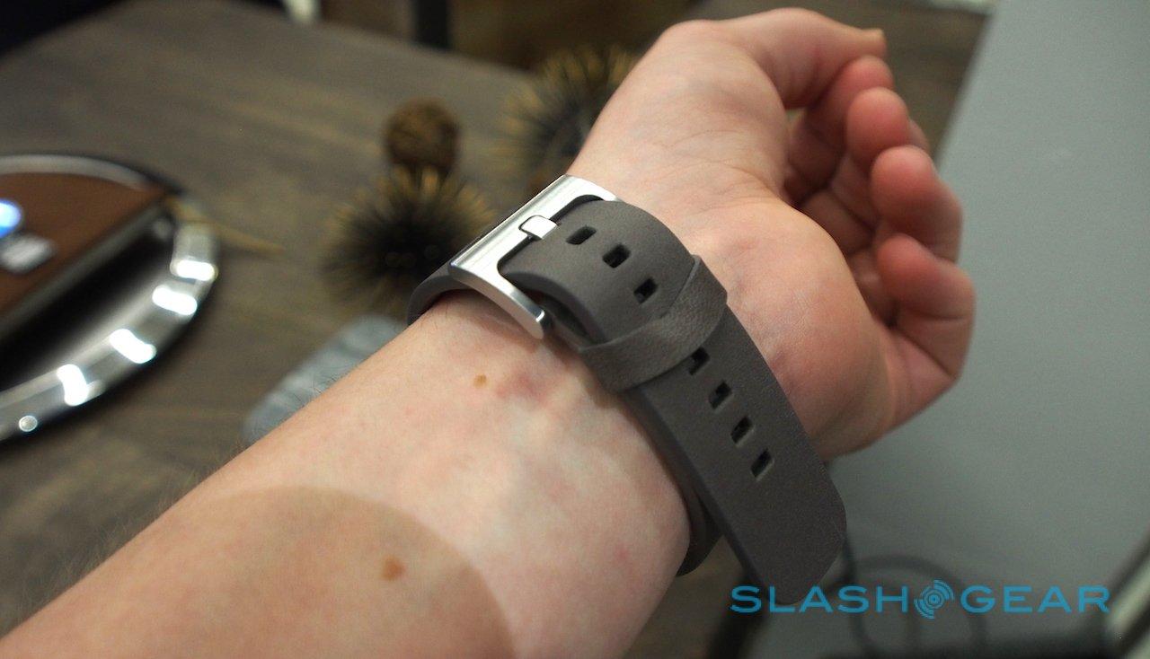
It's no ordinary leather, though. Motorola went hunting for the right hide for the Moto 360, and found it close to home in Chicago, courtesy of Horween Leather. Later in the fall, there'll be different colors and finishes to choose from, product manager Lior Ron tells me, though you can fit any 22mm band you might prefer.
Motorola is "strongly advising" against third-party metal bracelets, however, as there's a fair chance they may interfere with the radio antennas that are integrated into the Moto 360's metal bezel.
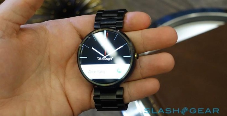
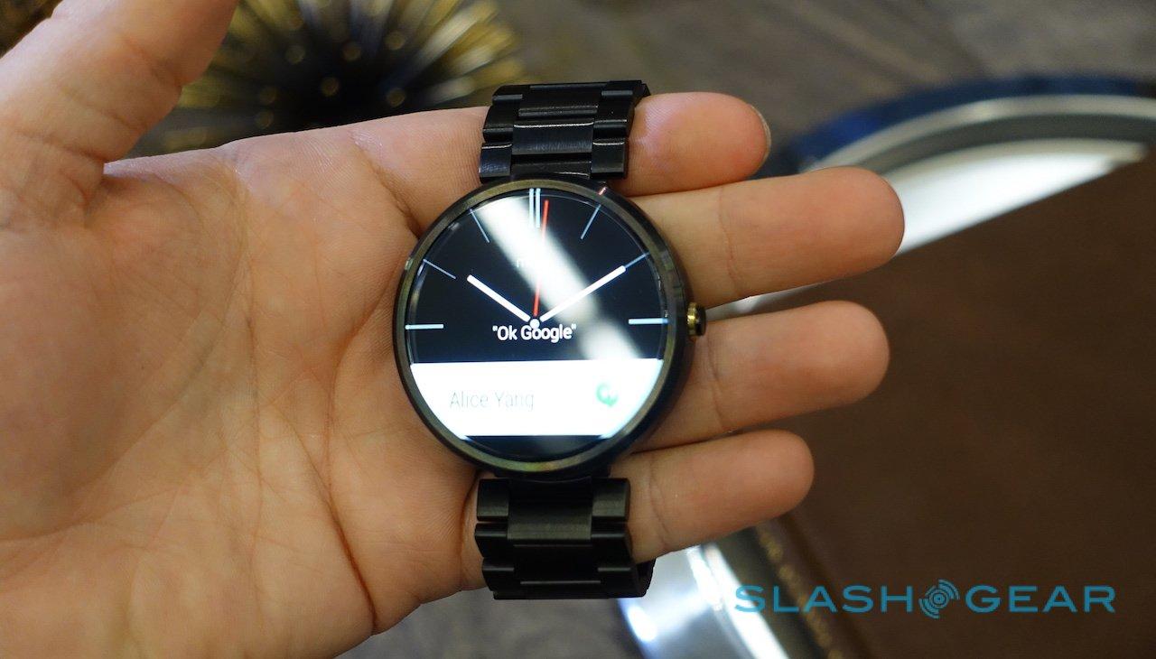
If there's been a controversial part of the Moto 360's design, it's the black notch taken out of the lower portion of the touchscreen. Motorola refers to it as the "slice" and, according to the product team, it was a conscious decision to include it.
The Moto 360 could've avoided it, yes, but it's where both the LCD driver and the ambient light sensor are placed. If they'd been moved – and the screen a full circle, as with the POLED panel on the LG G Watch R – then the bezel would've had to have either been thicker or warped to accommodate it. That had a knock-on effect to how the straps fit and how the Moto 360 sat on the wrist, compromises Motorola wasn't willing to make.
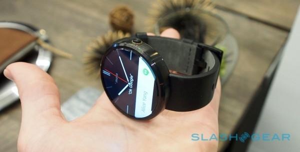
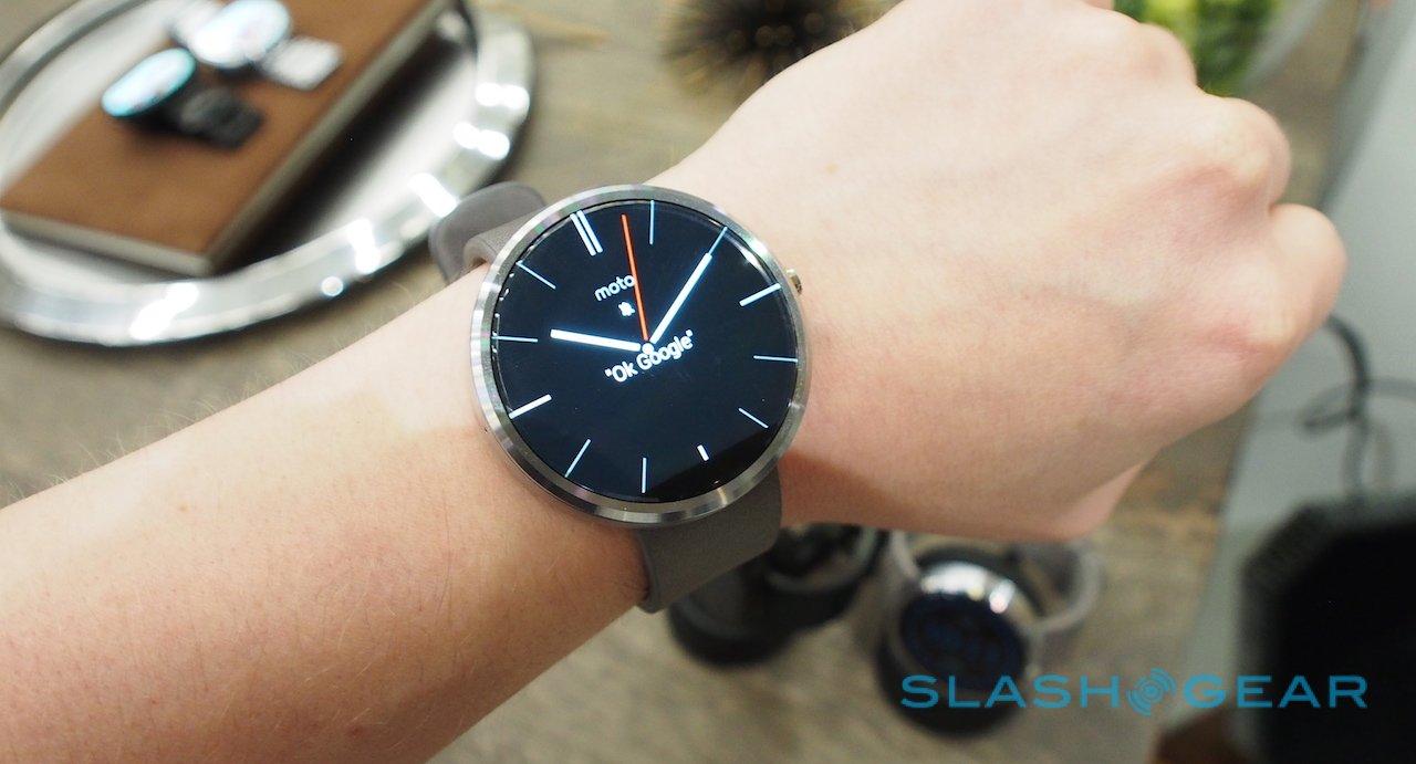
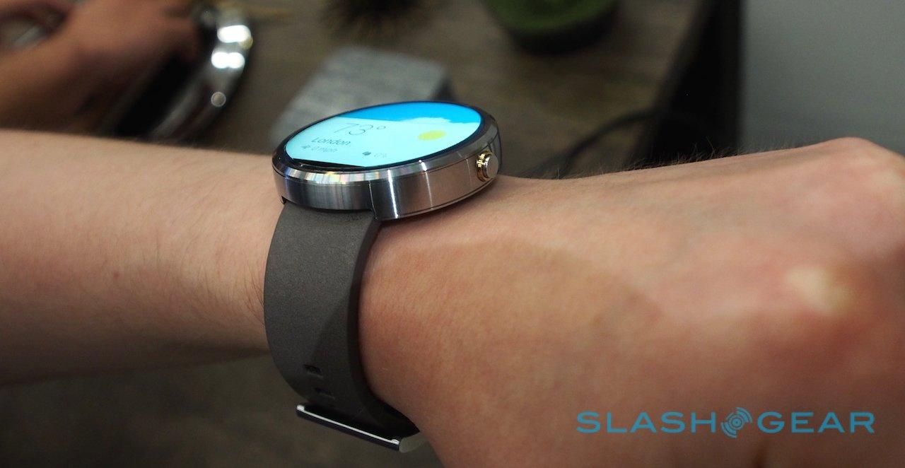
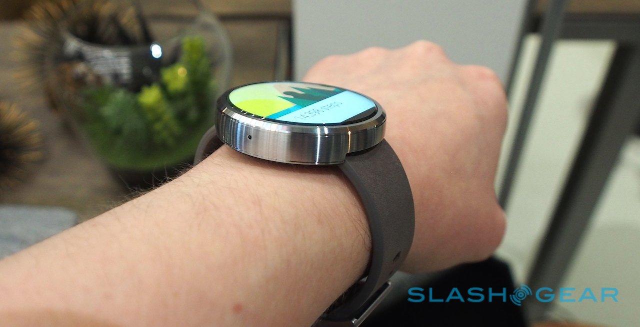
In practice, though you know it's there, it's not something you really notice after any length of time with the watch on your wrist. Other aspects catch the attention far more: the beveling to the edge of the coverglass, for instance, which refracts the light in interesting ways and highlights truly just how edge-to-edge the LCD is.
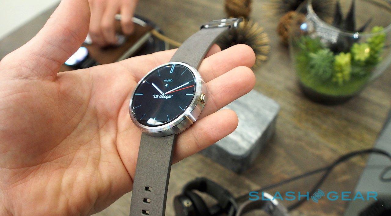
As panels go, it's a beauty. Viewing angles are OLED-level vast, it's bright and crisply colored, and Motorola's selection of watch faces do a great job of either disguising it as a dress watch or chronograph, or highlighting that it's actually all virtual with more unusual graphics. There are more to come, meanwhile; a recent design competition saw "thousands" of entries, Ron tells me, and as soon as Google adds third-party watch face support to Android Wear, the range should grow exponentially.
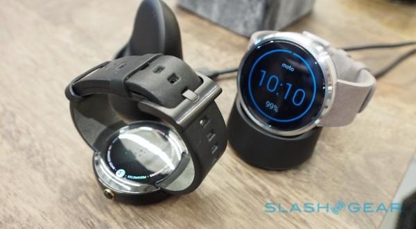
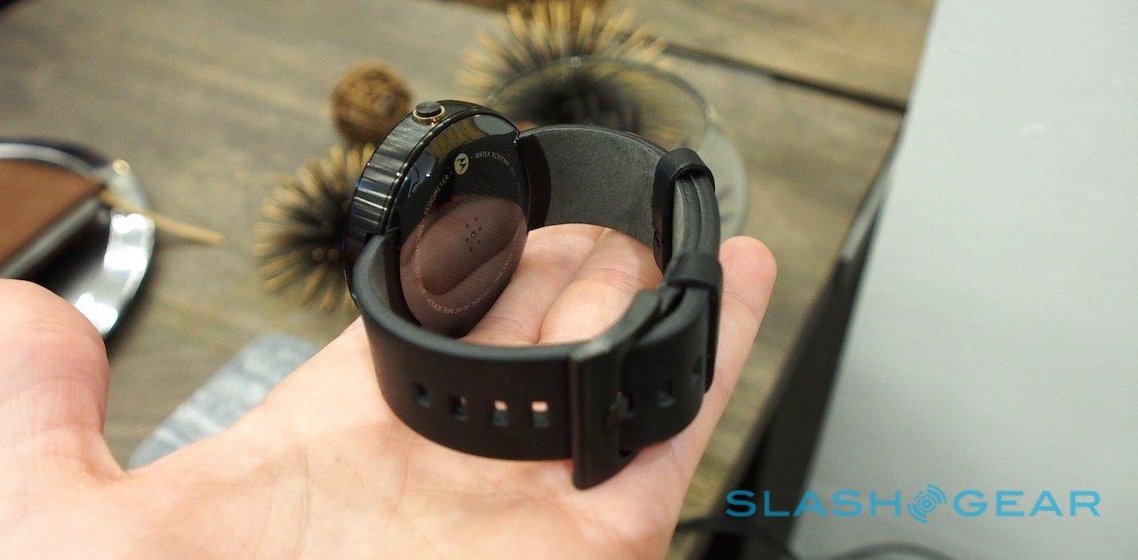
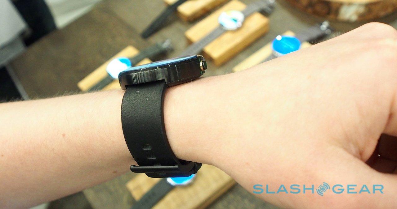
At the equivalent of a roughly 46mm traditional watch, it's not small, but even on my relatively narrow wrists it doesn't feel unduly clumsy. The design of the strap helps, with the leather bands folding in from underneath the body, rather than extending out from it on lugs.
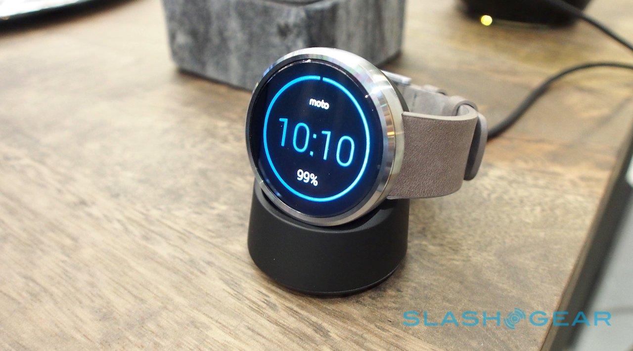
It's not the only slick design decision. Like Samsung, Motorola has fitted a heart rate sensor on the inside edge, but it's completely fared-in; there are no nooks or crannies for arm-gunk to accumulate (not a nice thought, no, but a pertinent one for wearables). The wireless charging dock not only positions the Moto 360 for use as your nightstand clock, but has been designed with the metal bracelet in mind, too: as Ron pointed out to me, had it been a flat charger then the bracelet wouldn't have been able to sit on it squarely.
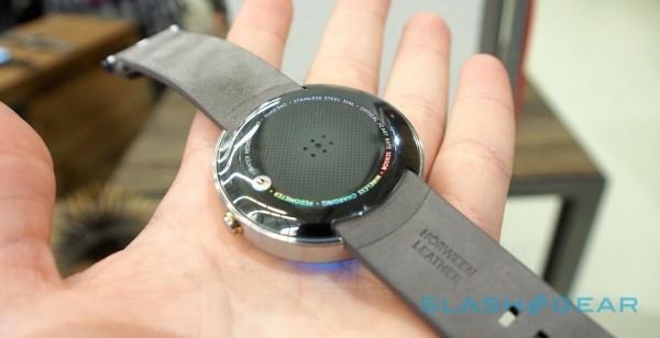
You'll be using it regularly, mind. Motorola is estimating a full day of use on a charge, which while akin to a smartphone is certainly more frequent than most watches need to be recharged or rewound.
There's a "discrete" display mode which keeps the panel turned off more of the time that might help prolong things a little – Ron actually describes it as intended to stop people from glancing at your notifications whenever you move your arm – but I've a feeling most will leave it in the normal mode which lights up more frequently. Interestingly, the same contextual core used to control when, exactly, the Moto 360 activates and when it shuts down is shared with the Moto X.

Beyond the premium materials and the eye-catching display, though, for the most part this is Android Wear as we've already seen it. You get the same "OK Google..." voice trigger, and the same notification and preview support from a paired Android smartphone; emails, texts, navigation instructions – pedestrian, cycling, and car – and Google queries can all be performed, with speech recognition along with simple taps and gestures for navigation.
Aside from the watch faces, the only major change Motorola has made is the fitness app. The heart rate sensor display is round, of course, and animates beautifully; similarly, Motorola is pushing Moto 360 wearers to commit to 30 minutes of walking activity a day, and that gets a circular meter that, with a swipe, shows how close you are to fulfilling a full week of hit goals.

As Lon highlights, a round display is particularly suited to showing the progression of time: we're naturally used to seeing it as a countdown to completion. Some of Motorola's watch faces take advantage of that, too – one blocks out notches in the clock to show when you have appointments on your calendar and when you're free, for instance – but there's a real sense that the potential for the form-factor is still relatively untapped.
If the initial feedback after the Android Wear launch is anything to go by, demand for the Moto 360 should be strong. Even with its $250 price tag, it could well be the best-selling smartwatch running Google's platform; LG will fight back with the G Watch R, though that's not on sale until later in the year, and we still don't know how much it will cost.
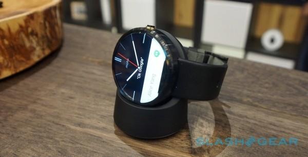
Ask Motorola, though, and the Moto 360 is not a smartwatch, it's just a wearable. Or – even better – just a watch, albeit what the team behind the Moto 360 would argue is the next-generation of timepieces.
No matter the name, it's tough not to be charmed. Even if you're not quite convinced by Android Wear (and, given its v1.0 status, I can't blame you too much for that), the form-factor itself is enough to single it out as a beautiful watch, period.
It may not have the mechanical prestige of a Swiss-made auto-winder, but it does have its own 21st century appeal. You simply don't find that many round displays in modern technology, and that alone gives the Moto 360 an edge that wearable rivals simply don't get.
We'll have a full review of the Moto 360 up on the site very soon.
