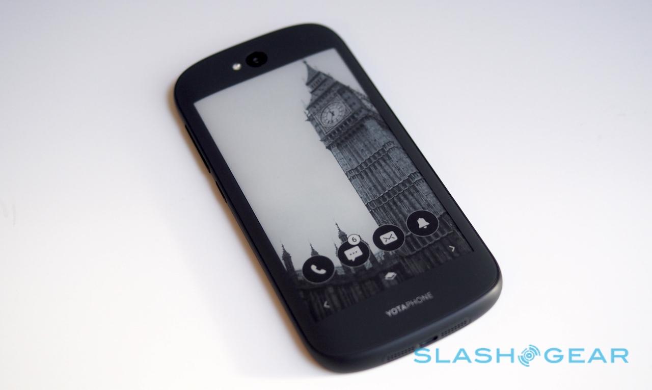
YotaPhone 2 First-Impressions - Odd E Ink Allure
You have to give the team at Yota credit for not giving up on their dual-display smartphone dream. The original YotaPhone was a curious – but flawed – riff on the Android smartphone, a regular screen on one side and an E Ink panel on the back, let down by immature software and hardware. Now, with the YotaPhone 2, the company believes both concept and product are ready for the mass market. I've been trying the new smartphone out this week ahead of sales kicking off today, and it's clear there certainly are advantages over opting for more screens, rather than just bigger ones. Read on for some first-impressions.
Ignore the E Ink panel, and the YotaPhone 2 doesn't really stand out from the crowd in terms of specifications. The traditional display is a 5-inch 1920 x 1080 AMOLED; it's a decent panel, with plenty of detail, though there's more resolution elsewhere in the market if you go looking for it. The main camera clocks in at 8-megapixels – again, low on the resolution count on paper at least – with a 2-megapixel camera on the front.
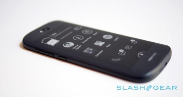
Inside, there's Qualcomm's 2.2GHz quadcore Snapdragon 800 – Yota's argument there is that the 801/805's main advantage over the 800 is their roughly 5-percent increase in battery efficiency, an improvement which while worth it for regular smartphones, doesn't warrant the effort of rewriting the dual-screen tech for given the E-Ink screen's own inherent frugality – paired with 2GB of memory.
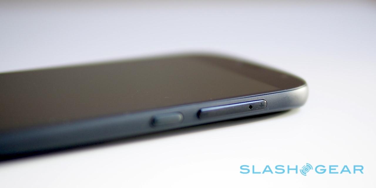
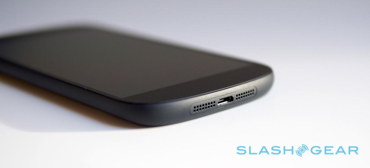
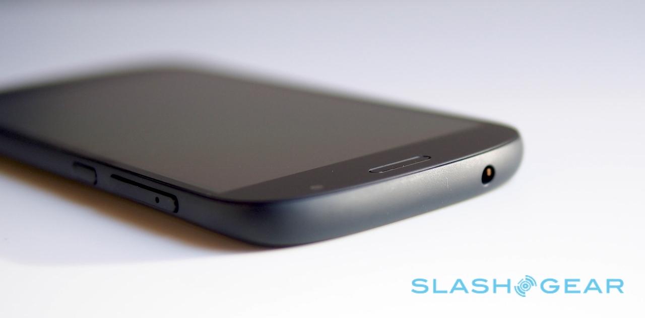
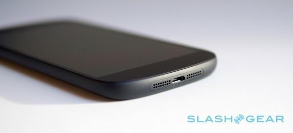
Storage is 32GB, with no way to expand on that; Yota opted not to fit a microSD card slot, and there's no removable battery, either. The 2,500 mAh Li-Ion pack is locked up behind the rear display. The nanoSIM tray is cleverly integrated into the volume rocker. Up top there's a 3.5mm headphone jack, and a microUSB port flanked by the loud and full-bodied speakers is on the bottom edge.
Connectivity includes GSM/DC-HSDPA/LTE with VoLTE support (if your carrier uses it), along with WiFi a/b/g/n/ac and Bluetooth 4.0. There's also NGC, A-GPS/GLONASS, and an FM radio.
It's not going to win any awards for outstanding design, but neither does it feel cheap, creaky, or – most important, perhaps – like you're paying a bulky penalty for getting two displays. The internal magnesium frame is covered by a 5.67 x 2.74 x 0.35 inches and 4.9 ounce shell of glass fiber-reinforced plastic, matte finished and easily gripped.
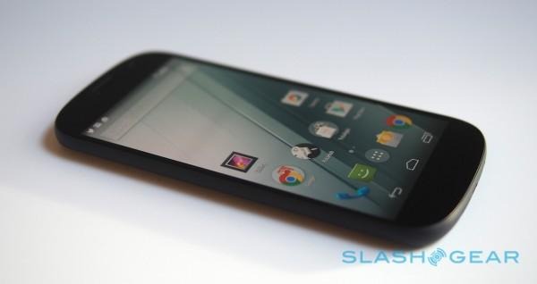
The combination of the curved corners – reminiscent, thanks to the edge-to-edge Gorilla Glass 3 fascia, of Samsung's Galaxy Nexus – and the similarly Gorilla Glass 3 protected curved back panel help mask the thickness, and as a result the YotaPhone 2 sits neatly in the hand.
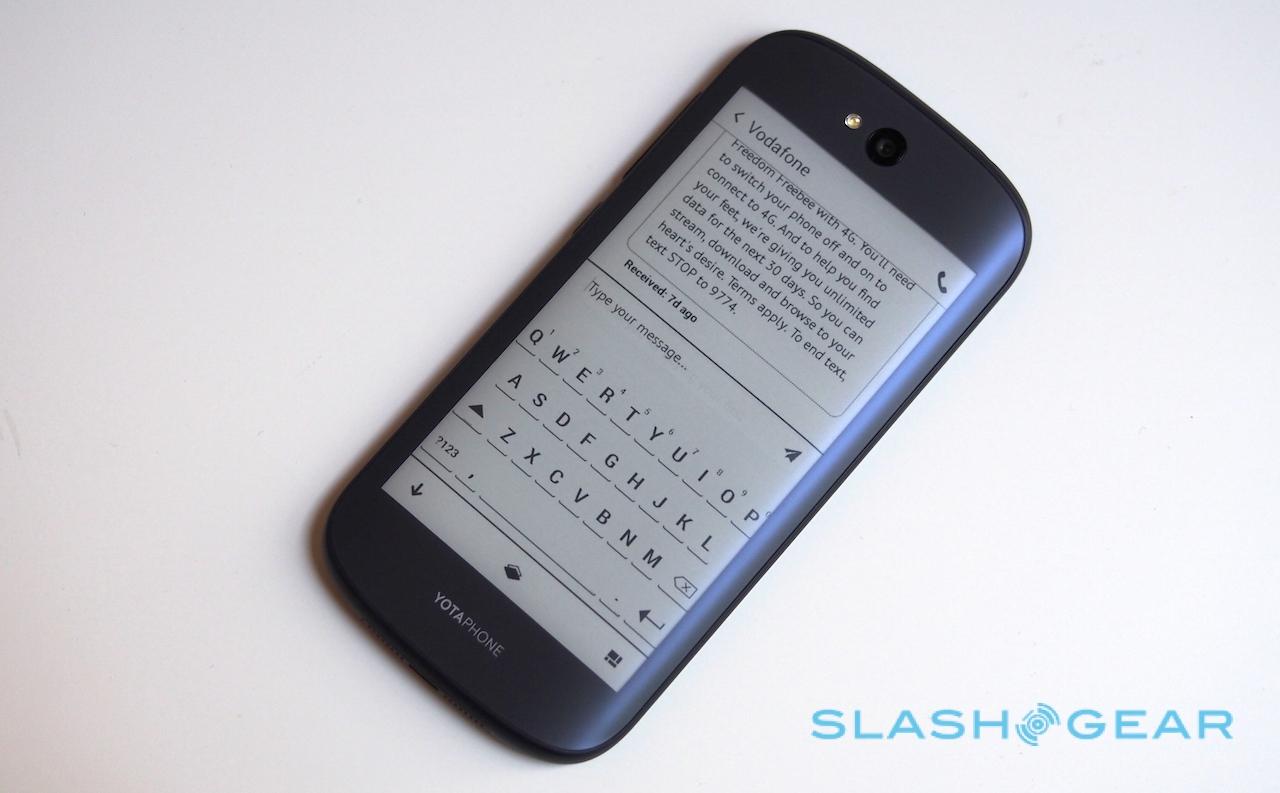
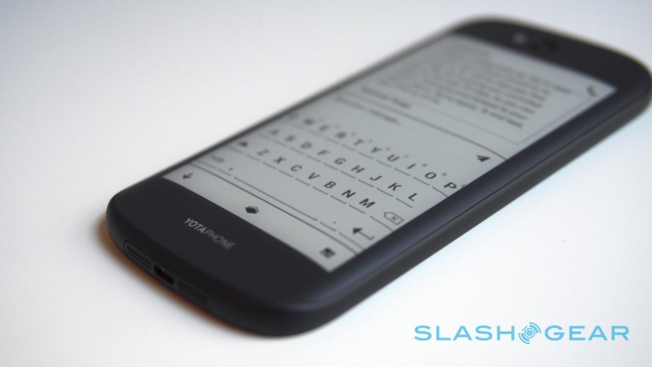
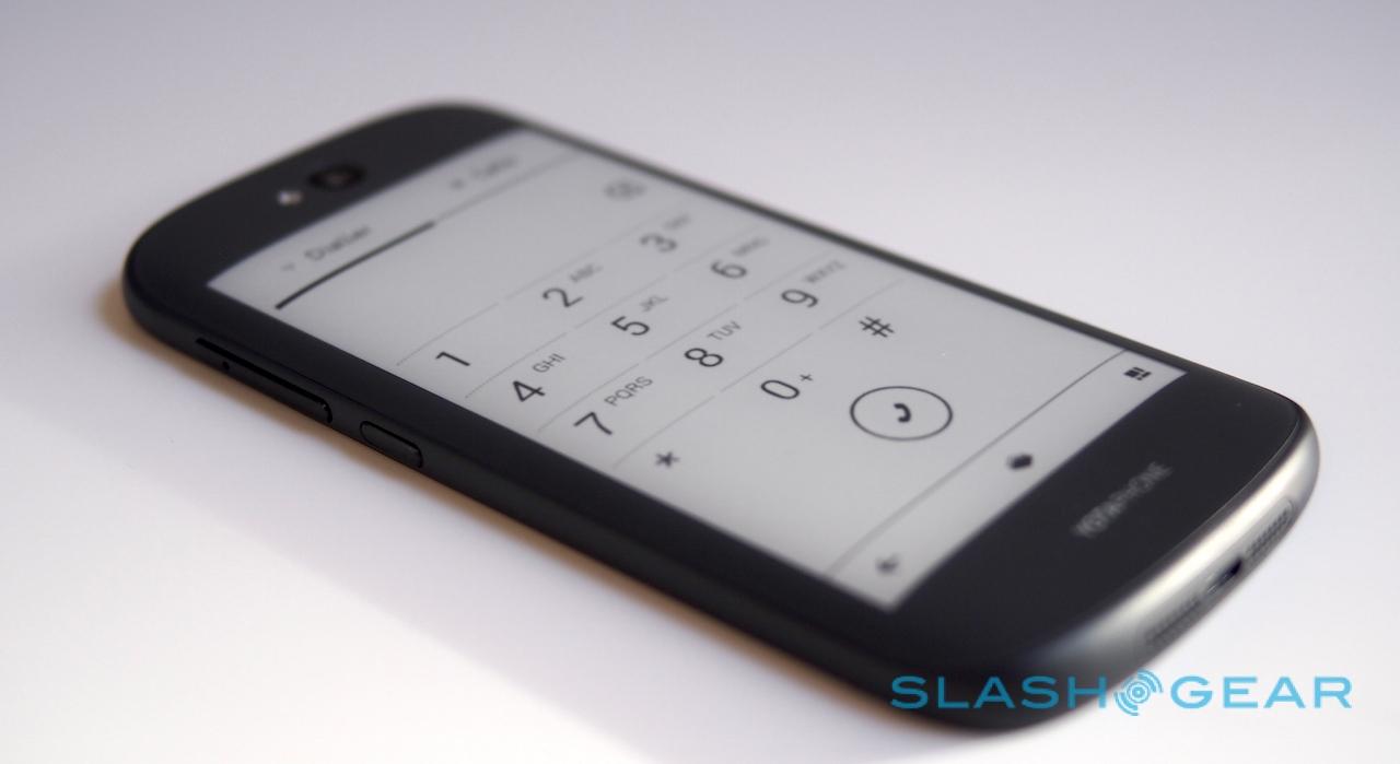
Of course, you can't judge Yota's handset without considering the E-Ink display. 4.7-inches and 960 x 540 resolution, it's E Ink's latest Carta panel technology, as used on Amazon's newest Kindle Voyage ereader.
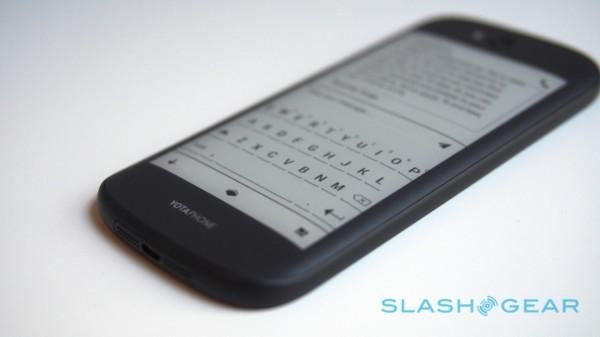
That makes it bigger than the 4.3-inch e-paper display on the original YotaPhone, but more importantly it now supports full touch. Whereas previously Yota had squeezed a tiny touch-strip under the E Ink panel, the YotaPhone 2's entire secondary screen (which has a pleasingly matte finish of its own) responds to not only your fingers but multitouch gestures too.
That immediately opens up a whole new range of possibilities for how the rear display can be used, and Yota hasn't wasted the opportunity. Key to that is a change in the way applications are accessed.
With the original YotaPhone, only apps that had been written using Yota's SDK could take advantage of the E Ink panel. It made certain of consistency and usability, certainly, but it also put Yota in the awkward position of waiting on third-party developers to embrace a brand new form-factor before owners would see any real range of titles to choose from.
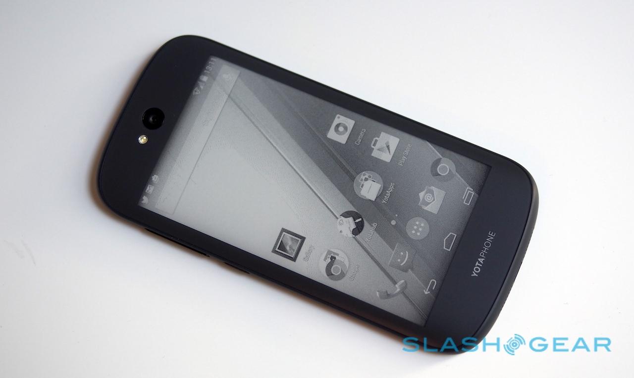
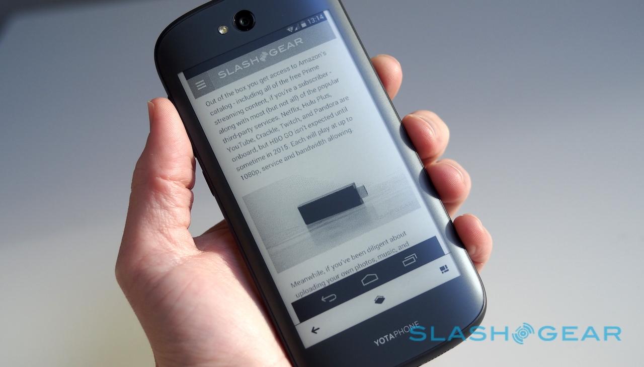
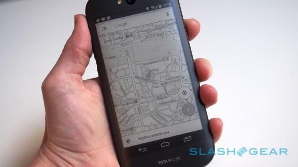
This time around, while the Yota SDK is still out there – and being adopted or at least considered by a number of developers large and small, the company tells me; the Twitter widget, for instance, was the collaborative result of the short-message social network and Yota – you can now mirror the entire regular Android interface on the E Ink display.

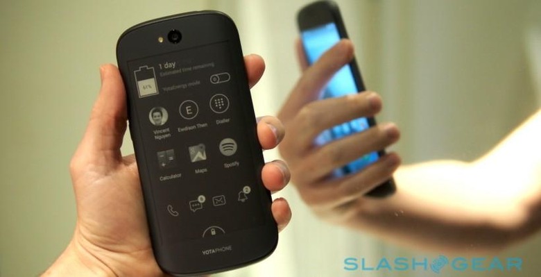
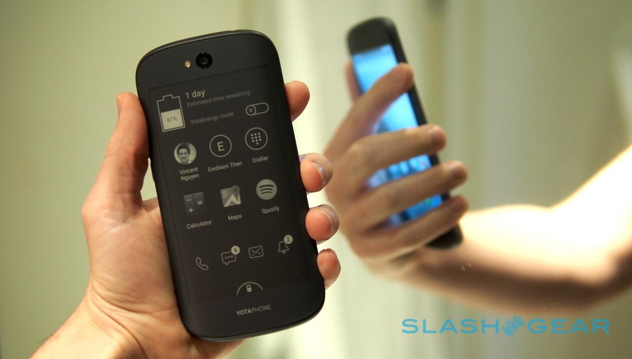
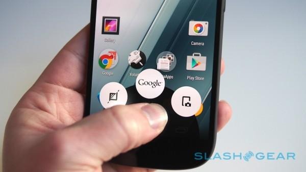
Swipe up on the Home button, and the Google Now option is flanked by two new YotaPhone 2-specific icons. Drag and release to the left, flip the handset over, and the screen you were just looking at is now recreated in shades of grey on the back of the phone. It's not just a picture, either: the whole thing can be interacted with just as you would normally.
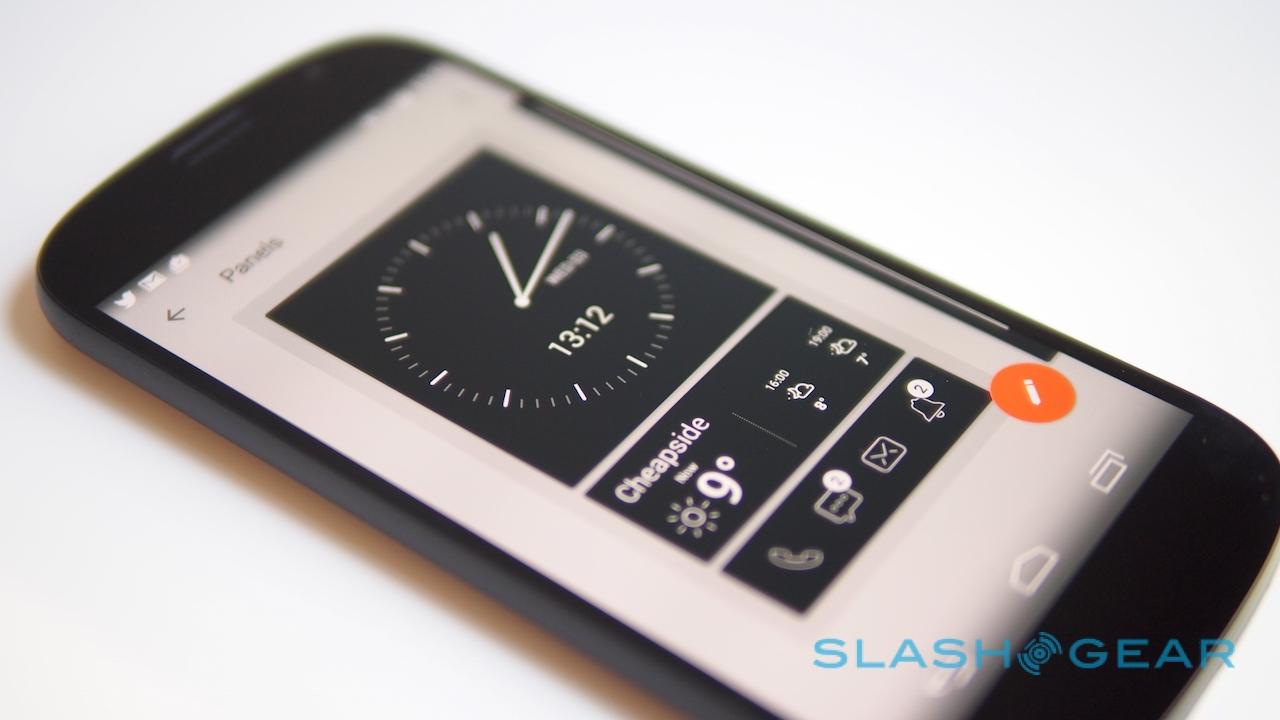
That means Yota's app launcher for the e-paper display – one of a number of widgets, including Twitter, weather, the upcoming calendar, notifications, and contact shortcuts, organized across up to four "YotaPanel" panes and configured in the YotaHub app – can link to regular Android apps, loading them straight onto the rear screen.
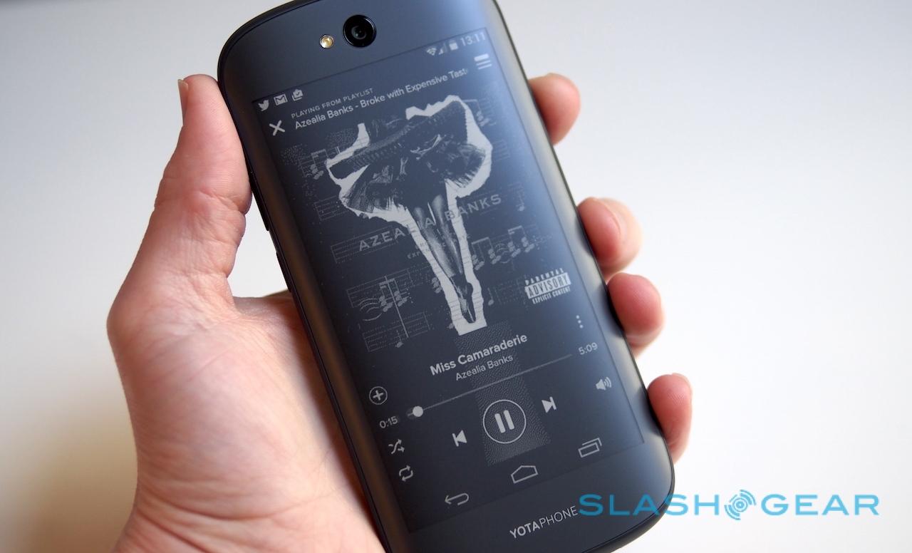
Obviously some are more successful than others. Anything that relies heavily on animation or video isn't really suited to e-paper (in fact, pushing an E Ink panel to the sort of high refresh rates you'd need for anything close to smooth video will see it use power more quickly than the regular AMOLED would), but I've been using Google Maps, Spotify, the calculator, Gmail app, Hangouts, and several others with no significant compromises.
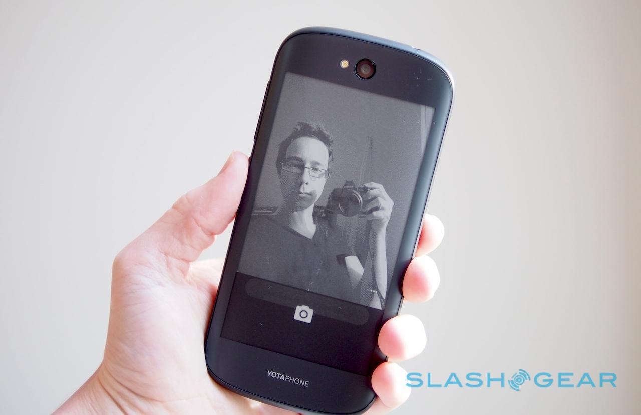
Sometimes, even with the unsuitability of E Ink to video, it's still worth using YotaMirror though. Taking full-resolution selfies with the main camera, for instance, is a whole lot easier when you can frame them using the e-paper display.
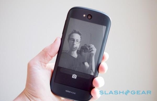
Overall, YotaMirror makes for a far more flexible system: with ebooks, for instance, now you can opt to use either Yota's own ereader app (which supports Adobe DRM), or simply load up Amazon's regular Kindle app for Android if that's where you get your content from. Both are eminently readable. Since e-paper only demands power when refreshing, you can have a map, or a schedule, or a list of instructions kept on-screen so they're permanently visible, without chewing through your battery in the process.
Taking particular advantage of that is YotaSnap, a screenshot tool accessed by swiping to the right of the Google Now button. Of course you could already take a screenshot using Android's built-in tool, but YotaSnap automatically puts that image on the E Ink display, where it'll stay even if the battery runs out and the phone shuts down. A widget to access all screenshots is available on YotaPanel too.
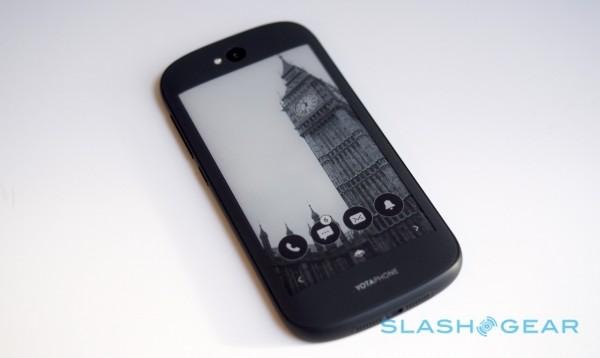
Finally, since permanently flaunting your upcoming calendar and other information on the back of your phone might not be your favorite idea, there's YotaCover. Effectively covering up YotaPanel with a picture, you can choose from shots saved on the phone, a particular Facebook gallery or your Instagram feed, or from a small number of images Yota provides.
In future, though, the company is hoping to offer photographers and others a way to push regularly updated galleries of images to the YotaPhone 2. For instance, you could have regularly updated artwork show up, or photos on a certain theme, or even "quote of the day" type information.

Battery life is the other improvement Yota is championing. With all of the radios turned on, you can apparently read for a solid five days on the E Ink screen on a single charge. True, that's not especially realistic, but judicious switching between AMOLED and E Ink promises a couple of days of more typical use, and there's a YotaEnergy mode – shutting down all by GPRS data and pushing core functionality like calls and texts to the e-paper screen – which Yota says should stretch 15-percent of battery for something like 8.5hrs.
All in all, it's a far more usable system than the first YotaPhone, and it certainly shows that Yota was listening to the early feedback. There are some obvious issues people will pull the company up on to begin with – the fact it runs Android 4.4 KitKat out of the box, for instance, with 5.0 promised "at a later date" – and it remains to be seen how fundamentally useful over time the twin display system is.

Biggest stumbling block may be price, with the phone coming in at £555 (869) in the UK or around €700 elsewhere in Europe.
I'll be putting the YotaPhone 2 through its paces to see if it warrants that sort of money, as well as whether Yota's dream of doubling up on displays actually has real-world advantages. If you're already convinced, you can order one in the UK from today, in Hong Kong by the end of the year, and in other Asia markets in Q1 2015. North American availability will follow on "soon after," Yota says.
