XPERIA X10 Review
If it feels like it's a long time since we first saw the Sony Ericsson XPERIA X10, that's because it really has been. First announced back in November 2009, and only now approaching the market, the X10 runs the risk – like other Sony Ericsson smartphones, it has to be said – of making promises that prove underwhelming by the time it delivers on them. With handsets like the Nexus One already on the market, is there still a place for the XPERIA X10? Check out the full SlashGear review after the cut.
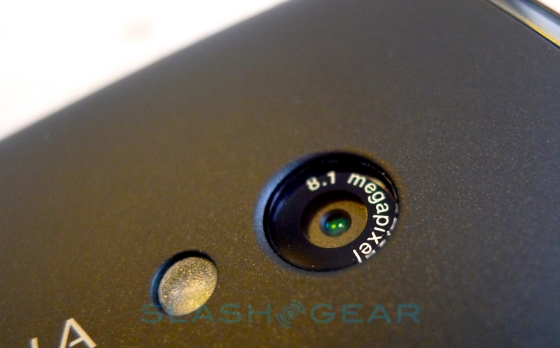
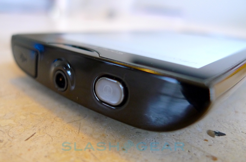
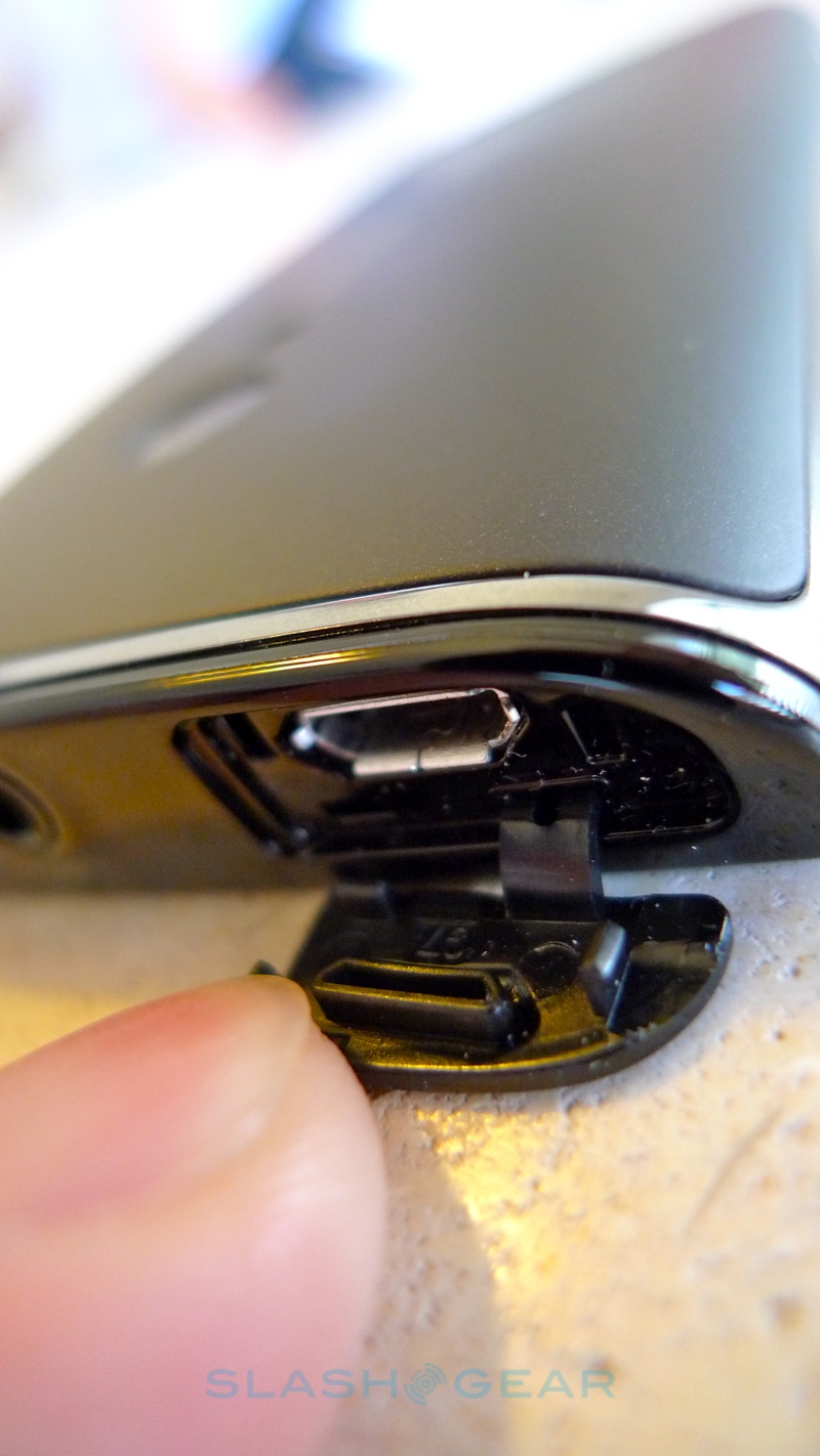
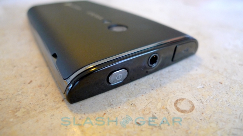
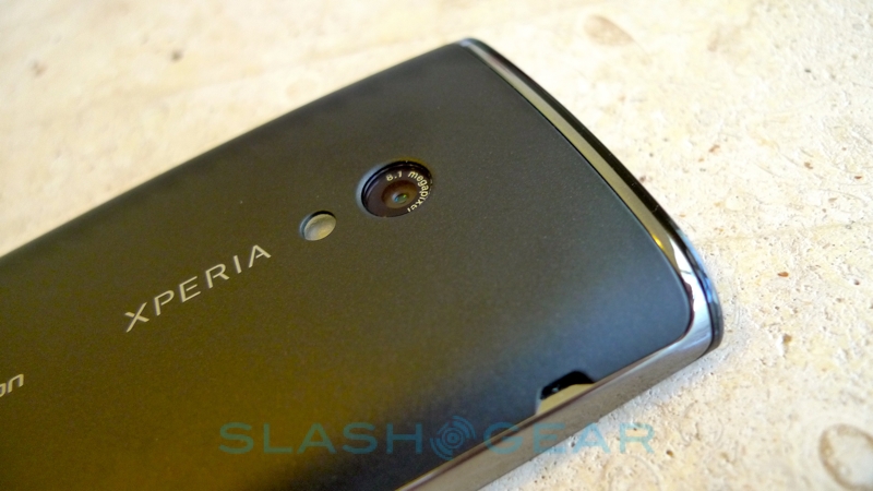
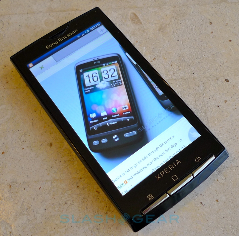
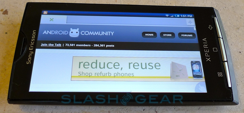
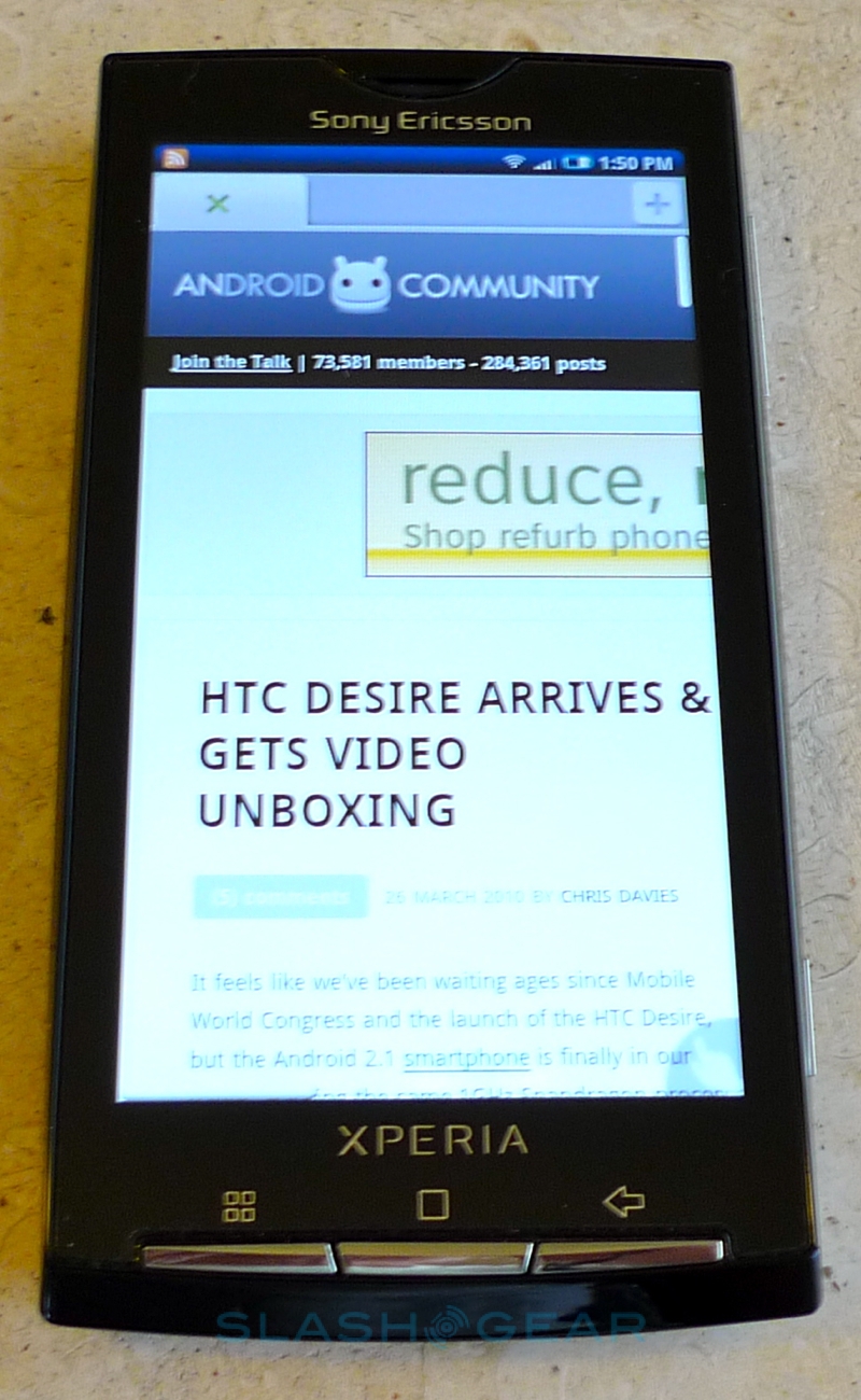
It's a testament to Sony Ericsson's ambitions that the XPERIA X10's hardware specifications still feel current despite the gap between announcement and launch. Based on the same 1GHz Qualcomm Snapdragon processor as the Nexus One and HTC Desire, the X10 has a 4-inch 854 x 480 capacitive touchscreen, quadband GSM/EDGE and UMTS/HSPA (800/850/1900 in the US, which means AT&T support but not T-Mobile USA; 1900/2100 elsewhere) connectivity, along with WiFi b/g, Bluetooth and aGPS. In some areas the X10 still stands out significantly: as well as that capacious display, the 8.1-megapixel camera certainly offers more pixels than the Android competition. Ports include a microUSB – hidden under an annoying little flap – and a 3.5mm headphones jack.
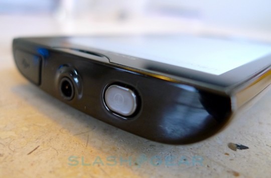
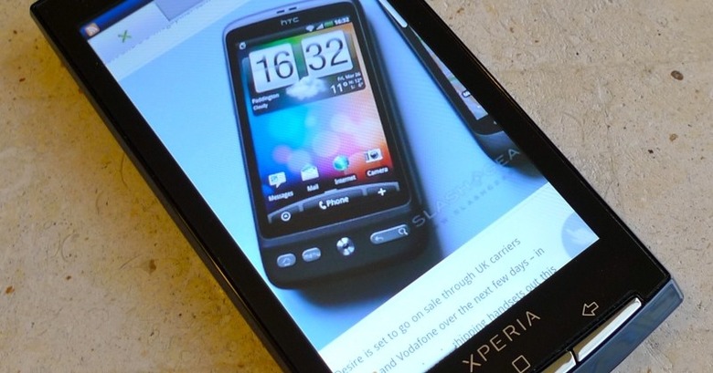
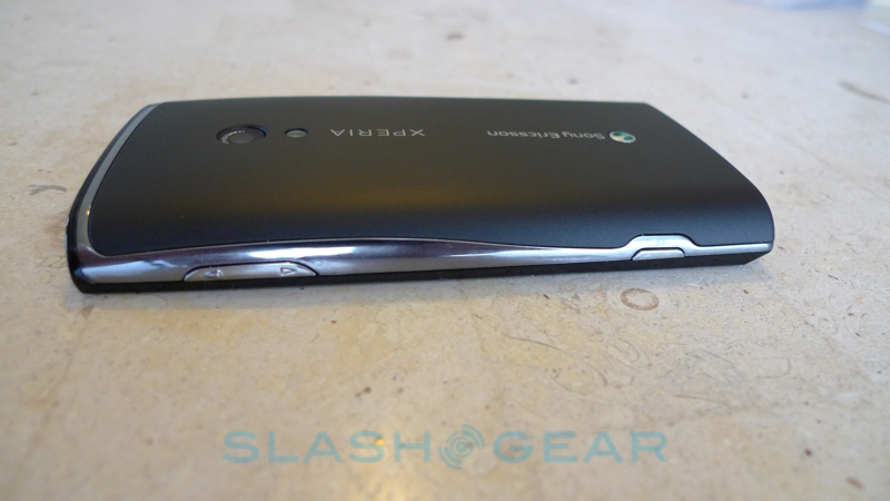
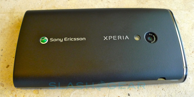
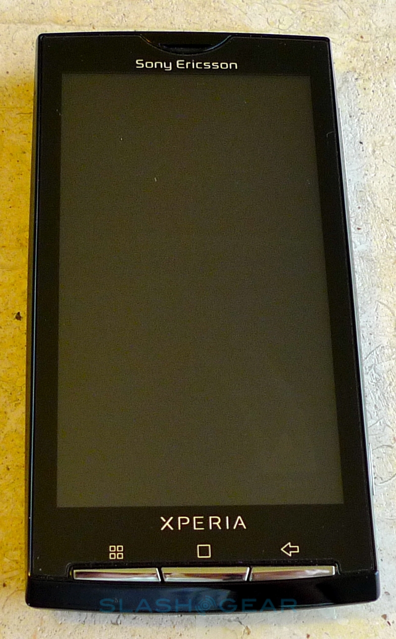
While the inside might be up to date, the exterior design of the XPERIA X10 feels a little old-hat in comparison to the high-end smartphones of today. Sony Ericsson have used a highly glossy plastic front panel and a soft-touch plastic rear, and while they're both of reasonable quality, lined up next to a Nexus One or a unibody HTC Legend the metal-clad rivals stand shoulders above when it comes to premium feel. To be fair, when Sony Ericsson announced the X10 the Teflon-coated HTC Hero was the height of Android sophistication, it's just that in the meantime the market has moved on.

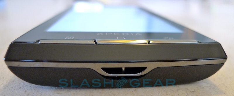
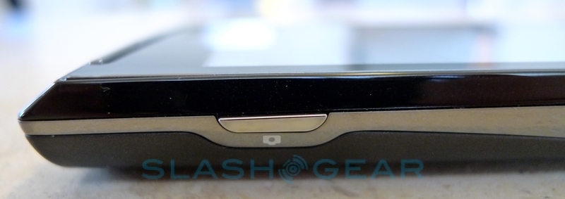
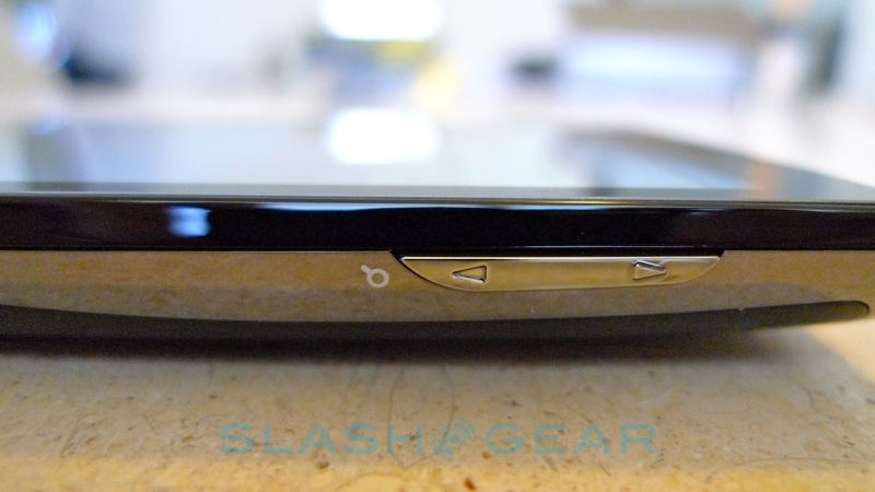
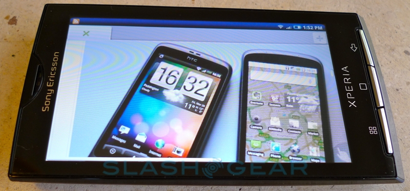
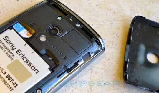
Still, despite the scale of the display the X10 manages to be reasonably compact. Screen bezels are narrow, and the whole phone measures 4.7 x 2.5 x 0.5 inches and weighs 4.8 oz (the Nexus One, in comparison, is 4.6 x 2.3 x 0.4 inches and 4.5 oz). There's a microSD card slot – supporting up to 16GB, though there's an 8GB card in the box – and 1GB of onboard storage. Curiously there's no dedicated Search key, as you'll find on other Android devices, with only Menu, Home and Back on the front panel while a camera shortcut and volume rocker/zoom control are on the side.
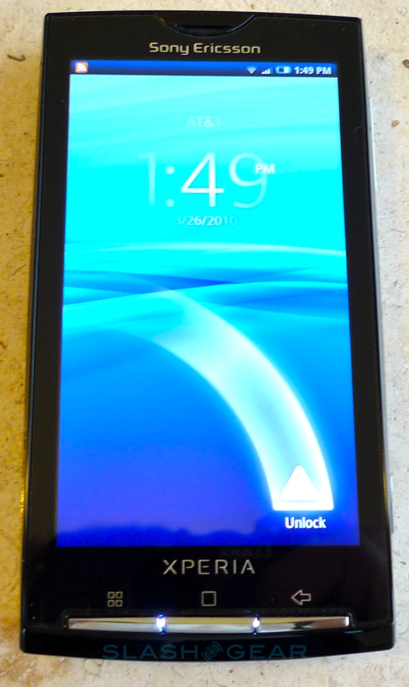
If Sony Ericsson undermined them by announcing the XPERIA X10 so far ahead of the smartphone's launch, they did themselves no favors with their first demonstrations either. The company's main differentiator beyond the regular Android crowd was their "Rachel" UI with its Timescape and Mediascape apps; choosing to demonstrate those apps on unoptimized hardware meant the first viewing many had of the X10 was of it stuttering and crashing through what should've been its moment to shine.
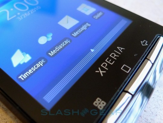
Happily, later demo models – such as those we tried at MWC 2010 last month – had been suitable optimized, and the experience is far better. We've grown to have a love/hate relationship with OEM-specific UI customizations on Android; while they generally improve the standard OS in both appearance and functionality, they can also slow down the rollout of OS updates. It's an issue we've seen affecting both HTC (with HTC Sense) and Motorola (with MOTOBLUR), and it looks to have had a similar impact on Sony Ericsson. The XPERIA X10 runs Android 1.6, a far cry from the Android 2.1 you'll find on both the Nexus One and HTC's imminent Legend and Desire, and while Sony Ericsson have repeatedly said that an update to a newer version is on the cards, they've also repeatedly declined to give any sort of timescale for its release. It's also worth noting that our review unit is running pre-release software, and will see at least one more update (though not in terms of the underlying OS, of course) before the phone goes on sale.
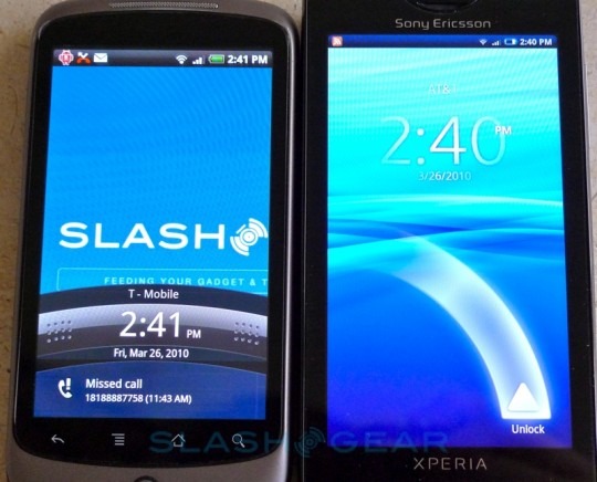
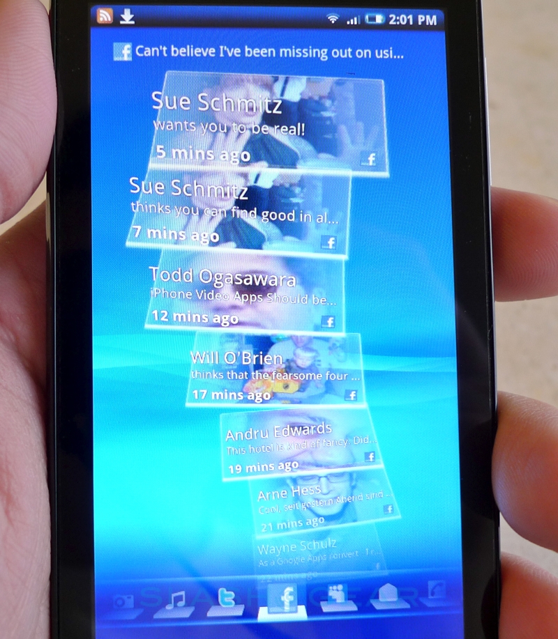
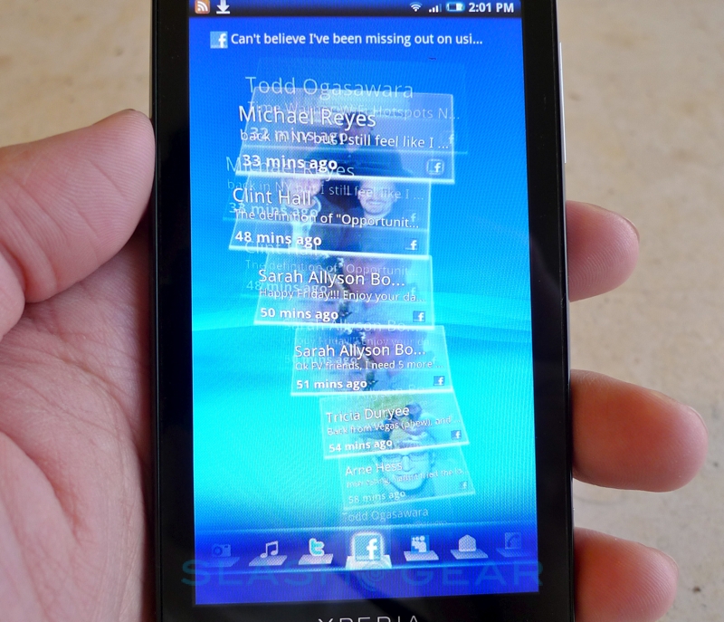
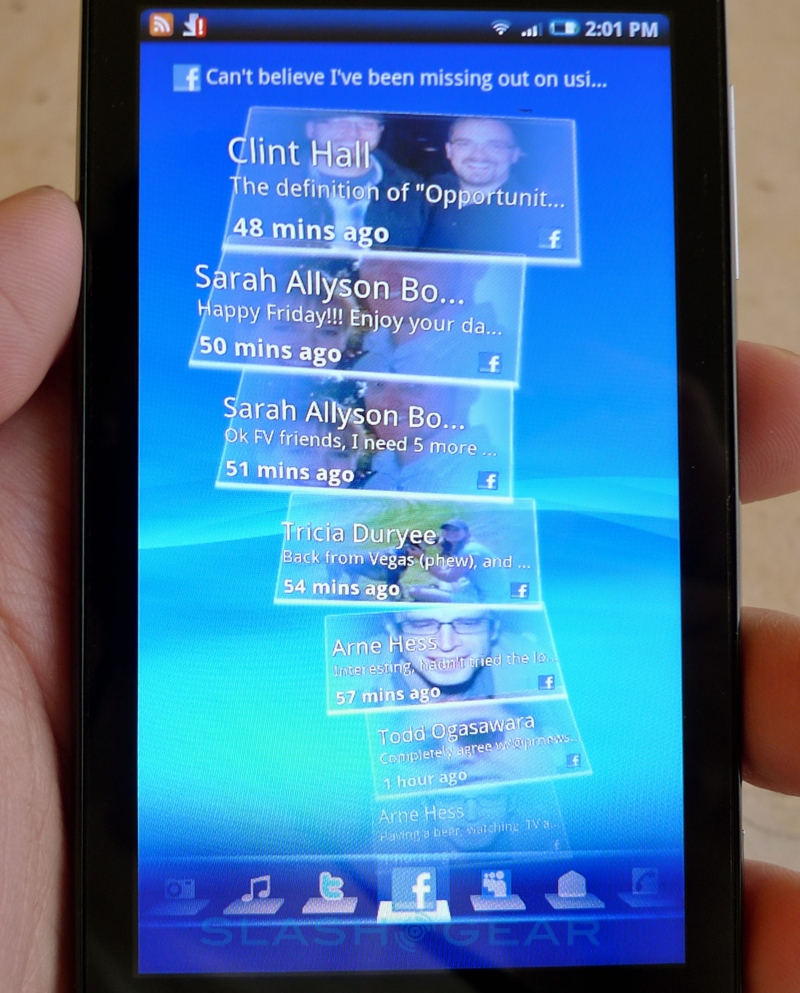
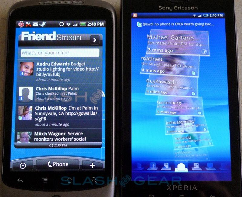
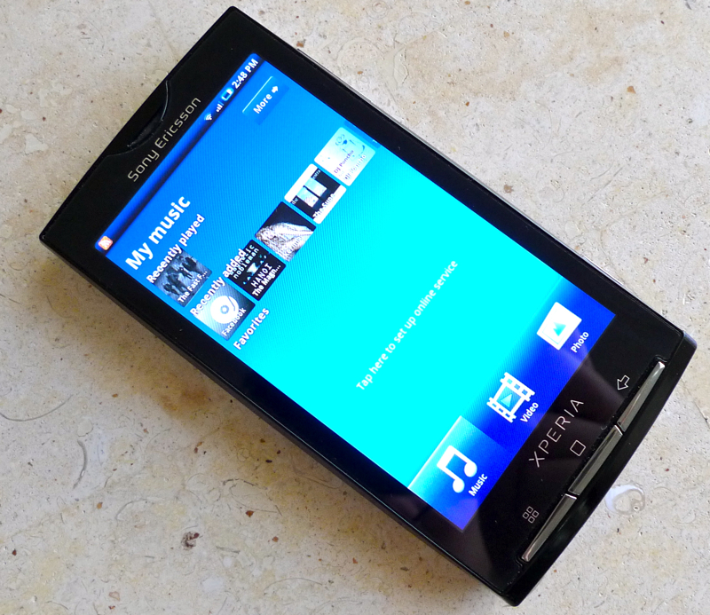
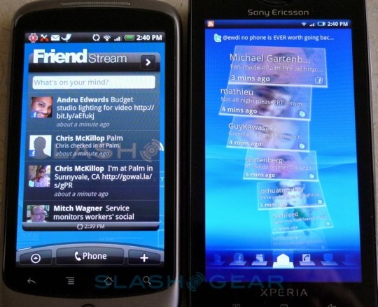
So, given you'll potentially be living with the stock X10 experience, how does it hold up? Aesthetically there's plenty to like, with various fluid transitions between menus, but the core offerings are Timescape and Mediascape. Timescape, like HTC "Friend Stream" and Motorola "Happenings", attempts to pull in all of your social life into one, chronologically ordered timeline; however where its rivals draw the line at online networks, Sony Ericsson have also included SMS, MMS and email messages, phone calls and other interactions. These are all presented in a cascade of cards which can be flicked up and down; tapping a card – say, a phone call from a friend – pulls up the full details (time of call, length, etc.) as well as the ability to view to that contact's full information including the full history of your contact with them.
Mediascape, meanwhile, tries to do a similar aggregation with audio, video and image content. Each category is split over a different page, and each page is divided between local content and online content. Sony Ericsson have used an infinity icon throughout the UI – it's the same symbol you tap in Timescape to pull up a contact's address book record – and hitting it in Mediascape pulls up related content. So, listening to an MP3 track and then hitting the infinity icon brings up the album from which the song came (assuming you have that locally stored); however Sony Ericsson have also added automatic online searching, so as well as other local music you'll also see links to YouTube videos of that band performing, say, or online streams of similar music. In Europe, where Sony Ericsson's PlayNow music store is operational, you'll also be able to buy new tracks directly from the phone.
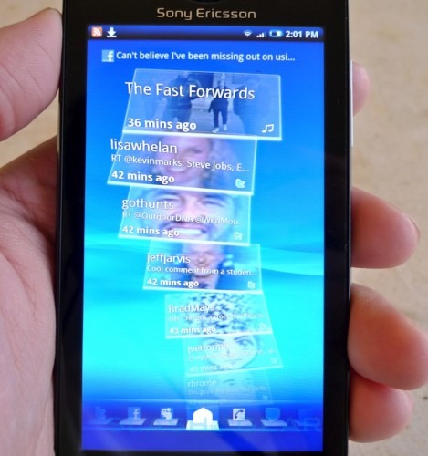
Of the two, while Timescape is perhaps more visually arresting, it's Mediascape that works better in day-to-day use. Like MOTOBLUR, we can't help feeling that Timescape was designed with only moderate social networkers in mind. Subscribe to more than a few people in Twitter or friend more than a handful on Facebook, and your update stream quickly becomes saturated; there's also no way to prioritize, say, seeing updates from certain key contacts. If Timescape learnt from our continued use, eventually bubbling up particular alerts from those individuals it knew we were consistently interested in, there'd be more incentive to stick with it, but there are standalone Twitter apps (and apps for other social networks) which do a better job of handling the update fire hose. It can also be a little laggy at times, though that's generally when pulling in updates; we're guessing that's a side effect of the connection, rather than the Snapdragon chipset, since when everything has been cached the timeline whips up and down smoothly.
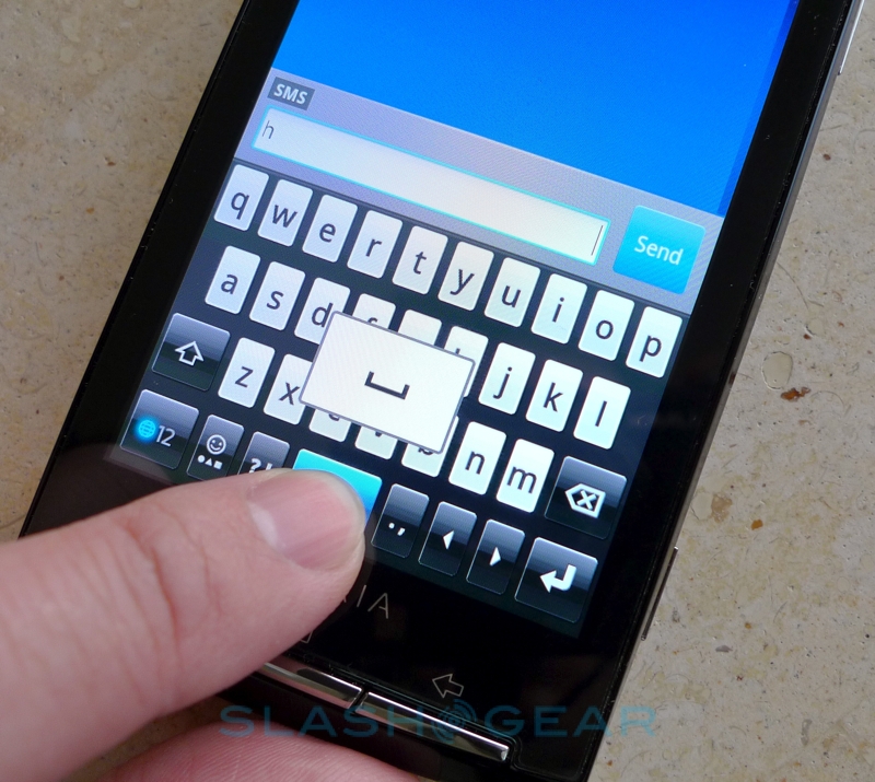
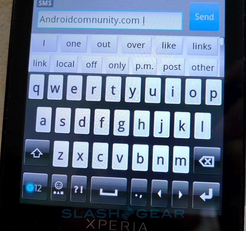
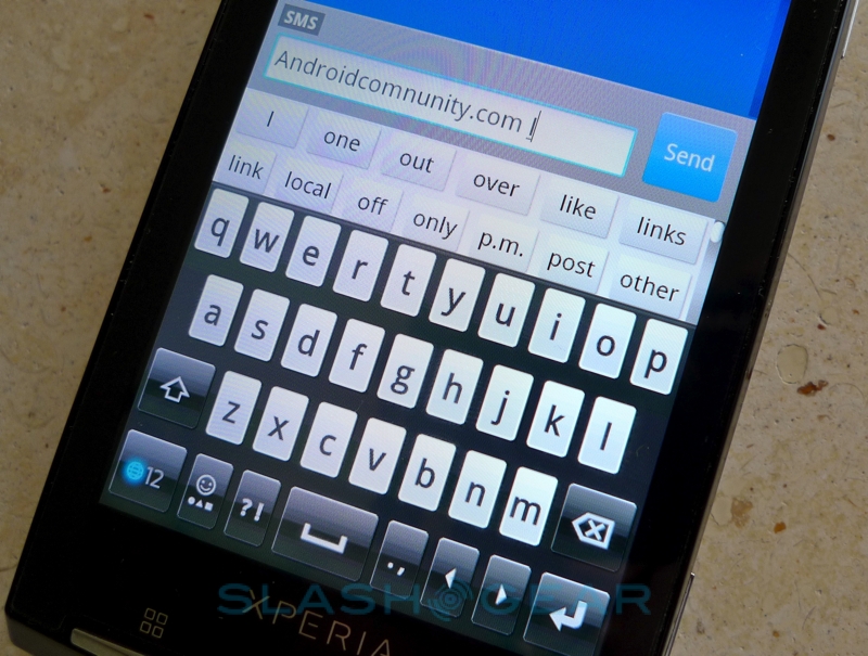
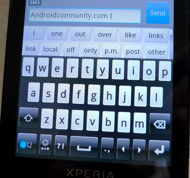
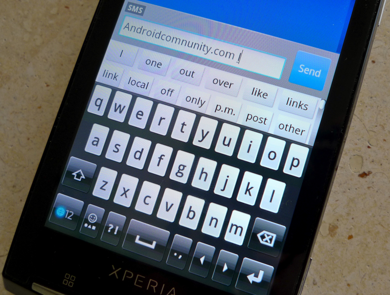
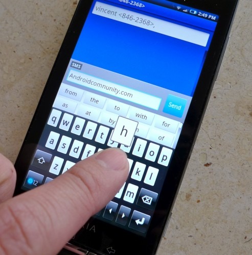
Unfortunately that isn't the most frustrating issue we've encountered; while we can cope with data stutters, missed screen taps – especially when using the on-screen keyboard – are far more annoying. Sony Ericsson's slightly modified QWERTY 'board lacks the layout finesse and intelligent auto-correction/prediction of HTC's version, too, and we quickly replaced it with one of the various alternatives available through the Android Market. Even so, we still experienced a few missed taps. We're hoping that it's a flaw in the pre-release software, and something that will be addressed prior to handsets reaching actual buyers.
While it may seem that in many ways the XPERIA X10 is playing catch-up with rivals, when it comes to photography it still holds the megapixel crown. It's not just the 8.1-megapixels that mark it out: the X10's camera has digital image stabilization, a 16x digital zoom, autofocus and GPS geotagging, together with less commonly found cameraphone functionality such as smile detection and face recognition. The latter features you'd usually have to reach for a dedicated point-and-shoot or above to acquire, with smile detection automatically triggering the shutter when the subject cracks a grin. As for face recognition, that's been cleverly integrated with the X10's contacts app: link a face with a contact and the smartphone will automatically pull out any photos it spots that person in, listing them on another tab in their contacts record. It'll only track up to five people per shot, and we found it took a few manual connections before the system started getting accurate in its identification, but considering face recognition is more commonly found on desktop photo management apps it's a neat addition.
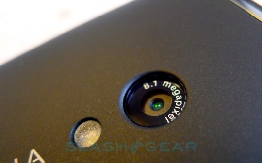
As for image quality itself, that's a pleasant improvement on what we're generally used to from Android devices. Shots have a decent amount of detail and contrast, with rich colors and surprising low-light ability; while there's an LED next to the camera lens it's not actually pretending to be a flash, instead working as a photo light (in both still and video capture modes). That actually makes it a little easier to take low-light photos, since you can better gauge the lighting sweet spot that we've found regular LED flashes so often demonstrate. Framing shots on the reworked camera UI is straightforward, thanks to the huge display, and the end results look pretty decent too.
Voice quality is decent, and while the XPERIA X10 lacks the active noise cancellation of the Nexus One, there's little background hiss during calls. We did find ourselves wishing for a little extra volume from the earpiece, however, though the speakerphone – the grill for which is on the side rather than the back of the phone – is suitably loud. Sony Ericsson rates the X10's battery as good for up to 8hrs 3G-talktime or 425hrs standby (alternatively 10hrs GSM talktime or 415hrs standby), though regular network hammering by Timescape obviously takes its toll. As with most other recent smartphones you're looking at a daily recharge, though just as you can slow down email updates it's possible to reduce the frequency at which Timescape refreshes.
There was a sense, back in November 2009, that had Sony Ericsson released the XPERIA X10 shortly after its announcement then it could have captured the Android market, for a time at least. In the intervening months, however, rivals have sliced away at the X10's potential lead; there are devices with screens almost as large (the Samsung Galaxy S, arriving sometime this year, has a 4-inch AMOLED, and of course the HTC EVO 4G has a 4.3-inch display and will drop over the summer) and social networking aggregation that, while graphically different, is functionally pretty much the same. It's also moved Android 1.6 further away from the most current OS release. Nonetheless, the XPERIA X10 remains a strong competitor.
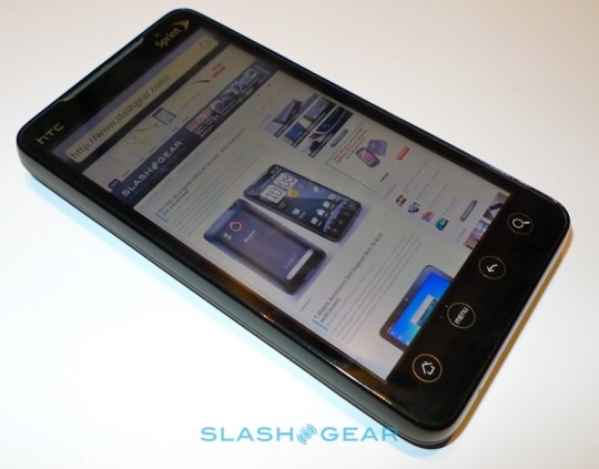
Camera performance bests anything we've seen on other Android smartphones, and with 4-inch displays teetering on the limits of what many users want to carry, you could argue a bigger panel would be overkill. Meanwhile the 1GHz processor is swift and there's no shortage of connectivity. We'll believe Sony Ericsson's promises to update Android when we see the update itself, but a more modest update to address data lags in Timescape and – more urgently, perhaps – patchy touchscreen response (which could well come in the final production build) seems a more realistic expectation. We're used to seeing new hardware arrive with teething pains, and it's up to Sony Ericsson to prove just how responsive they can be in tackling them.
[vms d99071c93af3917215ef]
It's taken a while to arrive, but at least the XPERIA X10 is here; that's more than you can say about some other Sony Ericsson smartphones. US and European availability is predicted over the next few weeks. It may not be the conclusive alternative to the Google Nexus One, but the XPERIA X10 is a strong addition to the growing Android line-up. If Sony Ericsson can demonstrate their commitment to ongoing support then the X10 slots into the top-tier of smartphones; that's not bad for the company's first attempt at Android.
