Xperia 1 III Renders Mix The Old With The New In A Good Way
It wasn't too long ago when Sony tried to not only reinvent its mobile business but also its mobile phone designs. That hasn't exactly taken off as much as the company probably hoped and some actually missed the more blocky but distinctive look of the older Xperia phones. Now it seems that Sony will be taking a few steps back with the Xperia 1 III which looks a bit like a throwback to the past with a few nods to the present as well.
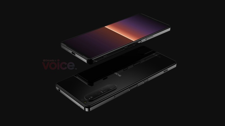
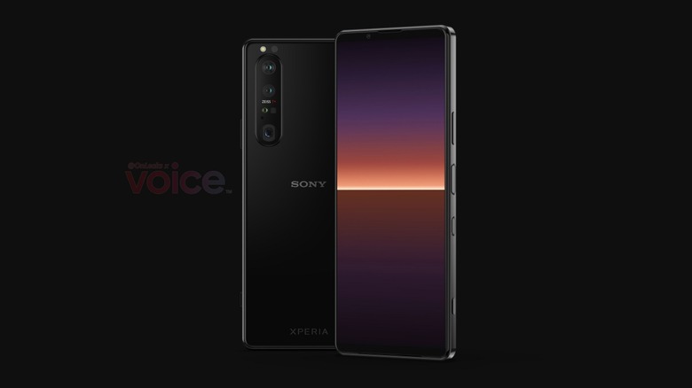
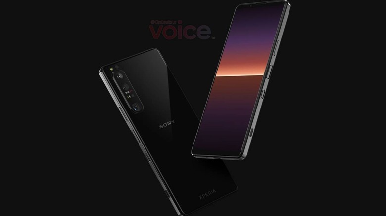
Phone manufacturers often explain the curved side edges of phones as more ergonomic and more comfortable in the hand, especially since the hard corners don't bite into the palm. Some users, however, find that it sometimes makes the phone too slippery to hold, especially with smooth glass backs that are en vogue these days. Based on renders shared by Steve Hemmerstoffer, the Xperia 1 III keeps the blockier design that the Xperia 1 II returned last year, but that's not the only "old" thing that Sony kept.

Still present, perhaps to some audiophiles' delight, is the 3.5mm headphone jack. This isn't exactly surprising considering Sony still heavily markets its wired audio accessories, like headphones and earbuds. There is also no sign of modern notches or punch-hole cutouts though, thankfully, the bezels have also slimmed down in this third-gen flagship.
That said, the Xperia 1 III won't be all old-school and will have new features to boast. The highlight will most likely be the periscope-style telephoto lens hinted at by the renders, a first for Sony. There will also be a new button that will most likely be tied to launching Google Assistant and, unfortunately, nothing else.

To some extent, the Xperia 1 III seems to bear a lot in common with its immediate predecessor but, hopefully, the upgrades that we don't see will be significant. Although Sony has indeed stepped up its mobile photography game, at least based on DxOMark's recent review, it still has a long way to go before it can even catch up to its old rivals.
