Windows Phone 7 Technical Preview
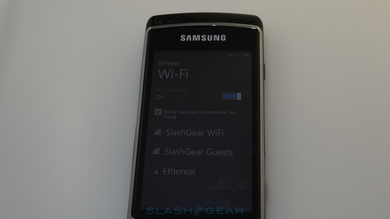
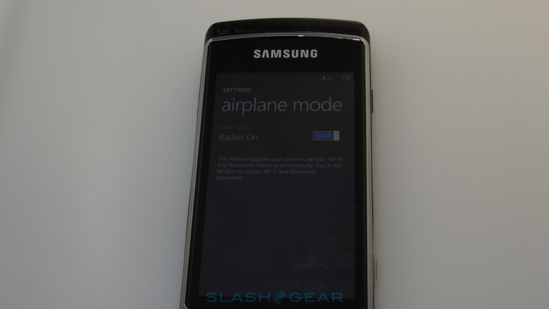
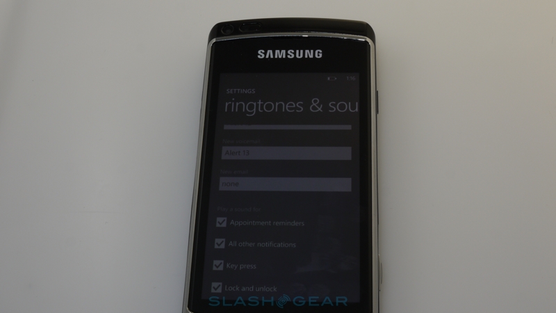
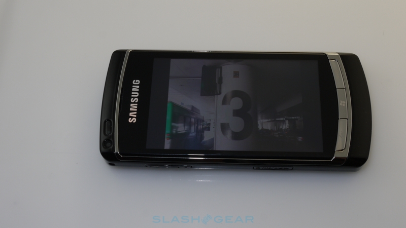
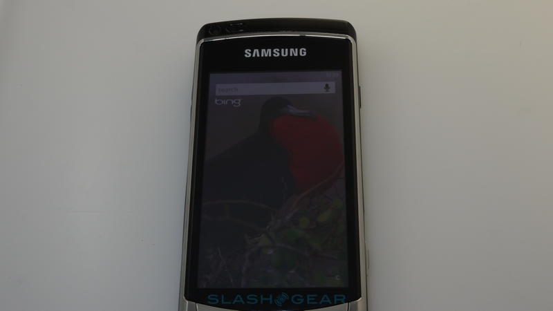
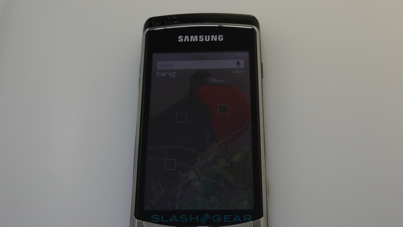
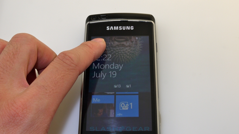
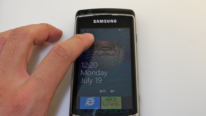
Tensions must be high at Microsoft. The recent embarrassment of the short-lived KIN project has left all eyes on Windows Phone 7, not only to justify its own existence but also to legitimize the company's place in the mobile ecosystem. With iOS4 freshly released, Android developing at a rapid rate, and webOS now under the auspices of HP, those in the market for a smartphone are spoiled for choice; never before has it been so competitive. A few months out from release, SlashGear has been given a Windows Phone 7 device – the latest OS build running on Samsung hardware – for a technical review. Check out our findings after the cut.
First, some background. Officially announced back at Mobile World Congress in February 2010, and fleshed out in no small part at MIX 2010 the following month, Windows Phone 7 is the successor to Microsoft's long-lived Windows Mobile OS, and practically a fresh start for the company's smartphone ambitions. Built on the Windows CE 6.0 R3 kernel, but borrowing the same aesthetic as Microsoft's Zune HD PMP, Windows Phone 7 signals a transition from the more enterprise-centric ethos of Windows Mobile and a recognition that the consumer market has a taste for always-connected, socially networked portable devices.
That's a market Windows Mobile always felt ill-equipped to deal with, at least in its factory-pure state. Facelifted and retrofitted in its latter 6.5 and 6.5.3 stages – themselves stopgaps as Windows Phone 7 missed its original planned 2009 launch window – the OS nonetheless only really found favor among consumers in heavily customized states, usually at the hand of device manufacturers themselves. HTC's Sense UI, itself the culmination of several years of the Taiwanese firm's TouchFLO interface augmentations, kept Windows Mobile usable – and distinct – and as it stands the platform has a roughly 15-percent smartphone market share. Still, dimming consumer interest means the updated platform is much needed.
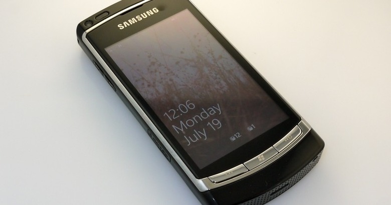
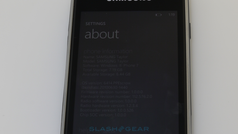
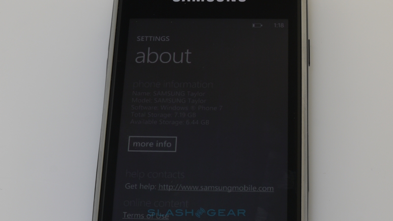
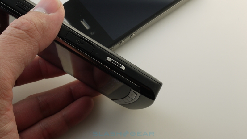
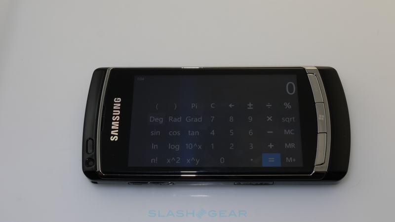
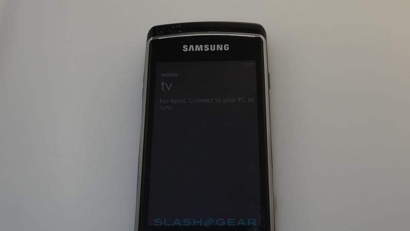
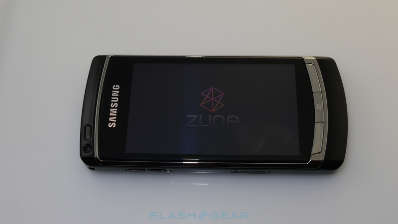
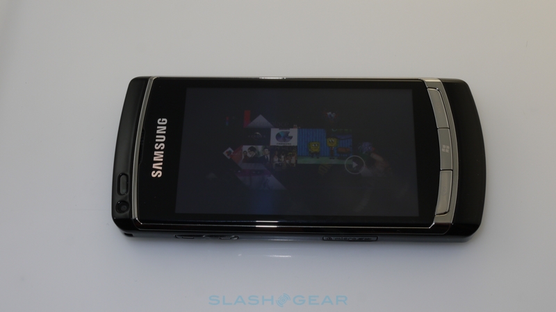
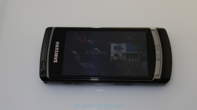
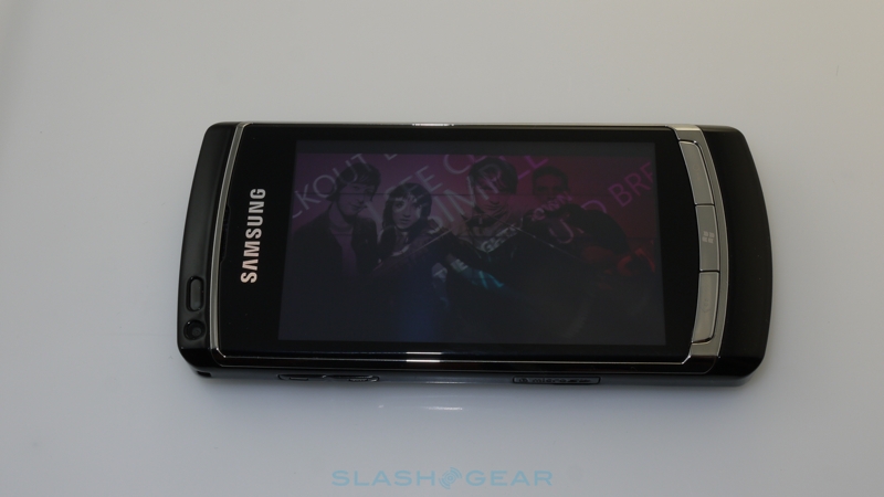
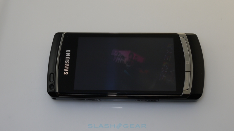
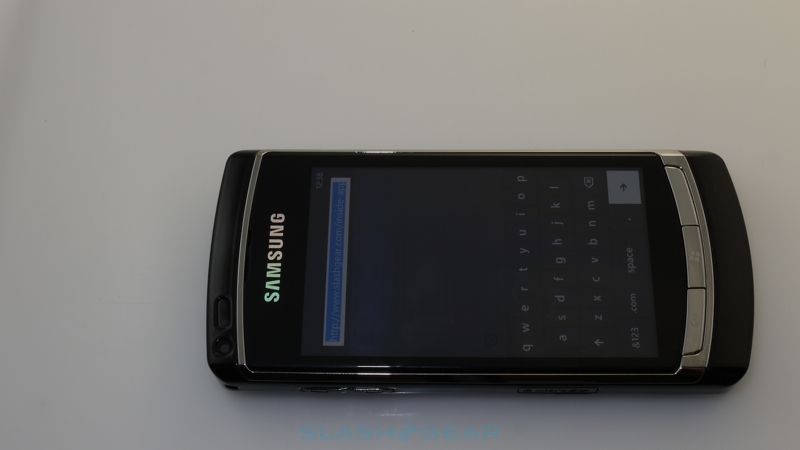
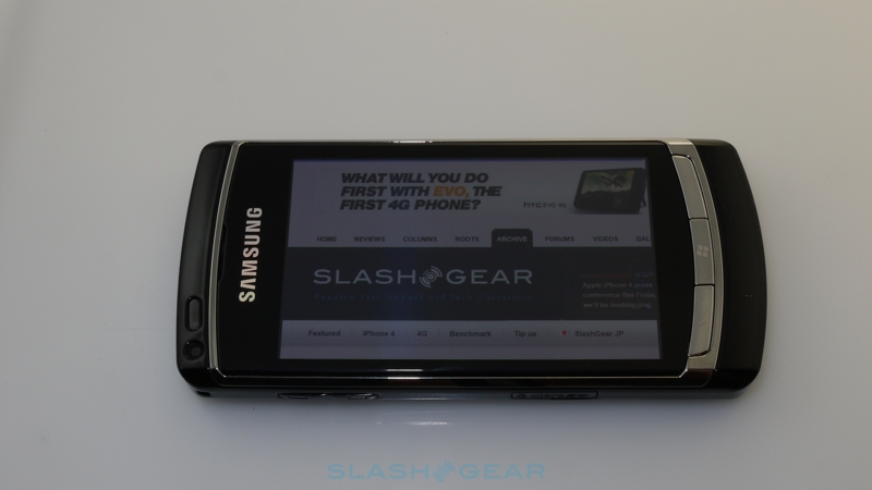
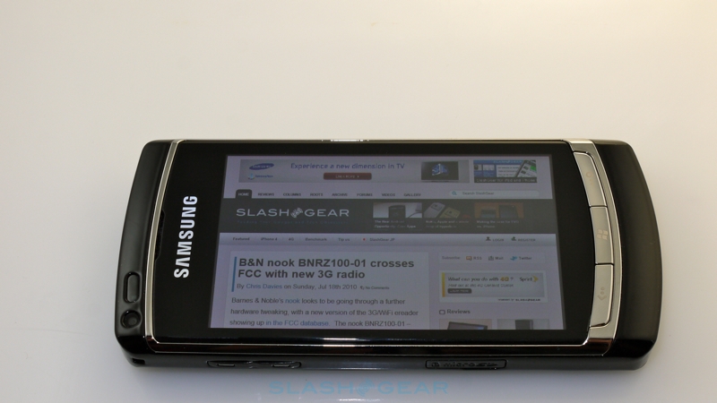
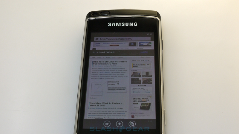
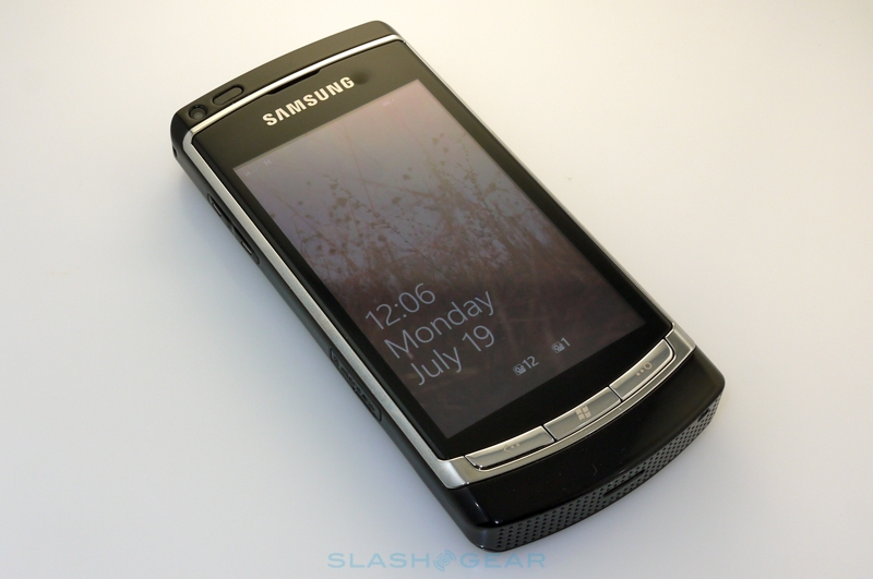
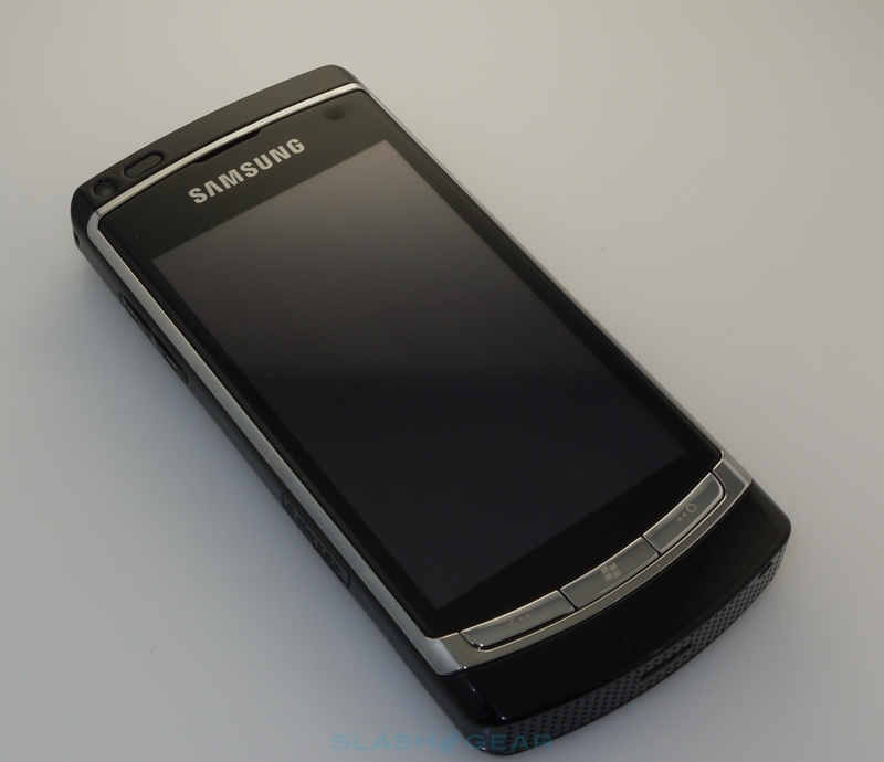
Our review is primarily of the Windows Phone 7 OS itself, not the hardware it runs on here. The Samsung handset is familiar from its MIX debut several months ago, a prototype designed to demonstrate the OS and for developers to use; it won't be among Samsung's line-up of launch devices. Actual Windows Phone 7 handsets will have to comply with Microsoft's minimum specification, including a capacitive touchscreen supporting 4-point multitouch, at least a 1GHz ARMv7 processor paired with a DirectX9 capable GPU, 256MB of RAM and at least 8GB of onboard flash storage, and a 5-megapixel or higher camera with flash. There are also various mandatory sensors and controls, including an FM radio, accelerometer, digital compass, light and proximity sensors, A-GPS and five hardware buttons: power, Start, search, camera and back.
Windows Phone 7 unboxing video:
[vms 6ab36c2904d3ba857305]
That's pretty much par for the smartphone course, and was so even back in February. By October, when the first Windows Phone 7 devices are expected to arrive, we're hoping manufacturers up their game from that minimum so as to at least stand a little distinctive from the rest of the handset market.

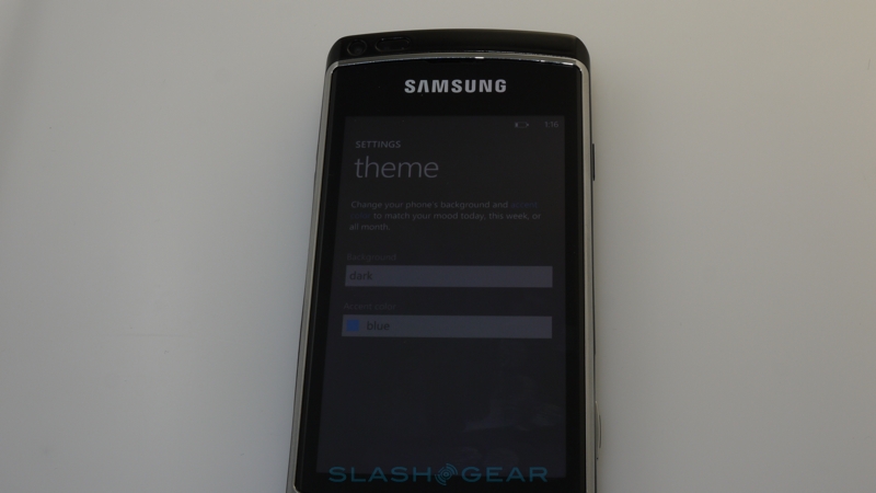
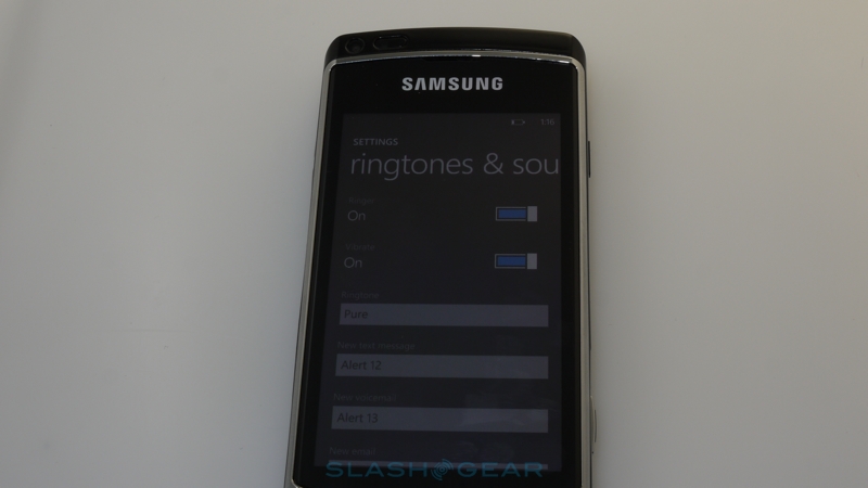
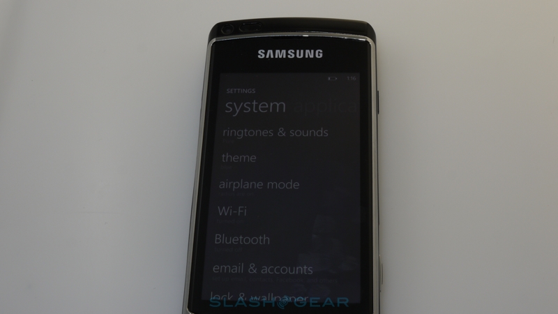
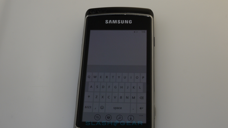
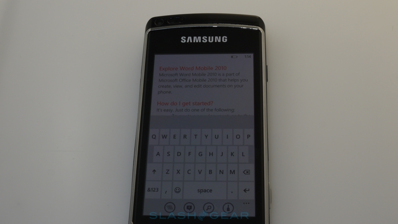
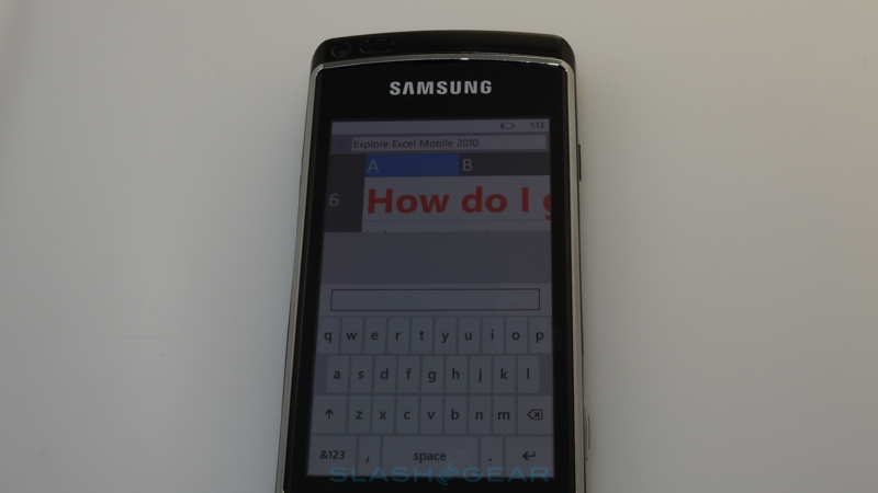
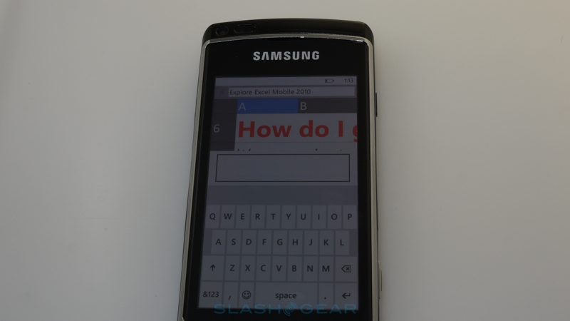
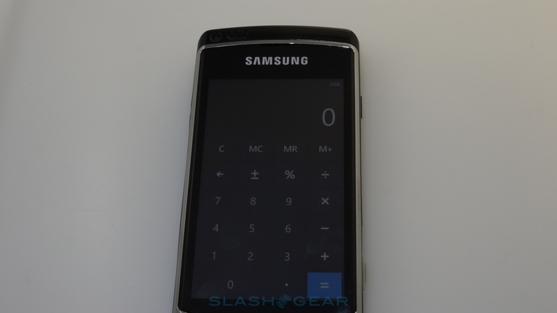
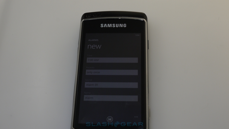
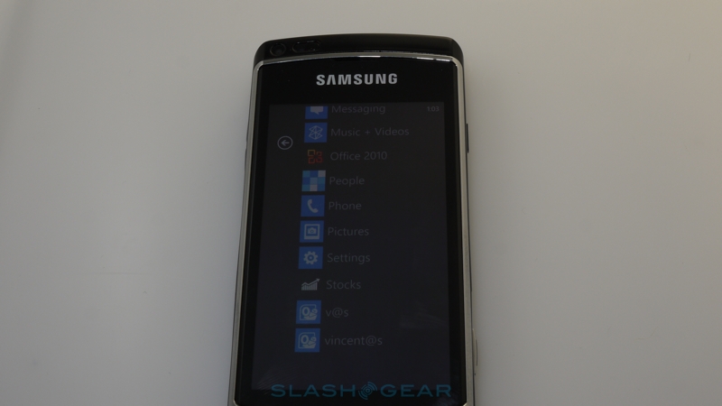
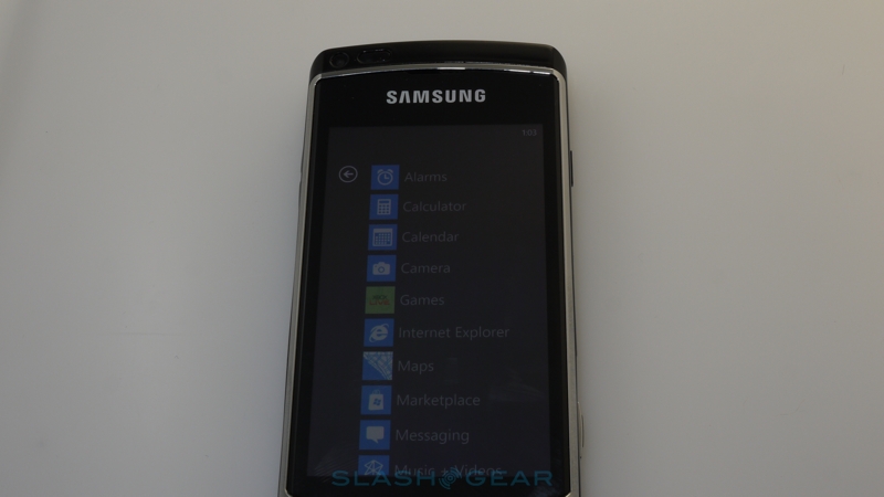
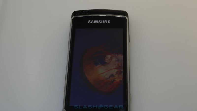
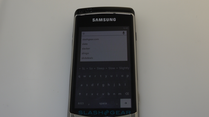
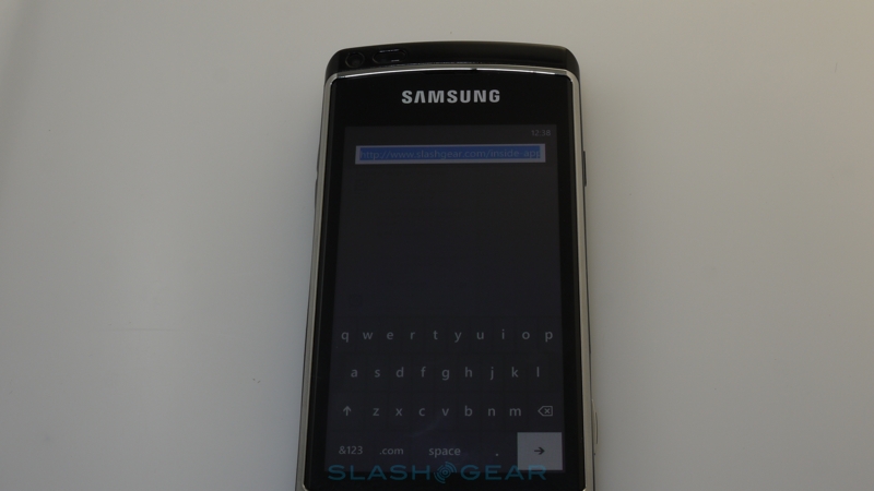
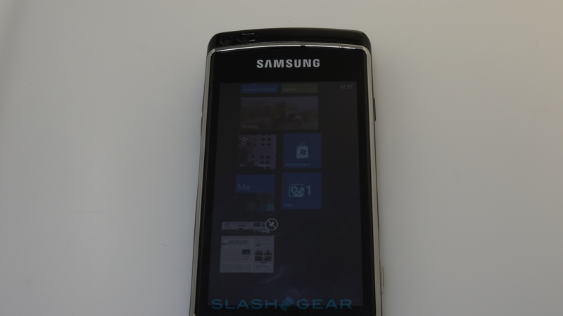
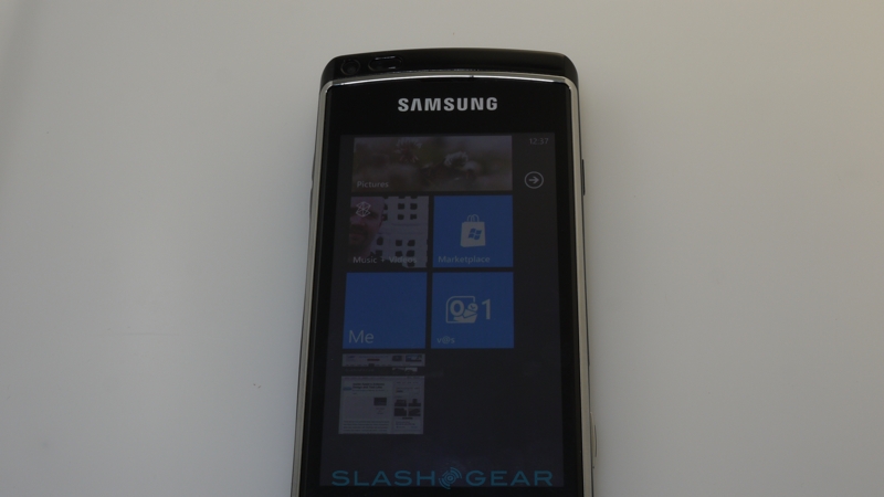
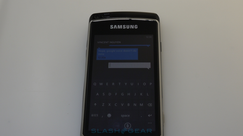
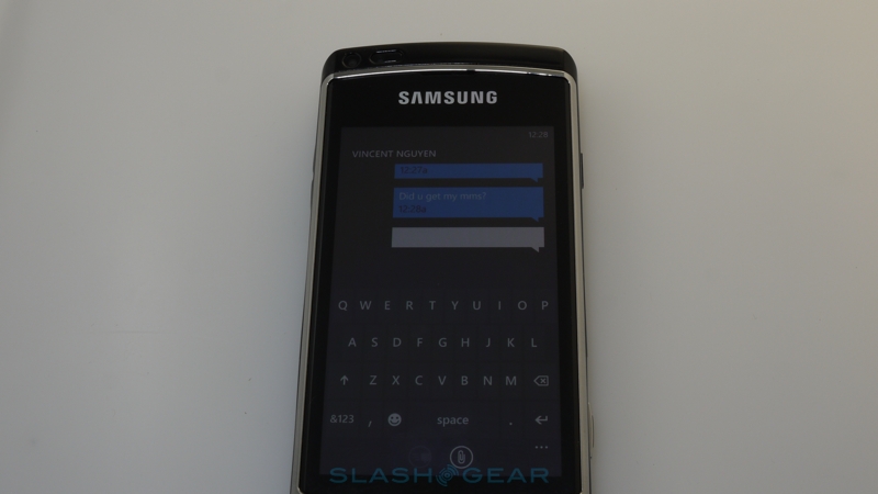
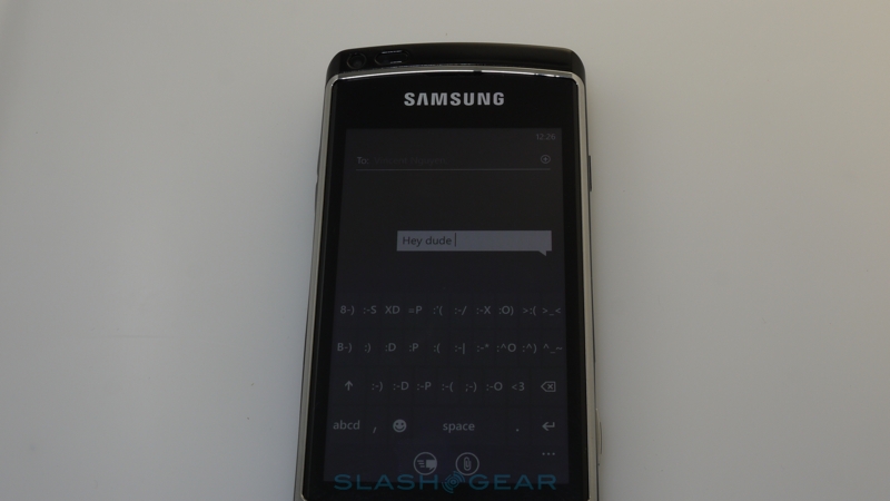
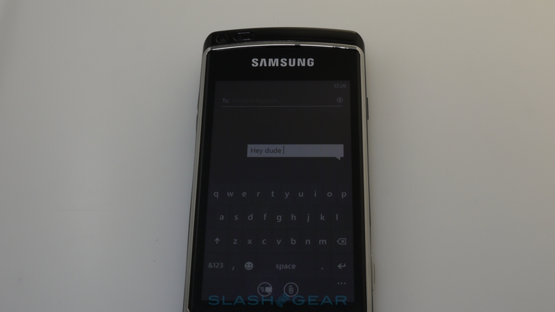
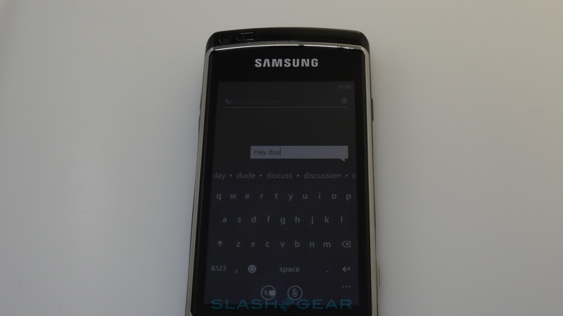
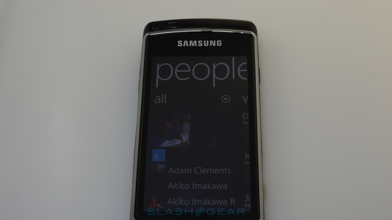
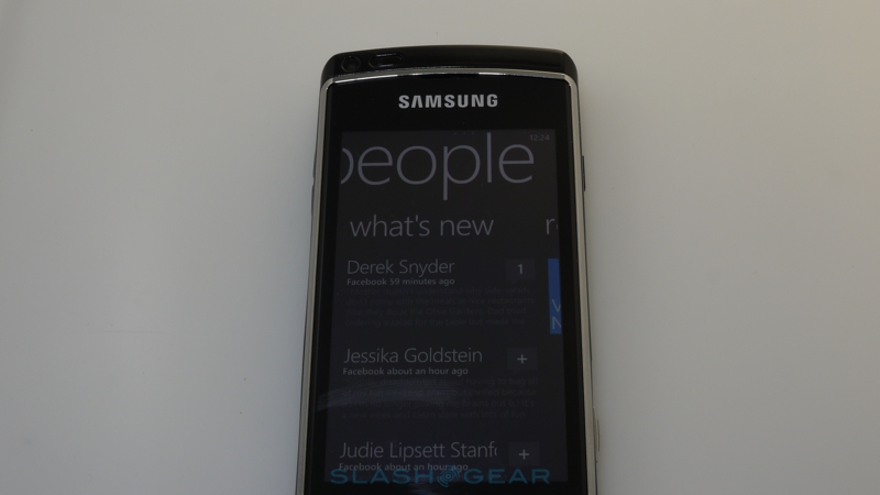
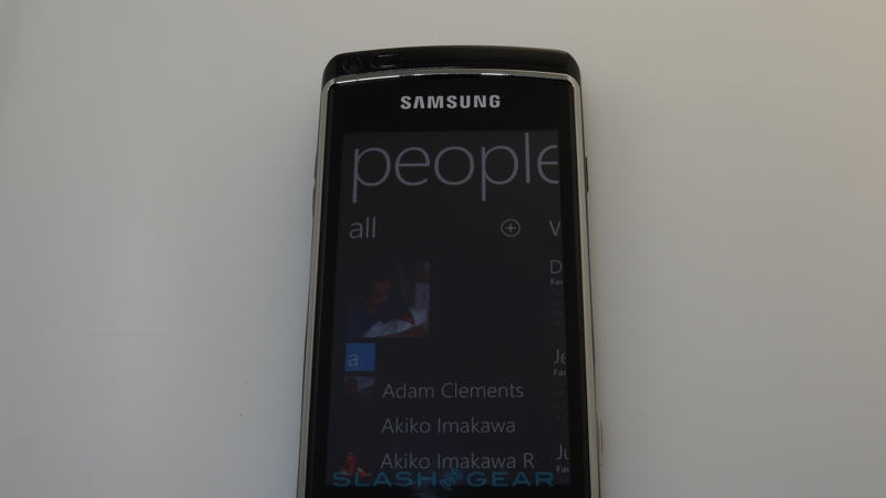
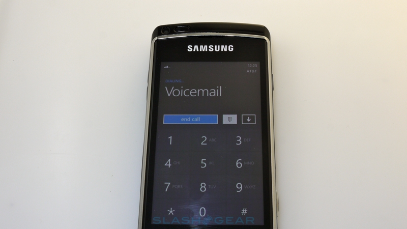
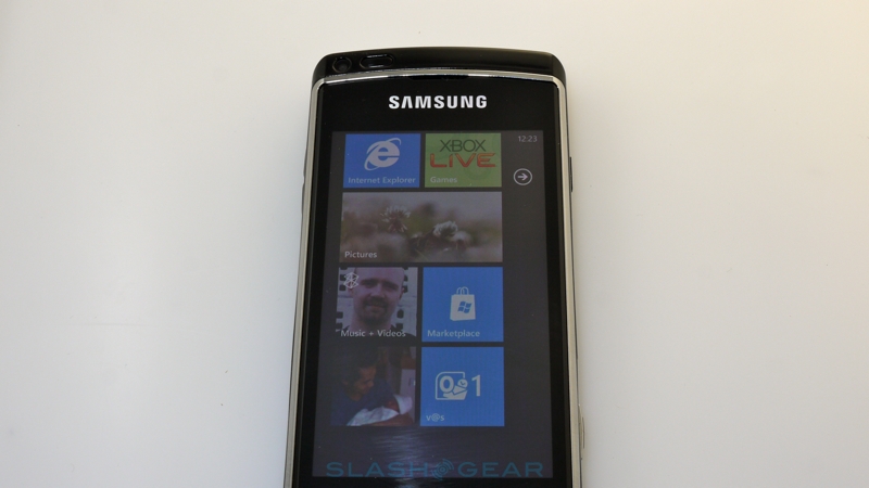
What's certainly distinctive is Windows Phone 7's software aesthetic. Gone is the fussy, icon-loaded UI of its predecessor and in comes Metro, Microsoft's new chromeless interface that stands pretty much apart from anything else in the cellphone market right now. If you've used a Zune HD then you'll find it familiar; there are no fussy menus, highlight boxes or paneling, with bold typography and large buttons – or tiles in Microsoft parlance – adding up to a seriously finger-friendly and unusual environment. The onscreen keyboard is stark and usable, with quick auto-prediction that meant one-handed typing was relatively error-free, while holding the hardware Start button triggers voice-searching that proved surprisingly accurate.
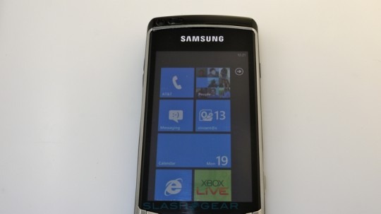
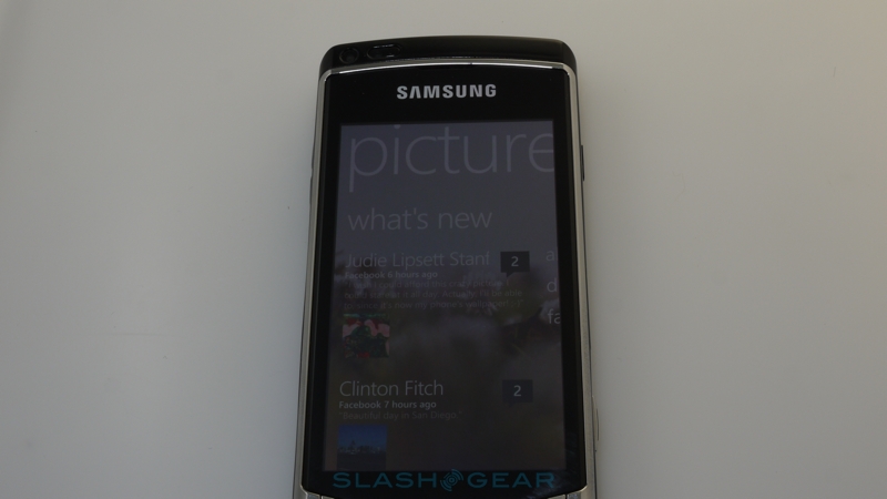
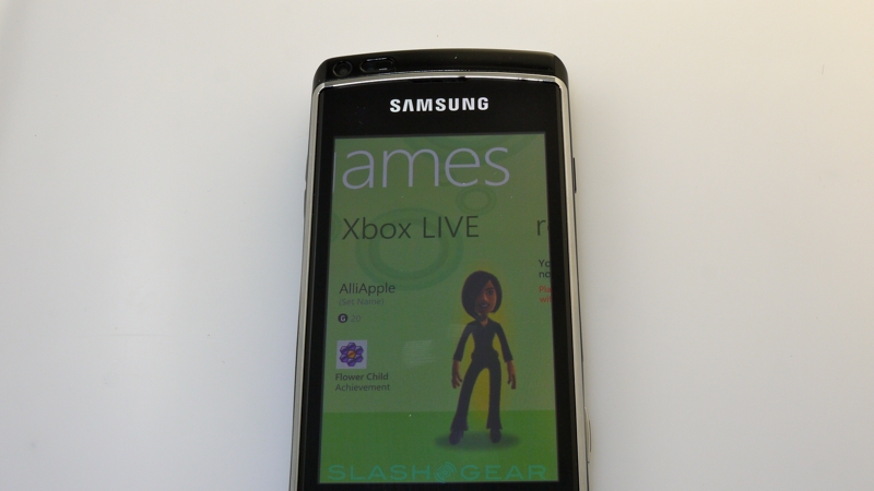
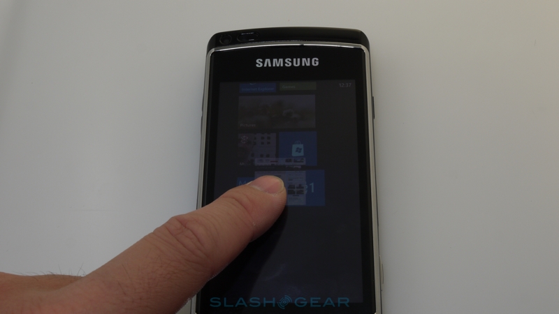
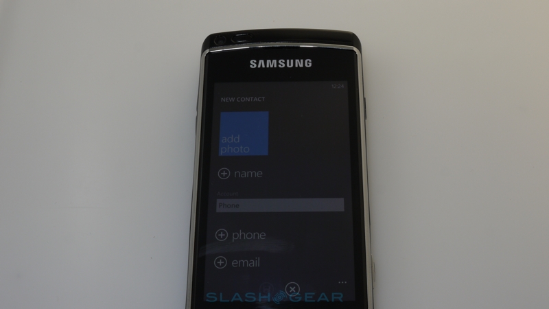
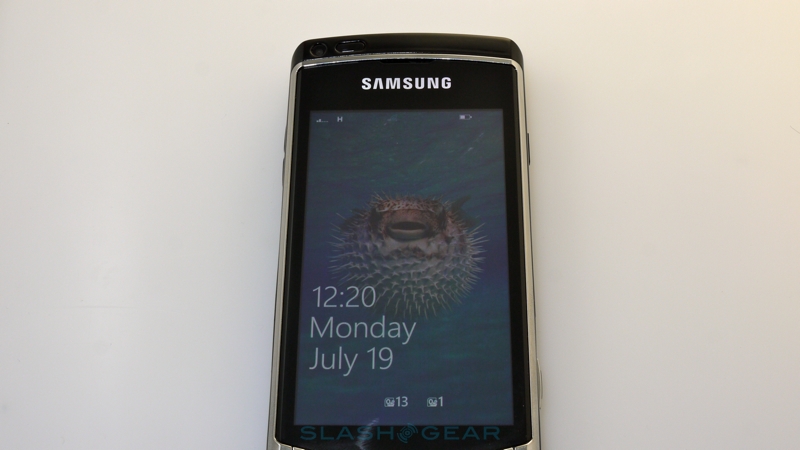
The bluntness of the resolutely 2D tiles is softened by Microsoft's attempt to squeeze information into them, so that the homescreen gives you an overview of status without necessarily needing to dip into individual apps. Each tile is a cross between a widget and an icon: they can show basic information, like number of messages or missed calls, but they can also dynamically update with new content, such as the latest images from your Facebook friends or animations from your Xbox Live avatar. From the unlock screen – which, like in WinMo, shows missed call, message and calendar information, only sticking to the new design language – you get the stark Start menu that can be user-reorganized. There's a decent amount of flexibility here, too; tiles can link to an app, but also to websites or people, galleries of content (with updating images showing the newest additions), media playlists or Microsoft's Hubs.
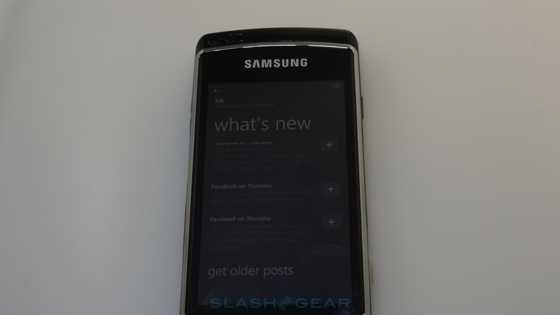
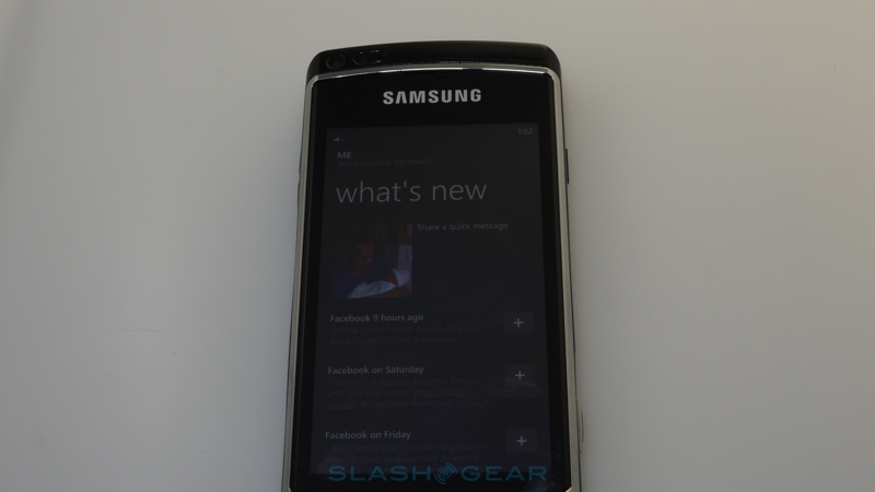
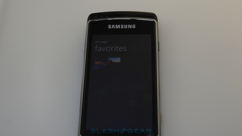
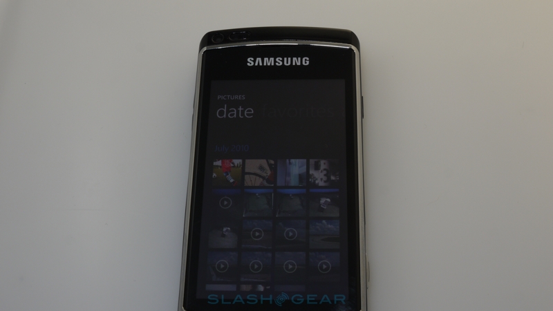
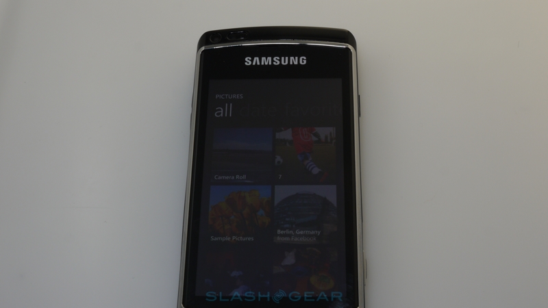
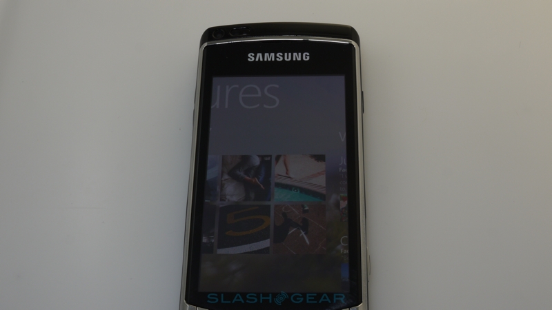
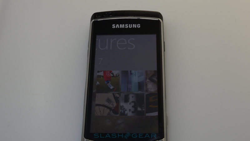
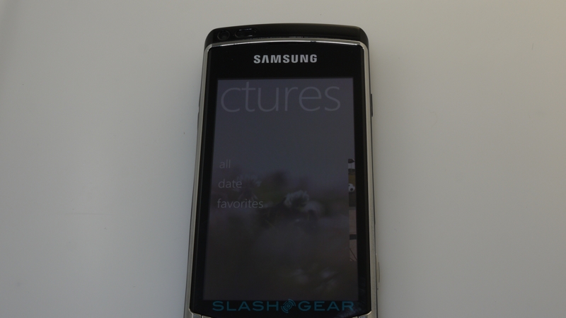
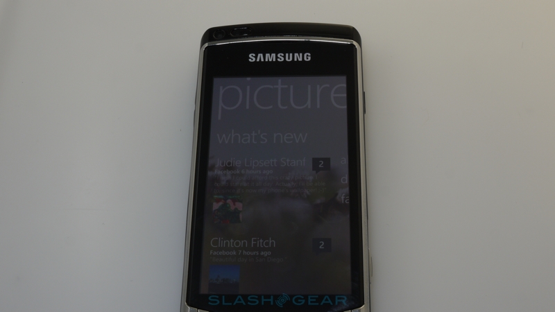
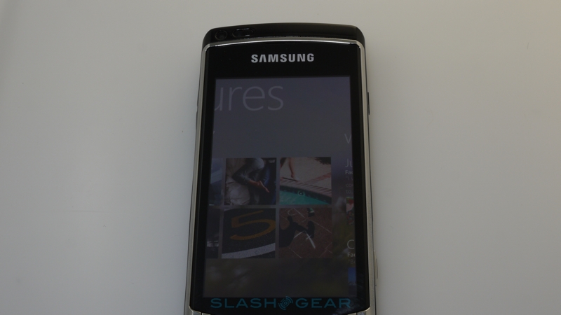
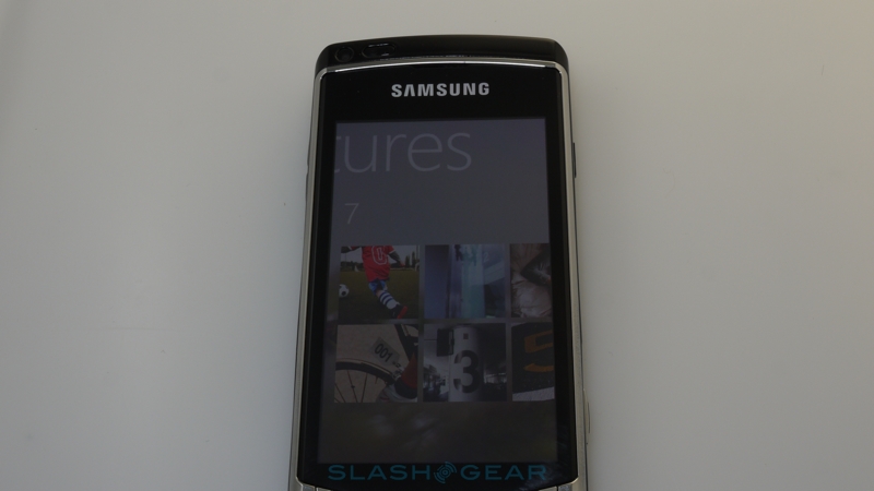
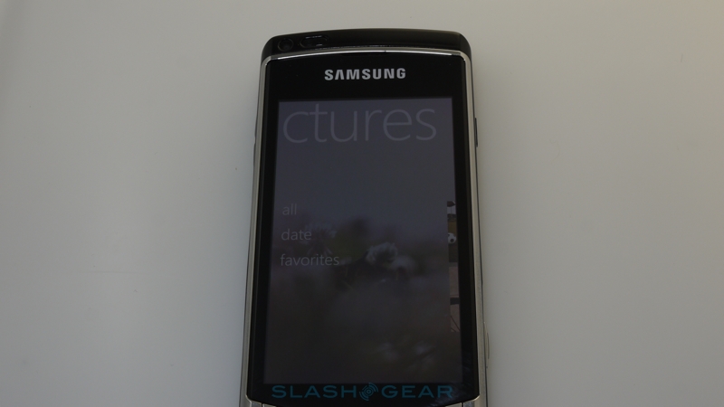
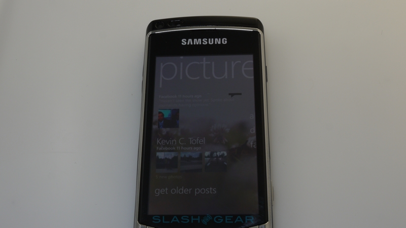
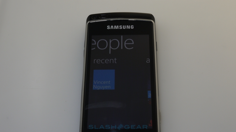
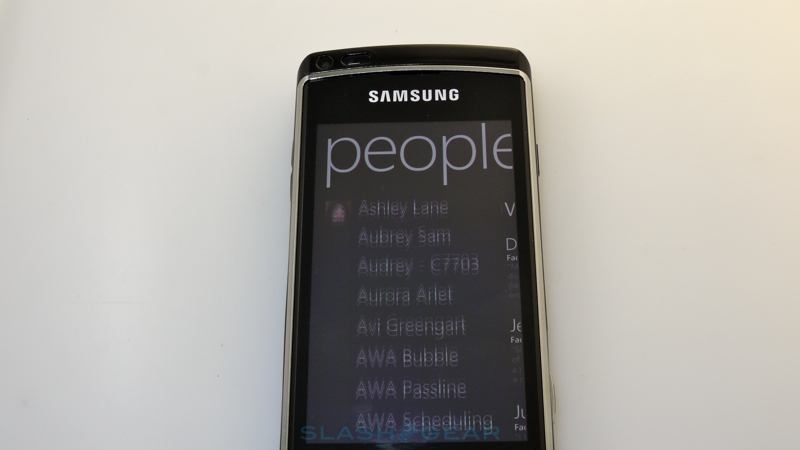
Hubs are Microsoft's attempt to cut down on app-hopping; that is, the common smartphone habit of leaping from app to app so as to get things done. Rather than deal with various silos of information – one app for your local photo gallery, one app for your video gallery, another for images stored online such as at Facebook or Flickr – it pulls them together into themed panes. Each of those panes is "broader" than the handset's display: you pan across the page to see more information. Microsoft describe this as "pivoting", but it's perhaps easier to imagine a wide panoramic desktop across which you pan the display "viewfinder", seeing a portion at a time. At the bottom of the screen are a few contextually-relevant options, and which you can drag up to show a more capable menu with controls that are similarly themed to the Hub you're in.
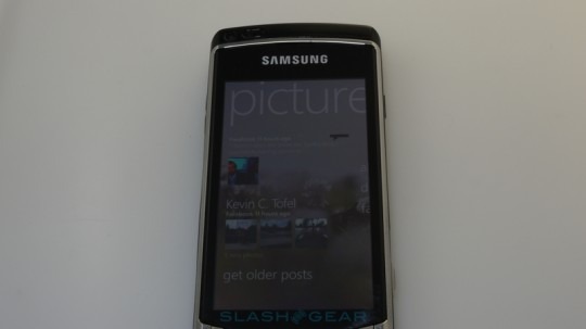
It's certainly different, but the question of course is whether it's any better than rival systems. On the face of things, pulling together similar content is hardly a bad idea, and the galleries – with their mixture of local and online media – work well. What's lacking is breadth and customization. Out of the box, Windows Phone 7 has native Facebook and Windows Live support but no Twitter or MySpace integration as you'd find on, say, Motorola's MOTOBLUR. That's an opening for third-party developers, certainly, but we're disappointed not to see it from the start. Similarly, the Hub experience is basically a fire hose of new information, with no way to prioritize or filter it. You can pick out a certain contact for a homescreen Tile, certainly, but you can't then tell the gallery Hub that you're interested in that person's new content above all others.
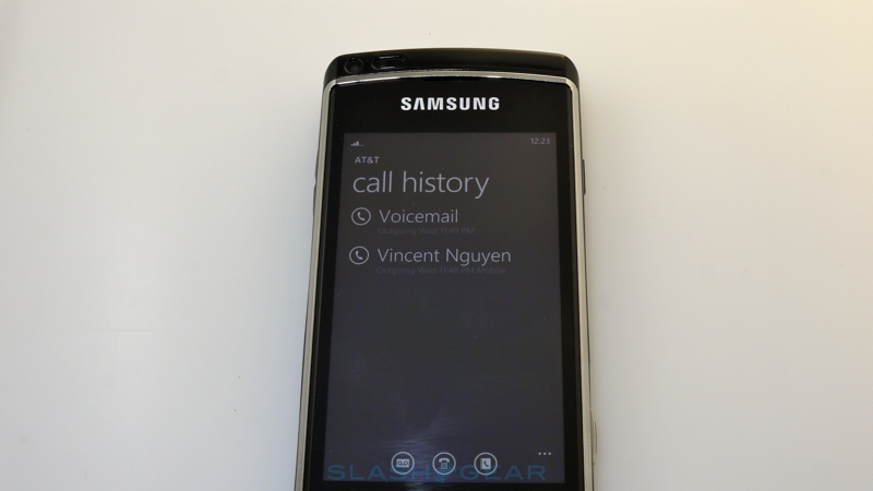
It's a shame, because Microsoft has otherwise treated inter-Hub integration surprisingly well. One of the crowing points for iPhone fans who had to suffer criticism from Windows Mobile users over the Apple platform's tardy addition of Copy & Paste functionality was the news that Microsoft wouldn't ship Windows Phone 7 with those abilities. In practice, though, their omission is less of an issue, thanks to some reasonably intelligent linking abilities. Addresses, for instance, are automatically linked to the map app, while links always open up the browser and phone numbers are spotted and triggered by a tap. It's obviously not perfect – and Microsoft admit that Copy & Paste will be added in a future update, though there's no public timescale for that – but it's a half solution.
Unfortunately, a half solution may not be good enough. We've handed the phone to several people, and there's a worrying sign that people just don't "get it". In fact, after a few basic questions – "are there apps?"; "can I play games?"; "can I Twitter?" – we generally got the Windows Phone 7 device back after a minute or two, often with the comparison that it felt like "a first-gen iPhone". The Hubs are a good start, and show promise, but that lack of breadth means that people soon get bored; there's not quite enough here to make the new paradigm worth getting to grips with. Microsoft has denied handset developers the ability to put their own, custom UIs onto Windows Phone 7 devices, but the OS' native abilities don't, in many ways, exceed what, say, HTC Sense can achieve.
In a similar vein to the Copy & Paste shortcomings, Microsoft has done a dramatic about-face when it comes to multitasking. Where Windows Mobile was a free-for-all of simultaneously running apps, Windows Phone 7 apes the iPhone in its limitations on what can be running in the background. The arguments are the same – apps churning away while invisible to the user can reduce the overall experience of the phone – and the solution is relatively similar too, with Microsoft keeping a snapshot of the running app (which it calls "tombstoning") that quickly resumes when you flick back to the program. There's minimal background support – less than Apple's latest batch of multitasking APIs in iOS4 – for things like audio playback, pretty much only for the native apps, but Microsoft's notification system is an improvement on the iPhone's. Instead of attention-stealing pop-ups, messages – or "toast" as Microsoft calls them – slide into view at the top of the display. It's similar, though a little more eye-catching, to what you get in webOS, but Microsoft has also chosen to hid the phone's status bar: you have to tap or swipe near the top of the display if you want to check how much battery you have left or what sort of network you're connected to. Both local and cloud-based apps can send "toasts" to the system.
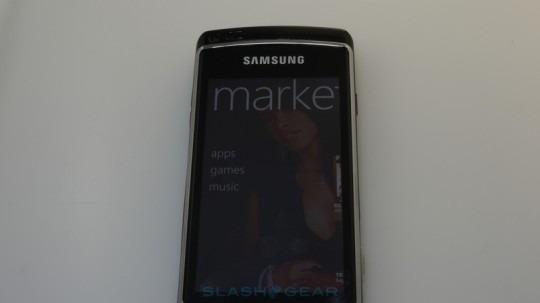
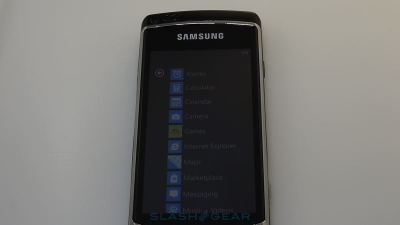
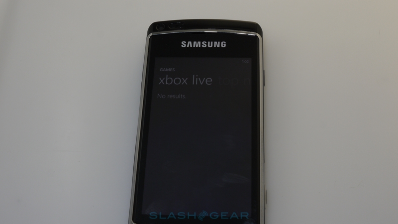
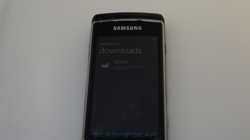
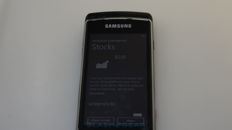
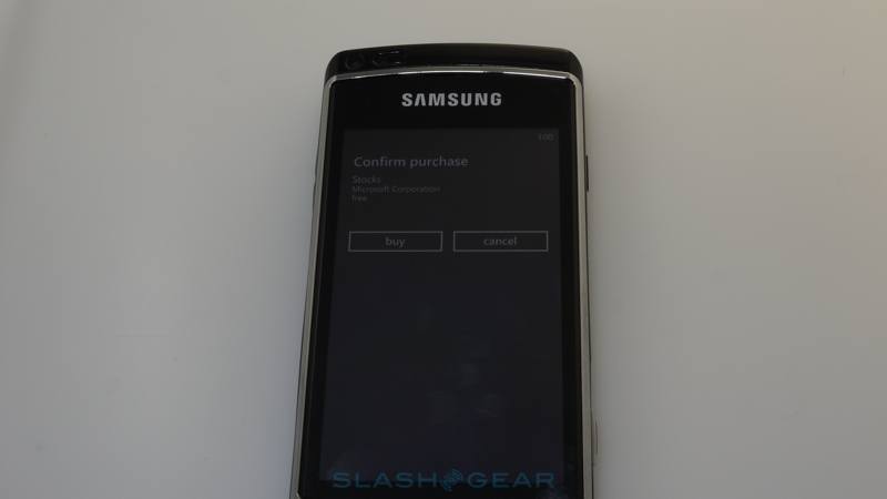
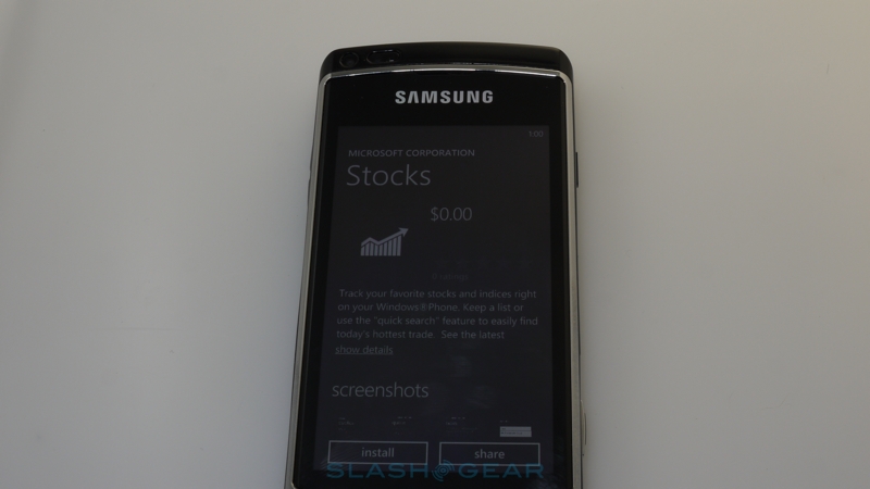
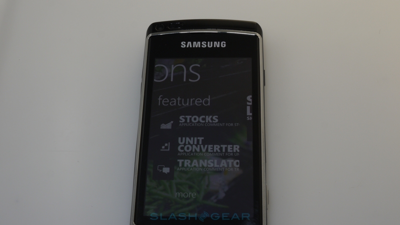
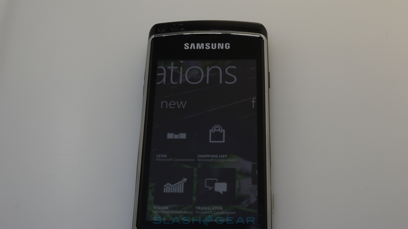
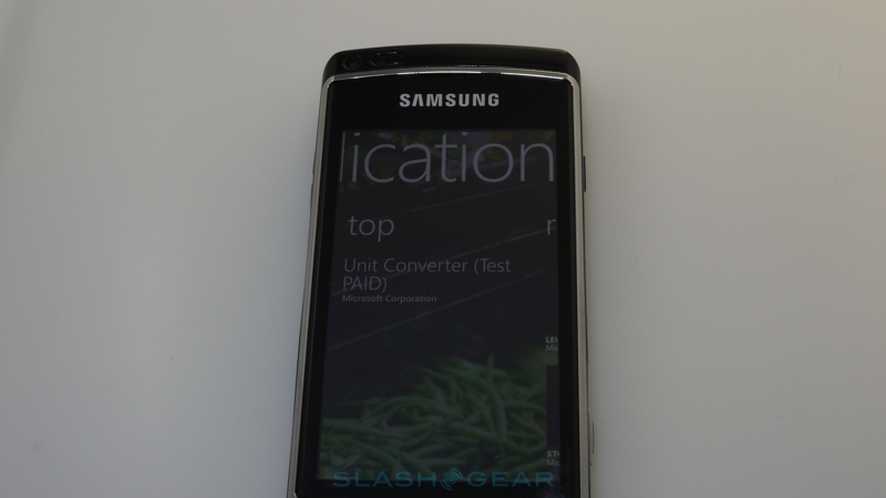
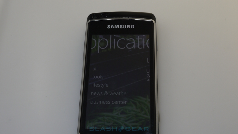
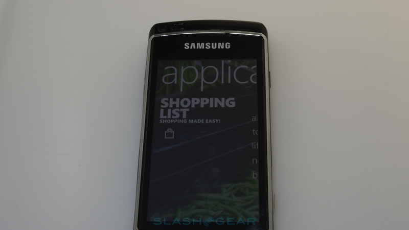
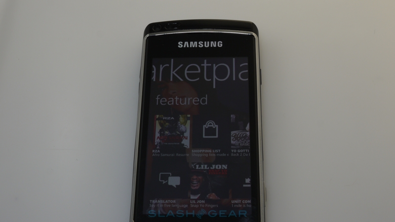
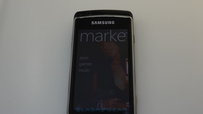
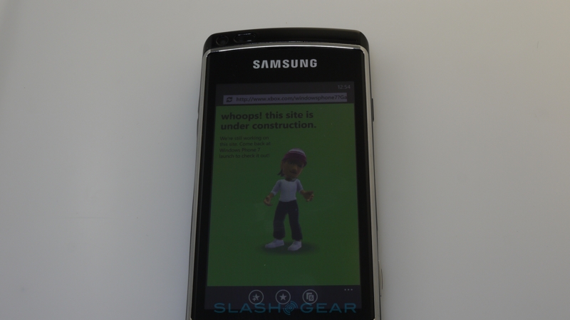
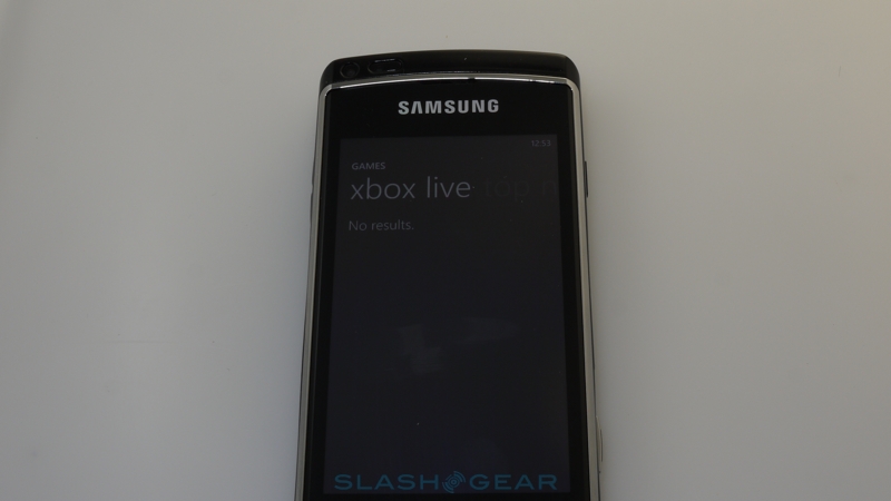
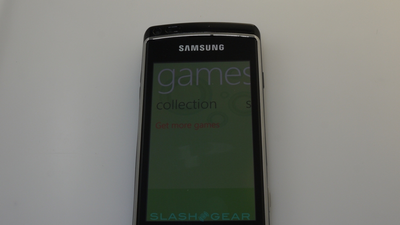
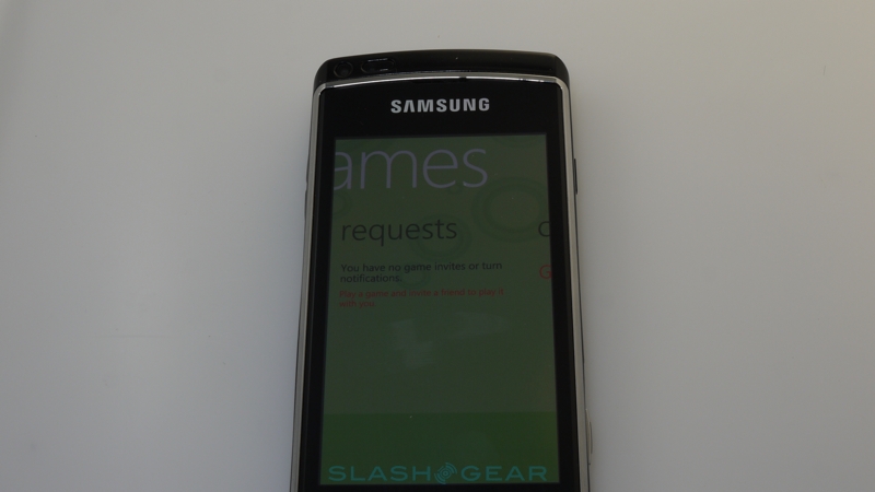
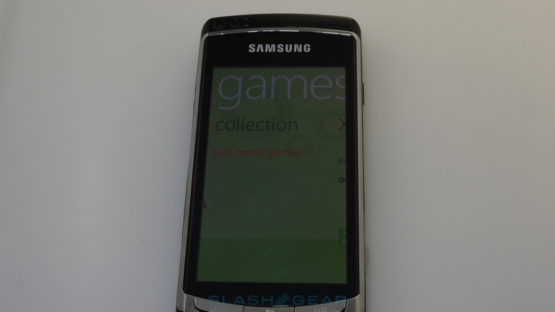
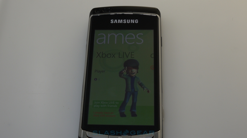
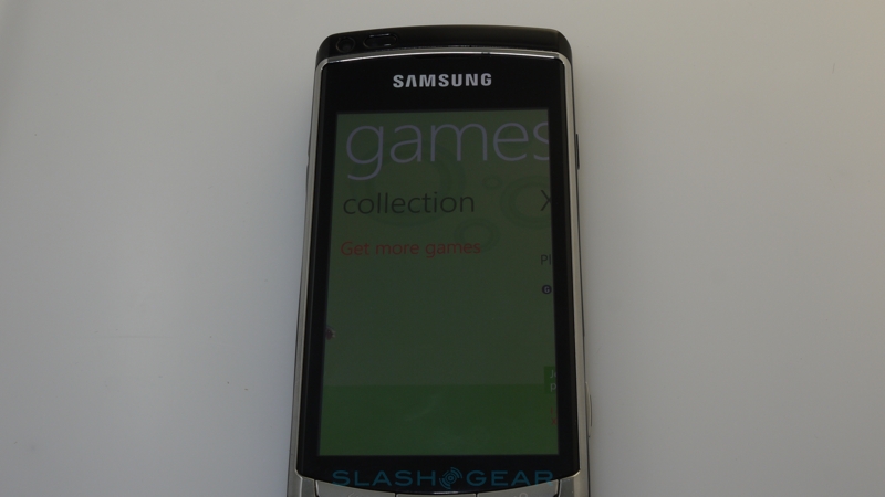
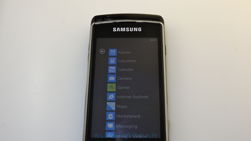
As for how you're get those apps, Microsoft has axed side-loading support in favor of the more controllable Marketplace download store. For the sort of consumer audience they're targeting that's probably not such a bad decision. Apps can be written in Microsoft's own Silverlight environment (Windows Phone 7 will supports Flash, too) – thus running on both Windows Phone 7 handsets and on PC and Mac desktops – while game developers can use the same XNA framework from Xbox 360, Zune and Windows desktop. The latter could certainly be Microsoft's ticket into convergence heaven, if they can leverage their 360 developer community to take advantage of the Xbox Live integration on Windows Phone 7 devices. Right now it's a fledgling effort, with the promise of mini-games for the smartphone that can be used to unlock features in their companion mainstream titles, and Xbox achievements and your avatar pulled into the games Hub.
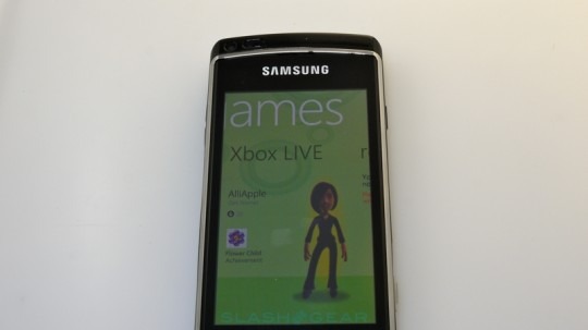
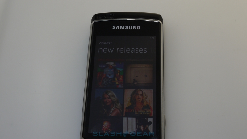
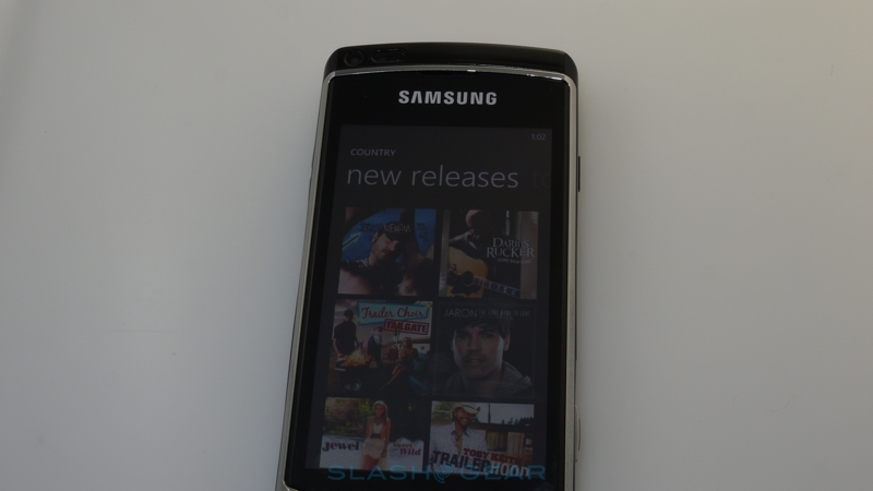
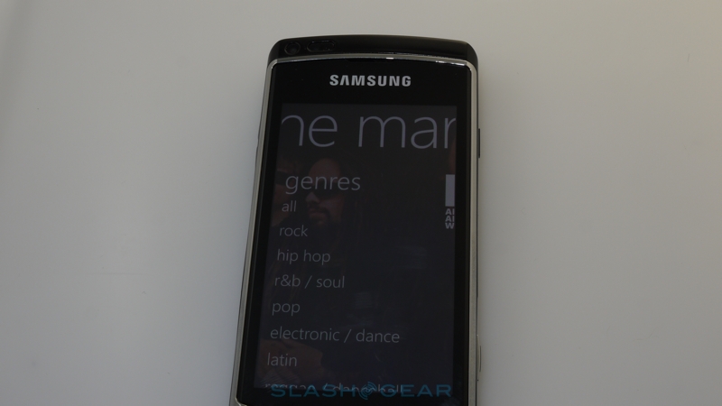
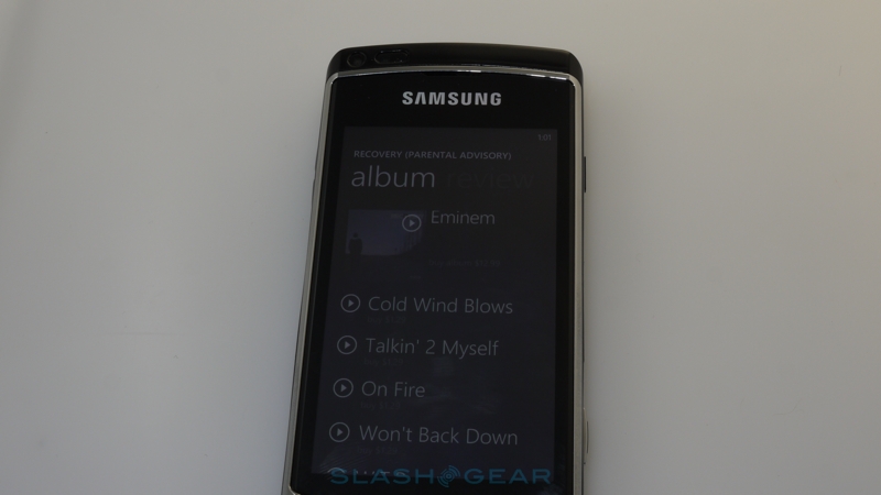
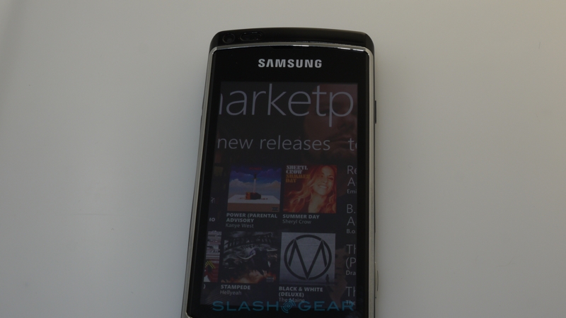
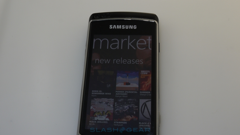
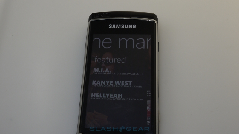
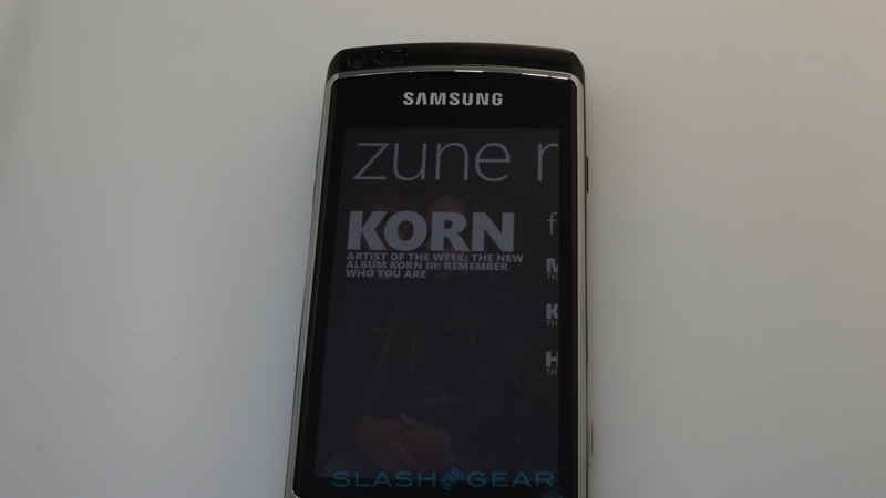
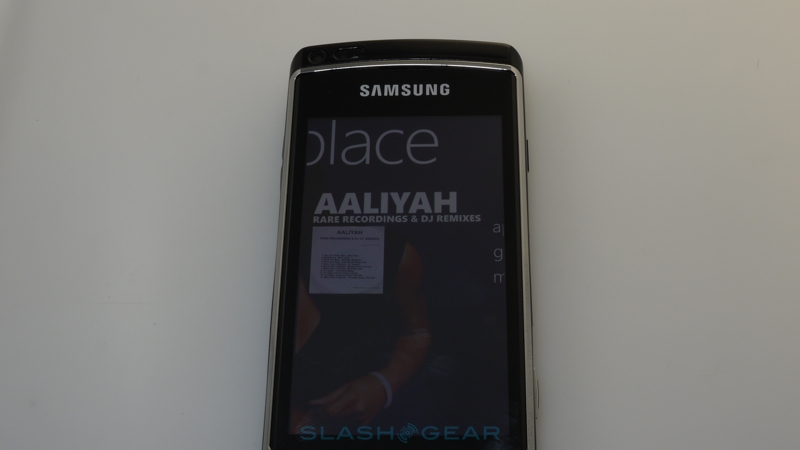
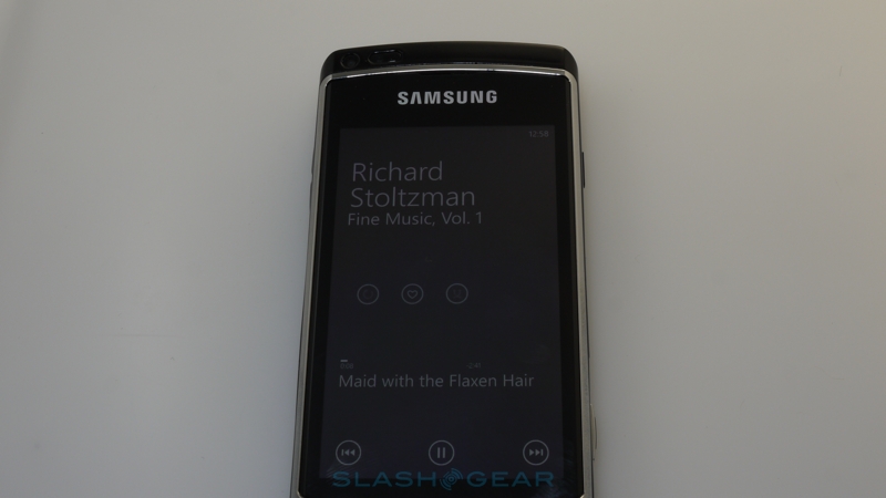
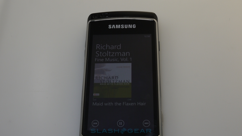
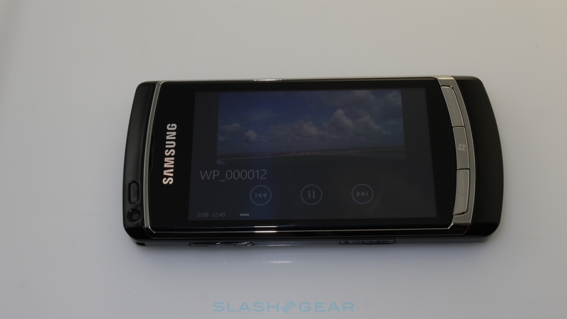
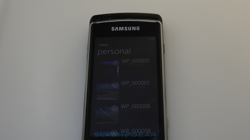
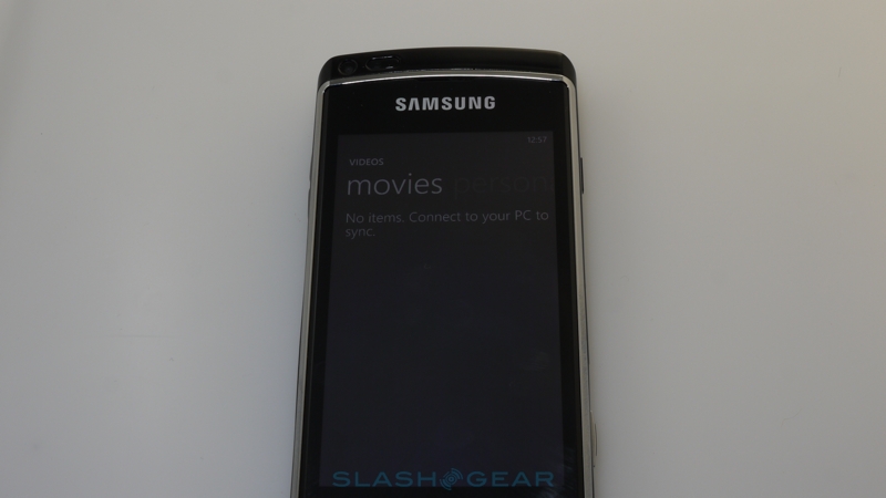
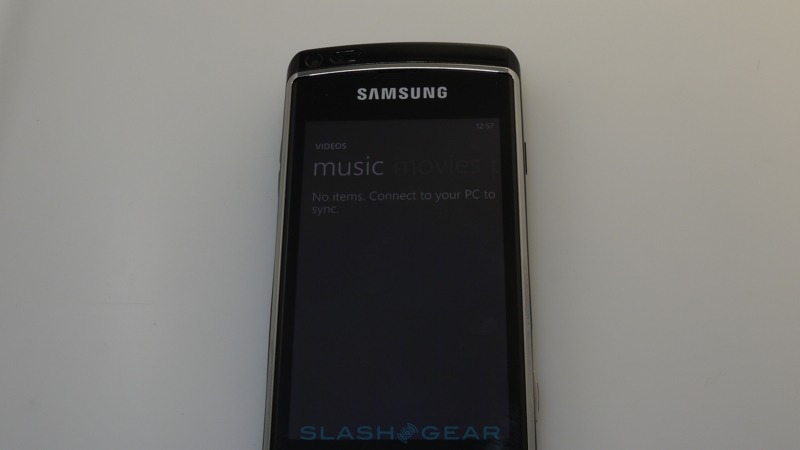
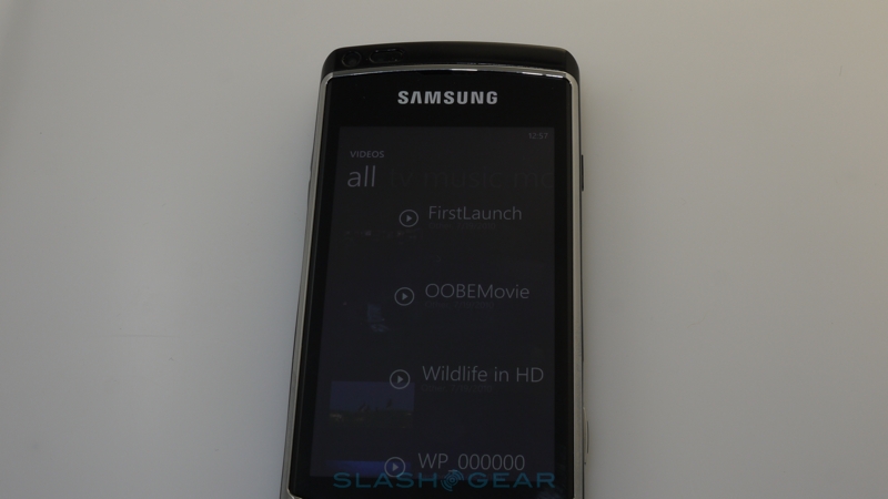
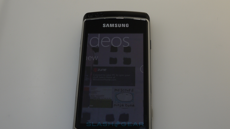
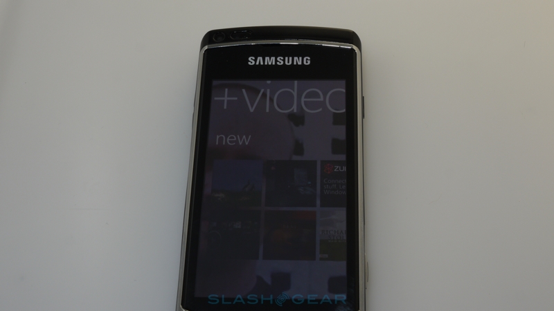
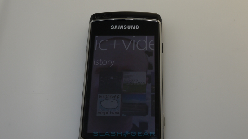
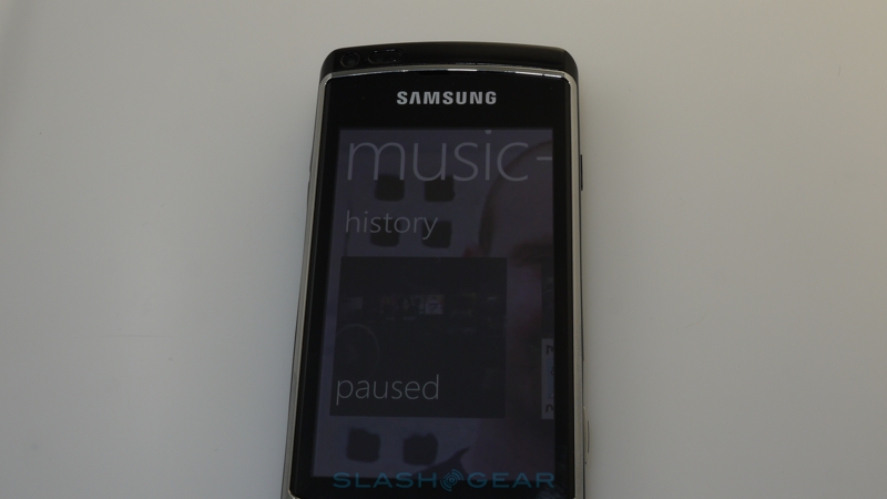
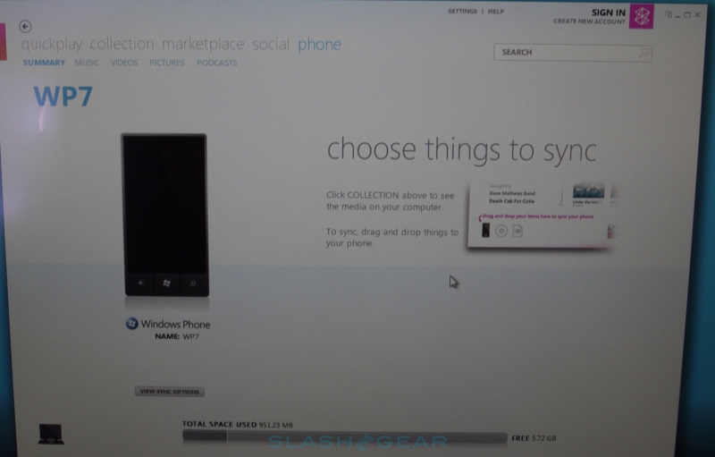
The music and video Hub is another key area in Windows Phone 7, and happily it's one of the most successful. This is where the Zune HD resemblance is most strong, primarily because Microsoft has pretty much lifted the standalone PMP's functionality straight across. We were able to get our Zune Pass account ($14.95 per month) up and running simply by dropping in our registered email address and then were happily downloading content under Microsoft's all-you-can-eat package. Audio in the native app can continue playing in the background, with tapping one of the hardware volume buttons calling up on-screen playback controls.
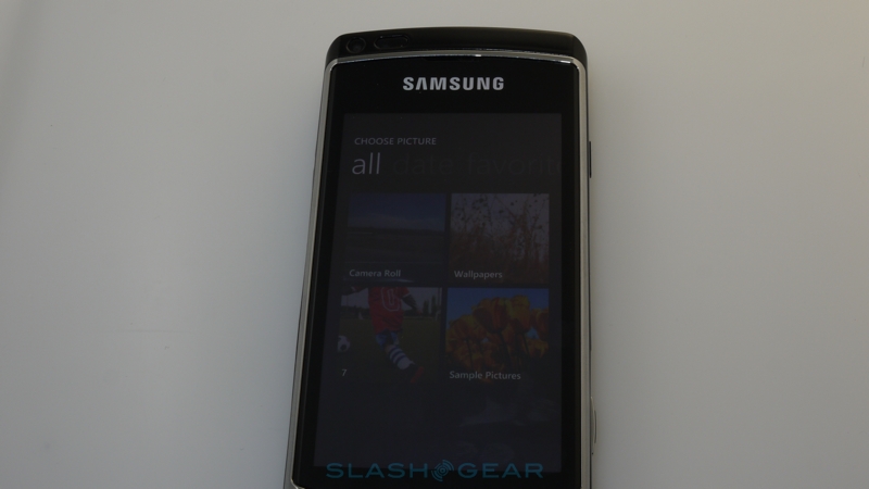
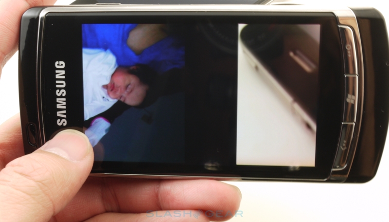
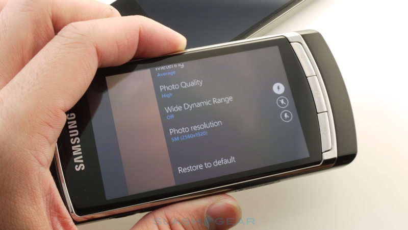
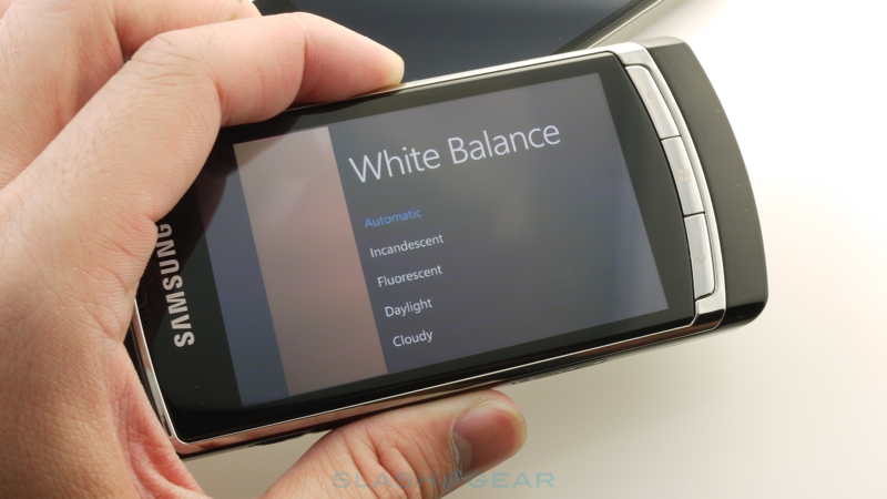
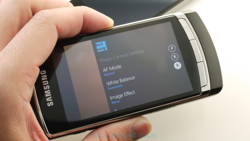
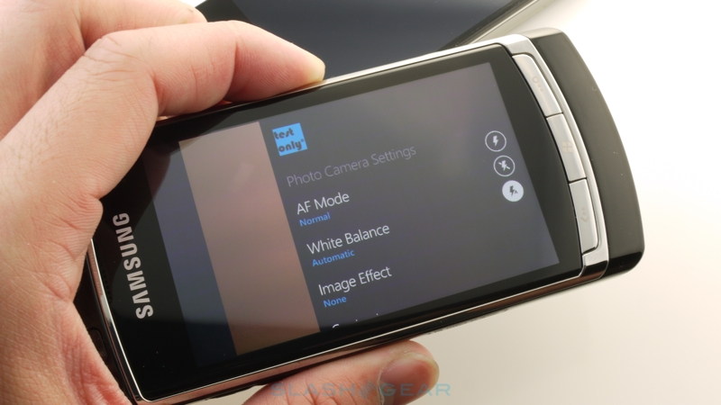
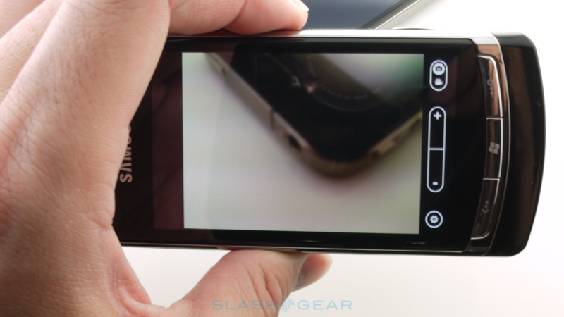
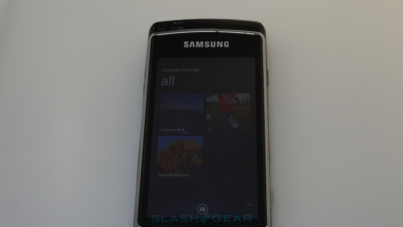
If you're more keen on creating content than consuming it, Microsoft's baseline specs for Windows Phone 7 cameras should ensure at least reasonable quality. Given that this Samsung device isn't destined for sale we don't plan on reviewing it specifically, but the camera interface itself is certainly slick, loading fast and then with minimal gaps between shots. There's some nice animation here too, blending the live preview with a film-roll of your previous shots; rather than jumping between a gallery and the camera, you can simply swipe back and forth. As with Android there are instant sharing options, to send images to Facebook or to Microsoft's own SkyDrive online gallery component of Windows Live, or you can have them automatically uploaded with various default levels of privacy.
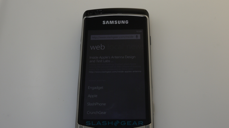
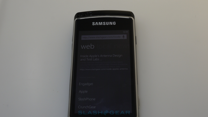
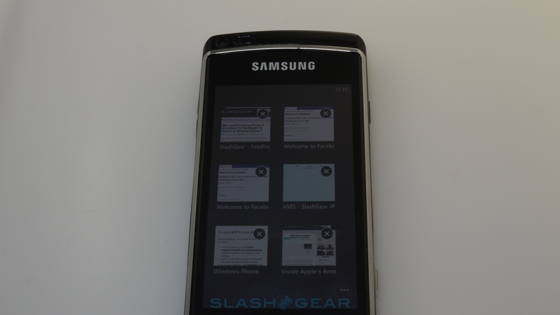
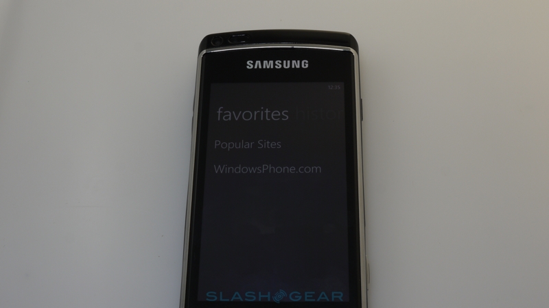
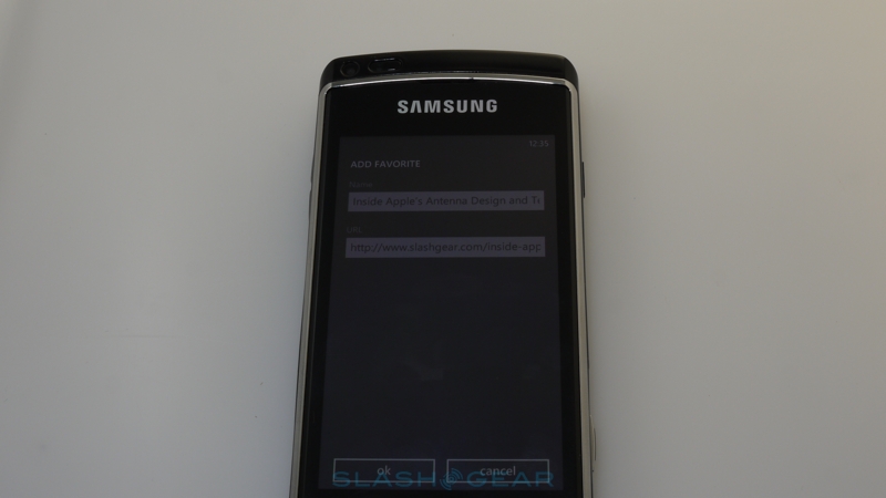
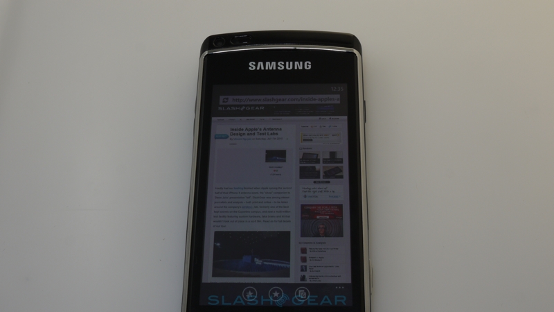
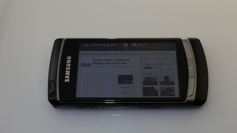
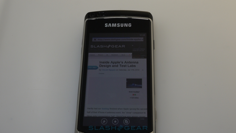
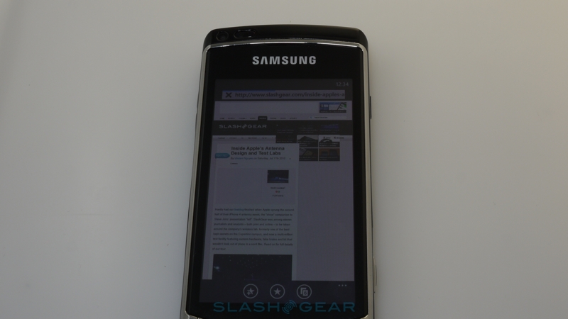
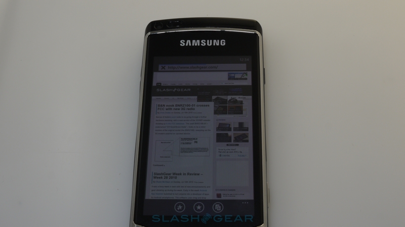
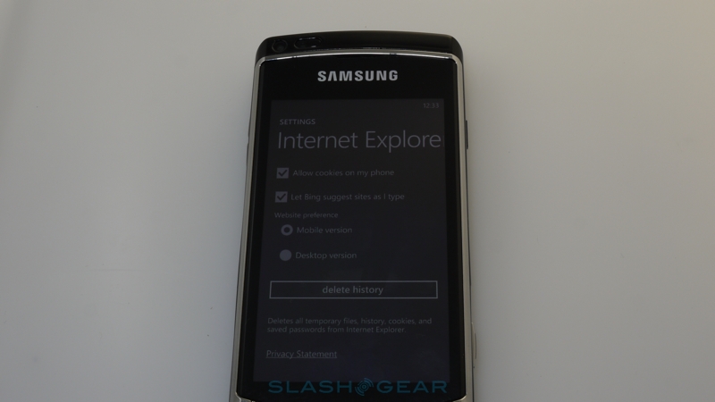
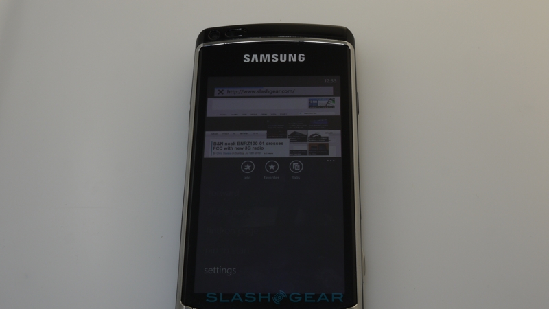
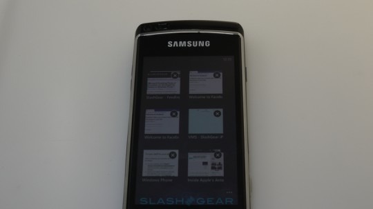
A strong Internet experience is key to any smartphone these days, and happily Windows Phone 7 feels more like browsing on the Zune HD than it does in Windows Mobile. There's pinch-zoom support and the rendering engine is a big step up, being fast and smooth. Unfortunately, despite what Microsoft has promised, right now there's no Silverlight or Flash in the browser, and nor is there HTML5 support. You can have up to six tabs open at any one time – we couldn't find a way to increase this in the sparse settings pane – and double-tapping automatically zooms in. Windows Phone 7 falls short when it comes to text-reflowing, however, though page orientation flips were quick and clean. As we said before, you can create homescreen tiles from webpages, which automatically get a thumbnail image of the site (which doesn't, however, seem to update dynamically as other tiles to).
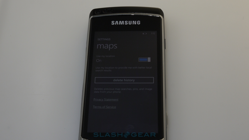
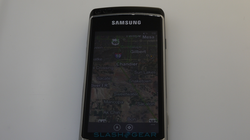
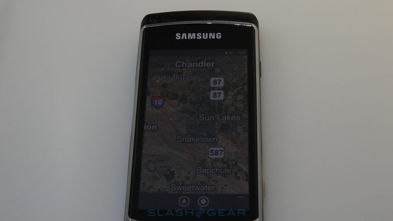
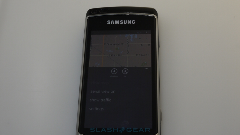
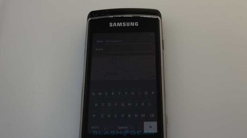
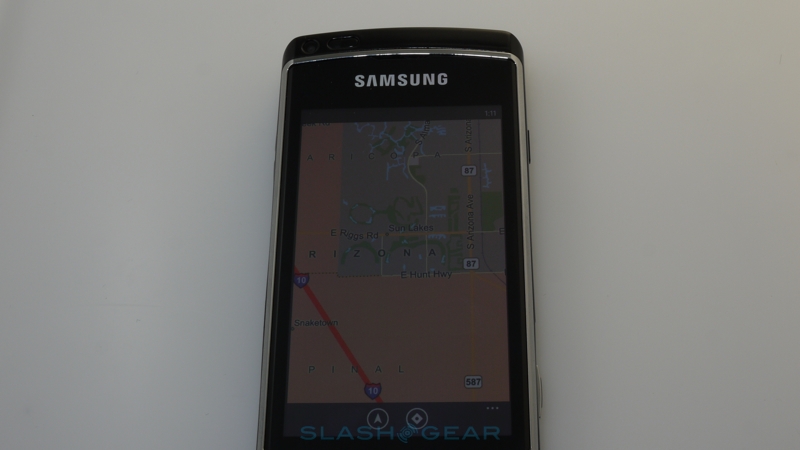
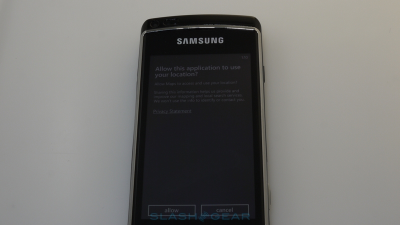
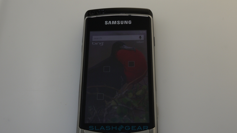
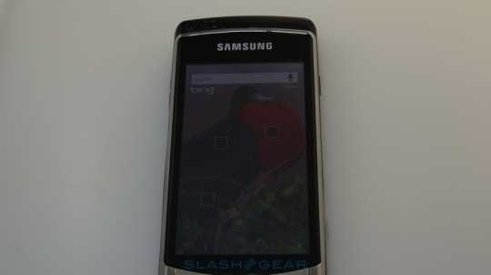
There's no Google Maps here, obviously, with Microsoft's own Bing mapping app taking center stage. It lacks the turn-by-turn voice navigation you'll find on Android devices, but still gets aggregated business reviews and on-screen directions for car or pedestrian journeys. The Bing UI has been neatly brought in line with Microsoft's Metro design language, and there are numerous neat animation touches. Zooming out, for instance, eventually flips the map from normal to satellite view, while there's similarly clever use of zooming to show your own location in relation to search results or destinations.
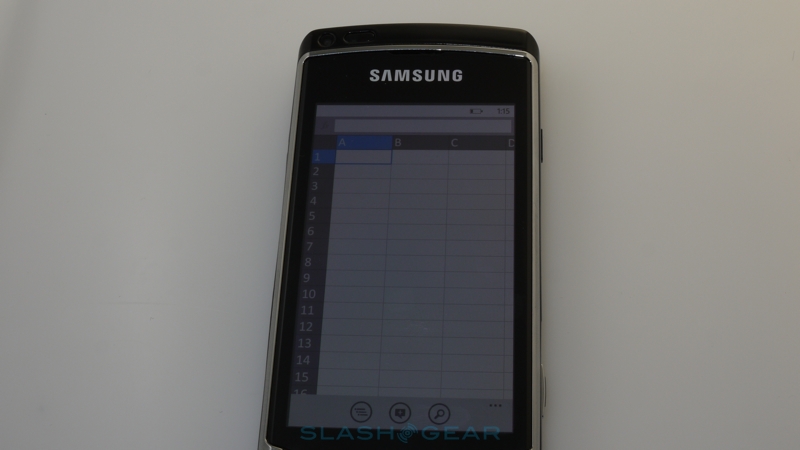
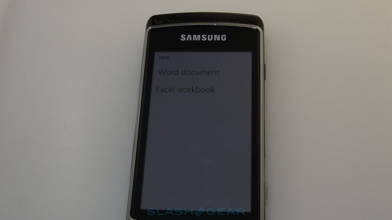
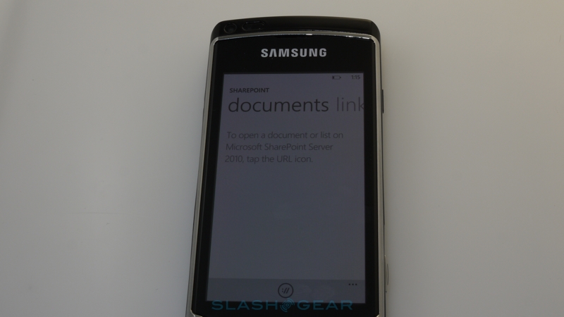
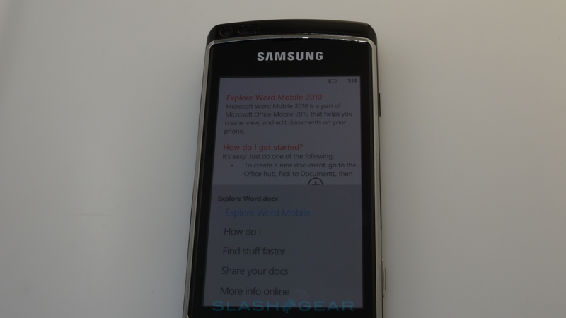
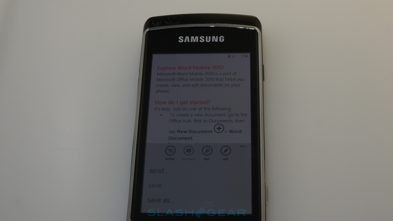
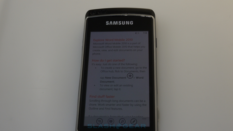
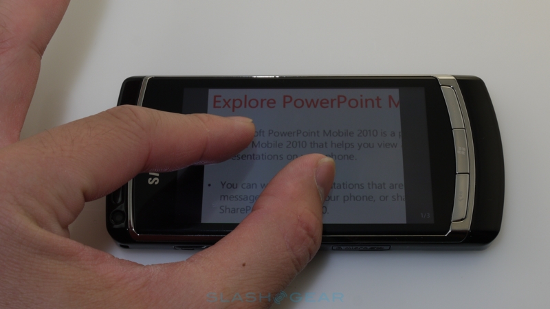
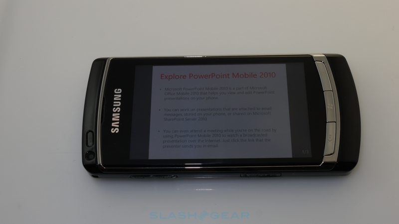
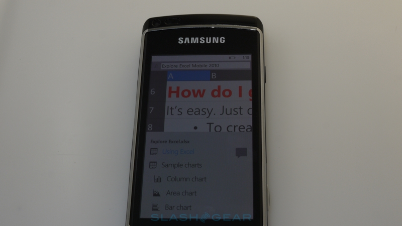
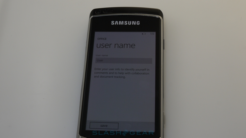
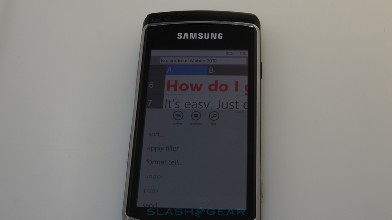
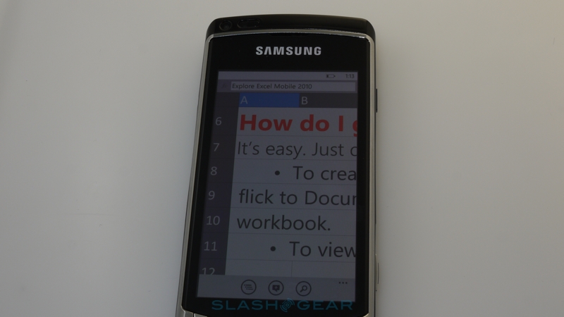
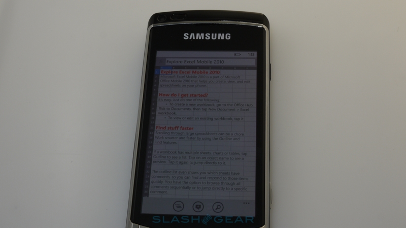
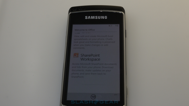
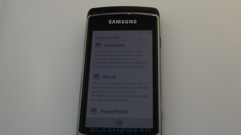
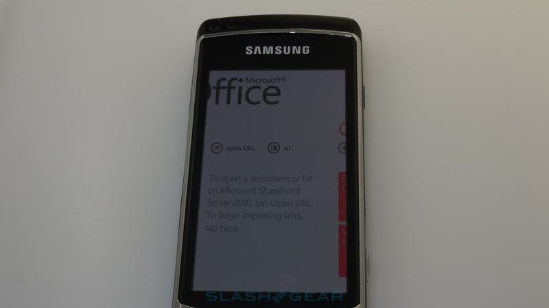
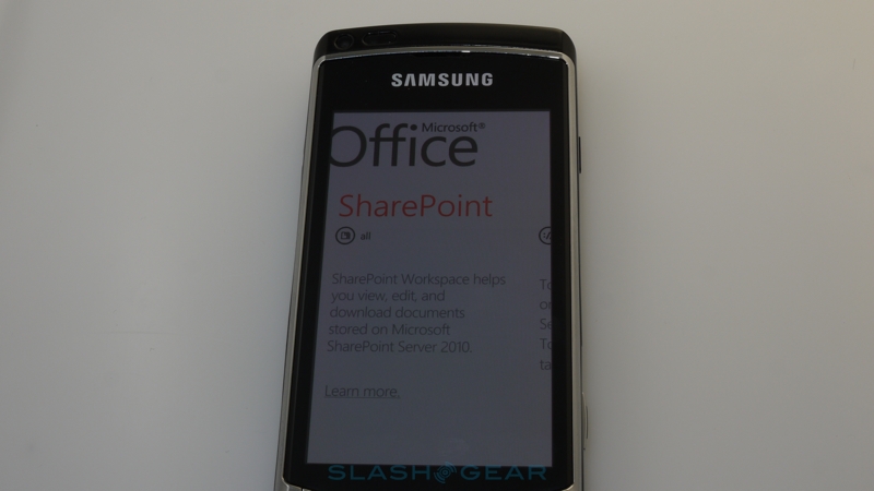
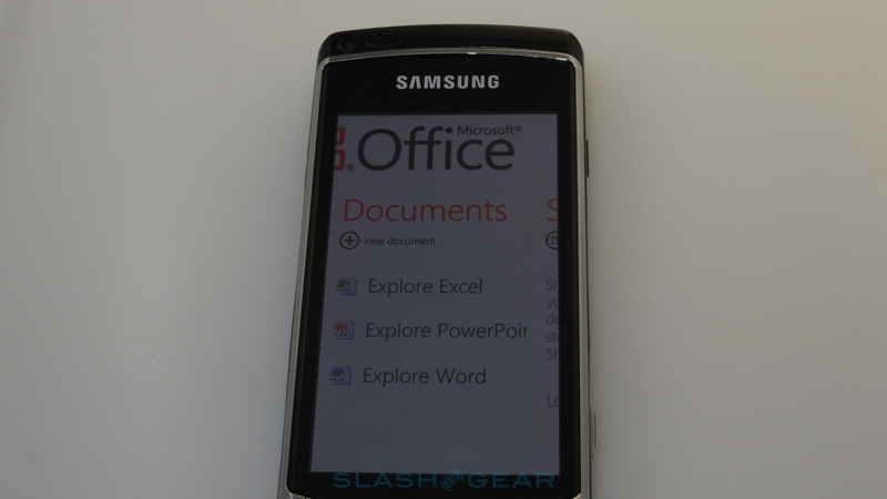
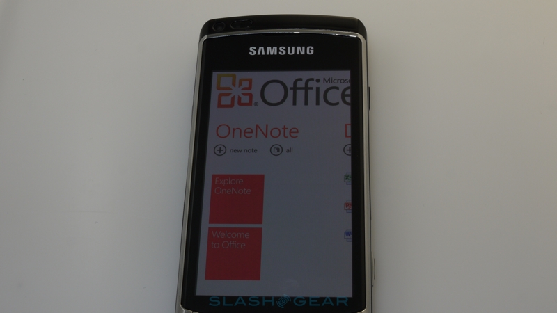
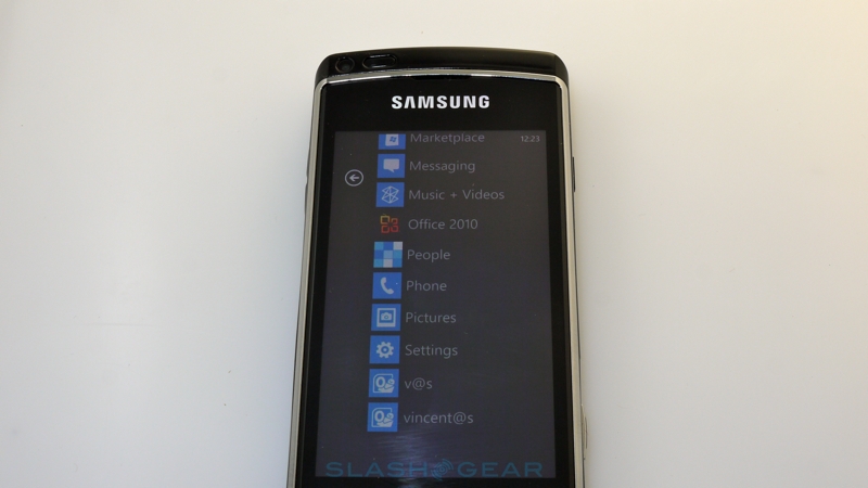
When a sizeable proportion of the world's computers use their Office software, you'd expect Microsoft's mobile Office functionality to be top notch. Frustratingly, some of the limitations of the Windows Phone 7 OS itself impact most notably here, with the biggest being the omission of Copy & Paste. In the Office Hub there are mobile versions of Word, Excel, PowerPoint and OneNote, together with SharePoint server access. Both Word and Excel allow you to create new documents, as well as view and edit pre-existing documents, but PowerPoint will only allow you to view or edit; if the device you eventually buy has a TV output then hooking up the Windows Phone 7 for a lightweight presentation is possible, though at the moment none of the Office apps work in landscape orientation.
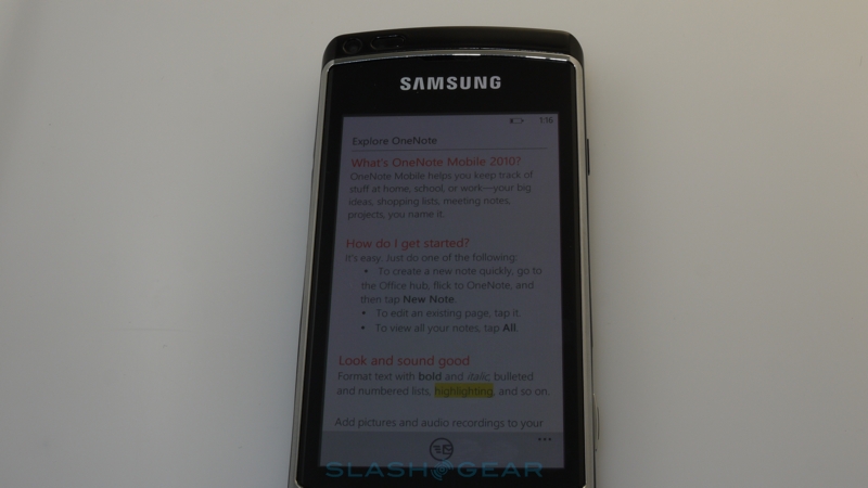
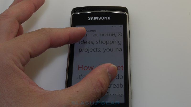
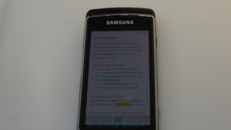
The most successful Office app, in fact, is OneNote, Microsoft's much-underrated notetaking app, which is actually the first page you see in the Office Hub. This allows you to combine text, images and audio together into a virtual notebook, complete with basic text formatting and lists, and which is then synchronized with Windows Live. You can log in and see your notes from a browser, email them, or pull them down into OneNote on the desktop via SharePoint. Unfortunately, while SharePoint has traction in enterprise markets, it's not something mainstream consumers are likely to have, and bizarrely there's no Office section in the companion Zune desktop software for managing personal content.
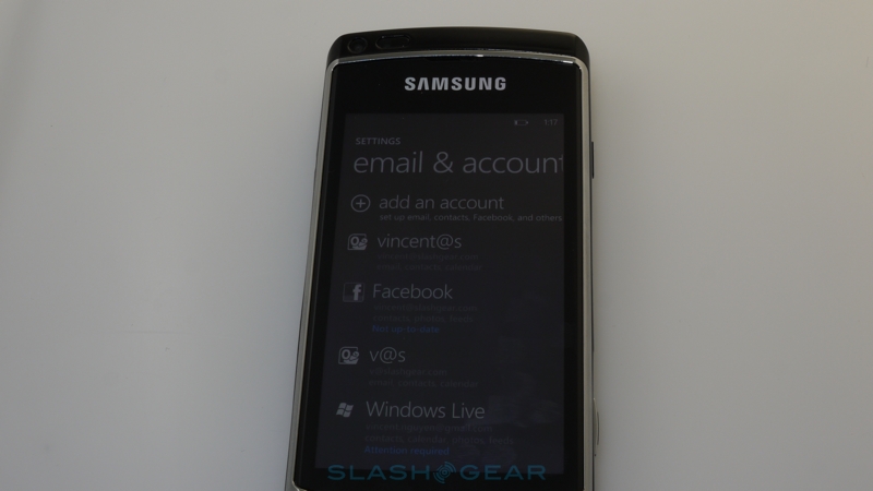
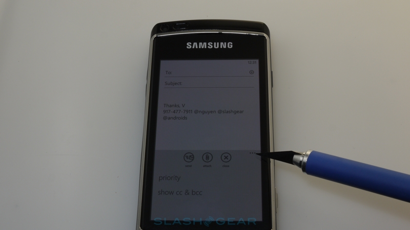
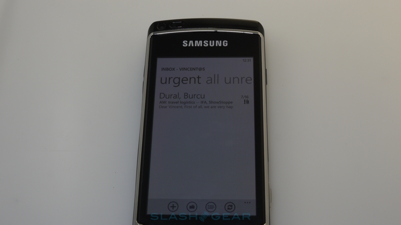
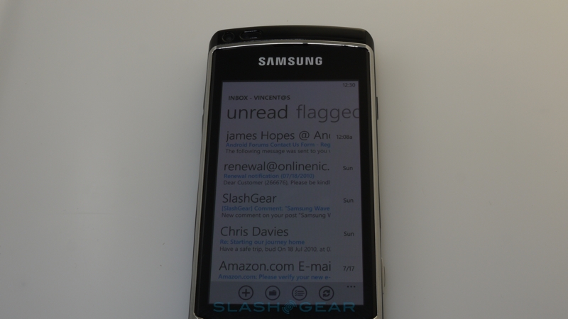
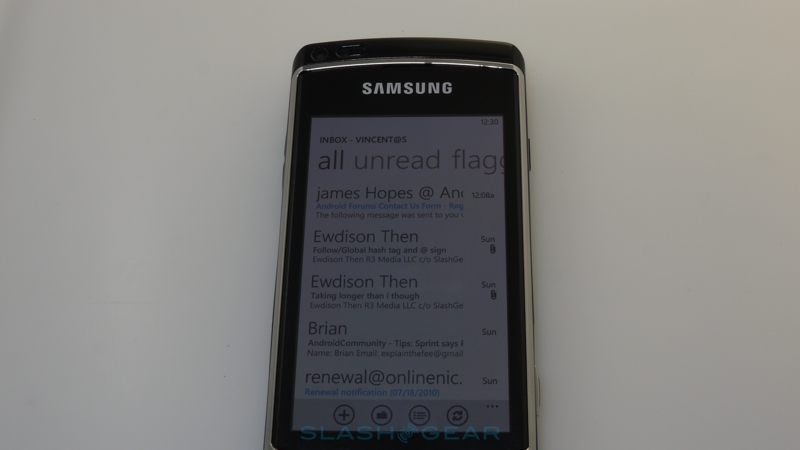
We've always praised Windows Mobile for its strong Exchange integration – as it should be, given that Microsoft are behind both products – but in the meantime rivals have caught up. Exchange support on iOS4 and Android 2.2 is very complete, and Windows Phone 7 has some notable omissions that do the OS no favors. While you can register multiple POP and IMAP accounts, together with Windows Live, Gmail, Yahoo! and Exchange mail, there's no unified inbox; each shows up separately and, if you want them all on the homescreen, you have to have tiles for each.
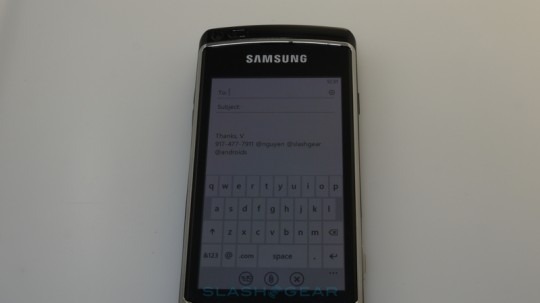
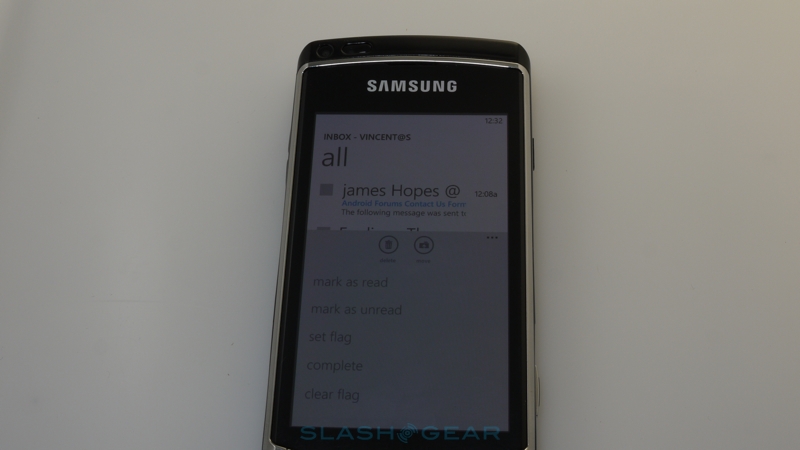
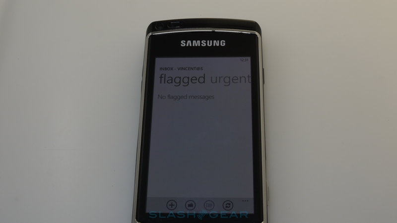
Triaging messages is straightforward, and you can flag messages for later attention (though not label Gmail messages in the inbox); there's a little animation, too, though the whole experience is relatively clean. Another obvious absence is threaded conversations, but the capable Bing search does work well for cutting through a hefty inbox; you'll want to have as many messages as possible sync'd down on the handset, though, since Windows Phone 7 currently lacks server-side search.
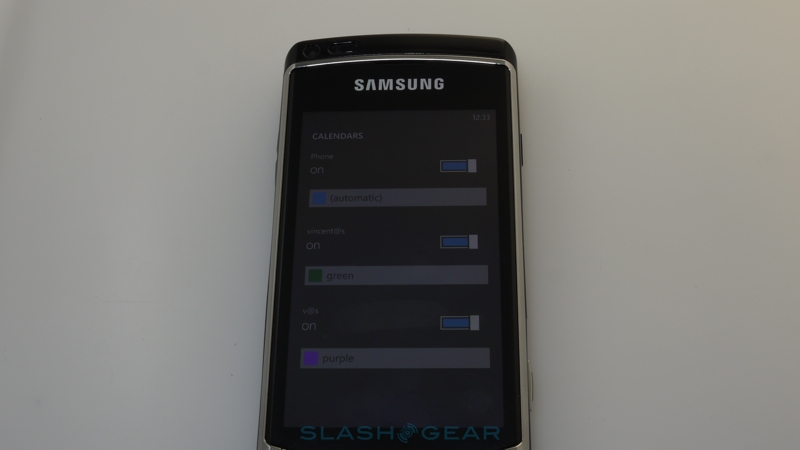
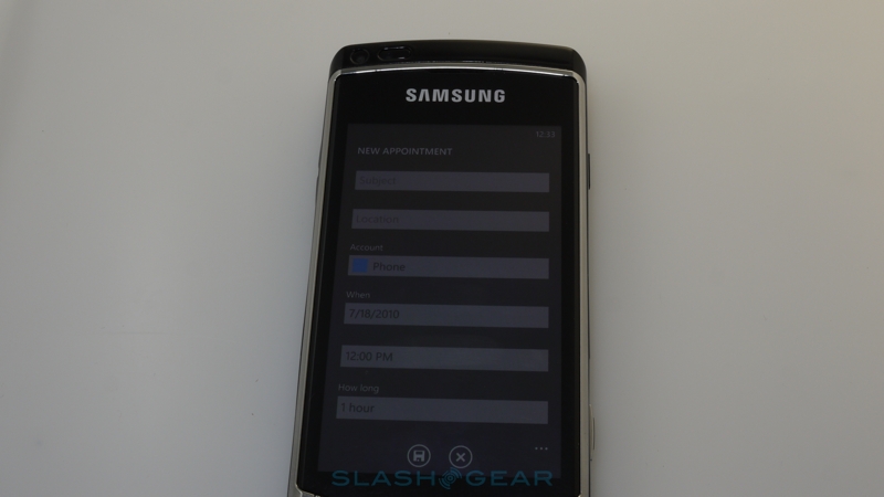
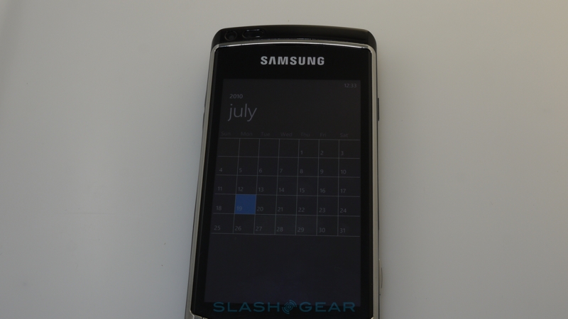
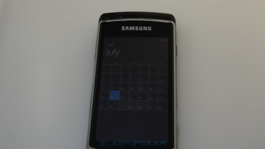
As for the calendar, it's a starkly simple UI but it works well, pulling in entries from Windows Live, Exchange and Gmail (though not your Facebook calendar). These can be toggled from view, and each is color coded. As well as a listed Agenda view there are Day and Month displays (though not a Week view), and new entries support attendees and notes. Only a single Google calendar would sync across, however.
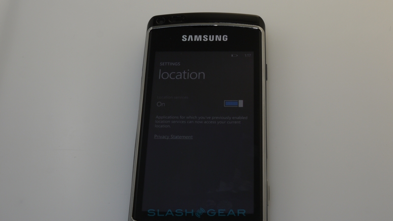
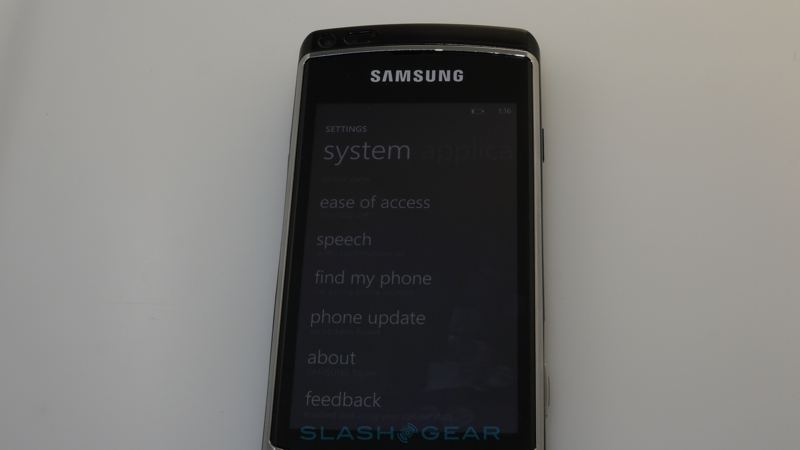
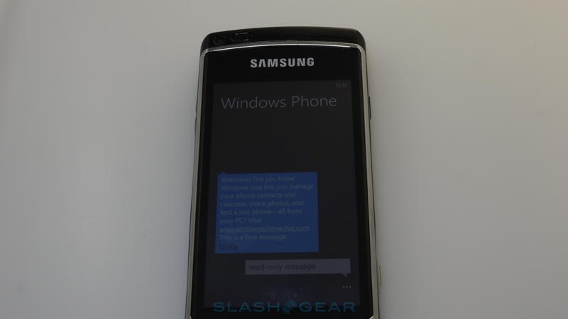
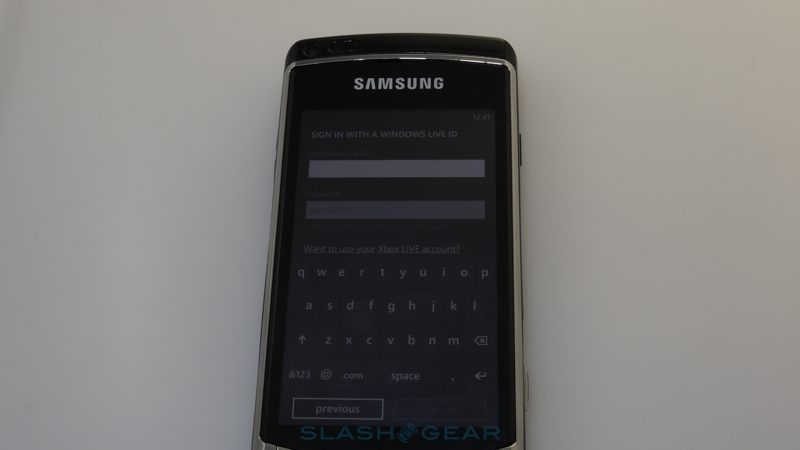
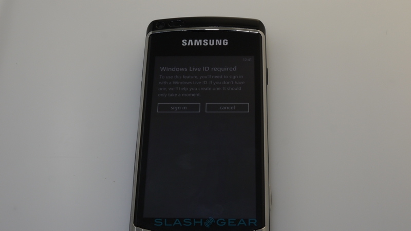
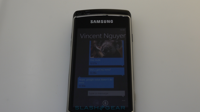
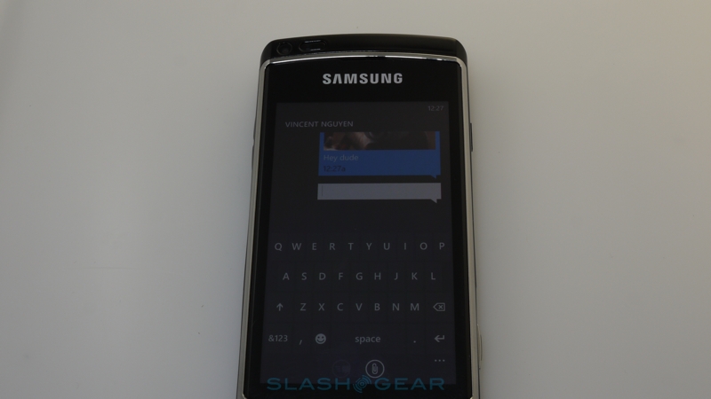
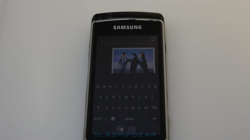
Beyond that, most of our other complaints are minor. The phone pesters you for a live.com or hotmail.com email address when you first power on, as with Google's approach with Android, though you can bypass it if you want to. The digital compass is mandatory, but non-functional, since Microsoft hasn't written the API yet; similarly there's no VoIP support as there's no socket access in the networking API. Removing SD card support and PC tethering, while we hear Microsoft's claims that it makes Windows Phone 7 more secure for enterprise users, still feels like another attempt to unduly lock down the platform and force owners through the company's mandatory hoops. The barebones SMS/MMS app bizarrely color-codes both incoming and outgoing messages the same shade, though at least supports in-line images. Some of our criticism could be mitigated by developers. The encompassing nature of the Hubs means that, if a careful and clever developer chooses, the empty spots could be fleshed out with broader functionality. That's certainly different to, say, iOS, where Apple's core applications are sacrosanct and new third-party abilities are offered alongside – rather than integrated with – the core tenets of the platform.
Microsoft's primary challenge is to convince not only enterprise customers to either upgrade from Windows Mobile devices to Windows Phone 7 handsets or jump ship from rival platforms like BlackBerry OS, but to persuade the increasing consumer market that WP7 has promise against Android, iOS and webOS. It's arguably easier for devices to transition from consumer to enterprise – look, for instance, at the iPhone's phased evolution from media-centricity to full Exchange compliance, remote administration and everything else a network administrator might demand. The opposite path, taking an enterprise device and making it consumer-friendly, is perhaps the tougher route, a heady mixture of multimedia, social networking, app availability and nebulous "fashion" allure.
Does Windows Phone 7 work as advertized? Yes, it does, and it's a distinctive and in some ways innovative platform, certainly leagues away from what we've been used to – and, it must be said, bored by – in Windows Mobile. The harder question is whether the new OS competes with the rest of the smartphone market, both now and at its Q4 release. That's not something Microsoft can take sole responsibility for; they'll need third-party developer support, together with the investment – and imagination – of device manufacturers.

Therein lies the rub. Much of what's missing is not in Microsoft's hands: the support of the developer community – who have helped make Apple's App Store the platform-driving success that it is, and Google's Android Market the fast-growing competitor – is essential if Windows Phone 7 is to gain traction among the smartphone segment. Microsoft are making the right noises, and their various developer blogs are doing their part in reaching out to third-party content providers, but it remains to be seen how many will choose to adopt the platform. A roster of big-name partners is one thing – Associated Press, Netflix, Pandora and Seesmic are among the names Microsoft announced at MIX – but it's the smaller developer teams that make up the bulk of Apple and Google's offerings, and they're the people who will need to justify the time expense in adopting another OS. The tools – which we're told are surprisingly straightforward, though not perhaps as simple as Google's recent drag-&-drop App Inventor – are there, as is the Marketplace for ease of distribution, and so it seems platform adoption will be the element that tips their hands.
Without production hardware it's hard to say what the day to day experience of Windows Phone 7 will be like. In its current state – Microsoft tells us what we've been using is 99-percent ready to ship out to manufacturers and carriers for preliminary testing – it runs as swiftly as you'd hope for and suffers little in the way of lag or crashes. It also has elements that are a real departure from the smartphone norm; we can certainly see where Microsoft is trying to take their Hubs concept, even if it's not the key differentiator they might bill it as today. In other ways, though, while it differs significantly from Windows Mobile, it's very much a v1.0 product; that might have been enough to compete strongly against early versions of Android, say, or iOS, but, by the time Windows Phone 7 devices reach the market, Android 2.2 will be mainstream and iOS4 firmly entrenched. That's strong competition, even for a company with the relative might of Microsoft.
This isn't KIN. It's altogether more serious and there's altogether more riding on it. Microsoft is making plenty of promises about the future of Windows Phone 7, and if they can coerce developers into play then they could carve a niche. In comparison to Windows Mobile, the new platform looks better, performs better and feels more aligned with how smartphone owners use their devices today. Of course, in the process Microsoft has cut ties with their sizeable back catalog of third-party WinMo apps and that's left a big gap in what's currently a sparsely-populated Marketplace. With only months to go before the first production devices are expected to go on sale, it remains to be seen whether Microsoft's distinctive UI and what we're hoping will be top-notch hardware can persuade users to look past established rivals and take a chance on what, even at launch, will be a work-in-progress.
Windows Phone 7 full walkthrough:
[vms 8b2561a0d90720d6ce11]
Sorry for the lack of audio – had some issues with the recording. I'll re-record the walkthrough with audio ASAP.
