Windows 8 Review
I have a confession to make: I never tried the Windows 8 consumer preview. You see, I've been a lifelong Windows user (I can remember my parents making a big deal out of our switch to Windows 3.1), and as a lifelong Windows user, I've been burned plenty of times in the past. Most recently, this happened with Windows Vista, so when Windows 7 came along, I decided that it was the only Windows version I needed for the foreseeable future. Sure, I watched plenty of videos and read plenty of articles about Windows 8, but none of those convinced me that OS was something I needed to have on my machine. Yet here I am, reviewing Windows 8 for SlashGear. Can Microsoft's latest version of the OS persuade this stubborn Windows 7 user that the grass really is greener on the other side? Read on to find out.
Setup
If you're upgrading from a now-outdated version of Windows, setup is pretty easy. You pop the disc in the tray and let autorun take over from there. Depending on what version of Windows you're upgrading from, you'll be presented with a number of options before the install begins. Coming from Windows 7, I was given the option of keeping my Windows "apps," settings, and personal files, just my personal stuff (which includes things like your desktop and your documents), or nothing at all.
Obviously, opting to move nothing over to Windows 8 will result in the shortest install and setup times, whereas going with the first option will mean that you'll be waiting a while as everything is moved over. I chose the first option, not realizing that pretty much everything on my hard drive would be spared. I have around 750GB of stuff stored on my hard drive, but despite that, the total time it took to get Windows 8 ready to go was only around an hour and a half. That doesn't seem too bad, but then again, I don't make a habit of installing new operating systems all that often, so I don't have much to compare it to.

Still, regardless of which option you choose, don't expect your Windows 8 install to be instantaneous. You're not required to do much of anything until the install is nearly ready to go, so you'll want to occupy yourself somehow while Windows 8 works its magic. Once the install is almost finished, you'll be asked to either log into your Microsoft account or create a new one. As far as I could tell, there isn't a way around this, but the account creation process is quick and painless, so you may as well get it over with.
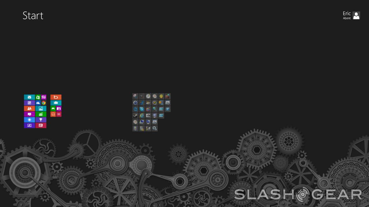
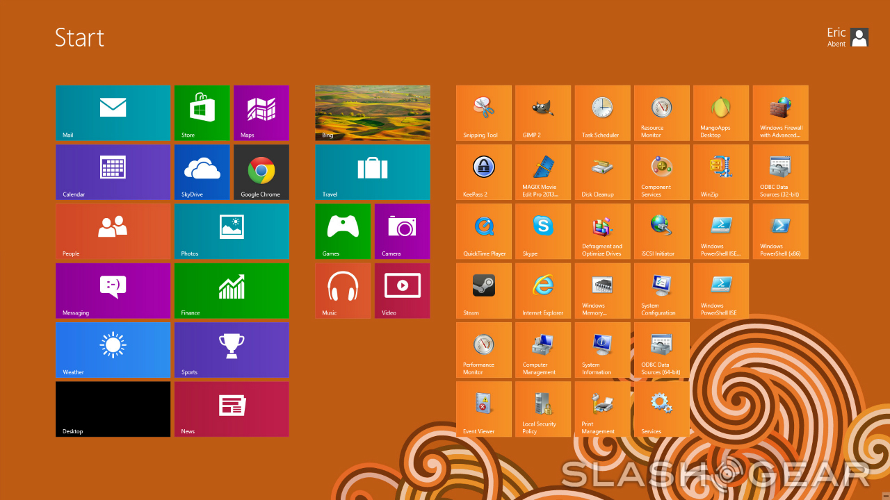
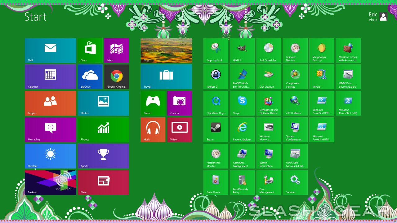
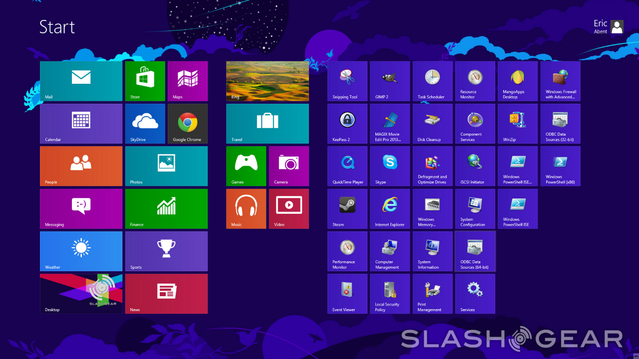
After that, you'll be presented with a number of customization options. You'll be picking your Windows 8 color scheme here, and there are a bunch of different options to choose from. I chose black as my primary color will blue accents – relatively tame, but there are definitely some wild color choices for the more adventurous types (anyone in the mood for an orange Start page?). Naturally, you can change your color settings at any time, and indeed, you'll have more options at your disposal once you're doing this within the Settings panel, so don't fret too much when it comes to picking your scheme – you've got a brand new operating system to dig into, after all.
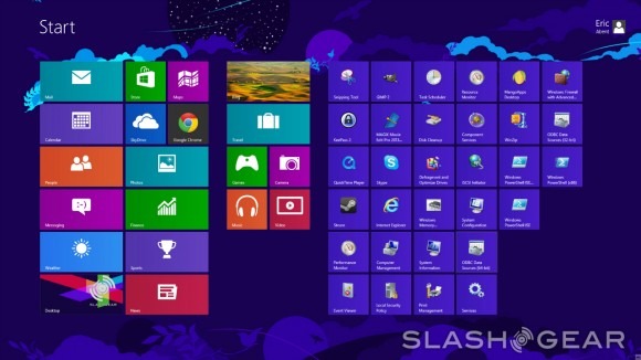
It isn't long before you find yourself at the Start page, and I have to say, for someone who has been using Windows all his life, seeing that Start page on the screen for the first time can be pretty jarring. We'll be talking about the Start page in much more depth in just a minute here, so let's move on for the moment. I was pretty surprised to see that not only did almost all of my programs survive the transition to Windows 8, but they worked just fine after the switch. There will be a few programs that you'll need to update after you install Windows 8, and you'll probably need to update those sound and video drivers before you get everything working perfectly, but for the most part, everything was working as it should.
That is definitely something that deserves some attention. The fact that most everything was working properly without me having to do anything else is a major bonus, and it makes upgrading to Windows 8 as headache-free as possible. Naturally, not everything will be working perfectly, but the majority of it should be, allowing you to jump right in and see everything Windows 8 has to offer. Speaking of which...
Start Page and User Interface
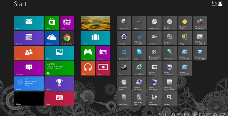
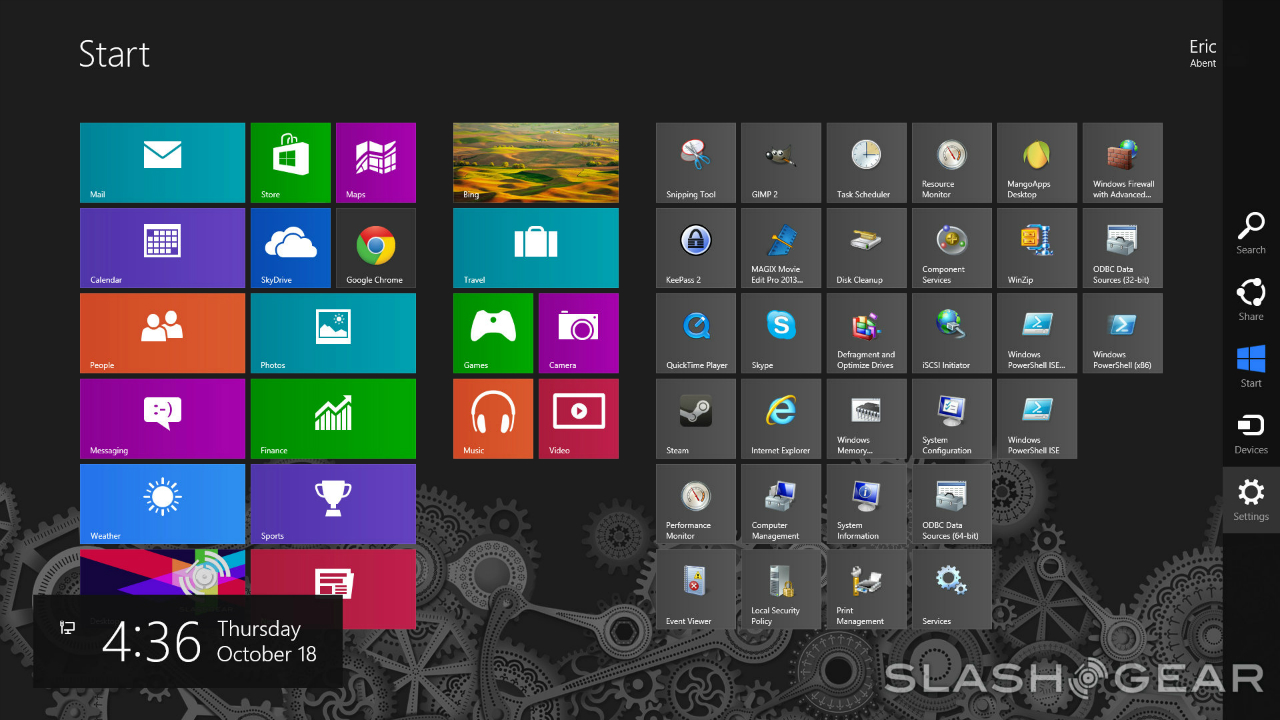
By far, the biggest change in Windows 8 is the introduction of the Start page. Gone is the Start button we've had since Windows 95, replaced by a screen that's packed with tiles just waiting to be touched. That's part of the problem though – while I have no doubt that the Start page will be excellent on touchscreens, it seems kind of unnecessary with a mouse and keyboard. It certainly looks sleek, but whatever advantages it has overthe Windows 7 desktop are, in some ways, lost on me.
That isn't to say there aren't upsides to the Start screen. From the very start, it comes packed with handy apps that are actually quite useful – but we'll get to those later. In some cases, information will be shown right on the tiles, with apps like the News tile giving you a very brief rundown of the day's top news stories (this is provided you're connected to the Internet, of course).

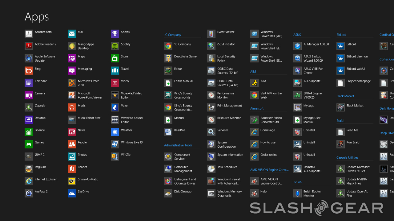
More importantly, the Start screen gives you a way to access the apps you have installed on your computer with a quick click – though clicking on any of the tiles that are for programs as opposed to apps that are made specifically for use with Windows 8 will just take you to the desktop. For apps that are designed for use in Windows 8, however, you're treated to better visuals; Windows 8 apps match the overall design of the Start screen, which does a lot to tie the whole Windows 8 theme together and make the OS stand out from past iterations.
There's a lot you can do from within the Start screen too. By right clicking on a tile, you're presented with a number of options: you can remove the tile from your Start screen, remove the program from your task bar (assuming it was there in the first place), uninstall the program entirely, open it in a new window, run it as an administrator, or open the file location. This is all geared toward ease-of-use. Instead of having to open the "Add or remove programs" menu by going through the Control Panel, for instance, you take care of all of that through the Start page. It's a nice touch, and these streamlined features give Windows 8 an edge over its older OS brothers.
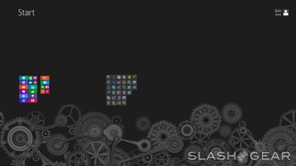
You can also click and drag tiles to move them around the page, or move entire columns of tiles around at once. Once you get enough tiles to fill up the entire page, the Start page begins to extend past your screen, which places a bar at the bottom that allows you to scroll through and see all of your tiles. I didn't have enough tiles place on my Start page to see how far the entire Start menu can extend, but it certainly looks like it can go on for a while. All of these features allow for a pretty deep level of customization, and it seems like Microsoft wanted each user to have a Start screen that felt uniquely their own.
Speaking of customization, remember how I said earlier that you'll have a larger array of Start screen customization options at your disposal once you got Windows 8 up and running? Though you don't have more color scheme options, you do get to pick from a number of different background images through the PC Settings menu in the broader settings hub. Background images range from tame – a few swirls to add a minimalistic accent, for example – to loud and chaotic, such as one that populates your Start screen with jungle animals that look like they just jumped out of the impressionist era. It's pretty cool, and it does that much more to make your Start screen feel like your own.

While the Start screen is definitely one of the biggest changes to be found in Windows 8, it's only one part of a larger User Interface overhaul. Move your cursor to the upper right-hand corner of the screen, and you'll be presented with a menu bar that pops in. By doing this, the time and date will also appear in the lower left-hand corner of the screen, which make it easy to check the time while you're on the Start screen, but proves rather unnecessary when you're on the desktop – the time and date are already displayed in the lower right-hand corner of the desktop, after all, right next to the system tray.
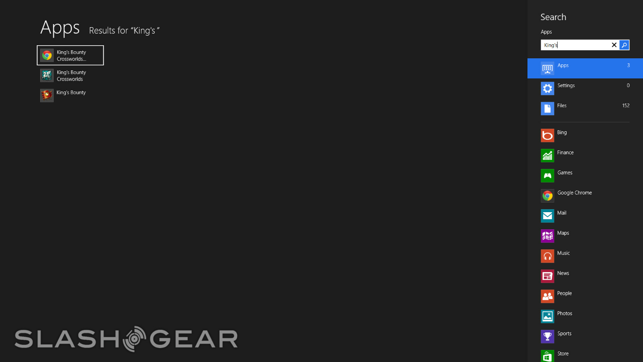
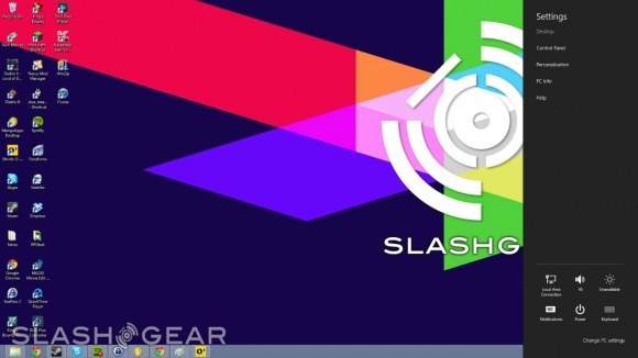
In this menu bar, you have five different options. You can open up search, which is a super-fast way to find programs that are installed on your machine; you can open up a share submenu, which will let you share a link to any app on the Windows 8 store; you can click the Start button to be taken to the start screen; you can click the devices button to check the various devices you may have connected to your computer; and finally, you can open up the settings menu, which changes depending on whether you're accessing the settings from the desktop, Start page, or within apps.
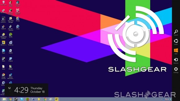
If you're on the desktop, you have the option of opening up the Control Panel, the personalization hub, your system information, and the help menu. It's here that you also have access to volume controls, Internet connections, Windows notifications, and power options like shut down, restart, and sleep mode. If your monitor supports it, you can adjust the brightness from this menu bar, and you can also switch between languages supported by your keyboard. Again, this serves to improve ease-of-use over previous Windows versions, as it means that you don't have to go searching through the Windows Explorer to find these individual submenus.
If you're on the Start screen, you don't have as many options with the settings menu, as it only allows you to change your tile settings and opening up the help menu. You also have access to the power, notifications, Internet, volume, keyboard, and brightness submenus from the settings on the start screen, but you'll most often be accessing the settings menu on the desktop rather than the Start screen.
The settings menu will also change when you access it inside a Windows 8 app. When you do, you'll be given individual settings for the app you're using, which is great. Accessing different settings by carrying out the same action saves a lot of time, and it means that you get one straightforward way to do a lot of different things.
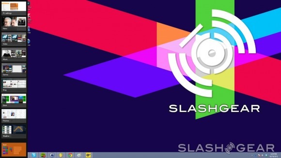
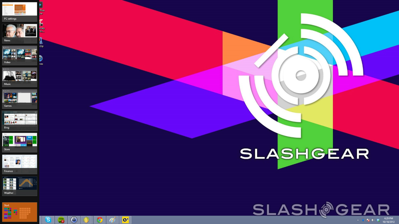
By clicking on the upper left-hand corner of your screen, you can quickly switch between your desktop and any Windows 8 apps you have open, whereas by bringing your cursor to the upper left-hand corner and "swiping" downwards (or upwards from the lower left-hand corner), you can open up another menu bar that shows you thumbnail images of your desktop and the Windows 8 apps that are currently running. Clicking and dragging a thumbnail into the center of the screen provides an alternate way of switching between your desktop and Windows 8 apps. In short, by bringing up the menu bar on the side of the screen, you can jump back to any Windows 8 apps you have running without having to go back to the Start screen first, which definitely comes in handy when you need to quickly switch over to check something.
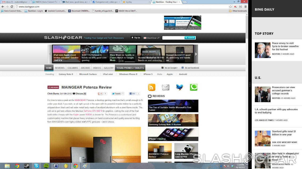
Right-clicking on one of those thumbnails will let you snap the app to the left or right side of the screen, which is basically a dream for multitaskers. This second app will take up about 20% of the screen, but there's a bar separating the two apps that you drag over to let it take up the majority of the screen when you need to use it. It's a nice feature to see, but obviously, you might not want to use it as often if you're using a lower resolution on your display. Screen real estate will already be at a premium if you are, so it might just be a better idea to only look at one app or program at a time.
If you bring your cursor down to the lower left-hand corner of the screen and click, you can switch between whatever you currently have on-screen and the Start page. This is something that definitely takes some getting used to, especially on the desktop, as you'll need to get your mouse into the corner of the screen before you can click to switch. Anyone who is used to the traditional Start button will struggle with this at first, since you'll probably find yourself mindlessly clicking in the general area of where the Start button used to be before remembering that it's been replaced with a Start screen. More often than not, doing this will open up the first program pinned to your task bar, which can lead to some headaches when you're just starting out. It won't be long before you get the hang of it, however, and you'll be switching between the Start screen and the desktop like you're a Windows 8 pro in no time.
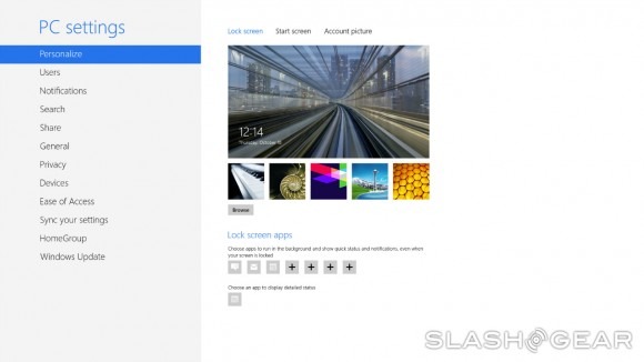
There's also a lock screen present in Windows 8, which again is something that makes sense for touchscreens but seems a little out of place on desktop PCs. The lock screen is the first thing you'll see when you boot up your computer, and through the PC Settings submenu you can assign a new background image and designate a handful of apps that will display information. It's a fancy touch, but as I said, its use seems somewhat limited if you're using Windows 8 on a desktop.
Make no mistake, Microsoft has made a lot of changes with Windows 8, but for the most part, the Windows we know and love is still intact. The desktop is more or less the same as it was in Windows 7 (with exception of the now-missing Start button, of course), and you can still delve into the depths of your computer by using Windows Explorer. I've found that most of the user interface changes Microsoft has implemented in Windows 8 are for the better, though it would dishonest if I didn't mention that there were some that left me scratching my head. The necessity of the changes may not be immediately clear at the moment, but I think they will be once we examine Windows 8 apps a little closer.
Windows 8 Apps
Windows 8 comes installed with a number of apps right out of the box, though in order to use most of them, you'll need to be signed into your Microsoft account. Of course, the Start Page is incredibly customizable in the sense that you'll be able to add any number of new apps you purchase from the Windows 8 Store, so for the sake of brevity, we're just going to cover the ones that come pre-installed with Windows 8 so you can get a better idea of their purpose.
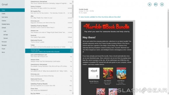
The usual suspects are all present and accounted for, including Mail, Calendar, and Messaging. Since I signed up for my Microsoft account with my Gmail address, my Gmail inbox was there the very first time I opened the Mail app, but you can add other accounts easily. The Mail app gave me all of the functionality of my Gmail account, which means that by accessing the Mail app, I save an extra step or two by cutting out the need to open up a browser and sign into my Google account.
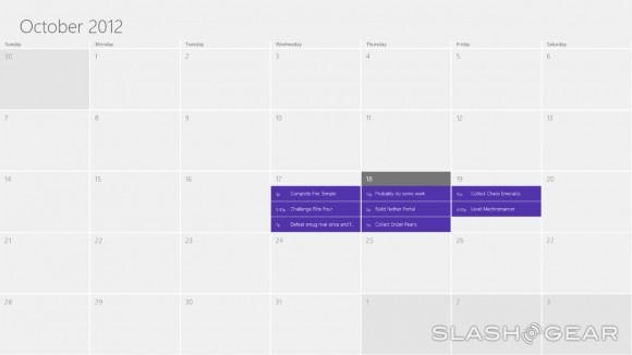
The same seamless integration mentality applies to Calendar. Upon opening it for the first time, I was greeted with my Google Calendar, and edits I made in my Google account immediately showed up in my Calendar app. That kind of integration can't be understated – it's really, really nice to have Microsoft implement something like this. It means that the amount of setup that falls on the shoulders of users is next to nothing, which will definitely be appreciated, particularly by those who feel a little overwhelmed when seeing all of the changes Microsoft has made in Windows 8.
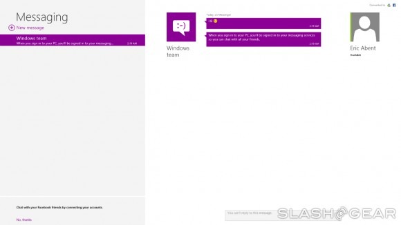
With the Messaging app, you've got MSN (or whatever it's called these days) integrated from the start, but you have the option of integrating other accounts to turn the Messaging app into one big messaging hub. For instance, I was presented with the option of linking my Facebook account to get Facebook chat right in the app – I didn't take Microsoft up on that offer though, since I've never been a big fan of Facebook chat. Still, that will be an option that a lot of people like, so it's good to have it around.
Next we come to the People app, which like the Messaging app, serves as another hub. You can link all of your favorite social networks to the People app, which means that you collect all of your contacts across multiple accounts and networks in one place. You don't get the full functionality of each social network along with the People app – you can download individual apps from the Windows 8 Store for that – but it's still nice to have all of your contacts collected in one place.
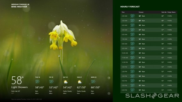
The Weather app is powered by Bing Weather, and naturally gives you forecast information for your area. It gives you a very broad range of data, including a five day forecast, an hourly forecast, more maps that you can shake a stick at, and even historical weather information. The Weather app is especially handy simply due to the fact that it presents you with a plethora of information. After checking it out, I see no reason to visit any of the weather sites I used to.
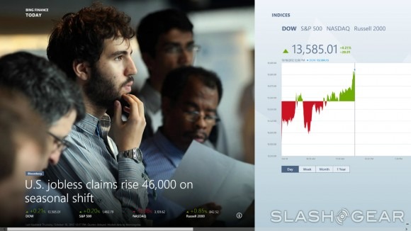
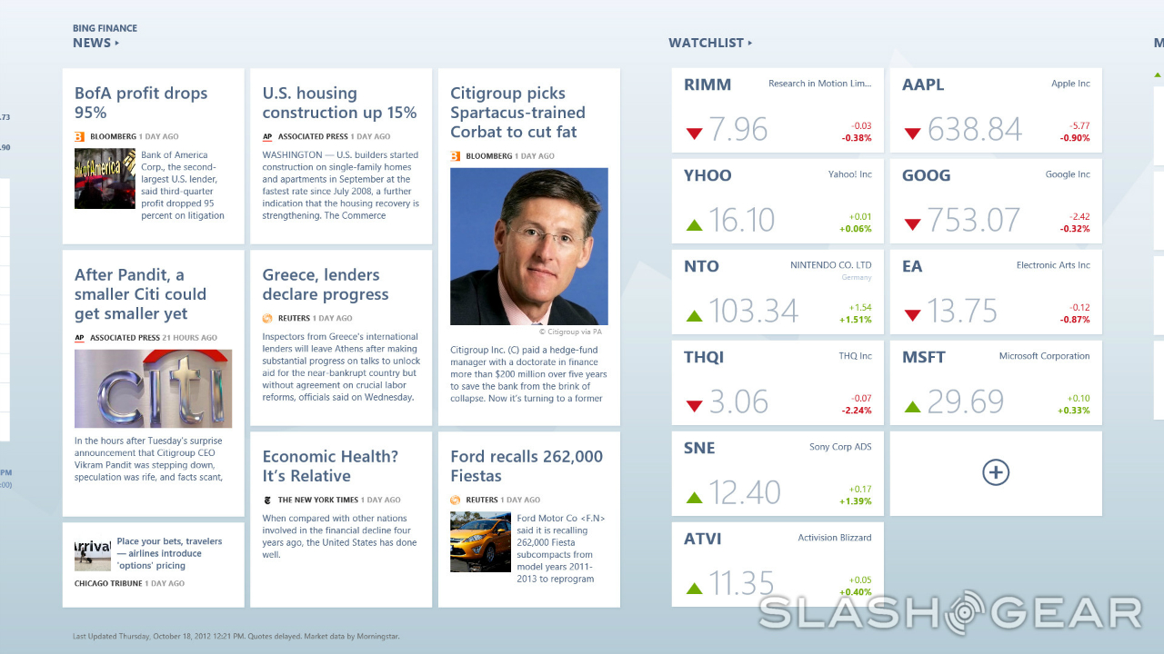
We also have News, Financial, and Sports apps to take advantage of, with each one offering a ton of information from different sources. The Financial app is particularly impressive, as it not only gives you a collection of financial news from a bunch of different publications, but it also allows you to set and follow individual stocks. Not only that, but the Financial app provides you with a list of "market movers," as well as information on currencies, commodities, bonds, and mortgage rates. You've got an impressive amount of information at your fingertips with the Financial app, and it will prove extremely useful for those who follow the market for one reason or another.

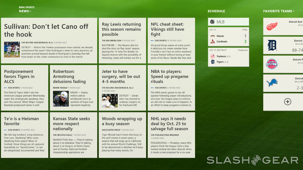
The Sports app is similar to the Financial app, in that it gives users a collection of news stories from a number of different publications and allows them to follow their favorite teams right there in the app. By right clicking anywhere in the app, users can bring up a menu that allows them to view news for different organizations and sports, whether that's the NFL, NBA, NHL, Golf, the Premiere League, of Formula 1.
The News app is pretty straightforward, as it brings you selections of news stories from the political, entertainment, technology, and business worlds. It's worth pointing out that the news stories you read in the app aren't as fully featured as those same news stories on the Web – for instance, if the author of the story posts a video, it won't appear in the app's reprinting of the article – but it's still a good resource to use if you need a quick rundown of the day's top stories.
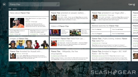
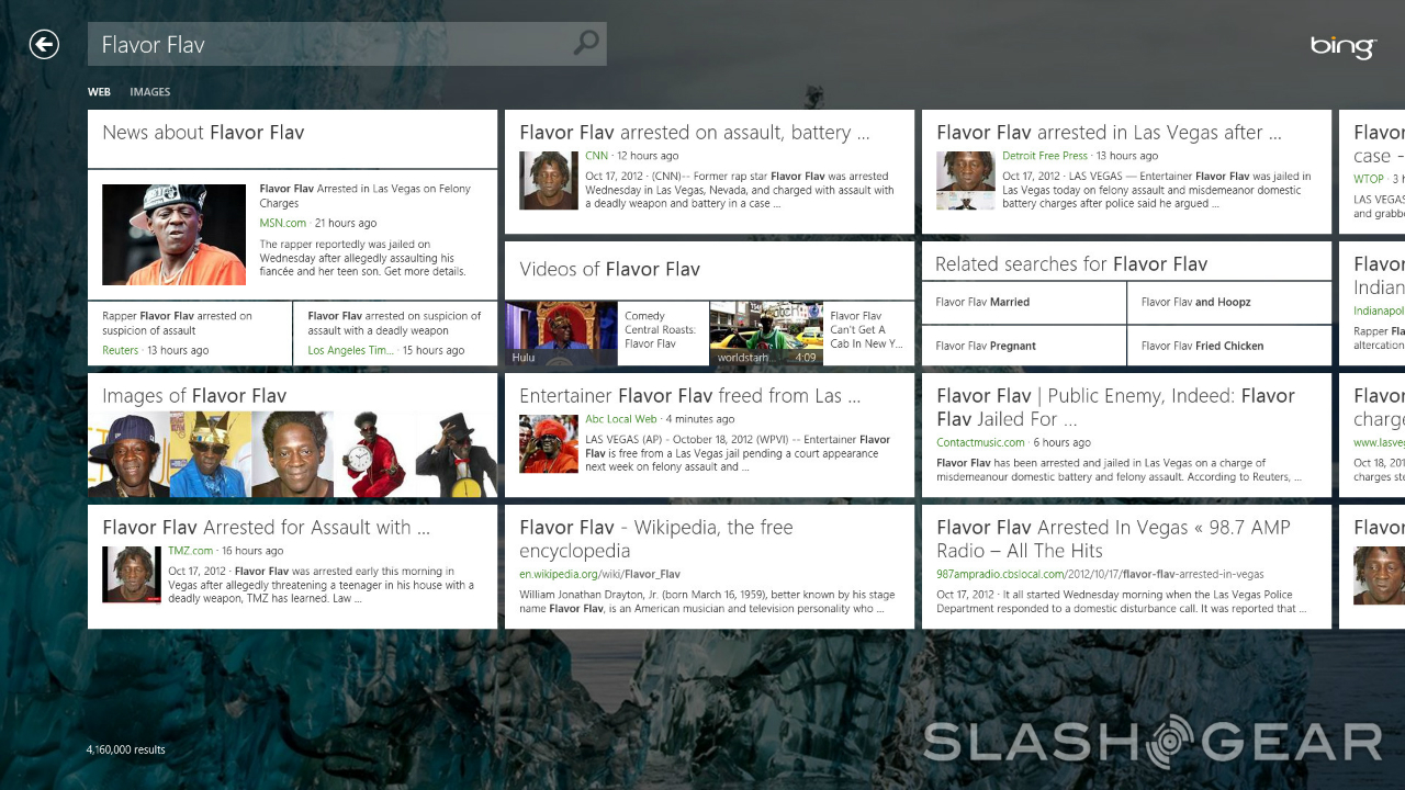
Naturally, with Windows 8 being made by Microsoft, you've also got a Bing app. The Bing app is pretty basic, as it allows for quick search and an overview of trending topics. This one didn't see too much use from me, because to be honest, even though the Bing app looks good, I'm still a Google guy. There's also a Maps app to take advantage of, which is powered by Bing and Nokia. The fact that Nokia is along for the ride makes this app instantly appealing, as Nokia has done a lot of good work in the maps space. This is one app that won't see too much use on desktop, but you can bet that it will get some heavy use on tablets and laptops.
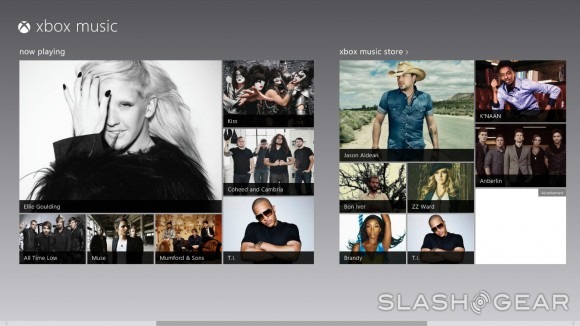
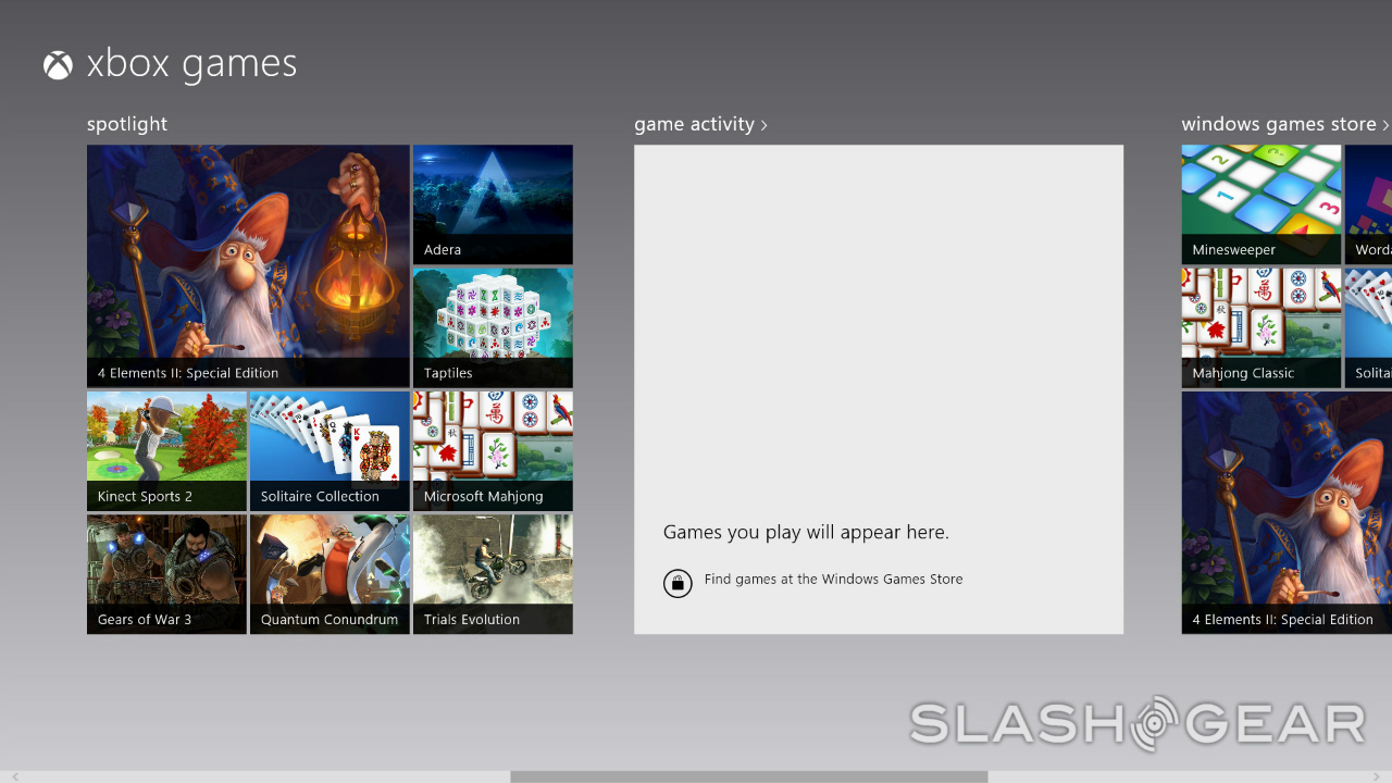
Next we come to SkyDrive, Music, Movies, and Games. SkyDrive is Microsoft's own cloud solution, but it's really like any other cloud app out there – choose files to upload to the cloud, and then you can access them from anywhere after you've signed into SkyDrive. Xbox Music, Xbox Movies, and Xbox Games are essentially just stores where you can buy movies, television shows, music, and games but they also display the relevant files you have stored on your computer right there in the app. I have to say, it's nice to see these three get their own apps, since that means that you won't have to trudge through a bunch of other app listings just to find the entertainment offerings.
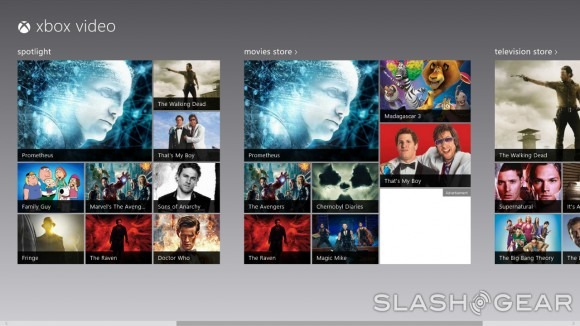
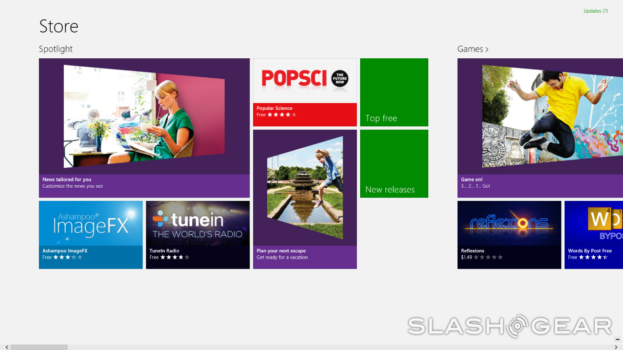
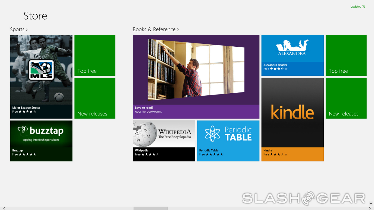
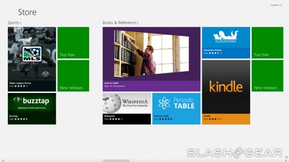
Finally, we come to the Windows 8 Store. The Store reminds me a lot of the Xbox 360 dashboard, and more specifically the Xbox Live Marketplace. There are already a healthy number of apps available for Windows 8, and they're split up into different sections right from the start, making navigation easy as pie. The Windows 8 Store is one of the most exciting parts of the Windows 8, and I'm really interested to see it become even more fleshed out.
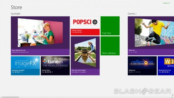
I'm already impressed with the apps that Microsoft has packed in with Windows 8, and I'm sure that once developers are pushing out apps for Windows 8 full-time, I'll be even more impressed. The Windows 8 Store is one of the operating system's strongest offerings, and its existence makes Windows 8 even better. It helps draw further distinction between apps and actual Windows programs too, and has convinced me that there is a reason for that distinction – before, I thought it was rather pointless to have "apps" that were separate from regular old programs, but Windows 8 did a good job of winning me over. In short, I'm sold, and I look forward to seeing how Windows 8 grows after release, especially from an apps and marketplace standpoint.
Performance
Before we wrap this up, I want to touch on the performance of Windows 8. When it came time to install Windows 8, my copy of Windows 7 was starting to struggle a bit. This, of course, is due to the fact that over the past two years I've packed my hard drive with a lot of stuff (most of it worthless, admittedly) and that my computer was starting to show its age somewhat. Imagine my surprise, then, when I booted up Windows 8 for the first time and discovered that it moves very fast.
Opening up the search panel and looking up a program is incredibly quick – much faster than using the search bar in Windows 7's Start menu ever was. Just the same, switching between the desktop or open apps and the Start page is seamless and almost instantaneous. The sidebar menus pop up quickly when you get your cursor in the right position, and it only takes a few seconds for an app to load after selecting it.
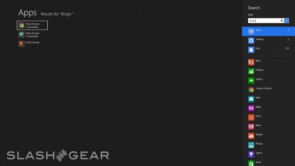
Boot and shut down times have also been significantly decreased. Whereas it would take 30 seconds to even a full minute to boot and shut down Windows 7 (for me at least), Windows 8 boots in about 15 to 20 seconds, and shuts down in about the same amount of time. Naturally, this is going to change depending on the power of your processor and whether or not you have an SSD installed, but for someone who has been chugging along for almost two years with a nearly full hard drive, those times definitely aren't bad.
Microsoft has also taken measures to hide the fact that some things may not load as quickly as others. Let me give you an example: I have a lot of stuff on my desktop – or at least I did before I cleaned it up a bit for these screenshots. I had so much stuff that, even after booting Windows 7, it would still take an additional 20 seconds or so for the items on my desktop to fully appear. It still takes the same amount of time for my desktop to load, but that's something I hardly notice anymore, since the Lock and Start pages load instantly once Windows 8 has been booted. Even though the desktop still doesn't load as quickly as it once did, it's not much of an issue these days, thanks to how fast the Start and Lock screens appear.
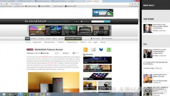
But speed and fluidity in use make up only a small slice of the larger performance pie. The new features that are present in Windows 8 make it much easier to multitask and get the information you need quickly. At the end of everything, Windows 8 represents a lot of improvements for Microsoft, but are those improvements worth an entirely new version of the Windows OS?
Wrap-Up
By now, you've read all about my experience using Windows 8, and as a Windows 7 die-hard who was unwilling to change while the rest of the world was talking about Windows 8, I have to say that I'm impressed. Microsoft has made a lot of really smart changes with Windows 8, and very few (if any) seem frivolous.
That alone is worthy of praise, especially since in the past, Microsoft has known to pack new versions of Windows with unnecessary features. True, the Start screen isn't quite as useful on desktop as it will be on touchscreens, and Windows 8 in general is clearly geared toward to ease-of-use on tablets and laptops. To be honest, it may have been better if Microsoft had put out a version of Windows 8 that was specifically made with desktop PCs in mind, instead of releasing an operating system that tries to work on multiple levels with all sorts of different devices.
I'm not saying that to undercut the advancements made with Windows 8 though, because there are certainly plenty of them. Windows 8 is beautiful, it's fast, and most importantly, it's easy to use (once you get through that initial rough patch of adjusting to the changes, at least). Microsoft only made changes where they would matter, and has left much of the Windows we know and love untouched. The company deserves a pat on the back for that one, because it realized that not everything about Windows needed to be completely revamped in this latest release. Some things have been entirely overhauled, there isn't any doubt about that, but the fact that some things have been left untouched speaks volumes to the idea that Microsoft really thought this through and didn't simply change for the sake of offering something totally different.
This is only the beginning too; even though I'm impressed with Windows 8 at this early stage, I know it's only going to get better as the Windows 8 Store begins to flesh out more. I think having apps made specifically for Windows 8 is going to be a big draw of the OS, especially once people get their hands on the full version and begin using apps on a daily basis.

I know there has been a lot of controversy surrounding the extreme UI changes Microsoft has made in Windows 8, and indeed, those changes take Windows in an entirely different direction. As far as I'm concerned, however, the change in Windows 8 is only a good thing and should be embraced. It may not be the Windows we're comfortable using right out of the box, but it won't be long before hesitant users begin to realize the value in Windows 8 – the fact that it makes multitasking easier, the fact that it sports a lovely new Start screen, and the fact that ease-of-use has shot through the roof. For that reason alone, Windows 8 is a worthy successor to Windows 7, and worthy of your attention. Dissenters can keep complaining as often and as loudly as they want, but I'll be too busy enjoying Windows 8 to notice.
