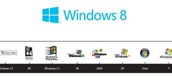
Windows 8 Logo Revealed
Microsoft has revealed a new Windows logo, coming into play with Windows 8 and intended to better mesh with the Metro UI used in the new OS and indeed Windows Phone. Gone is the wavy, four-color flag, replaced by a single color skewed four-pane block; Microsoft says the original, simple logo of Windows 1.0 had been corrupted by the temptations of color, animation and 3D capabilities, and this new version will take things back to their roots.
"Microsoft and Windows are all about putting technology in people's hands to empower them to find their own perspectives. And that is what the new logo was meant to be" the company says about the simple squares, which are the handiwork of Paula Scher from the Pentagram design agency. Don't think it came easy, either: it involved a sit-down meeting for a full day with several people from the design team, designers and marketers from Microsoft and the Windows team, and others from around the company.
The new version is flat and clean, and Microsoft says that – like the Metro UI, with its absence of fake shadows, artificial materiality and ostentation – it's "Authentically Digital" and even humble. The blue color isn't fixed, either; if you change your preferences in Windows 8, the logo – in software, at least, not the one silk-screened onto your laptop or tablet – changes color too.
The new logo is already prompting controversy, with mixed feedback about whether it's a clean design or, in fact, looks a bit cheap and underwhelming. Let us know what you think in the comments.
