Windows 11 First Impressions: 5 Features I Love, Plus 1 I Hate
Over the past few weeks we've been testing both early builds and (over the past week) a final public build of Windows 11. During that time, I've set aside 4 features that exemplify the overall positive experience Windows 11 has been in our testing and review process so far. I also have one significant complaint, and it has to do with an element that might just be unavoidable.
5. Snipping Tool
Over the decades I've been using desktop operating systems for work and play, snapping screenshots hasn't always been a particularly intuitive experience. With Windows 11, Microsoft seems to have come around to the idea that capturing a screenshot a key part of the desktop experience.
Finally, with the latest iteration of Windows' tools for screengrabs and the editing of said captured imagery, Windows 11 has a Snipping Tool that's not just the bare minimum. It still works simply: WIN + SHIFT + S, and now the captured imagery is treated with a bit more respect.
4. Pen & Windows Ink
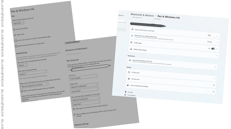
Like many of the features in Windows 11, Pen & Windows Ink has been simplified and expanded at the same time. Settings are reduced from 14+ lines of options and check-boxes and etc. down to 8. From this one screen, these 8 options on the screen (aside from Get help and Give feedback), give access to all the options available in Windows 10 (and more), but make the entire experience of settings access much, MUCH more simple.
3. Quick Settings
We've had access to an iteration of Quick Settings in Windows 10 – they've been around for a while now. The important bit in Windows 11 is how this feature has become boiled down to its most essential elements.
With Windows 10, this feature launched a 100% height interruption of the screen to the right, complete with notifications from apps. I haven't needed access to these notifications with this feature once since I've had access to this feature in Windows 10.
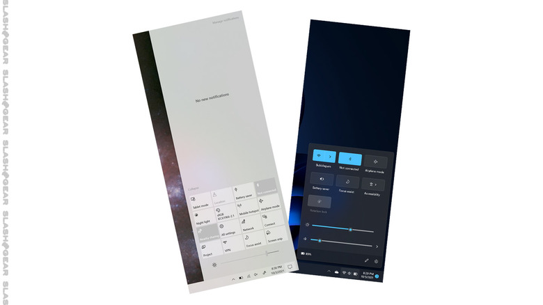
In Windows 11, WIN + A delivers a rounded-corner rectangular control panel with toggles for Battery Saver, Focus assist, Airplane mode, Bluetooth, and wireless internet, with quick access to Accessibility. This panel also has sliders for screen brightness and volume, quick access to volume settings, and a robust menu editing system. This editing system allows you to add toggles for Casting, Keyboard layout, Mobile hotspot, Nearby sharing, Night light, and Project (screen projection), and the ability to move all toggles and sliders around the menu. It's just NICE.
2. Voice Typing
In the past, the ability to transcribe audio into text required the use of dictation software. Now, at long last, "Voice Typing" is enabled in Windows – right inside the OS. Windows 11 enables Voice Typing (so long as you have a Windows PC with microphone capability), multiple ways to access the feature.
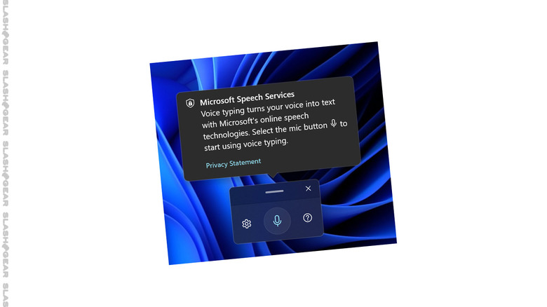
There's a basic Voice Typing launcher, there's the Microsoft Edge context menu, an on-screen keyboard button, and a physical keyboard hotkey combo (Windows + H). This Voice Typing feature works with surprising accuracy, with both inflection and rhythm in voice detection for automatic punctuation.
Above you'll see a demonstration from Microsoft of how the Voice Typing feature works. You'll also see a bit about the Touch Keyboard system in Windows 11, which has been a (mostly) positive experience for us as well.
1. Personalization
In Windows 10, "Personalization" was a settings menu with access to Background, Colors, Lock screen, Themes, Fonts, Start (options), and Taskbar (options). The system with which this series of options were presented felt disjointed and almost... forgotten?
Now, with Personalization in Windows 11, Microsoft finally has a settings system that looks like it was thought out and arranged all at once. Now it feels more like Microsoft considers Personalization more like a key component of the experience.
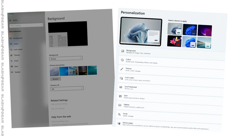
At the top of this settings menu is the most important bit – a series of 6 themes, each of which have their own series of curated colors and backgrounds. You can change these further if you like, but the quick access to well-considered basics are going to be ideal for the vast majority of users.
Personalization still has access to Background, Colors, Lock screen, Themes, Fonts, Start (options), and Taskbar (options), but it also gives quick access to Touch keyboard (themes, size), and Device Usage.
That which is included with Device Usage is actually the bit about Windows 11 that I like the least.
0. Recommendations
Windows 11 features options under "Device usage" that allows you to "select all the ways you plan to use your device to get personalized tips, ads, and recommendations within Microsoft experiences." You can select Gaming, Family, Creativity, School, Entertainment, and Business.
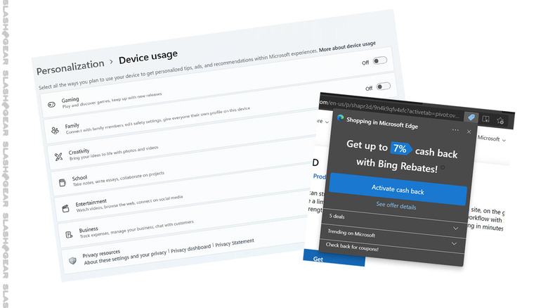
I am glad that Microsoft includes this system of "personalized" elements as optional throughout the operating system. Microsoft does still attempt to get users to choose their pre-installed apps and services instead of 3rd-party options (see: Microsoft Edge), but nothing in this regard seems to stick around for long.
Ideally I'd like to see all software and hardware companies leave the "recommendations" to more objective 3rd party groups. I'd also like there to be no such thing as user info tracking and product recommendations based on computer algorithms, but that's not the world we live in today. I am glad Microsoft allows tracking and recommendations to be turned off in Windows 11, at the very least.
