Why Volvo's Autonomous Car Concept Is The Most Realistic Yet
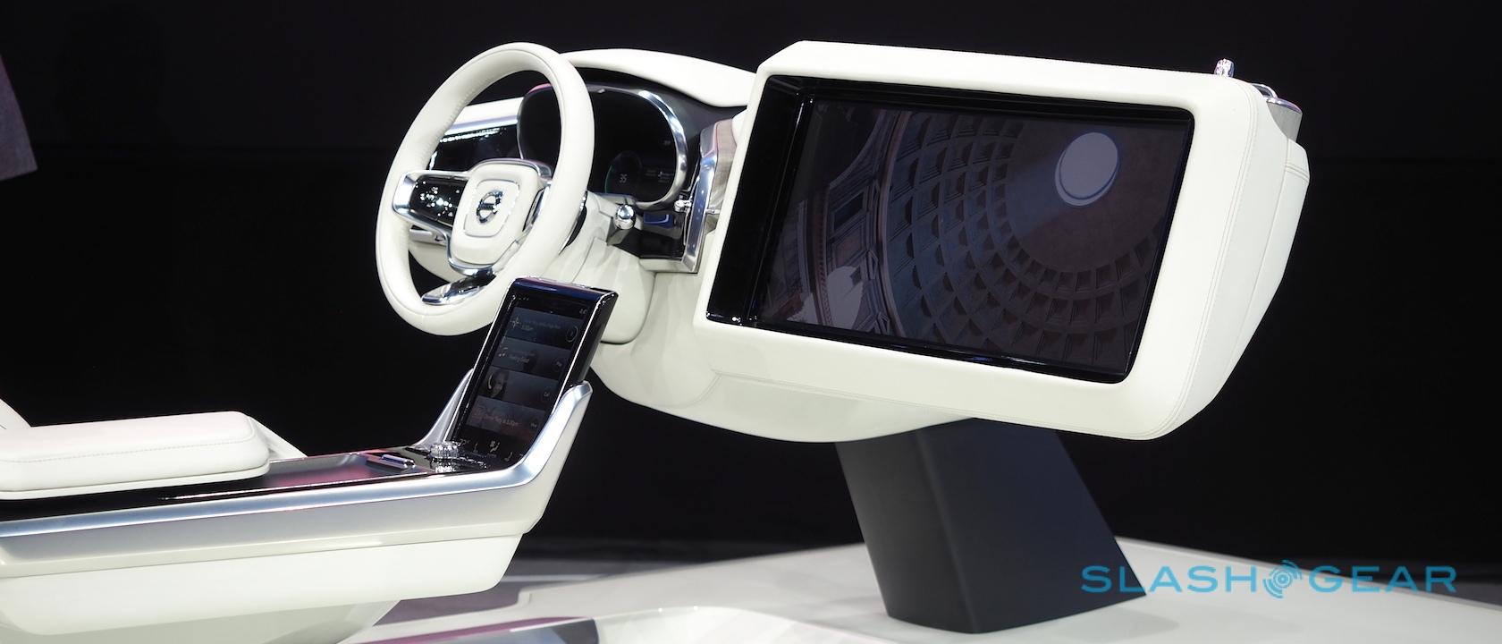
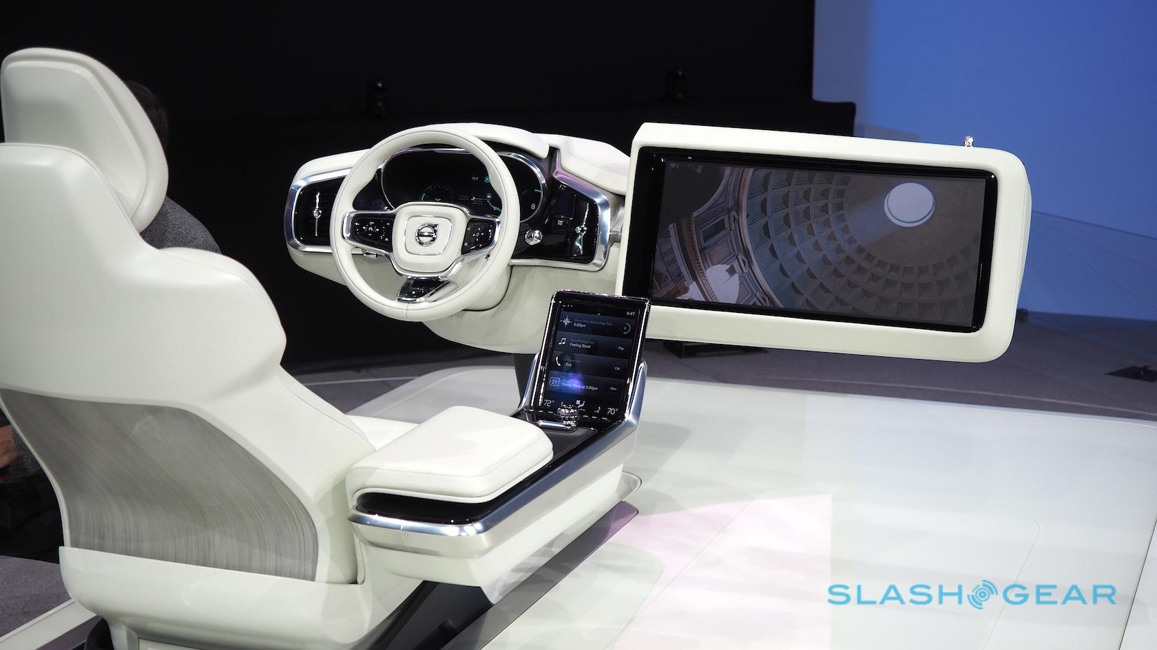
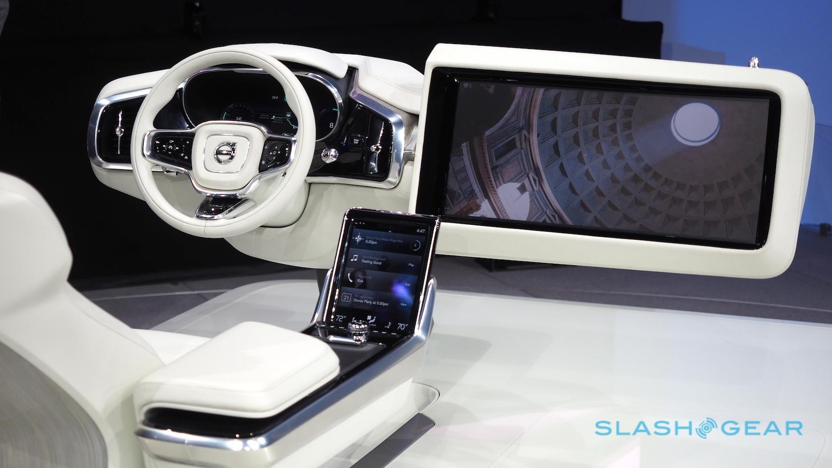
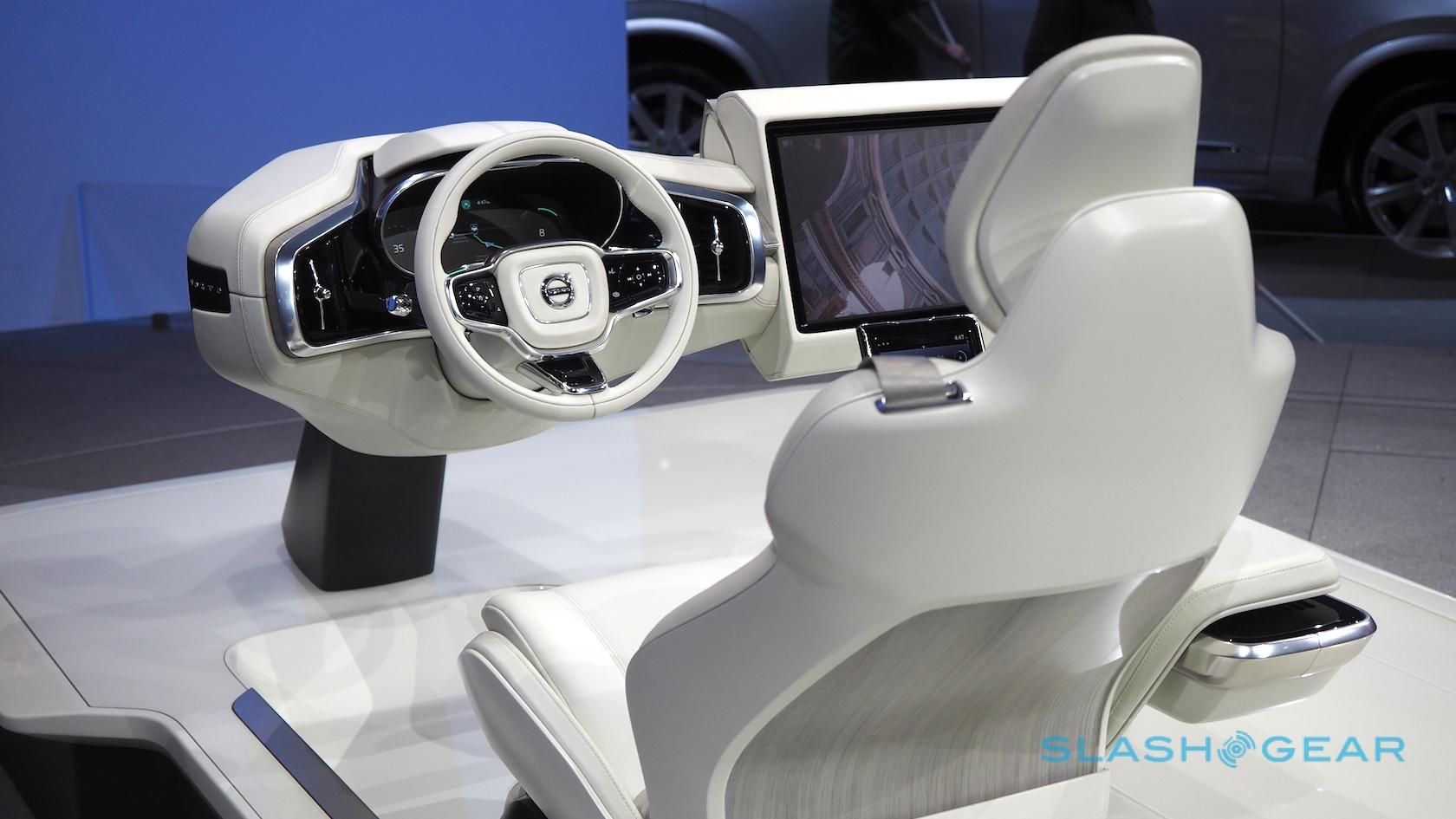
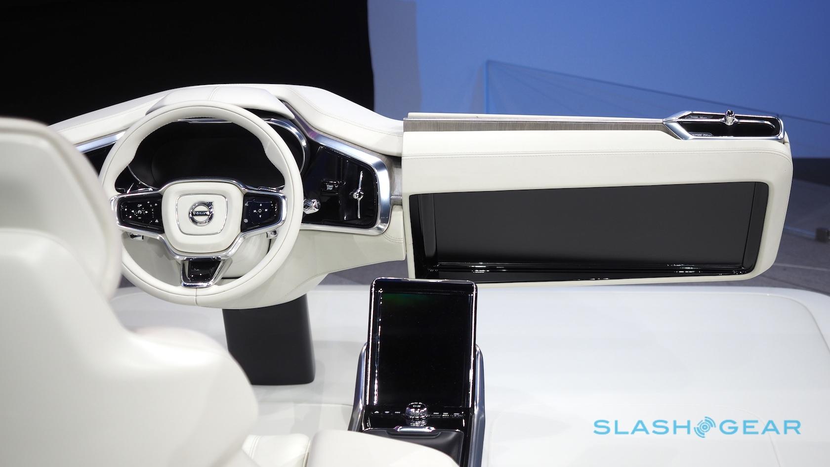
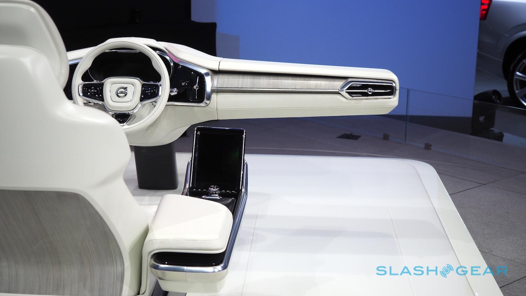
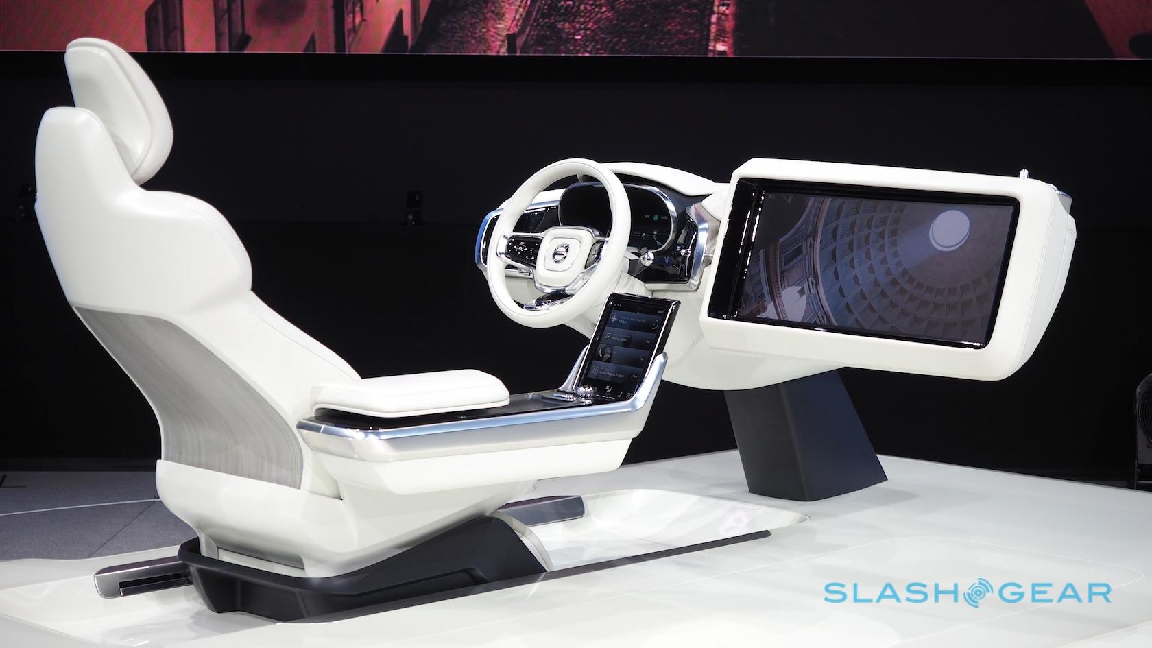
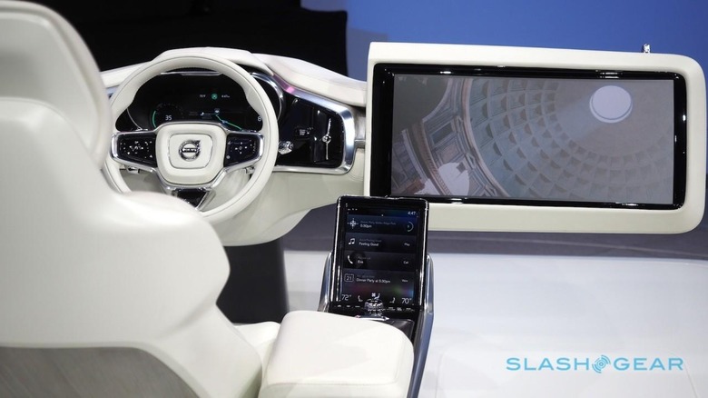
Volvo's autonomous car cabin might look like a Michael Bay movie, but the Concept 26 dashboard has a surprising vein of practicality most rivals are yet to attempt. The huge swiveling touchscreen and motorized wheel have the theater of a designer's fancy, but the sensible Swedes have actually thought through a lot more than how to build big, eye-catching displays into cars somewhere in a nebulous future.
It's a move to answer one of the lingering questions around self-driving vehicles: how they'll interact with the suddenly-idle driver. The transition between manual control and the computer taking charge is widely expected to be one of the trickiest moments – particularly in a situation that overwhelms the car's systems and demands the driver unexpectedly take the wheel – in any autonomous experience.
In Concept 26, Volvo suggests that physically moving the driver will be one way of highlighting the changing role. When planning a journey using the car's navigation system, either the fastest route can be calculated or the route that involves the greatest proportion of assisted-driving.
The value, as Volvo sees it, is in knowing in-advance how much time you'll have to read a book or catch up on your emails. The driver's seat pulls back and the wheel retracts to emphasize the change in roles; at the opposite end, a countdown summons the driver back into duty, their seat and controls moving back into place.
Should an incident take place that requires a premature end to the piloted driving, the electromechanical steering is still functional, even if the wheel itself is retracted. Reaching out and turning it will still control the car, and automatically switch back to human control while the seat shifts back into place.

There've been no shortage of autonomous car concepts and prototypes over the last few years, but what's particularly interesting about Volvo's Concept 26 is how production-feasible it is. Rather than hand the designers an empty sheet of paper and give them free reign, the Swedes aimed to create something that could fit into its existing models.
"We don't really have the luxury of doing pie-in-the-sky," Jim Nichols, product and technology communications manager at Volvo Cars of North America, explained to me.
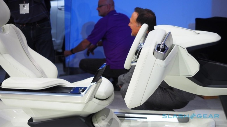
The result is that, while it may appear outlandish with its huge rotating touchscreen section, Concept 26 could actually be fitted into the current XC90. It's been created with the Volvo Scalable Product Architecture – the platform on which the SUV is built, and on which many future Volvo cars and trucks will be – as its key parameters.
As for the tablet in the center console, that's based on the same Sensus infotainment system as in the XC90 too.
According to Nichols, the autonomous technology, and certainly the infotainment technology, are both functionally operational right now. Still, there's a difference between technologically feasible and market-ready.
Instead Volvo plans to roll out its Drive Me autonomous test fleet in Sweden from 2017, a research project expected to last around 1-2 years and explore how self-driving vehicles co-exist with other traffic. In parallel, the interface between driver and car as expressed by Concept 26 will continue to be developed.
The goal is that, once the market is considered ready, so Volvo will be with a practical and safe cabin. The company has already said it will accept liability for autonomous car crashes, unusual in an industry still for the most part blaming legal uncertainties for entirely self-driving vehicles still being some years off.

Today, even with features like adaptive cruise control and the Autopilot technologies Tesla has rolled out, the person behind the wheel is expected to stay attentive: watchful, if not entirely in command.
The reality of the mobility experience when the car shares those duties entirely means the interface of the future will have to strike a new balance between downtime and driving – more, certainly, than just the "stop" and "go" buttons of a Google driverless car dashboard.

