This Is Why Google's New Chromecast Is Unexpectedly Colorful
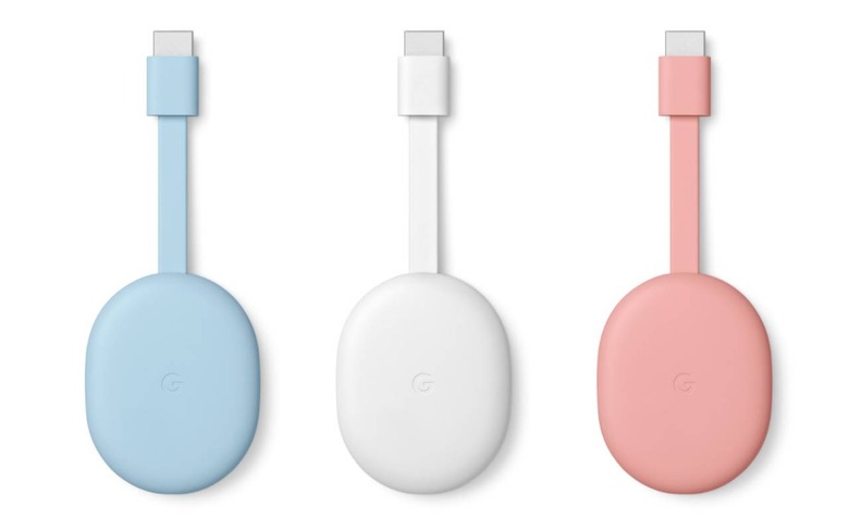
The new Chromecast is Google's most powerful media dongle and finally addresses the issue of the missing remote, but all I could think about when I first saw it was... why did they make it in three different colors? On sale from today, the $49.99 streaming adapter can be had in Snow, Sunrise, and Sky, which seems a weird decision when you consider you'll probably only get to enjoy those finishes for a couple of minutes before you plug it in behind the TV.
We're used to home entertainment hardware being fairly drab and sober. In the early days, A/V devices like amplifiers and speakers were all big, monolithic black boxes; if you were lucky, there might be a silver or a champagne gold version to break up the monotony.
Over the past few years, we've seen companies flirt with softer, more visually-appealing devices. More fabric, picked for its decorative value rather than just to protect the delicate speaker cones. Smooth edges and curves, on the assumption that devices have to look the part even when they're not in use.

Still, that's usually based on the assumption that it's a device you're going to see. The new Chromecast, however, is intended to plug into an HDMI port behind your TV: there's very little chance that you're going to see it at all. Why, I wondered, was Google so keen to make it stand out from the simple black versions that came before it?
"People have different aesthetics, and we really wanted to make sure they could match with the design of their home," Cory O'Connor, product manager on the Google TV team, explained to me. It's also a conscious attempt to harmonize with Google's Nest ecosystem, even if the Chromecast isn't Nest-branded. That way it fits more readily in with devices like the Nest Hub smart display and the new Nest Audio smart speaker.

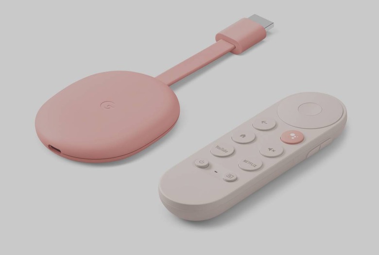
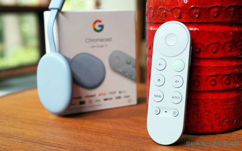
Of course, now that the Chromecast comes with the Assistant-powered voice remote, the different color options do make a little more sense. While the dongle itself may be hidden, the remote – which Google says is in part inspired by the pastel tastiness of a macaron – is more likely to be left out on your coffee table. There it'll probably clash a little with what are likely to be far more boring other remotes for the rest of your entertainment equipment.
Perhaps the most important justification for Google thinking differently for the new Chromecast colors, however, is environmental. "Our range of colors are inspired by the home versus traditional technology, making the object feel more approachable and identifiably Google," a company spokesperson explained to me. "And, dark plastics are very hard to identify in recycling facilities. In our commitment to sustainability, we are reconsidering where we use dark plastics."

Sustainability is something we hear a lot about these days, whether it's the specific choice of materials or the packaging devices come in. The new Nest Audio's 70-percent recycled fabric shell, housing, foot, and a handful of other smaller parts, counts on eco-credibility being as important as sound quality for potential buyers. While we may be used to hearing about types of plastic and fabric, however, the impact of color on how recyclable or reusable they are is less often considered.
In the end, I'm still not entirely sure I needed a salmon pink remote or a pastel blue one, for that matter. Google could probably have got away with making a single, off-white version of the new Chromecast and called it a day. All the same, if I have to look at another remote on my table, the idea that it's slightly less ominous environmentally is a pleasant thought.
