At WWDC, watchOS 5 Paves Way To Apple Smart Glasses
Apple's message at WWDC 2018 that we're too attached to our iPhone seems, for a company the fortunes of which are so closely tied to its smartphone, a strange one. From iOS 12's Screen Time tattling on the apps you're most addicted to, to watchOS 5's increasing independence, you'd almost think Apple was having a change of heart after a decade of making iPhones.
Certainly, for some time to come it'll still be the iPhone in your pocket that cements the Cupertino firm's bottom line. All the same, features discussed at WWDC sessions I've been attending this week – including Siri Shortcuts and the new notifications in watchOS 5 – make it obvious that the way is being paved for a transition all the same. Apple isn't saying "put down your phone," so much as "be prepared to pick up the right interface at the right time."
As a result, the official line is a little more complicated than simply "stop using your phone so much." In actual fact, it's more like "make every interaction the most effective it can be." Nowhere is that clearer than in how watchOS is progressively divesting itself from the iPhone it was once desperately tethered to.
Notifications are the new Apps
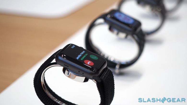
Notifications, Apple says, are the number one reason Apple Watch wearers are strapping the wearable to their wrists. It's fairly ironic, then, that back when the first-generation Apple Watch launched, the way notifications were handled was one of the more common criticisms. In watchOS 5, though, they're getting a lot more powerful.
Part of that is a general tidy-up. Grouped notifications will now be supported, clustering multiple messages, IM chats, and more together if appropriate. Even if you're already looking at a chat notification from a third-party messaging app, if a new addition to that conversation comes in then the Apple Watch is clever enough to append that on.
There's support for two new types of notification, at each end of the importance scale
There's also support for two new types of notification, at each end of the importance scale. At the one extreme, watchOS 5 introduces Critical Alerts. These have more prominent haptics and play a sound even if you have the smartwatch in Do Not Disturb or silent mode. Apple is expecting them to only be used for the most important warnings – think connected medical devices, perhaps – and the apps responsible for them will have to get explicit permission to send them, beyond the general notification permissions.
At the other extreme there are Quiet Notifications. These don't even get a pop-up on the Apple Watch screen: instead, they go straight to the Notification Center. You'll be able to convert an app from regular alerts to quiet versions by swiping left on its notification and choosing the setting there.
What's interesting about Quiet Notifications, though, is that they have more liberal permissions. App makers won't need to ask for explicit approval to send an update direct to the Notification Center: it'll operate, Apple says, as a provisional permission, which in effect will give apps a trial to show users how their alerts will work. You'll still be kept up to date, it'll just be up to you to decide the timescale on that awareness.
It's about making notifications more useful
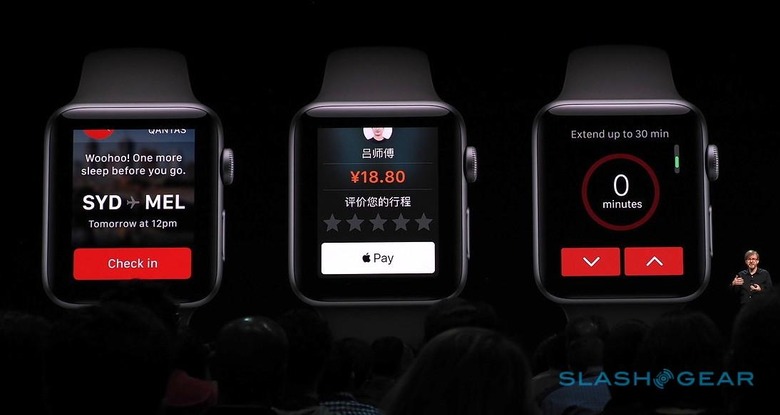
It's not just about making notifications tidier, though: it's also about making them more useful, and helping you avoid grabbing your phone out of your pocket. Dynamic Interactive Notifications are being added in watchOS 5, alerts which also act as highly streamlined interfaces to a few key features of the software they're sent by.
A restaurant booking app, for instance, could not only have a notification that reminds you of an upcoming reservation, but offers buttons to change the number of people at the table. A parking meter app might remind you that your time is about to expire, but in addition the ability to increase the time remaining directly from the notification itself. Dynamic Interactive Notifications will support buttons, switches, sliders, and the Apple Pay button for transactions; you can even have them respond to gestures (albeit with the system gestures taking precedence). At their most extreme they look like long, skinny applications in their own right, through which you scroll with the Digital Crown.
What they don't need, necessarily, is to take you to the app itself. Tapping an Apple Watch notification now automatically opens the app responsible for it, but these new alerts won't work in the same way. Instead, that will need to be explicitly added by the developer.
As I watched Apple's team discuss how much more comprehensive watchOS 5 notifications can be, I couldn't escape the idea that, for the same reasons that app-makers are being pushed to consider a streamlined notification process, so they could be seen as applying just as readily to a head-mounted display. Similarly, the idea of more full-featured – yet still focused – notifications, which not only alert you to something but allow you to swiftly interact with the most essential aspects without pulling your phone out of your pocket or bag, also resonates strongly when you're thinking about smart glasses.
Siri Shortcuts focus on priorities
Nowhere is that more obvious, I'd argue, than with Siri Shortcuts. Apple's macros and shortcuts – built in no small part on its acquisition of Workflow, with a dash of macOS favorite Automator thrown in along the way – promise to surface the most relevant services when and where you're likely to need them most. They also introduce a new hierarchy system.
Siri Shortcuts are designed to show the most relevant shortcut at the top, and the least relevant at the bottom. On the one hand it's down to developers to help organize that hierarchy: there are new relevance provisions which app-makers can use to suggest the times, locations, and other criteria that would help decide when they're most appropriate to surface.
So, the Starbucks app might suggest it gets pushed higher in the list when you're near to your usual coffee stop, while the app for your connected lights might rise through the ranks around the time you usually change the scene for movie night. Your own interactions with them will help shape that prominence, however: if users fail to interact with a shortcut, it'll drop on the page. Conversely, if you regularly scroll down to find a shortcut, watchOS 5 will likely improve its hierarchy in the list.
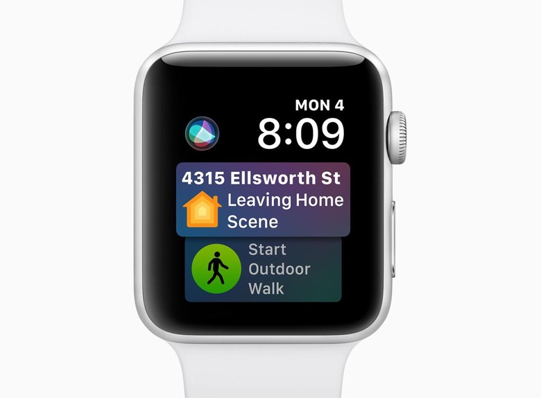
Beyond just individual features, though, the push is to continue turning Apple Watch into not just an adjunct of the iPhone but a standalone device in its own right. That's something we've seen progression toward already, like the cellular connectivity option in the Apple Watch Series 3, and the potential that opens up for calls, messaging, and music streaming beyond the range of your iPhone's WiFi and Bluetooth. watchOS 5 only expands on that individuality.
More than an iPhone on your face
Smartglasses would do better modeling the Apple Watch
It's not hard to visualize this as another step on the path to an augmented reality device. We may all end up wearing smartglasses, but we're not going to want to be constantly interacting with them. An "iPhone on your face" sounds like a great idea, up until you consider how inefficient that would actually be in day to day use. In reality, smart glasses would do far better by modeling the Apple Watch, where Apple once said the ideal length of a quick interaction was just two seconds.
That will require a very different breed of application from what's currently present in the App Store for iPhone. Improving our ratings in Screen Time won't happen if all we do is transpose the screen from smartphone to smart glasses, after all. The beneficiary may be the Apple Watch today, but those same lessons are going to translate just as well to smart glasses, too.
Apple's unspoken message, therefore, seems fairly clear at WWDC this year. There are going to be lots of ways to not only interact more quickly and efficiently with apps and services, rather than spending time digging through software and interfaces, but also do so without needing to have your iPhone in your hand. Initially, that replacement interface will be on your wrist, but pretty much every improvement made for the Apple Watch translates just as well when the "watch" in watchOS refers to your line-of-sight, not your timepiece.
