Your New Phone's Display Was A Waste Of Money
Today I'm going to go over the reasons why the money spent on newly enlarged or otherwise differently-shaped displays is wasted. From the time the new display was made to the point at which it became a standard, in that timeframe. In that span of time, that extra bit of display that wasn't in the mix before – that's useless. It's akin to the black bars you see above and below your movie when you play it in "widescreen" format on your home TV.
Sharpness is Wasted
In the Xperia XZ Premium, we had the first 4K display on a smartphone. Sony knew before launching that it didn't make sense to run all 4K pixels at once, for one simple reason: barely anything was ready for 4K at the point at which the phone was launched.

Instead, this smartphone very intelligently ran 4K only when 4K content was on the screen. Otherwise it ran in 1080p Full HD. Therein lies the rub. Does it make sense to pay for a display with an ultra-sharp panel if you have no content with which to truly experience the entirety of this set of pixels?
Long Ends are Wasted
When the LG G6 was launched, it made use of the world's first smartphone display with an 18:9 aspect ratio. That's just an industry-friendly way of saying it had a 2:1 aspect ratio, aka two squares, one next to the other. LG launched this phone with features that worked specifically for said ratio.
When other brands began launching smartphones with that same extended ratio, where before that displays were a bit shorter, they didn't do a lot to make use of the extra space. As such, some UI cut off at the point where the display used to be, and no additional space was used.
Display Shapes are Wasted
When you've got a display that's not rectangular, parts of the display are wasted. App developers cannot possibly account for the vast number of different shapes and sizes of display, so they're forced to build in flexibility. This in itself is an art. It's one of the most challenging elements in modern software design – designing for displays you might never get to test on.
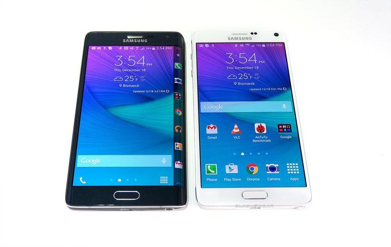
ABOVE: The original Samsung Galaxy Note Edge tried to make use of the cascading display, but ended up making solutions for problems that never existed. Still, it looked nice – isn't that what counts most?
New display shapes most popular today are the curved-corner display, the cascading display, and the notched display. The cascading display, or curved-edge display, is what you see on a Samsung Galaxy S9, for example. Developers can still make use of that curved edge, but it's not the same experience as the full flat touch environment provided by a flat, rectangular display.
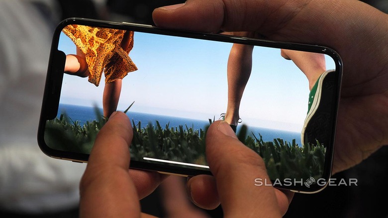
Manufacturers have the opportunity to make use of the notch or the curved corners, but they don't often do so. Apple sort of makes use of the notch in the iPhone X in the software, but for the most part they've just incorporated it as a sort of fanciful interruption in an otherwise fairly basic screen.
What can you do?
App developers of very popular apps are partially to blame for this situation too, but only if the manufacturer of the new displays did not give fair warning to the public of said display's launch. For Android devices, that's exceedingly difficult because of the massive number of different sizes of displays around the world. Because of this, we've got space that's inevitably wasted.
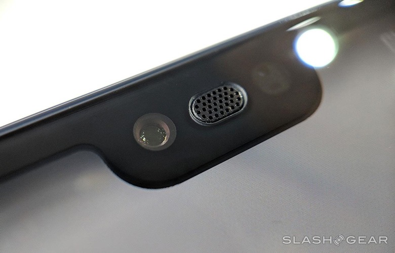
It doesn't have to be a bad thing, this wasted space. I shouldn't even really call it wasted, as some developers are extremely clever about the variables we see in the variety of smartphones on the market today. To them, I say well done! To everyone else: How dare you make a non-rectangular display, you big jerks, how dare you ever even do such a thing.
Get back to me when you've created a smartphone whose display is there to do exactly what it was supposed to do this whole time. That's display the content in a way that's not distracting AND not altered only to attempt to beautify the end product. The smartphone is a container for content, not a fashion accessory.
Leave the alterations to the rest of the device. Want to make some strange choices with the casing for the phone? That'd be totally fine with me. Want to make the color of the phone all mood-lit or filled with LED lights? Go right ahead! But leave that display the way it was meant to be – rectangular and regular.
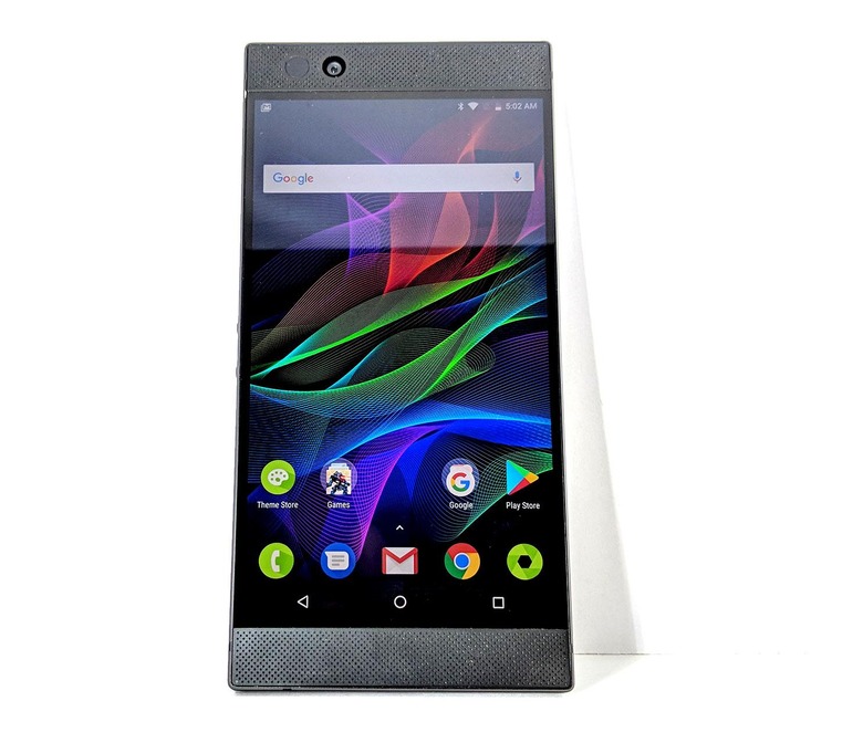
Above you'll see one of the last big-name releases in smartphones left on the planet with the courage to release a display that's standard. No curves on the corners, no cascading edges, no notches. Of all the devices in the world made to appeal to the masses, this supposedly niche gaming phone from Razer does the best for the end user in the display department.
Can a major-label smartphone maker like Samsung or Apple ever make a rectangular display on a smartphone look innovative and "new" ever again? Can they sell smartphones without making displays without wasted spaces? I can't imagine!
