Vivo NEX Dual Display Edition Review
- Beautiful, futuristic design
- Solid performance and battery life
- Decent camera
- Fast fingerprint and face scanners
- Free bumper doesn't provide much protection
- Limited market availability
Some say that innovation isn't a matter of creating something completely original because almost nothing these days is. Instead, it's about taking existing things and mixing them together in a new and exciting way. If that's true, then the Vivo NEX Dual Display Edition, the mouthful formal name of what most will probably simply call the Vivo NEX 2, is perhaps one of the most innovative smartphones these years. Or at least that's the claim that we're now putting to the test.
Specs and Performance
A few years back, the spec sheet would probably be considered the keystone of both smartphone user experience and product marketing. These days, it's often just rattled off as quickly as possible to get to the meatier aspects. Of course, these are still the things that make the Vivo NEX Dual Display Edition, which we'll henceforth call the NEX DDE, be the beast that it is. So we'll give it its due as quickly as we can.
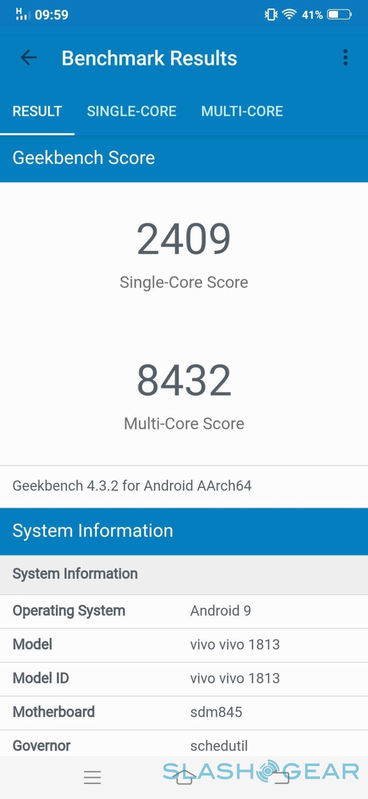
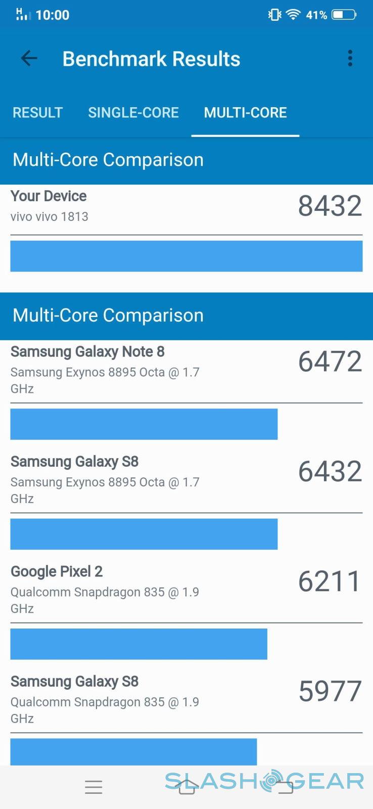
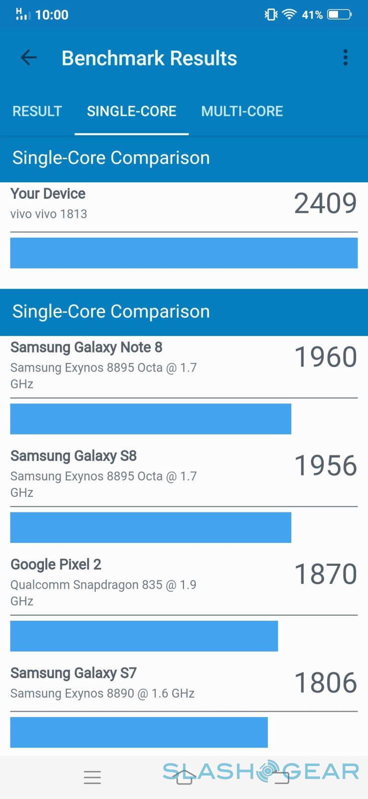
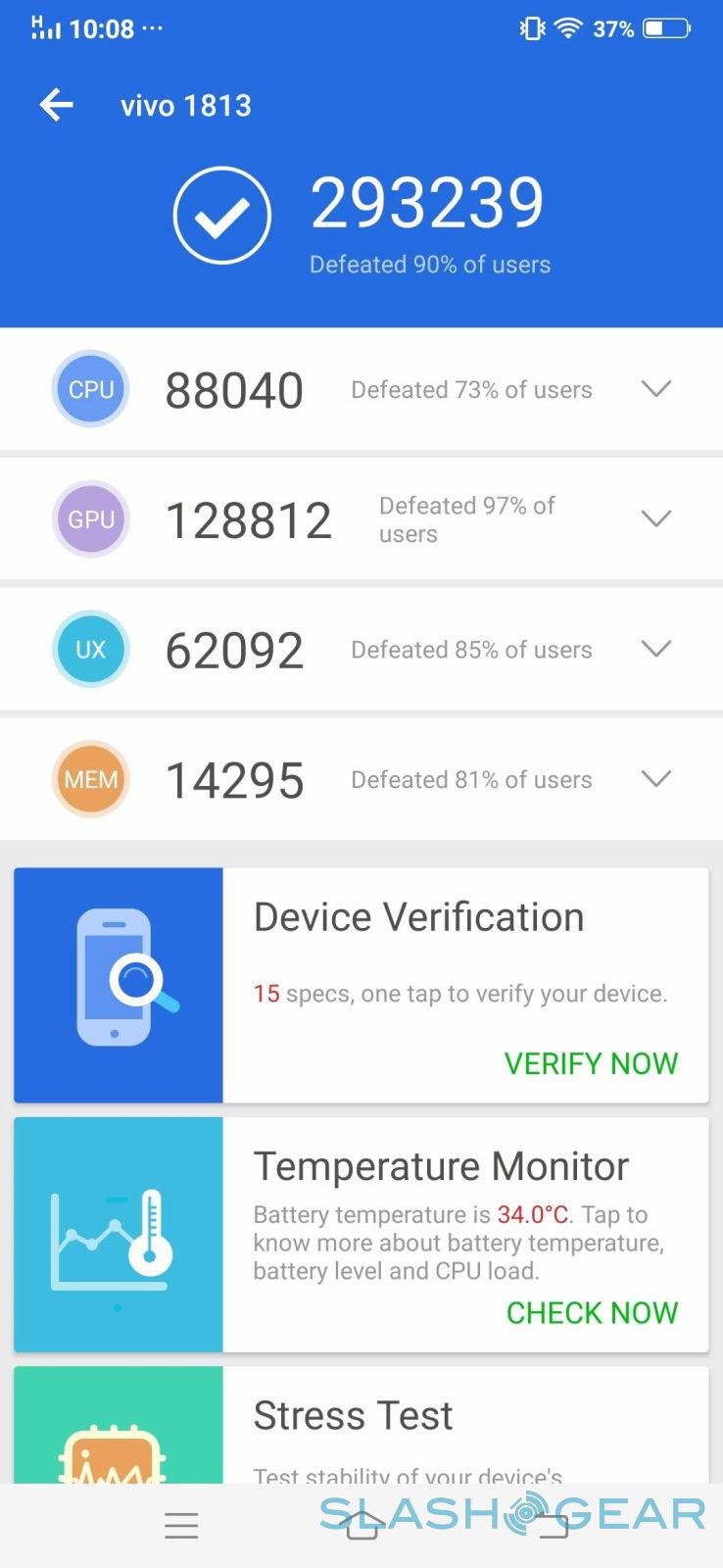
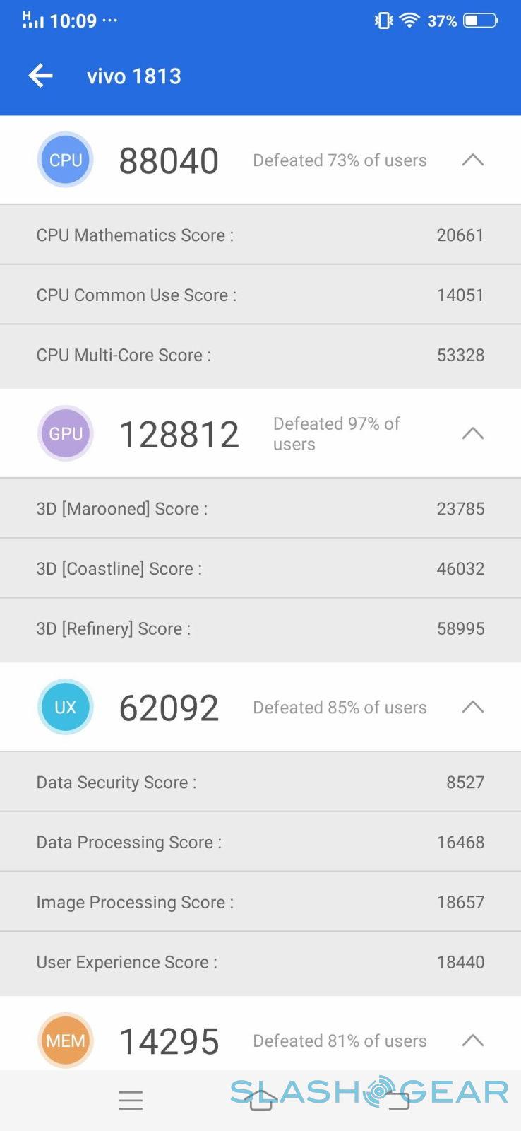
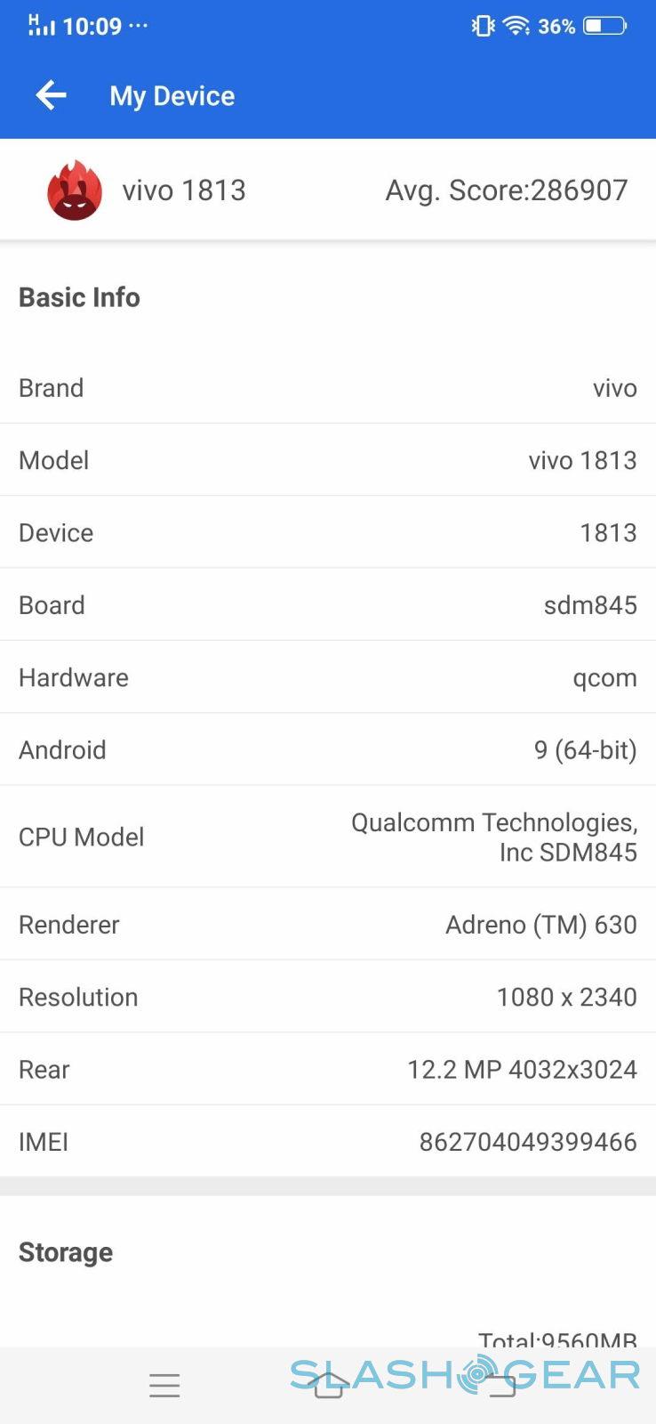
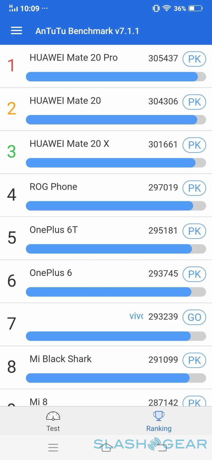
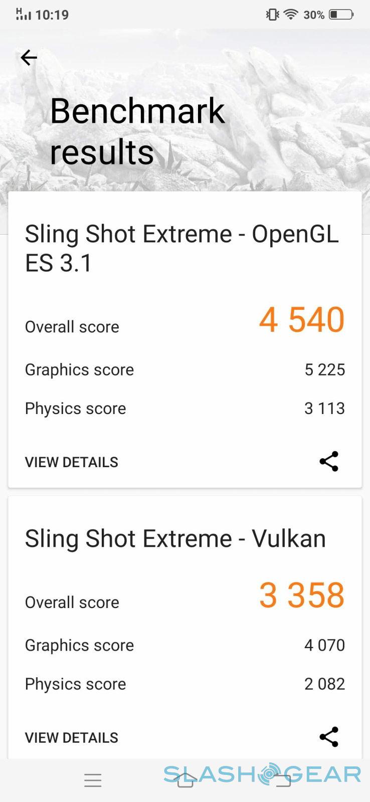
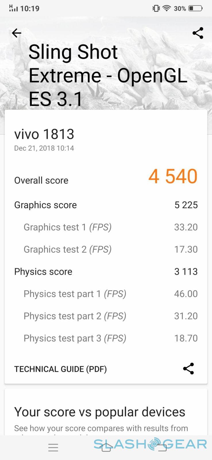
It is, of course, powered by the Qualcomm Snapdragon 845 just like all the heavyweights these days. But it is also paired with 10 GB of RAM, making it one of the first to have more RAM than you can possibly need these days. There's 128 GB of storage and, sadly, that's all that you will get with no other configuration or even a microSD card slot. In other words, it is a beast of a phone in terms of performance, as shown by these synthetic benchmarks.
The 3,500 mAh battery might sound generous, but when you consider the phone's defining feature, you could worry about longevity. Fortunately, having two screens doesn't seem to impact battery life too much, especially since you're unlikely to have them both active at the same time all the time. With mixed use, which includes running benchmarks, we hit the second day with 9% left to spare. More regular use will still most likely last a good day before needing a fast charge.
Design
The Vivo NEX DDE is a pleasure to look at and hold right out of the box. It has an almost perfect balance of weight, which is surprising considering you have a bit more hardware inside. It feels solid but not too heavy and, at the same time, not too flimsy.
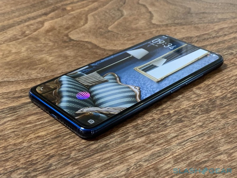
The NEX DDE uses the same glass-metal-glass sandwich but, of course, this time it's also screen-metal-screen as well. The aluminum frame now even has more responsibility in keeping things together and providing structural integrity for the entire phone. Fortunately, it doesn't have much around its edges, just the volume rocker and power button on the right, Vivo's "Jovi" AI assistant button on the left, the USB-C port at the bottom flanked by the SIM card tray and the speaker grille, and, thankfully, a headphone jack at the top.
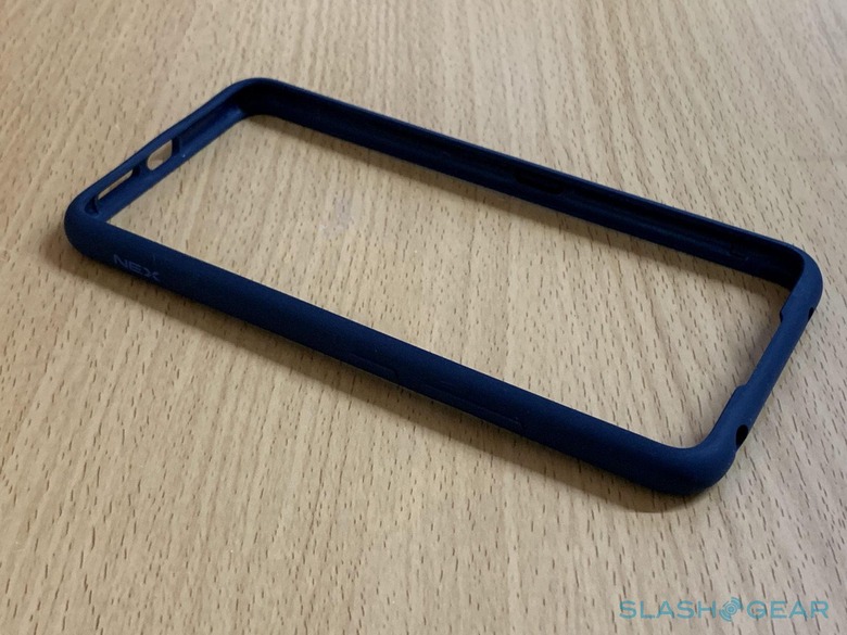
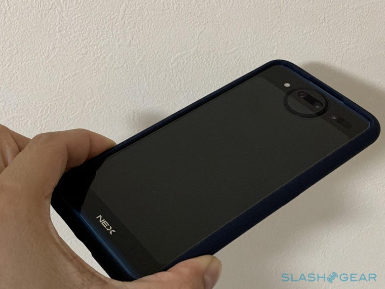
While the NEX Dual Display Edition definitely feels comfortable to hold, there's always the fear of dropping such a glassy contraption. The fear is doubled when you realize that, whether it drops on its face or on its back, it will always land on a screen. Since you can't really put a case on this one, as even a transparent case will make the back screen untouchable, Vivo instead ships with a bumper that not only protects the edges but also provides a buffer between either screen and the point of impact. The bumper matches the color of the phone, which comes in either Blue or Red.
Display, Part 1
Now we come to the meat of the Vivo NEX DDE. Actually not yet. But while the second screen on the back is undoubtedly the pièce de résistance, the front, main screen is just as important. After all, it's what most users will be interacting with most of the time. Not unless the actually prefer to live on the back screen, always ready to take a "selfie" without the need to flip over.
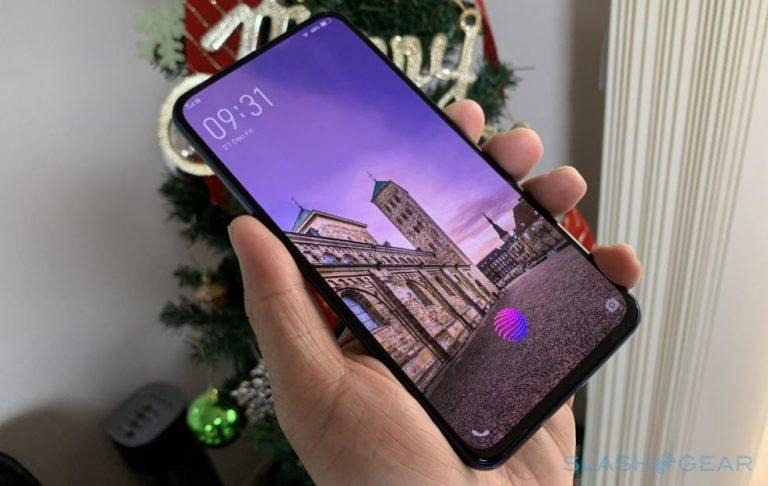
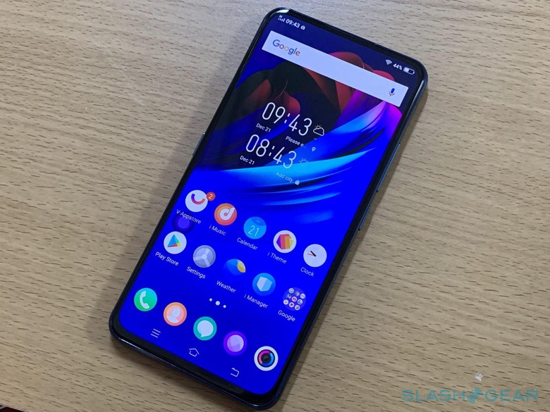
Fortunately, the front screen is bright, vibrant, and, most importantly, full. It is much like the Vivo NEX S in terms of bezel-less design and it just as gorgeous. There's still a bit of bezel, of course, out of necessity and limitations of manufacturing. Unlike the ZTE nubia X, which admittedly was the first with this kind of dual screen play, Vivo uses an AMOLED panel on both sides. In this case, the front gets a 6.39-inch 2340x1080 19.5:9 screen.
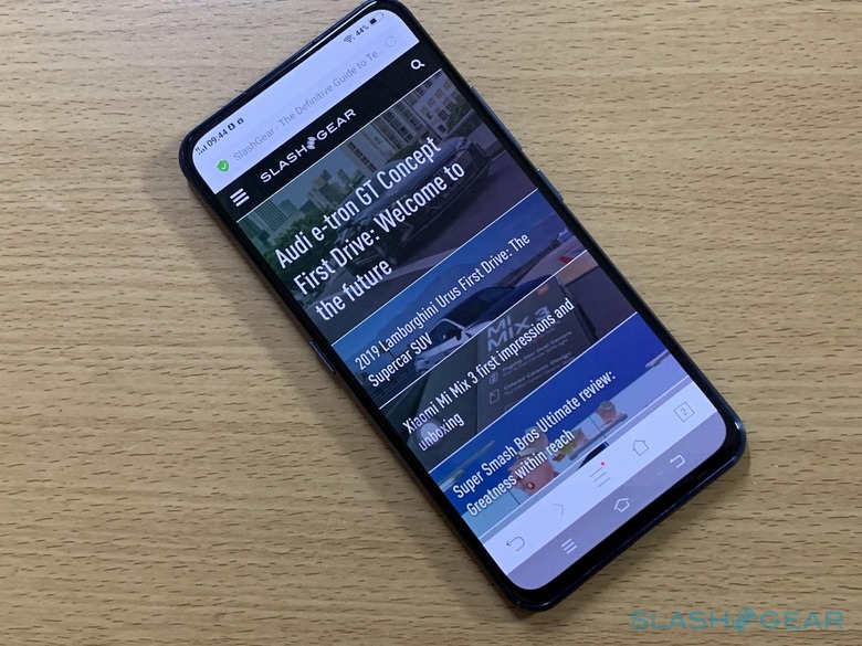
The lack of bezels and notches is both beautiful but almost boring in its minimalism. There are absolutely no sensors here and the only thing that breaks its face is the nearly invisible speaker slit at the very top. Other than that, the Vivo NEX DDE's face is blemish free, almost like the perfect face for a selfie.
Display, Part 2
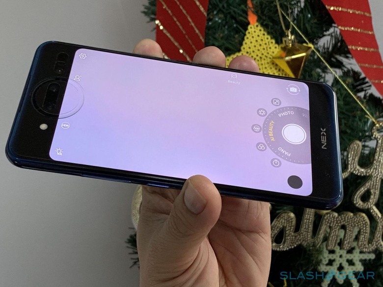
In contrast to the serene quiet of the front, the new NEX's back is very busy. It's where all the action is, after all. That means the triple (yes, triple) cameras and the 5.49-inch 1920x1080 16:9 AMOLED screen. We'll deal with the former later.
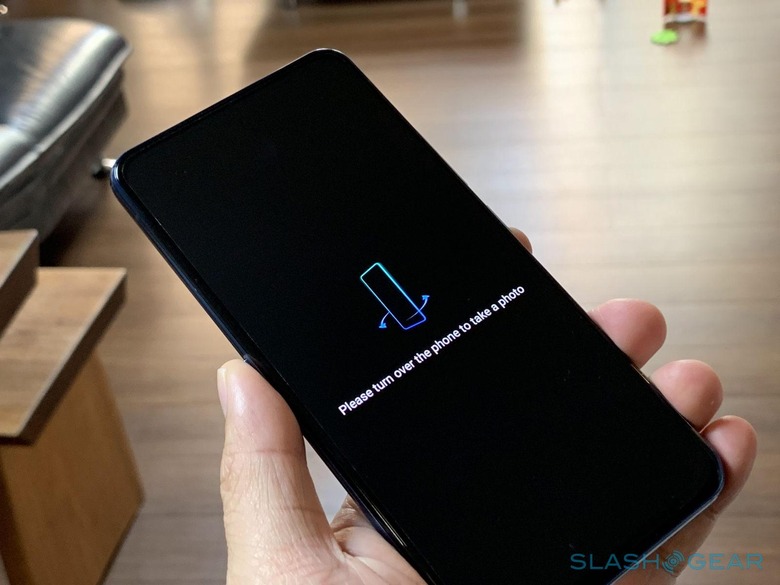
While that second screen is of course there to help frame the perfect selfie, it's a full-fledged normal touch screen as well. As mentioned, you can even live off this side of the phone if you don't mind the lower resolution and smaller area. You can easily switch between the two screens with the press of a button, usually that Jovi button by default. When you do flip, however, the power and Jovi button flips as well so that the latter is always on the left, no matter which side you're on. Alternatively, you can also just press both buttons at the same time if that proves to be too confusing.
There is, however, one thing that could keep you from fully living on the rear. Vivo calls it a Lunar Ring and its a design and notification gimmick that, for better or worse, eats into the back screen. Above the screen, it's an LED arc that surrounds the two main cameras. That arc, however, continues down into the screen to form a full circle. The Lunar Ring lights up with dramatic flair to call attention to notifications or shine light on your face with selfies. It's simply a visual trick thanks to some fancy glass design but it's always present nature might make it less conducive to use that side for prolonged periods.
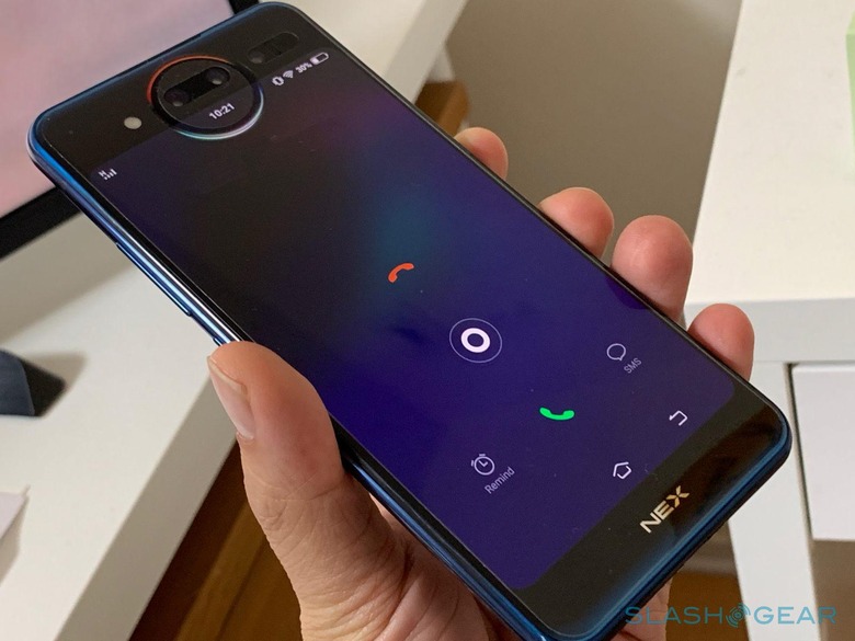
As for the screen itself, being the same AMOLED panel makes it just as vibrant as the front. When it's off, however, it is clearly apparent that it's not of the same material as the frame around it. At the same time, gives it that Google Pixel dual-color vibe that might not be so bad, depending on your aesthetic tastes. That second screen also functions as a second game controller, Vivo promises. Think of it like playing a game on the main/front screen while all or some of the controls are on the second/back screen. You do get a full view of all the action, but whether your fingers will ever get used to controls you can neither see nor feel is probably the bigger question.
Cameras
While the second screen might be the NEX DDE's most eye-catching feature, it's really just at the service of the smartphone's cameras. To be more specific, it's specifically designed to avoid the notch problem and, at the same time, let users take selfies with the same capable main cameras they use for anything else. For that, the Vivo NEX Dual Display Edition employs Triple Cameras. Or actually, just two and a half.
If numbers are the only metric, it would be terribly disappointing. After all, what high-end smartphone these days uses a 12 megapixel sensor, even if it has an f/1.8 aperture lense, 4-axis OIS, and dual pixel PDAF. And the second camera? A 2 megapixel f/1.8 depth sensor for things like bokeh and additional image information.
The end result, thankfully, isn't completely disappointing. In the bright outdoors, the Vivo NEX Dual Display Edition produces sharp and bright images as well. Inside, the results are bit less consistent but still usable. Just don't zoom in on either photos or you'll break the illusion. Artifacts and noise seem to be common fare for the cameras. And forget zooming the camera in either. With no telephoto lens and fewer pixels to count, even low-level digital zoom can produce unpleasant photos.

You could say that those cameras were probably intended more for selfies anyway. And, to some extent, that would be accurate. The Vivo NEX DDE pretty much enthrones the selfie culture even though it seems it's putting the focus on the main cameras instead. In this case, though, you could say that dual selfie cameras are the main cameras rather than the other way around. Case in point is the third camera, really a time-of-flight or TOF sensor with an IR illuminator. It's used for both 3D face recognition, as we'll see in a while, as well as for selfie beautification.

The camera app has various modes that take advantage of the Vivo NEX DDE's special hardware setup, including, of course, AR stickers. Mirror Mode lets the person on the other side (facing the back screen) see their photo as you are taking them. Pose Mode, on the other hand, gives them some "inspiration" on how to, well, pose.
Security and Software
Vivo learned its lesson from the first NEX where it opted for a fingerprint scanner and nothing else. This time it has both fingerprint and face recognition, though you can't use both at the same time. Or, rather, you can only one use one or the other, depending on where you're facing.
There is only one fingerprint scanner and it's located in the front screen's display. This feature is like that of the Vivo NEX and other newer smartphones with fingerprint-on-display sensors or FODs. This time, though, the response rate and accuracy is a lot better. Almost as fast as Touch ID. Almost.
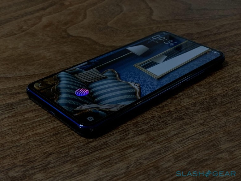
Without a front-facing camera, or at least a traditional one, there's really no way to use face unlock on the front. That, of course, is on the back side. The TOF 3D sensor advertises being able to detect 300,000 points up to a distance of 3 meters. With the IR illuminator, this simply means that face unlock works reliably even in dark places. Perhaps to keep things fair, the back side doesn't have a fingerprint scanner like the front. Understandable but unfortunate. ZTE's nubia solved the problem by putting the fingerprint sensor underneath buttons on both sides of the frame.
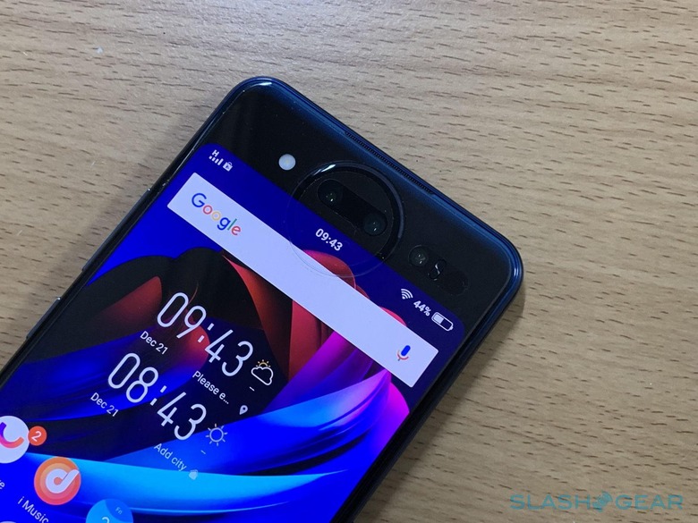
The Vivo NEX Dual Display Edition is one of the few smartphones that ship with Android 9 Pie already pre-installed. Of course, that also means it has Vivo's Funtouch OS customizations on top. International versions of the device, like the one we had for review, also get Google Play Store. There isn't much bloatware in that particular unit either and we're hoping the Chinese version would be the same.
Wrap-up
The Vivo NEX Dual Display Edition definitely feels like a preview of the future. Or at least one of the many possible futures that could run alongside foldable phones. Like the ZTE nubia X, it is, so far, one of the better implementations of dual screen phones we've seen so far. Unlike the nubia X, the Lunar Ring gives it a nice, futuristic touch.
That future, if it ever comes to pass, will hopefully also be better. While usable, the NEX DDE's cameras leave a lot to be desired and having to choose which biometric authentication to use isn't going to be automatic. But, for now, Vivo does come super close to that dream of a bezel-screen that doesn't compromise on the photography experience. At least not too much.
