Virgin Mobile Helio Ocean 2 Reviewed: Better, But Better Enough?
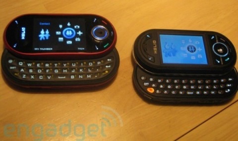
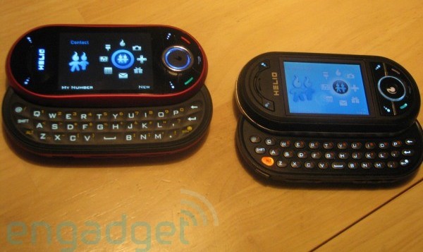
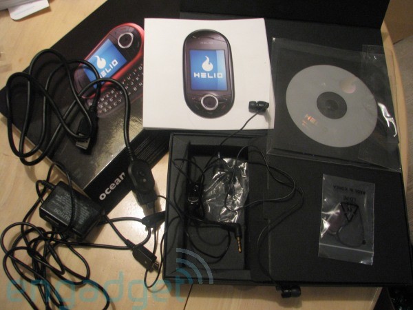
After its unboxing last Friday, the Virgin Mobile Helio Ocean 2 is back for a more meatier review. The dual-sliding QWERTY handset has taken some time to arrive, and it's finally dropped just in time for would-be users to ask if MySpace, chunky casings and 2GB of onboard storage is enough to tempt them in. Engadget Mobile have been comparing the Ocean 2 with its first-gen predecessor – together with the rest of the current feature-phone crowd – and have come back with mixed feelings.
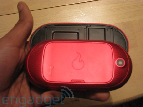
The Ocean 2 certainly gets some things right. Although far from svelte – not least because of the double-slide mechanism – it's now thinner and a smoother, more tapered shape than the first Ocean. There's also a new touch-sensitive directional control pad, although that may prove to be a mixed blessing in usability, but the 2.6-inch QVGA display is a big improvement over the last-gen screen.
Software has been subject to minor tweaks, many of them making a significant difference to usability, though, like the media app's new ability to play music in the background, no matter what program you switch to. Still, it's arguably not enough to differentiate the Ocean 2 from the feature-phones that have launched since the first-gen Ocean, making this a great device on Virgin Mobile, but not so convincing compared to offerings from all the rival networks.
Meanwhile, CNET have also been playing with the Ocean 2, and they're a little more confident in its improvements. They had fewer issues with the touch-sensitive controller, and were more accomodating of the closed OS and, therefore, a software set that's less likely to see third-party developers creating apps for it. Call quality – which is rated as "amazing" – is a strong saving grace if you like to use your phone as, well, a phone, and both audio and EV-DO quality were similarly impressive.


