Virgin Mobile Helio Ocean 2 Quick Look And Unboxing
It's been a long time coming, but the Ocean 2 has finally launched and should be reaching customers' hands this weekend. Along the way, network Helio has been acquired by Virgin Mobile, and we've seen devices like the iPhone 3G, T-Mobile G1 and various high-end feature phones all crash the market. The stakes are undoubtedly higher, and the question is whether the Ocean 2 is too little, too late; we'll have the SlashGear review for you soon, but first off here's the video unboxing and some first impressions.
In the box, there's the USB sync cable, Helio-branded charm, wired headset, AC adapter and a CD along with printed documentation. The packaging itself still concentrates on Helio more than it does Virgin Mobile.
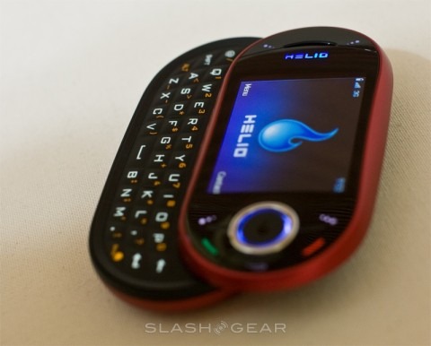
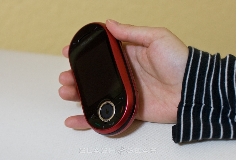
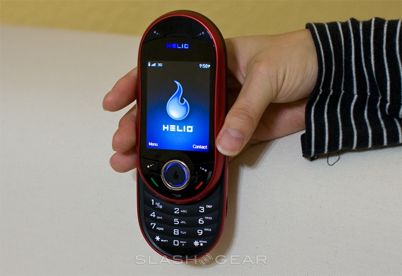
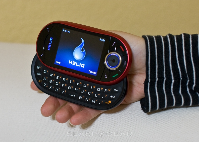
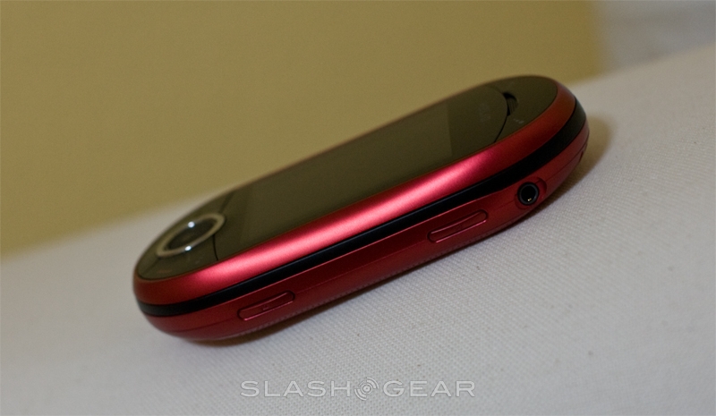
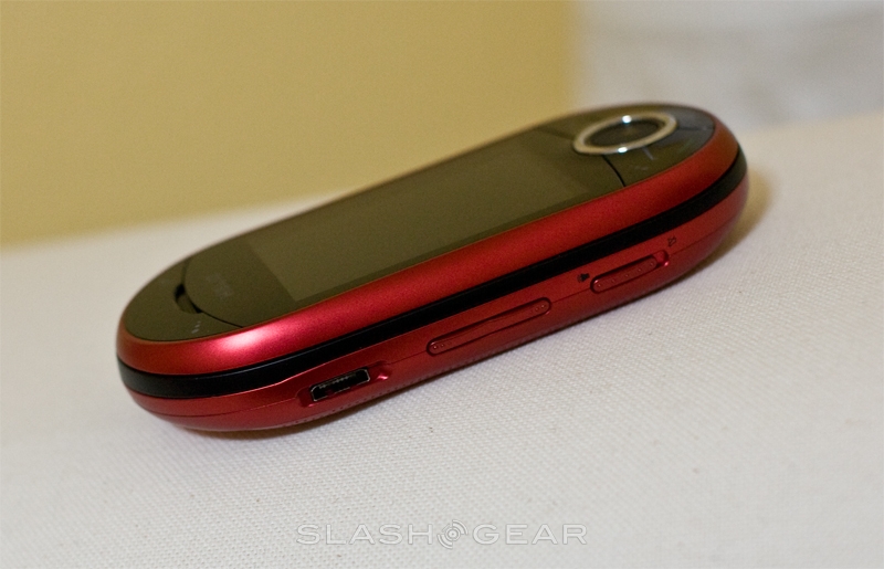
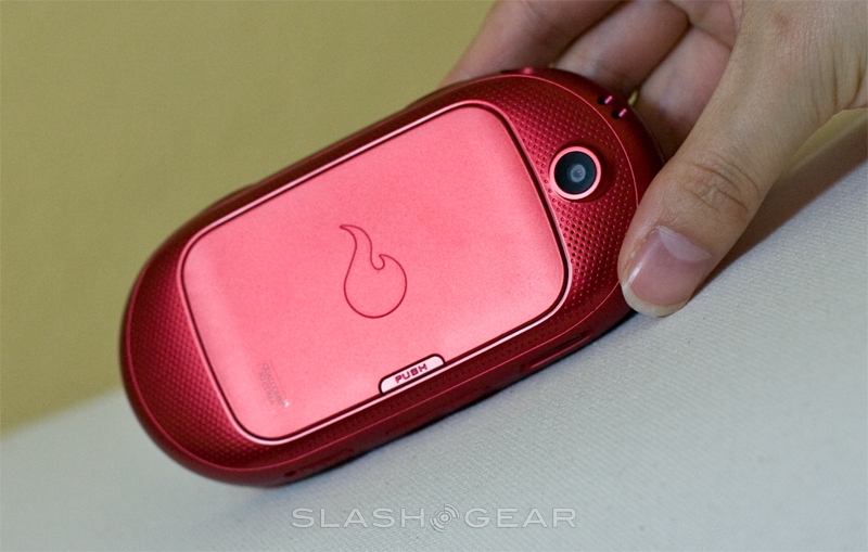
First impressions of the handset are good, with the build quality being high and the plastics feeling sturdy. As with the first-gen Ocean, the slide-out QWERTY keyboard (which has now switched levels with the numeric keypad) mechanism seems strong and is flex-free, snapping neatly into place. There's minimal twist or shift when closed up, either, although this is of course a brand new device, and it's altogether slicker and slimmer.
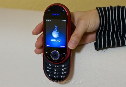
Other changes over the first-gen Ocean include an improved display, of which our initial impression is that it's much brighter and has better color saturation, but seems a little small at 2.6-inches. Meanwhile the touch-sensitive control pad is going to take some getting used to.
The QWERTY keys are larger and easier to press, and while it's unmistakably an Ocean handset they've done a good job bringing it up to date. Where Helio devices always shined was the software package, particularly the location-based services, and it's those which we'll be looking at closely for our review. Until then, enjoy the unboxing video and initial gallery!
