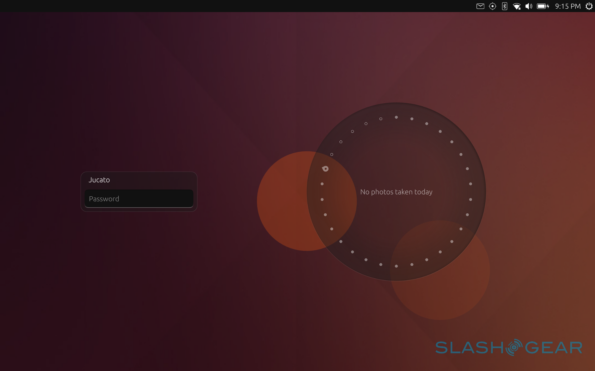
Ubuntu Bq Aquaris M10 Review Part 2: Software
In part one of our rather lengthy review, we took a look at the bq Aquaris M10 Ubuntu tablet's hardware. Suffice it to say, it perfectly played the role of a mid-range tablet. While the device had a few ups, like its lightweight design, bright display, and substantial battery, it would have been easily passed for a mediocre slab if not for the software running on it. In this round, we take a deeper look into what makes this tablet truly one of a kind, and almost literally too. This time, we take a dive into the alien world of Ubuntu Touch.
The Lay of the Land
To anyone who hasn't been familiar Linux for the past 10 years or so, or even to some Linux users, Ubuntu Touch is a very different experience from the mobile operating systems we have today, namely Android and iOS. To some extent, Ubuntu Touch has some parallels with Windows 10, but even then the association is thin. To get to know Ubuntu Touch, one has to necessarily also be acquainted with Ubuntu itself, which just happens to be one of the most popular Linux distributions (think "flavor") to hit the scene. Some have even grown up to think "Linux = Ubuntu", much to the consternation of other distributions and users.
Ubuntu's meteoric rise could perhaps be attributed to the synergy of timing, hype, community fervor, and a user-friendly, easy to use desktop. With Ubuntu gunning for top spots in computing, going as far as explicitly targeting Windows and Mac OS X, it was really only a matter of time before Ubuntu started the trek towards mobile, the hottest new market in the computing world.
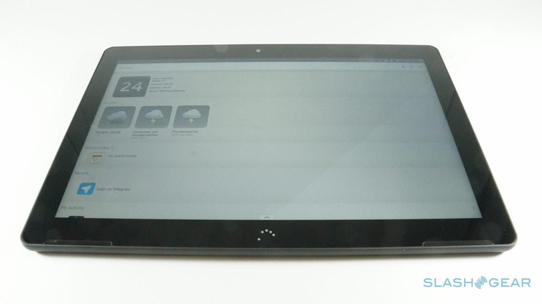
It wasn't a smooth ride for Ubuntu Touch, the version of Ubuntu designed for smartphones and tablets. Canonical, the company behind Ubuntu, and Ubuntu's own community wasn't lacking in vision and ambition. Perhaps it even had too much. While Ubuntu Touch existed in source code form and images intended for testing on Nexus devices, it would only be in the last two years that it would find a home in actual commercial devices, sold by Meizu and bq. And now, it even has its first official commercial tablet, the bq Aquaris M10. Ubuntu Edition, that is.
A Fresh Face
Ubuntu Touch is new not just in terms of origins but also in terms of user interface. Of course, it has some similarities to the likes of Android, iOS, or even Windows 10, but those are usually elements common to all of those as well. Interestingly enough, Ubuntu Touch somewhat has more in common with Windows 10, and even the earlier Windows 8, in its use of all four sides of the screen as "hot points". Those who have experience with Jolla's Sailfish OS will also find parallels here.
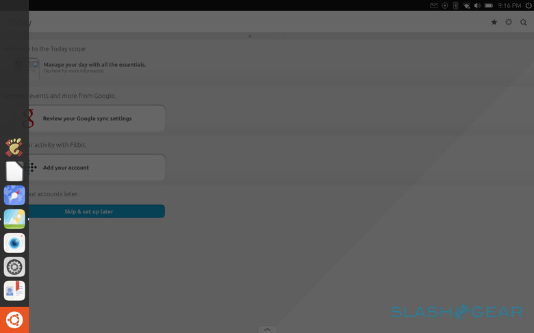
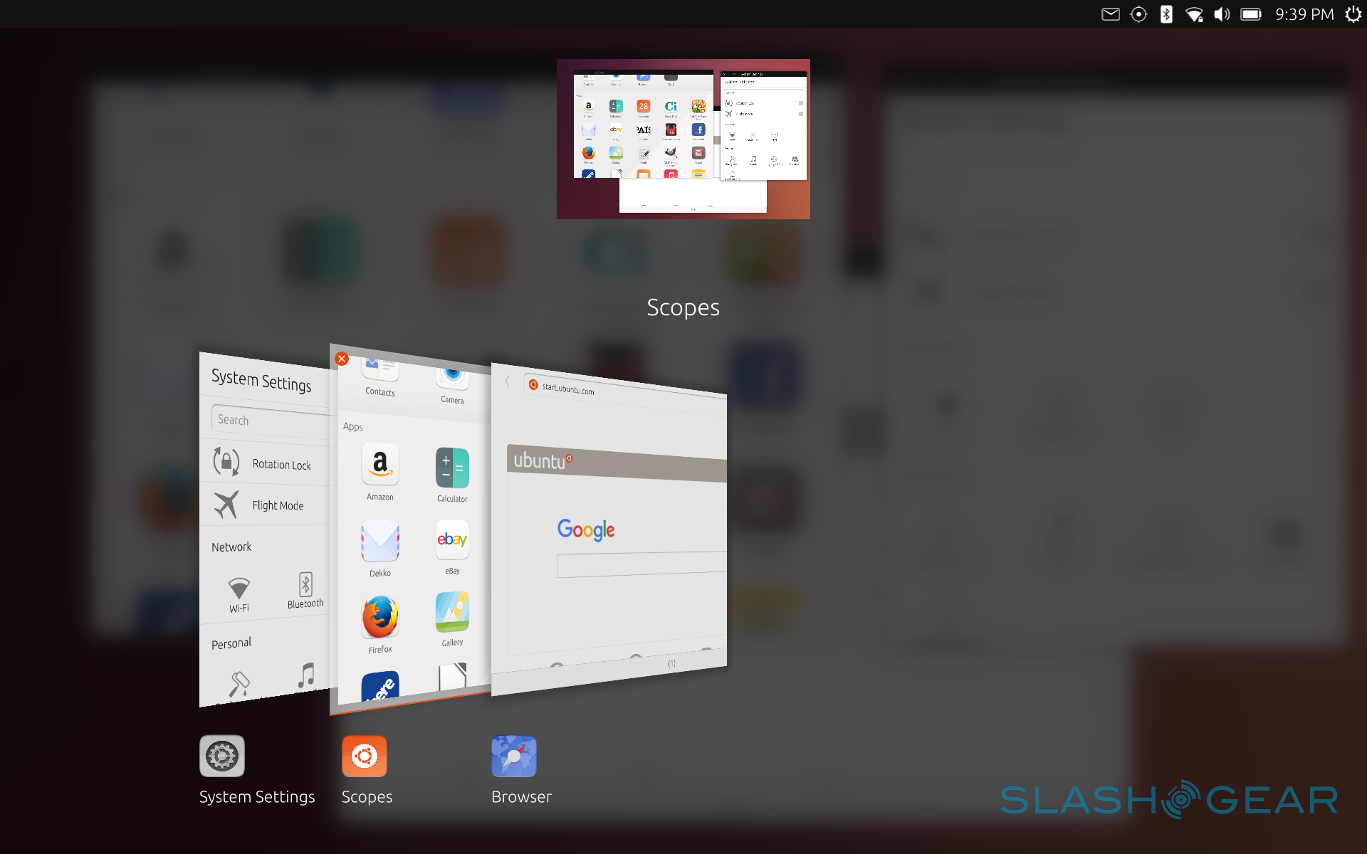
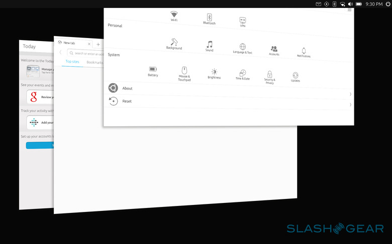
Swiping from the edges of the screen brings up different actions. A short swipe from the left edge reveals a side dock for putting shortcuts to apps. It also has the Ubuntu icon which takes you "Home". A longer swipe from the left immediately takes you to the Scopes windows, which is practically your home screen. More on that later. Swiping from the opposite right edge is all about switching through apps. A short swipe simply switches you back and forth the most recently used apps. A longer swipe, on the other hand, shows all opened apps in a list, allowing you to pick through them or close the ones that you don't need to have running. This is something you'll want to do regularly in Ubuntu Touch.
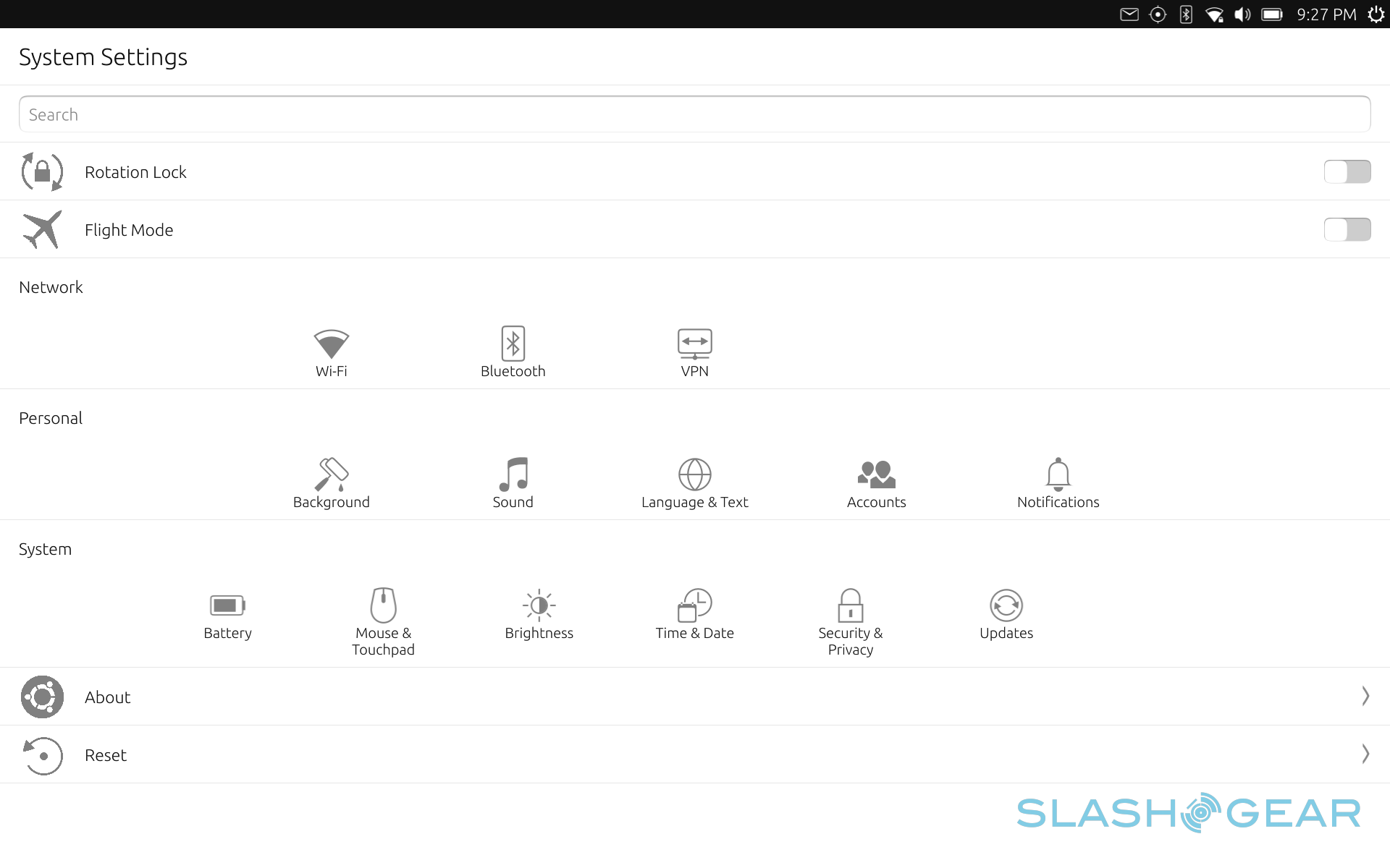
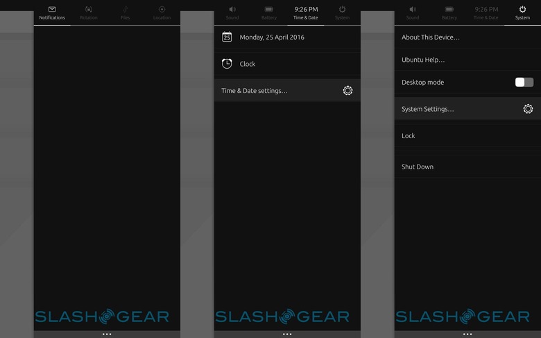
Like Android and iOS, the top edge is reserved for notifications and control toggles. But unlike those two, the notification panel is really only limited to a side bar, so you'll have to swiped down near the right side of the screen. There is a sort of hidden feature that is both convenient but can also be annoying. Depending on which icon your fingers was on when you swiped down, it will immediately jump to that tab in the notification panel. Some of those icons depend on having the relevant feature turned on, like Wi-Fi or Blutooth. Some are always there, no matter what, like Sound, Date & Time, and Battery. The tabs themselves behave as you might expect, with switches and options related to those features. Some tabs, however, don't make sense on their own. The rotation lock, for example, is the sole resident of its own tab, while Files really only gets some action when you copy files. The former would probably feel at home just as well in the System tab, while the latter probably wouldn't mind dropping once in a while in the Notifications tab.
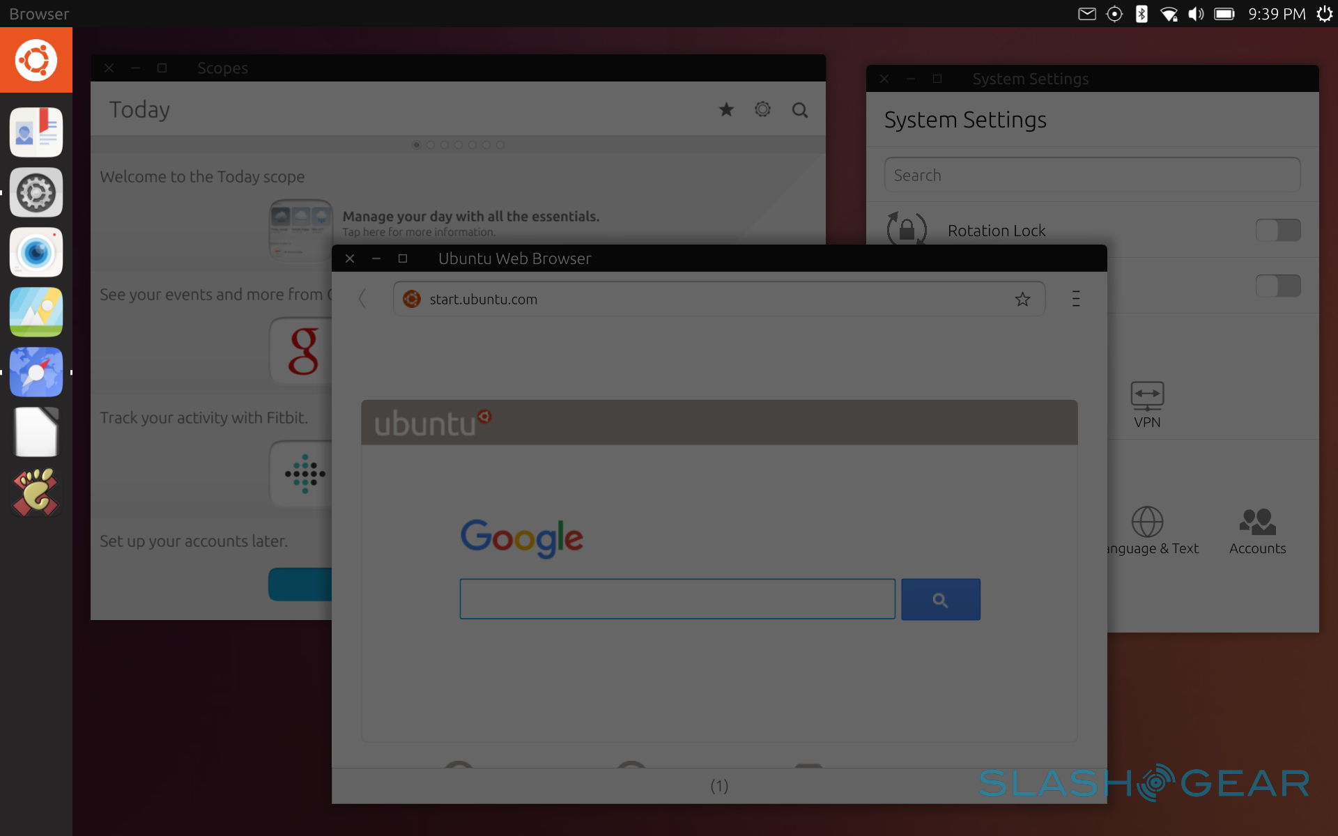
While the top, left, and right sides are mostly the jurisdiction of system-wide swipes, that is, they work no matter what app you're using, the bottom edge is left free for apps to use for their own. The Scopes screen (or app really), for example, lets you manage scopes with a swipe from below. So too the Notes app, depending on the app's windows size. That said, it isn't a common convention and there is no policy requiring or assuring it.
A New Scope
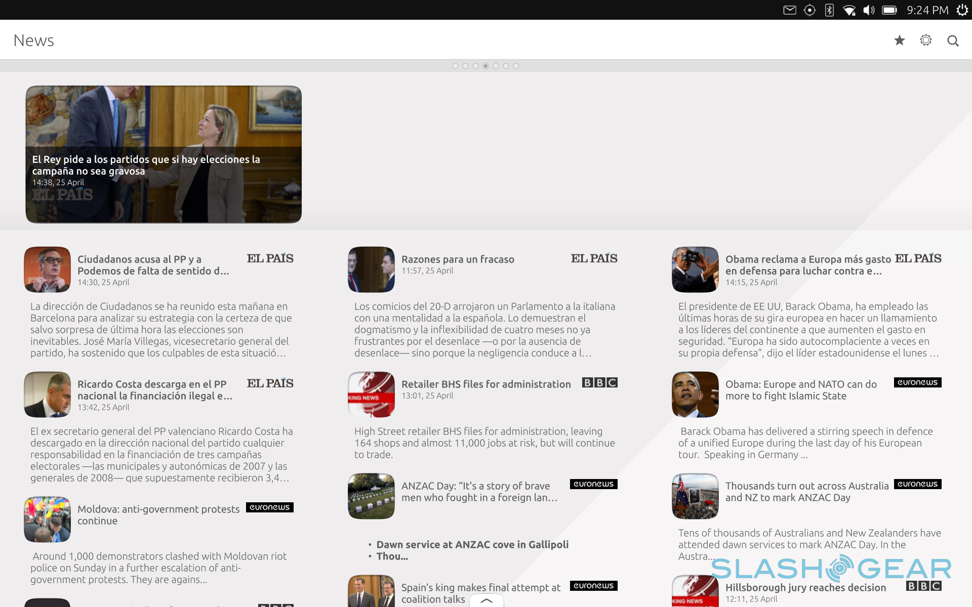
Part of what makes Ubuntu Touch unique, and also what makes it unfamiliar and sometimes confusing, is Scopes. To some, it's a breath of fresh air amidst the breezes of Android, iOS, and Windows 10. To others, however, it is an unnecessary layer of complexity implemented for the sake of differentiation in the market. To put it in terms most consumers will be familiar with, Scopes is practically a highly dynamic and expandable home screen and app launcher. In tablet mode, it really takes the place of the launcher, obscuring the wallpaper beneath. In desktop mode (which we'll meet in a while), it is simply yet another app, but one that you cannot close as hard as you try.
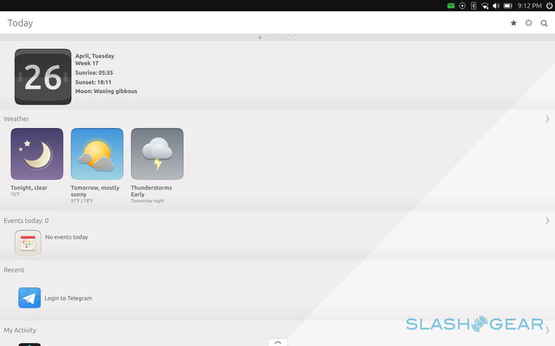
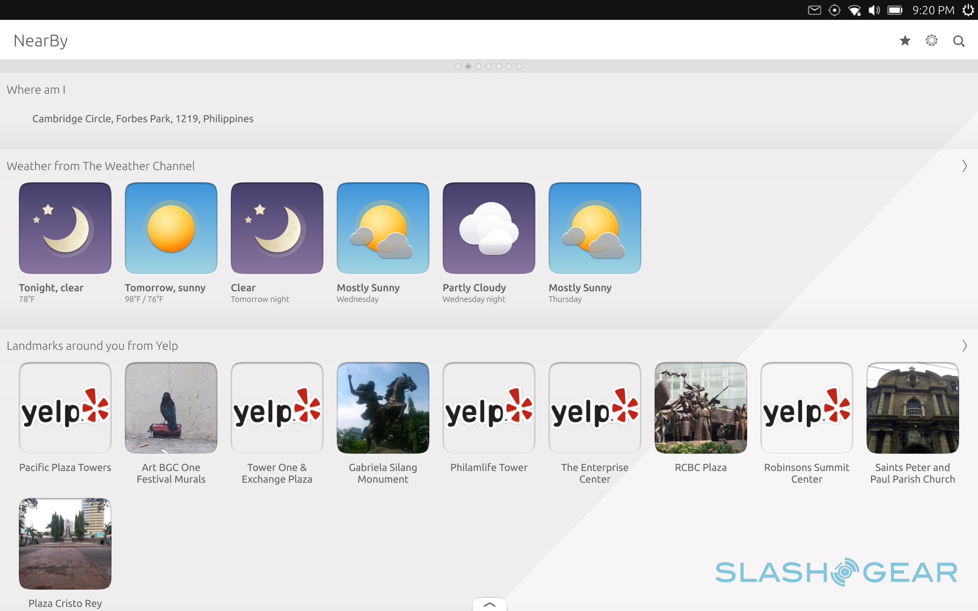
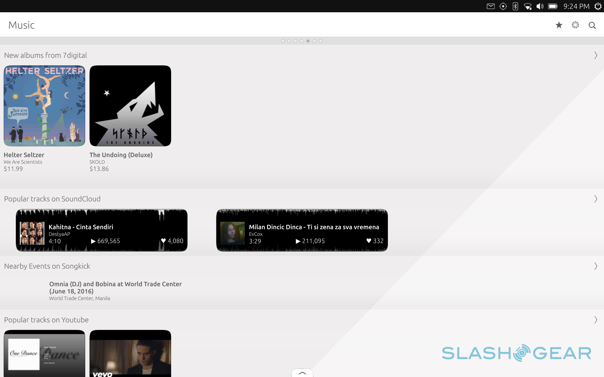
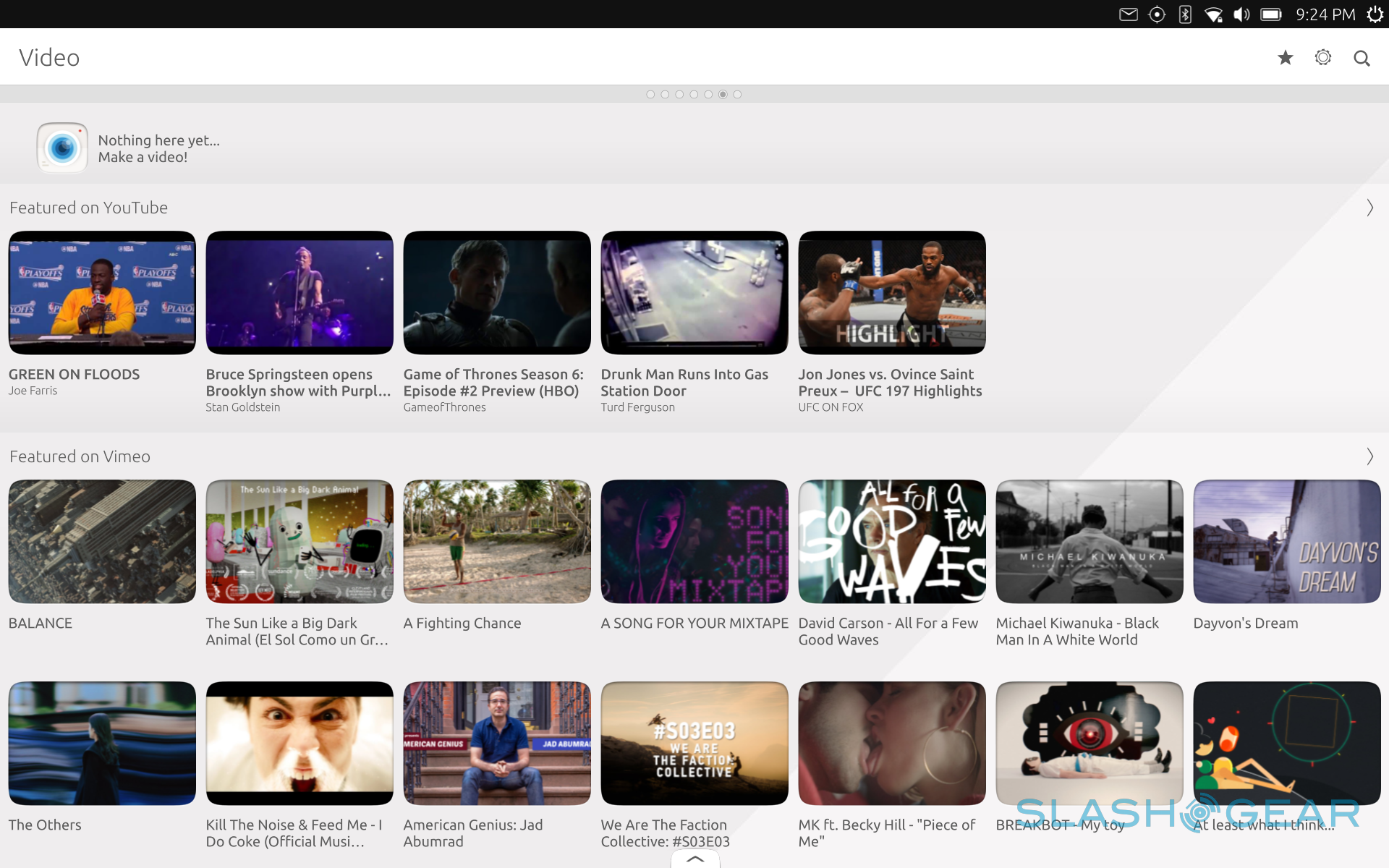
Equating it to a home screen or app launcher would be a disservice. While it does function in that capacity as well, it does a lot more. It has multiple screens, or scopes, but you can't actually move content around. Instead, each scope is organized along a specific theme or even an app. The primary Today scope, for example, gathers all relevant information for you to see your day at a glance, like the weather and appointments. Apps, naturally, show all your installed apps and lets you manage them from there. Photos, Music, and Videos scopes do show your locally stored media files, but they do a lot more, which is where things can get both exciting and murky at the same time.
Scopes aren't limited to showing content from locally installed apps or files. They can also gather those from various sources over the Internet. Photos, for example, can harvest images from Instagram and Flickr, while Videos also surfaces popular YouTube videos. As you can imagine, content shown in those scopes change regularly. Some scopes are dedicated solely to a single app, in which case it would be like running the app themselves, just embedded in a scope. Scopes, especially apps that have scope versions, have the advantage of being "pinned" to the Scopes app, therefore, your homescreen, so you don't have to run them in a separate window for convenience.
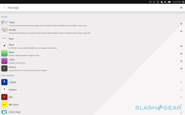
Not all scopes, however, need to be always visible. Some installed scopes can be hidden and only summoned when, or if, you do need them. A swipe from the bottom of the Scopes screen will bring up the list of install installed scopes. Starred ones at the top are those pinned to the Scopes window and are just a few swipes away. You can re-arrange them with a tap and hold gesture. Scopes at the bottom can be opened by tapping on them or added to the favorites by tapping on the star icon.
For some users who have developed an app-centric workflow, Scopes might actually get more in their way. The could opt to pin their favorite apps to the shortcut bar or remove all other scopes except the Apps scope, which, coincidentally, it the only scope you can't remove. Android users will probably be able to find a home screen alternative or two that has some of Scopes' functions. In the Ubuntu Touch world, with a lack of such options, this is as close to home screen customization you'll be able to get.
The Apps that Make or Break
Each new operating system, especially mobile ones, are beset by the same major problem that plagued BlackBerry 10 and Windows 8/8.1: apps. Ubuntu's case is interesting because it is both similar yet potentially different. Users familiar with the history of Windows 8 up to Windows 10 will probably see some similarities here, mostly because, like Microsoft's desktop OS, Ubuntu Touch is born from two very different worlds.
On the one hand, you have the touch-enabled, touch-friendly, and sometimes even touch-only mobile apps. Ubuntu Touch apps, to be precise. These are the apps that are designed from the ground up to cater to a mobile use case. Whether they behave well in other contexts depends on how well they are built, but, in theory, they should behave well on smartphones and tablets. This type of apps has become the bane of newer mobile platforms. Even with its industry clout, Microsoft discovered to its horror that developers would not simply flock to its software platform. Developers are mostly driven by market penetration or revenues. Or both! A small mobile platform, at least compared to giants like Android and iOS, just doesn't have either those two. Ubuntu Touch is in the same boat with regards to popular mobile apps, but it addresses this problem in two different ways.
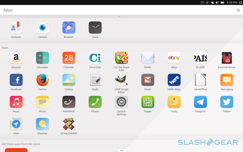
The first is probably the easiest. Unlike those other platforms, Ubuntu Touch makes it dead simple to create web app versions of popular web services. So while there's no official Twitter or Facebook app for Ubuntu Touch, there is an official web app version written by Canonical developers themselves. So too for other popular websites like Feedly or Pocket, and some for even more obscure ones. The advantage to this solution is that there is a larger chance you'll see an Ubuntu Touch "app" for your favorite mobile app, as long as they have a web service for it. The problem is that you are really limited to using a web app version, basically the same if you had access it through a browser, which means there's really only a very thin integration with the operating system.
The second solution is the more complex, powerful, but also problematic one. Like Windows 8 to 10, Ubuntu Touch has one foot on the desktop roots of Ubuntu and Linux in general. As a desktop, Linux isn't completely bereft of software. Though you won't find heavyweights like Photoshop, you will be able find something else, or sometimes something even better, like Krita. Being one of the most popular Linux brands, Ubuntu has the advantage of getting developers' attention, which means if there's a Linux version of a software or game, chances are there's an Ubuntu package available for it.
In theory, that is great for Ubuntu Touch as users will have access to popular Linux software like Firefox, LibreOffice, or the GIMP, all of which are actually pre-installed on the bq Aquaris M10. In practice, however, that isn't exactly the case. For one, Ubuntu Touch, at least in this incarnation, is running on an ARM-based hardware. While Linux's support for ARM is significantly better than Windows, at least as far as third party software goes, it is not completely there yet. Some software just don't have an ARM version, either because of technical issues or just a lack of manpower. But more importantly, like many mobile operating systems such Android, Ubuntu Touch's internals are locked down. To be technical about it, the root filesystem image is read-only, so installing additional software via Debian's APT utility is impractical. But not impossible. There are ways to do it, one of which can turn Ubuntu Touch into a "full" open Linux system. But not only is it not supported, but you also get left out of future OTA updates, until you restore the system to its pristine state, losing your modifications in the process.
Convergence: The Future of Computing
But even with that technical limitation, which can be overcome, depending on your inclination or need, Ubuntu Touch is still a promising and intriguing operating system if for one and only one feature alone: Convergence. Though the idea is not entirely original nor new, Ubuntu has been one of the first to put it out to the public, though Microsoft's Continuum beat it to the retail punch. I mention Continuum because most of the comparisons will be drawn between these two, but there is a distinct, though subtle, difference.
Continuum can be practically seen as focusing on the app, and consequentially the app development platform. In other words, Microsoft's Universal Windows Platform. The message, in essence, is this; any app written using UWP can, in theory, work on any Windows 10 device, give or take a few changes depending on the factor, and totally dependent on the developer's whim. These apps can take different forms depending on their screen or context. Continuum is best exemplified by the UWP Office apps on the Lumia 950, which can change from phone to desktop form, depending on whether or not it's connected to an external screen.
Convergence, on the other hand, can be seen as revolving more around the device itself. Sure, there are Ubuntu Touch apps that change shape from phone to tablet using the same base code, but it's more because the device itself changes its context and not because of the app itself. In short, Convergence dreams of a future where the smartphone or tablet truly becomes a desktop and doesn't discriminate between Ubuntu Touch apps and regular desktop apps.
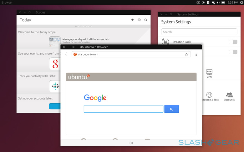
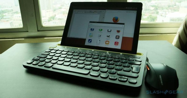
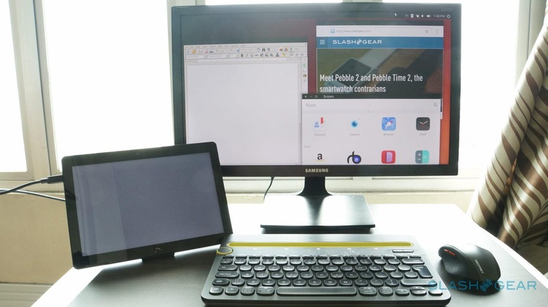
That promise is being fulfilled in the bq Aquaris M10, the first true Ubuntu Touch device to exhibit Convergence. Connect a mouse, wireless or wired, or connect an external screen and watch your tablet become a desktop. The whole user interface changes from a touch-oriented one to a mouse and keyboard usable one. You want resizable and movable windows? You've got it! You want true desktop-grade multi-tasking? Sure! Want to watch a YouTube video while working on a document while keeping an eye on Slack? You can have your cake and eat it, too! Really, you are only limited by the hardware, which isn't much, and the available software you can use, which isn't much either.
Now that you've gotten the idea, it's time to get into the nitty gritty. The bq Aquaris M10's 10.1-inch screen is large enough to use by itself even in desktop mode. In most case, the most common configuration would be to connect a keyboard and a mouse and type and click away to productivity. In practice, however, things to tend to get a bit slow and moving the mouse sometimes feels like you're moving it through tar. It works, but it's not as fast as fast can be.
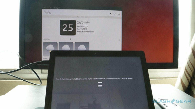
If you want to use a larger screen, you can attach one via the micro HDMI port. But if you're thinking of experiencing ultimate multi-screen productivity, sorry to burst your bubble. If you connect a screen to the tablet, the tablet is transformed into a gigantic touchpad. No screen mirroring, no screen extension. It's a feature that probably makes more sense for a smartphone but not so much on a 10.1-inch tablet. But even on a smartphone that should be optional, as you might want to still view notifications or even messages on the smaller screen and dedicate the bigger one to serious work. So if you do attach a second screen, that will actually become your only screen. That said, the tablet doesn't become entirely useless, as the connection only courses video. Audio still comes out of the Aquaris M10's loud speakers. A handy feature as not all computer monitors have built-in speakers.
Waking Up from the Dream
Imagine having a smartphone or tablet that, at a moment's notice, and with help from a mouse, keyboard, and monitor, can turn into a desktop computer and let you do relatively complicated tasks and work you could really only do with a desktop. Imagine Canonical and bq working together to deliver that future today. And imagine receiving that long awaited parcel that finally put that future into your hands today.
And now, it's time to wake up.
All of the above, promises and dreams, are actually, factually, and objectively true and are taking place in the bq Aquaris M10 Ubuntu Edition. But none of the above (or at least only one) really described how it fell short of truly making that dream come true to its fullest. While bq's hardware naturally limits the things that Ubuntu Touch can feasibly do, as the primary medium of user experience, the software does have the lion's share of the blame.
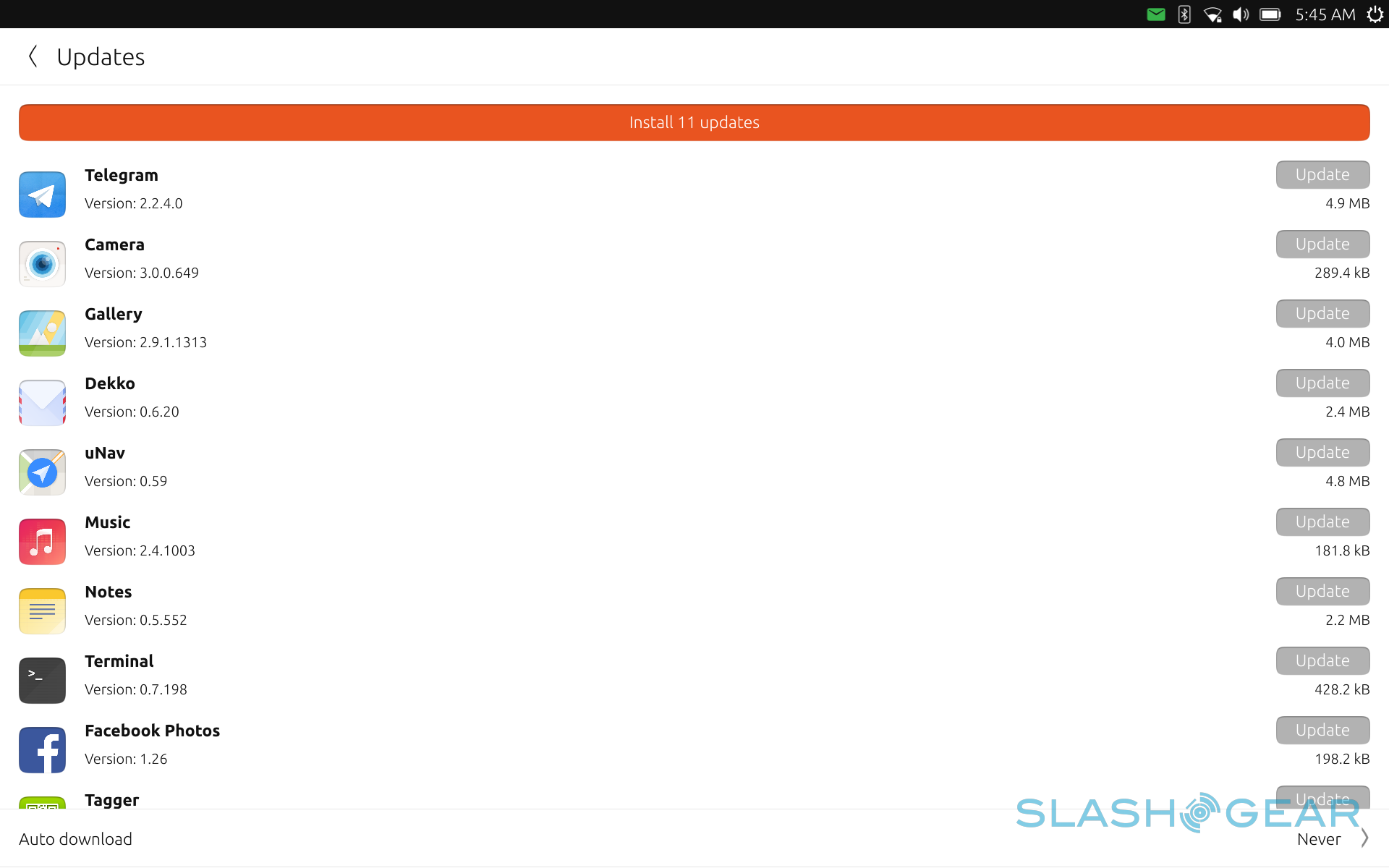
Ubuntu Touch definitely shows promise, but its execution is quite raw in this context. Some might even label it as a beta, or even an alpha, that is released in a retail product. That would actually be a harsh verdict but it does show a discrepancy between expectations on commercial software, or software sold on a commercial product, and the usual "non-final" development process more familiar to open source communities. Linux users are used to software sometimes having bugs but they are less stressed because patches and fixes roll out regularly and quickly. On mobile devices, that usually takes months even years. OTA-11, the next major update to Ubuntu Touch, is expected to arrive this week but has already been delayed by a month. And that after months in development.
As it stands, Ubuntu Touch on the bq Aquaris M10 is crawling with tiny bugs that may not be a showstopper for some but are life and death for others. A favorite of mine is how it is impossible to copy and paste text between Ubuntu Touch apps and desktop apps like Firefox, or even between LibreOffice and Firefox. (Technical reason: desktop apps run in sandboxes of their own, blind to everything else). It is entirely possible to use the tablet without those, but it is a mind-boggling limitation for a platform and device that preaches productivity and the convergence between mobile and desktop computing. Another bug that painfully wakes you up to the gap between those two worlds is how the virtual keyboard doesn't popup in desktop apps. While Windows 10 does sometimes exhibit that annoying behavior, you at least have the ability to manually summon the on screen keyboard. Sadly not the case on Ubuntu Touch.
The app selection is, as mentioned, quite scant, but the default apps installed is perplexing. For one, there is no document reader installed by default, even though there is actually an official one from Canonical. In an ideal world for some, there would be no need for file managers. But there are cases, especially with Ubuntu Touch, that you will need one. Good news: there is also an official file manager app. Bad news: it is also not installed by default. Some of the default apps also have rather strange behaviors. The Dekko e-mail client, for example, doesn't have notifications yet. If you need those, you'll have to make do with the Gmail web app.
Not all of the app selection are that bad however. The Notes app, for example, can sync with Evernote, which is a rare thing for a third-party Linux app. There is also a Terminal app for Linux power users, though you'll have to install it yourself. It is, however, completely usable with a touchscreen.
Sometimes, Ubuntu Touch's Linux roots bleed through the interface, and not in a good way. The Aquaris M10 has a microSD card, but plugging one in is next to useless unless you know your way around Linux. It notifies you that a card has been inserted and that it is scanning. However, even if you wait for a day, you won't be able to see any of your files, even the usual ones like photos and music. You'll need a file manager for that, which you'll have to install as mentioned. But even then, you won't see what's inside your card. It will present you with an empty list, making you believe it is empty or needs to be formatted. That isn't the case, you only need to tell the File Manager app to Unlock Full Access, with your user passcode, of course. Sadly, some unknowing users might have mistakenly reformatted the microSD card at this point.
Wrap-up: A promising start, but only a start
Despite the warts, it's hard not to get excited about Ubuntu Touch and the bq Aquaris M10 if you're anything of a computer or technology enthusiast. After all, who can resist the allure of having a device that can do it all. Linux itself has grown considerably over the past years to the point that it has become a viable option even for desktop users. And among the Linux distros, Ubuntu, with its corporate backing and OEM ties, is in the perfect position to make it happen. Ubuntu Touch definitely represents the future of computing, especially open source computing.
Sadly, it is still seemingly at a beta level, despite being marketed in a commercial product. It is a productivity-oriented device that is nigh impossible to use productively because of its sandbox implementation. And the device might initially turn off Linux enthusiasts because of its locked down file system, which also prevents the kind of ingenuity and creativity that has made a hundred or so different Linux apps proliferate.
Ubuntu Touch is undeniably still in its teething stages, but to dismiss it entirely at this point would be like passing judgment on a child based on grown-up standards. Ubuntu's more open ecosystem and Linux's easy access to development tools can help turn it into a vibrant and conducive development platform. Updates are coming and more are promised. Hopefully, Canonical and bq are committed to long-term updates, unlike some manufacturers out there.
