Twitter Testing New Search Page For Web Client
Twitter, which has undergone a series of updates lately, is again toying with what you see once you're logged in. The new-look search results in Twitter don't toy with your results, but do feed them to you in a flashy new way. When you perform a search in the Twitter web client, you might see a new layout designed to engage and entice followers. It's not available to all users, nor is it working with all search queries just yet.
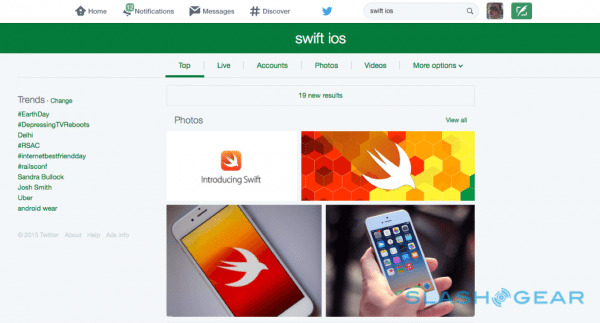
Now, when you search for something, you'll get a few sub-headers that break tweets down to a more contextual level. Top tweets now occupy the de facto landing page, but you'll also have 'Live', 'Accounts', 'Photos', 'Videos', and an options menu that can parse the results a bit further.

Twitter has confirmed the changeover, saying they're "currently testing this among a small group of users".
Above and below, you can see the views compared. In addition to revamping the view, you'll now get pictures populating at the top of search results; a nod to Twitter's new visual-first agenda which also makes pictures on the mobile app much more prominent.

The 'Live' tab seems to more closely mimic the 'Everything' view on the older version of the web client.
The new look also dovetails with other recent initiatives at Twitter, like a new API that feeds Twitter results to other apps and a revamped landing page for new or logged-out users.
