Twitter Starts Rolling Out New Web Interface: Here's How To Get It
Back in August 2018, Twitter revealed that it was testing a new interface on the web that included Explore and Bookmarks. Now, several months later, the company is giving a larger number of people access to this simplified new design, though they won't see it automatically. Some Twitter users on desktop can now an opt-in for access to the redesign.
According to Twitter, some users have received a new opt-in option for switching over to the new Twitter interface, which features a cleaner, simplified, more modern appearance. There are a number of changes, including a new emoji button for easily adding expressive icons to a tweet when using a desktop browser.

Users also see an "upgraded" trending section, the part of the interface that shows what other users are talking about, there are quick keyboard shortcuts, and also an advanced searching option. Whereas the previous version featured a three-column design, the new web interface has two columns with neatly sorted, compartmentalized content.
The new aesthetic is a welcomed change, but the difference goes deeper than the surface, decreasing reliance on mouse clicks and the amount of time it takes to find commentary on popular topics, as well as providing better search results. The new interface brings some much-needed attention to Twitter's web platform, which looks increasingly dated.
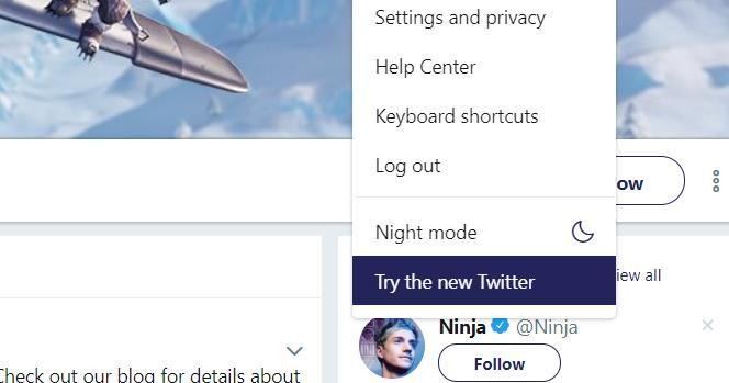
Some features are still notably missing — you can't edit a tweet yet, for example. Users on the receiving end can enable the new interface and check it out themselves by clicking their profile icon, then scrolling down and clicking the menu item (if you have it!) titled "Try the new Twitter."
