Twitter On Android Finally Gets The Timeline Right Again
The word "timeline" itself suggests something chronological in nature. Back when social networks were simpler and less assuming, that was definitely the case. These days, however, they have redefined timelines to be anything but chronological, forcing you to see something that may have happened days ago just because it's trending. Twitter is, fortunately, giving users back the ability to decide what they want to see first, but its wording makes it clear what its preference really is.
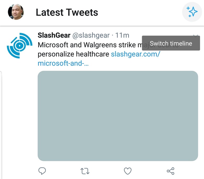
Last month, Twitter announced the ability to switch between seeing top Tweets first or seeing the latest Tweets first. All you needed to do was to tap on that oddly named "Sparkle" icon to switch between the two options. That said, the feature was initially rolled out to iOS first, promising Android users will get their turn soon.

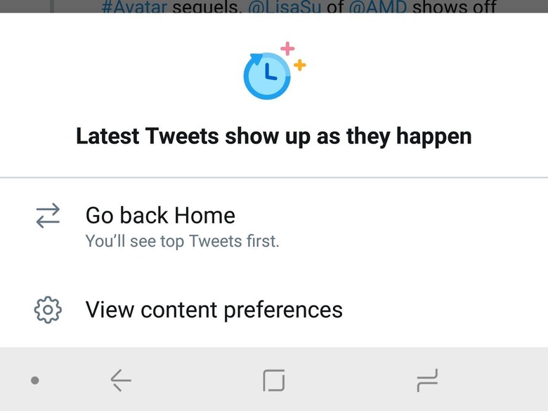
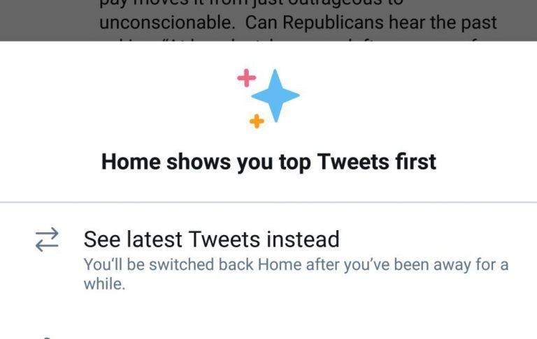
That happens today and Twitter on Android now features that same Sparkle icon on the top right corner. Tapping it will bring up a sheet that tells you what you're viewing at the moment and an option to change it. It may require at least two taps, but it's better than having none.

That said, that isn't Twitter's preferred mode. As the text of the options implies, "Home" is viewing top tweets first, not the latest. That's probably meant to increase "engagement" with what's trending, but it can be potentially confusing if you don't pay close attention to the dates.

Then again, this will soon be the only reality social network users will know soon. With the likes of Facebook, Instagram, and Twitter pushing for "top posts" at the, well, top, the days of chronological sorting are all but over. One can only hope users will double check dates before reposting or reacting, but that might be asking too much of them.
