Twitter Interface Change Today: Reflecting Mobile
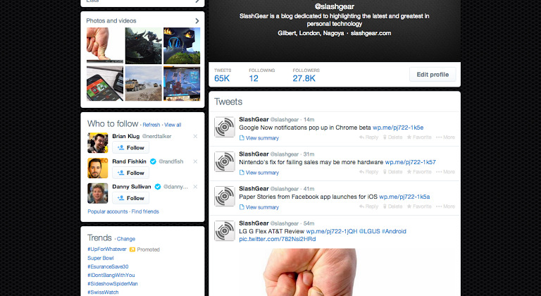
Today you may have noticed a relatively large change to the way you're experiencing Twitter on the web. This is because Twitter is pushing their newest user interface to the web in a big way. While they announced this change up back on the 13th of January, today is the day that the largest cross-section of users will gain access without any effort on their part.
Inside you'll find a "whitened" sort of look, as if Twitter has just finished brushing its teeth. White boxes are joined with a bit more letting in all text areas, making the whole setup look a lot easier on the eyes. Users will also see a light blue continue to be used throughout this UI.
This update also adds on a more visible home bar for logged-in users. Here users will be able to tap on Home for their normal feed, Connect to see who has been mentioning them, Discover to see Twitter's most-used tags at the time, and Me to see one's own profile.

A Twitter logo in the center of the page should help you to understand where you are at any given time (you are at Twitter.com). while the right side of the interface features a Search bar, Direct Messages button, and Settings button. Here you'll also find a Compose button just incase you need to access it quickly instead of moving down into the "Compose new tweet" bar when you're in the Home tab.
Here we also see the continued evolution of Twitter into a money-making project. You'll see Trends and Who to Follow continuing to appear while paid advertisements pop up throughout your normal Twitter feed.
