Turns Out, The Jolla Tablet Is Really Onto Something
Sometimes a few inches is all it takes to make a difference. Back when Jolla first started, a team of former Nokians taking MeeGo and spinning it into their own Sailfish OS, it became a smartphone curio. The simple UI and gesture-based navigation had promise, but compared to an iPhone, Android, or even Windows Phone device, it felt underwhelmingly simple. Now, the Finns are back with not only Sailfish 2.0, but a tablet for it to run on, and it turns out that makes for a great pairing.
Sailfish, like MeeGo before it, tries to take some of the "home button leaping" out of mobile device navigation. Built around a combination homescreen and task switcher, with menus that slide in for launching apps and checking social updates, it was a solid idea but poorly implemented on the Jolla phone.
Sailfish 2.0, however, is a very different kettle of, well, fish.

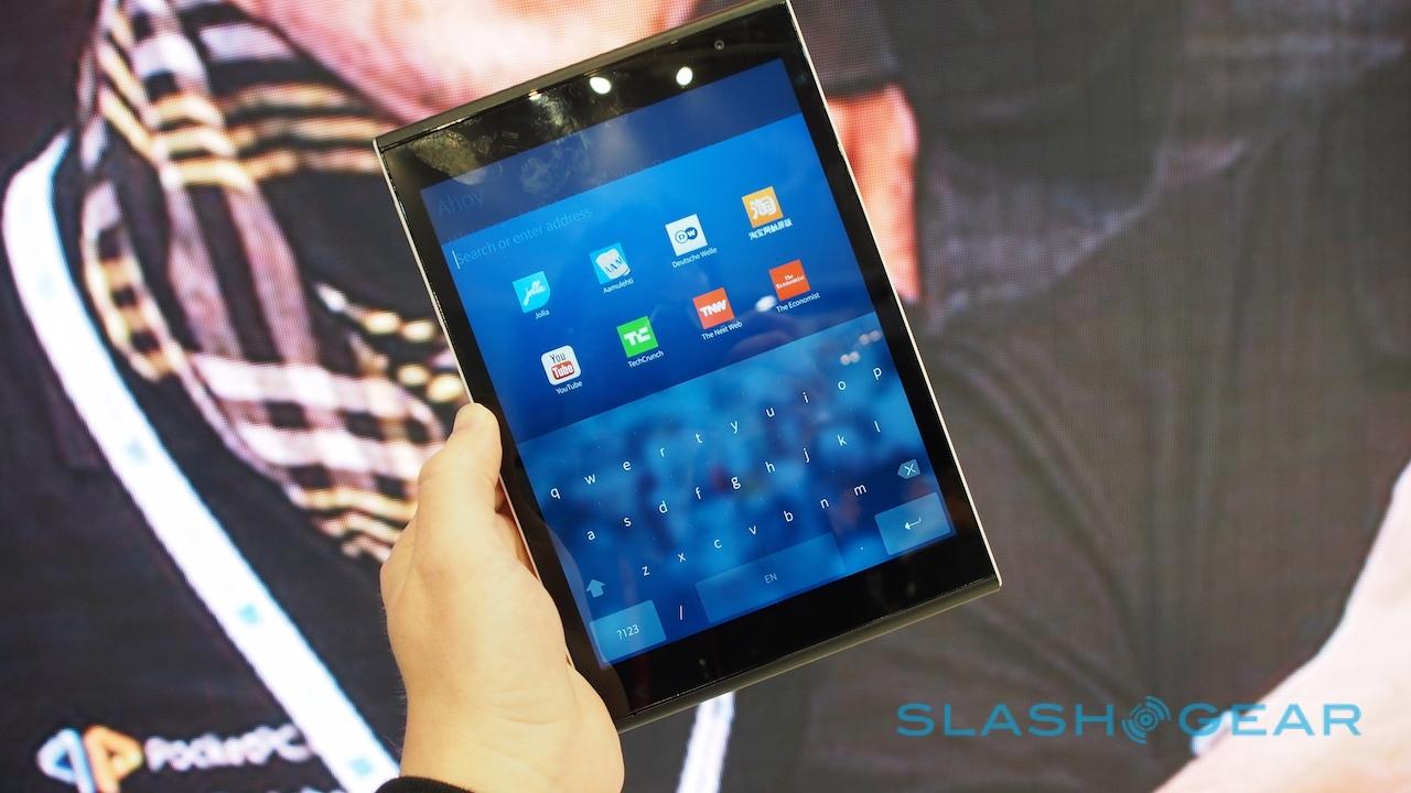
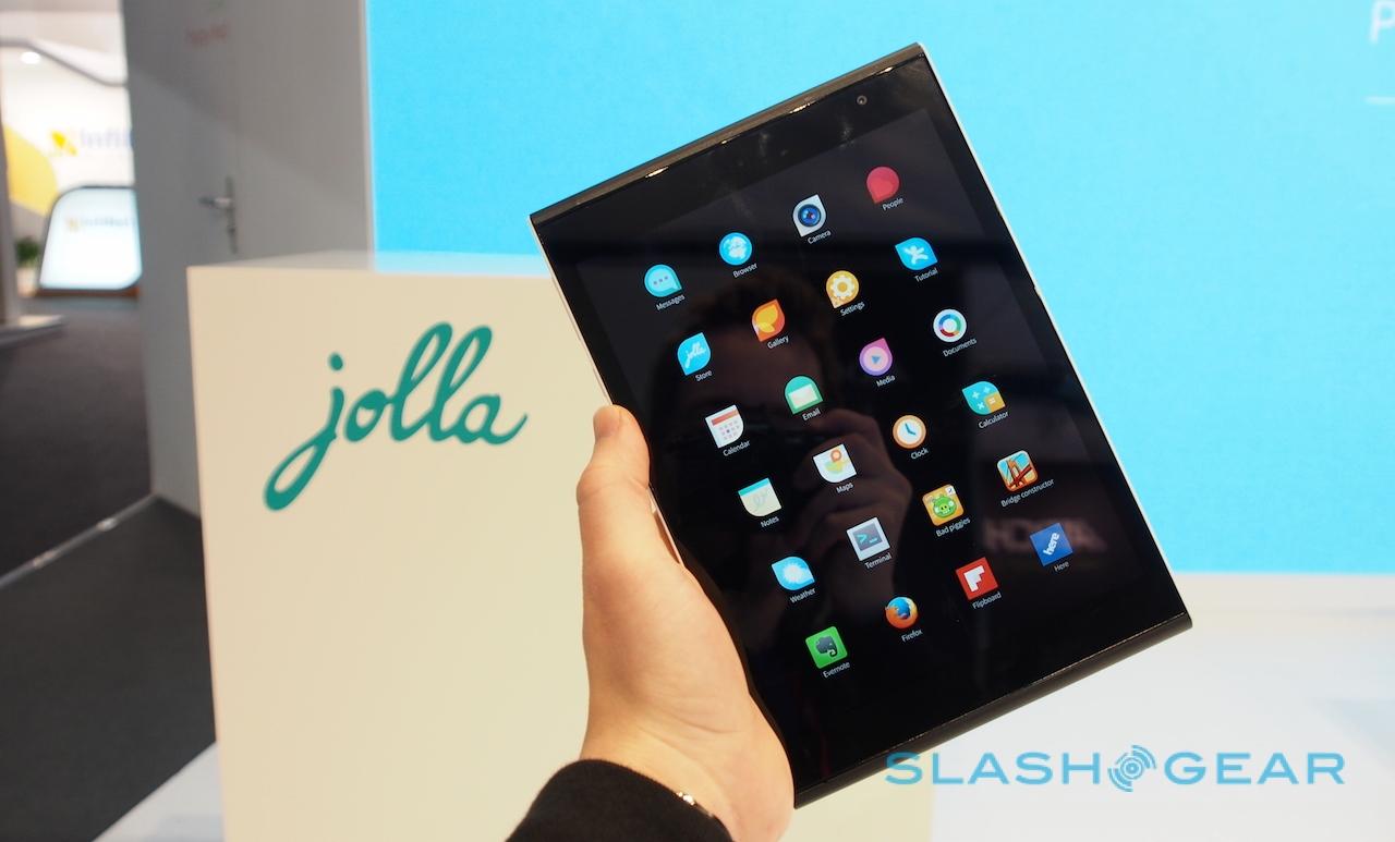
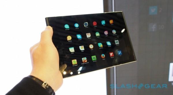
For a start, the gestures have been rejigged so that they're simpler and easier to remember. A swipe up from the bottom always summons the app launcher drawer. Swiping to the side takes you to the app switcher.
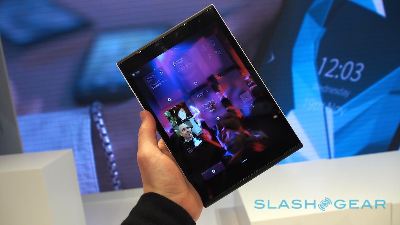
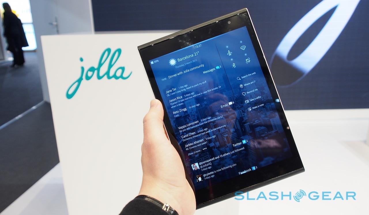
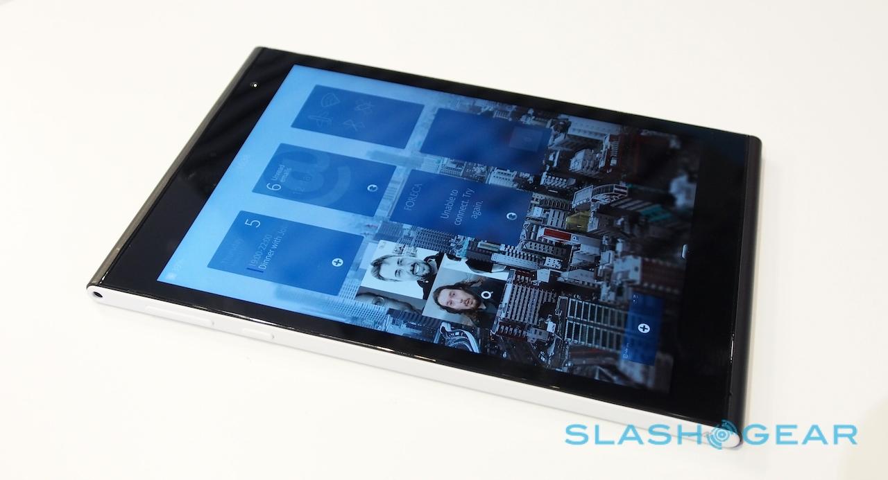
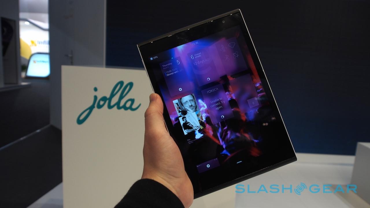
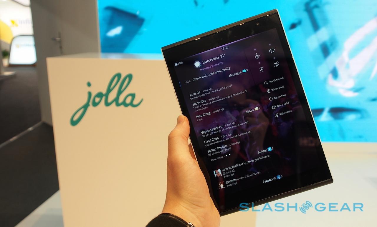
A further swipe opens the social feed, which collates all of your social accounts, upcoming calendar entries, recent emails and messages, and shows the weather. It's also where a number of shortcuts reside for things like toggling wireless options, checking "Where am I?" or asking Sailfish to "Remind me" of something.

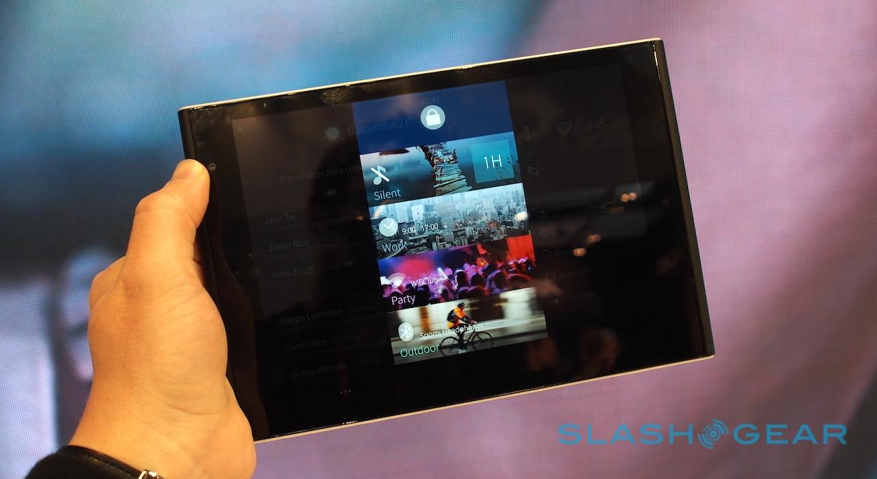
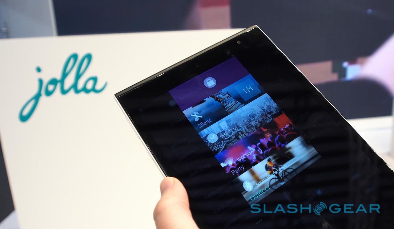
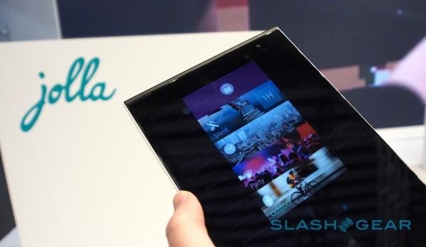
Pull down from the top, and you can switch between different modes, or scenes. For instance, Jolla had demo devices set up with three modes – Work, Party, and Outdoor – which could either be left to automatically switch between on a schedule basis, or be manually selected.
Each mode prioritizes different inboxes, accounts, apps, and schedules: so, you might have quicker access to your personal email and Twitter if you set up a Home mode, but get your enterprise messages and calendar in your Work mode.
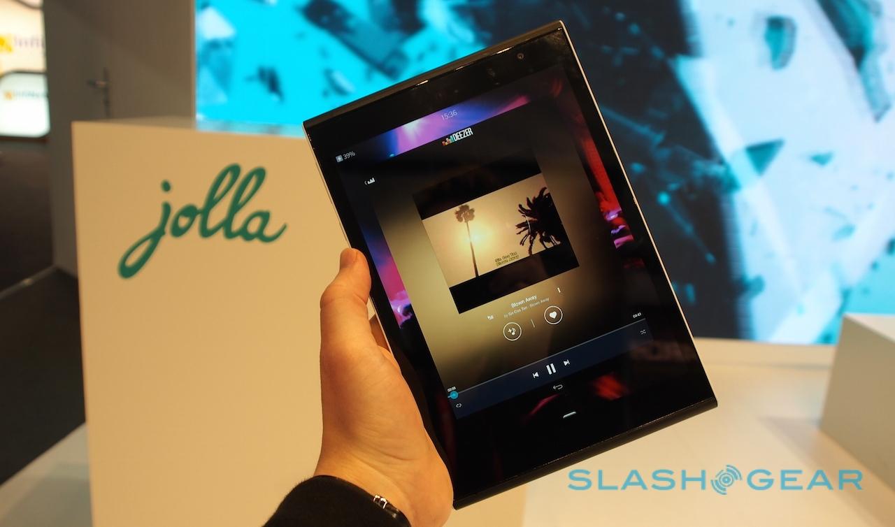
A new "partner screen" interspersed in the side-swipes could be used to showcase a particular app's functionality. In this case, Deezer's media player had the position of honor.
It's simple, and it works well. If anything, however, I can't escape the feeling that it's just too simple for a smartphone.
On a tablet, most people seem to focus on a core set of apps and services. Browsing, multimedia, social networking, and maybe some gaming: they're the general tasks that slates are expected to deliver, and they're all things Sailfish 2.0 seems to have a grip on (it's worth noting that neither the OS nor the hardware I tried is final, so I'll reserve judgement on things like performance until final tablets are ready).
Our phones, however, have become far more personalized devices. Yes, they all satisfy a (similar) set of cure functions to a tablet, but beyond that we've become spoiled by the surfeit of apps out there, and so meeting our demands for smartphone functionality is increasingly tricky (as, say, Microsoft discovered with Windows Phone, despite far greater manpower than Jolla can lay claim to).
Sailfish might have broad compatibility with Android apps, but without the Play Store it's reliant on developers embracing Jolla's concept or users being willing to spend the time side-loading.
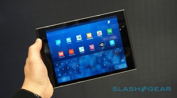
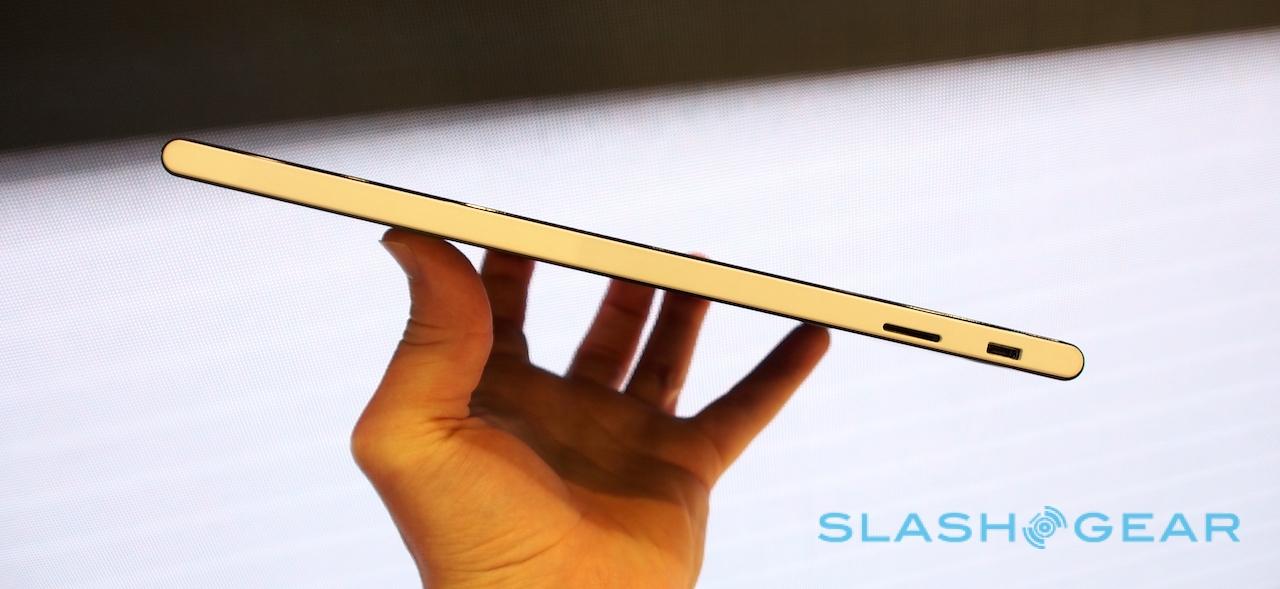
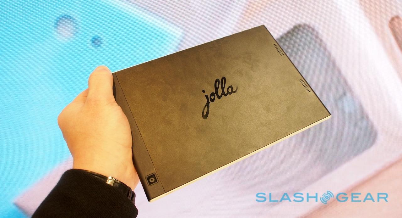
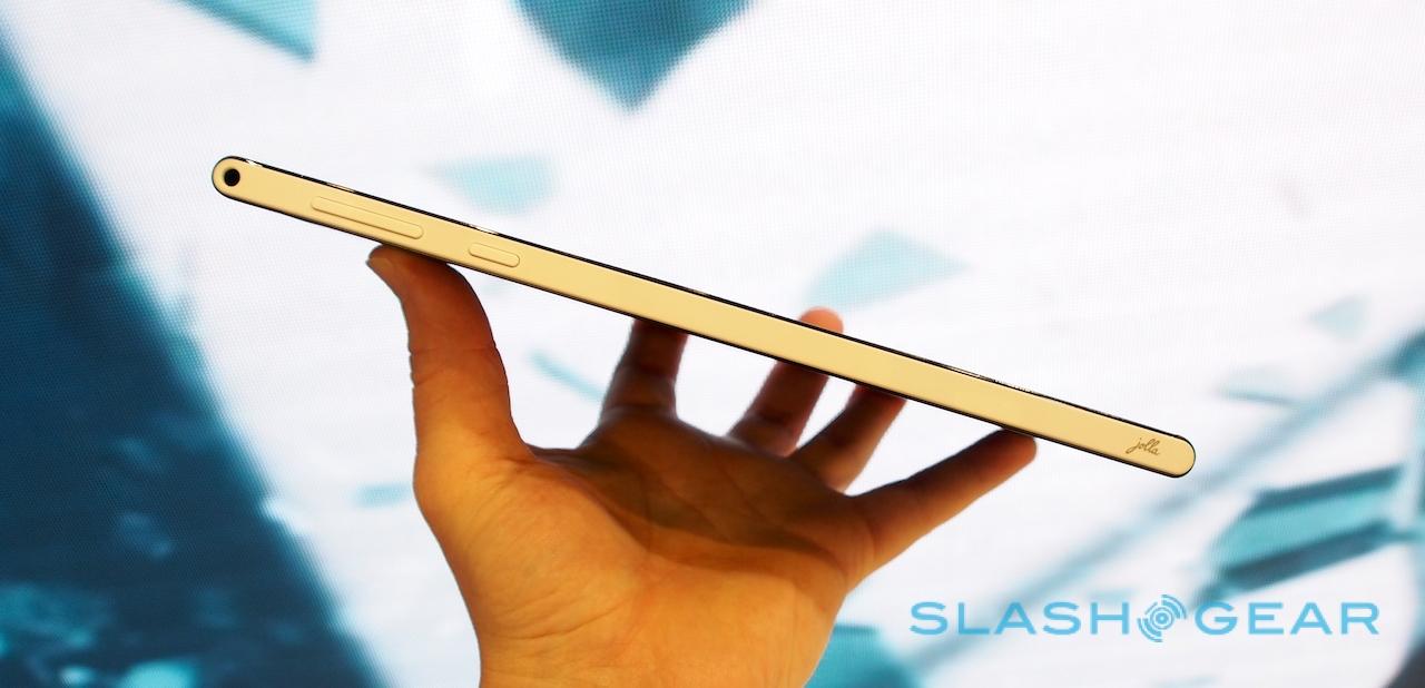
Luckily, then, Jolla has put together a well-thought-through tablet for Sailfish 2.0 to run on. The hardware isn't as crisply premium (or, to be fair, as iPad-derivative) as Nokia's N1, true, but the plastic is sturdy, the rounded edges clean, and the minimal buttons straightforward.
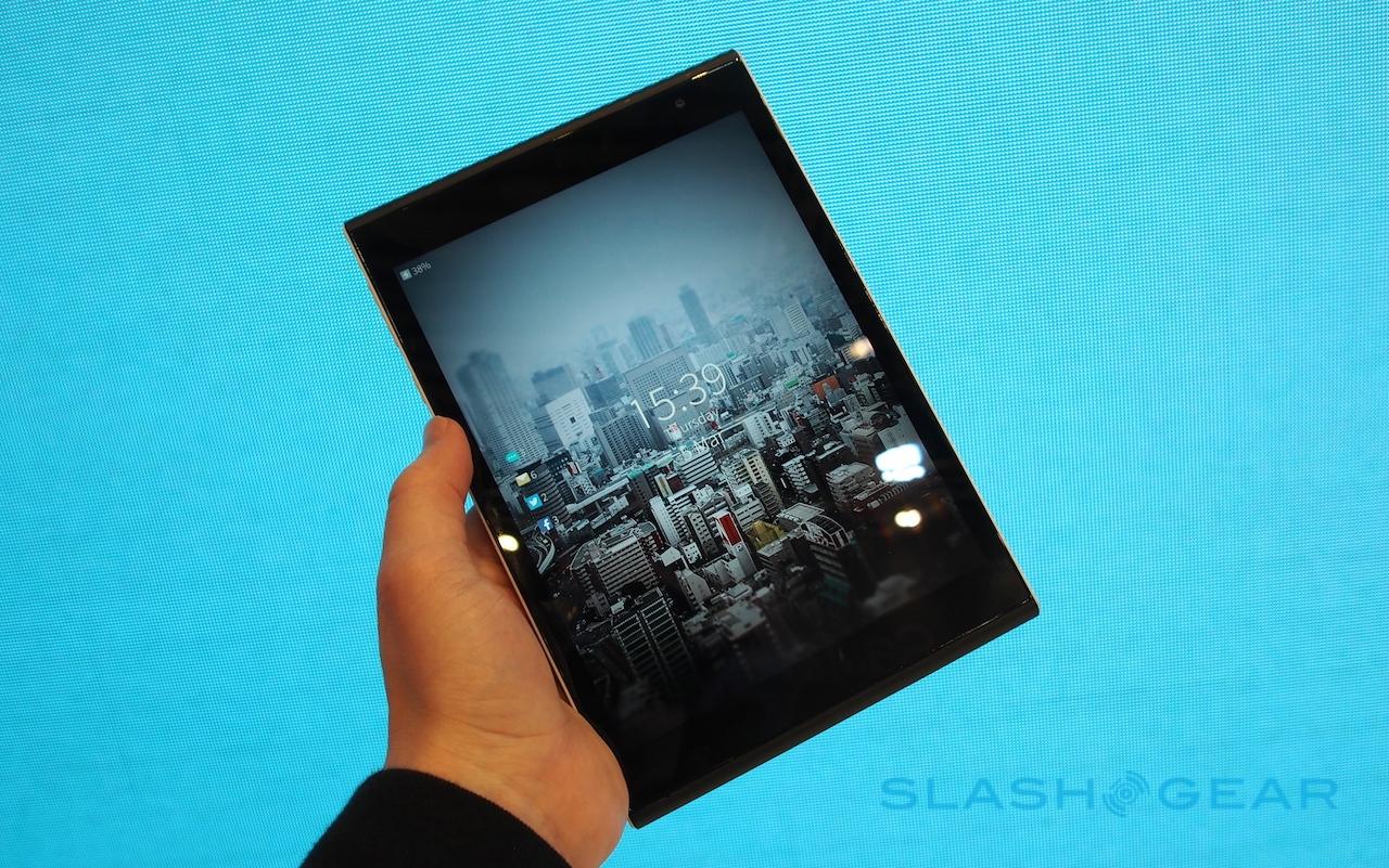
Most importantly, the 7.85-inch screen looks brilliant, an IPS panel running at a healthy 2048 x 1536 resolution, with good viewing angles and bright colors. It all fits into the hand nicely, is neither too heavy or too light for comfort, and Jolla has baked in some thoughtful features like a split QWERTY keyboard that loads automatically when you're in landscape orientation.
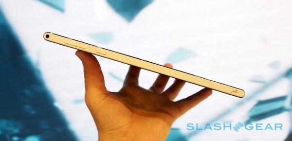
It was enough to convince sufficient crowdfunders to drive the Jolla Tablet comfortably past its original target and on to more than $2.25m last November, and I think enough to make the $249 slate arguably a better option for many than one of the legion of cheap (and often not especially cheerful) budget Android tablets out there.

