Todoist Updates Desktop And Web Apps, Plugin With New Look
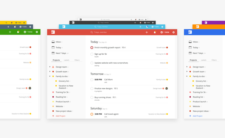
Todoist it has revealed a major update today, and among the changes (of which there are many) is a complete rehash of the company's desktop and web apps, and its plug-in. The new interface is, says Todoist, cleaner and brighter, and with more spacious arrangements thanks to list rows. A total of 10 customizable themes are available (for the top navigation menu, anyway), the icons have been refreshed, and the design has been given a focus on responsiveness (meaning it'll play well with different window sizes).
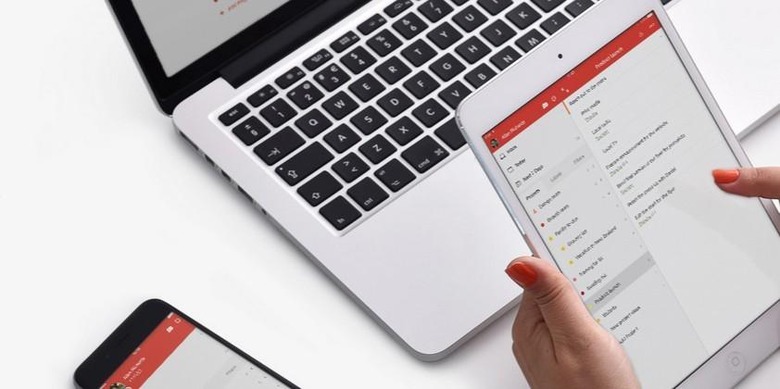
Todoist, for those unfamiliar, is a productivity app that recently pushed out redesigns for its mobile apps. This latest update follows in line with that, and brings more than just a redesign — there's also more features for using it on Windows, Mac, the web, Gmail, and others. This include intelligent Quick Add for rapidly adding tasks to Todoist.

Users are also able to now add more complex to-do tasks to their tasks list, such as specific commands that will automatically be parsed by the software and utilized as appropriate. The web app can be used on mobile devices, Quick Find can be used to rapidly locate data, and comments can be attached to a new task via the Quick Comment feature.
Todoist says it has been working on its new rebranding effort for more than a year, and that these new features and looks are part of this. Perhaps most importantly though, if you like the previous look, you can adjust the theme to keep it just the way it is.
SOURCE: Todoist Blog
