This Is Why You Want The New Android Auto: Walkthrough
Android Auto is getting its biggest revamp since the phone-powered infotainment platform launched five years ago, and it's all about making interactions speedier and safer. I've been testing the new system out, and the good news is that the refreshed Android Auto might well be enough to keep you from being too jealous of new cars running Android Automotive OS.
For sure, I still think that embedded Android – as will debut on the Polestar 2 – promises to deliver the most comprehensive and satisfying infotainment experience. Nonetheless, Android Auto support is far more prevalent, and with the software running on your phone rather than your dashboard, it means many more people will get to take advantage of this update.
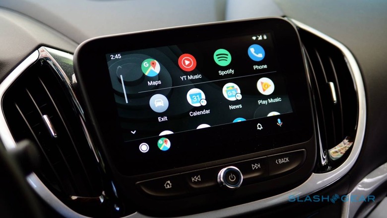
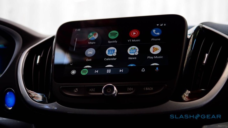
What you first notice is the new layout. The app launcher has been redesigned, and is opened by the button in the bottom left. Google organizes the most commonly-used apps at the top, with the rest laid out underneath. There's also now a Google Assistant badge on some of those icons, which indicates that you can tap to have an instant report. Hit the weather app icon, for example, and the Assistant will read out the forecast; hit the calendar app, and you get a summary of what's on your agenda.
On the road faster
A lot of what has changed boils down to one thing: getting you underway faster. Plug in your phone, for instance, and Android Auto will automatically resume whatever audio you were previously listening to, through the car's speakers. If you were looking at a route in Google Maps – or another navigation app, for that matter – on your phone, that will automatically show up in the Android Auto interface, serving up the first instructions.
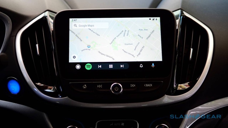
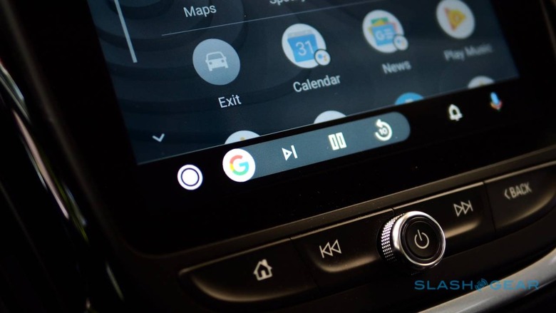
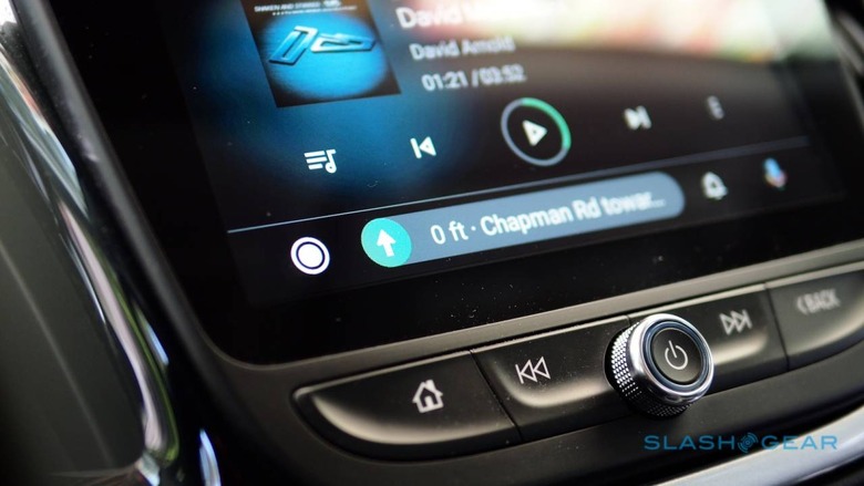
Much in the same way, there's now a new navigation bar and a new notification center. The former is context-sensitive, its contents depending on what else is on-screen. While I was using Google Maps for directions, for example, the navigation bar showed me playback controls for Spotify as that was playing in the background. If I flipped to Spotify, however, the navigation bar would show the upcoming turn instead.
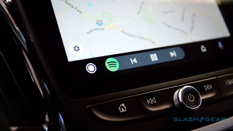
It leaves Android Auto feeling much more like a smartphone interface on the dashboard, and less like a static window into a single app. Similarly, the revamped notification center is more akin to what you'd see if you pulled down the shade on an Android phone. There, you'll get a summary of the recent calls, messages, and any alerts that have come in, and which you may have (sensibly) ignored to focus on the road instead.
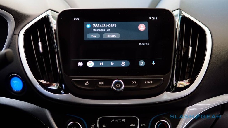
Infotainment screens are getting bigger - so is Android Auto
Unfortunately what might make the biggest difference to usability is something most people aren't going to be able to try. The new Android Auto supports widescreen layouts, showing more on-screen at any one time. That could include upcoming navigation instructions, details of the ongoing call, or controls for your music, while also looking at a different app.
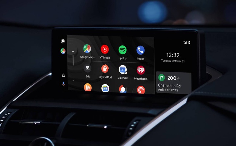
Problem is, currently just a handful of vehicles are compatible right now, including a selection of 2019 Jaguars, the 2020 Lexus RX, and the 2019 Mazda 3. Here's hoping that list expands soon.
What more people will get to try out is the new Android Auto dark theme. Like night mode on Android phones, it's about having a more eye-friendly interface. It's accompanied by new color accents, while the fonts have been changed, all in the name of making the UI easier to understand at a glance.
There's no excuse for not plugging in your phone
The importance of having a safer way to use your smartphone with minimal distractions can't be understated. Whether you're an Android user and that's Android Auto, or an iPhone user and relying on Apple CarPlay – itself getting a big update with iOS 13 later this year – controlled interactions through pared-back, simplified interfaces can be the difference between safely accessing a playlist or sending a message, or being in a crash.
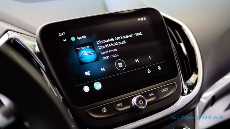
The drawback has typically been that, while native car infotainment systems usually aren't all that great, CarPlay and Android Auto have had their own issues too. This new version goes a long way to refining that Android Auto experience, however, and if that gets more people to plug in their phone and keep their attention on the road, that's no bad thing.
Google says the new Android Auto will roll out to users over the next few weeks. As for Android Auto for the phone screen, that won't get this new interface but will instead be eventually upgraded to the new Google Assistant Driving Mode previewed at I/O 2019 back in May.
