This Is What Using Glass Almost Looked Like
With all eyes on Google's new Android Wear program for smartwatches, what better time for the Glass team to show off a little of its wearable history, revealing an early – and awful – concept interface for the head-mounted display during GDC 2014. The Glass team brought the headset along to the Game Developers Conference to talk up its potential to bend digital games with the real world, which perhaps unsurprisingly includes just as many warnings about what not to do as it does advice on best-practice. Ironically, though, one of the biggest pratfalls was one Google's engineers themselves almost fell for.
"We don't show this off very often" senior developer advocate Timothy Jordan admitted, using the slide to illustrate one of the cardinal sins Glassware developers are warned about: not simply porting their existing app interface to the wearable.
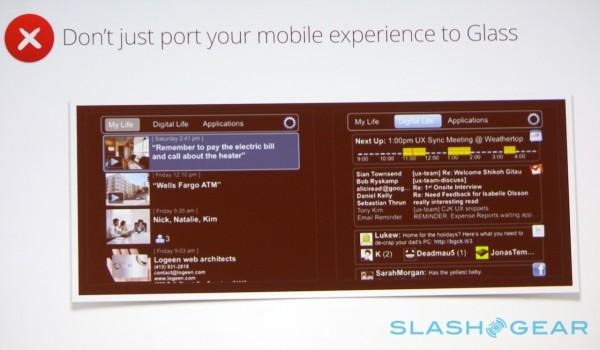
Google's initial idea, Jordan explained, had been to effectively put a mobile app interface into Glass' tiny display. That would've kept to the timeline concept that Glass uses today, but have been split into separate columns for "My Life", "Digital Life", and "Applications" which could be navigated both side to side and scrolled up and down.
Compared to the incredibly pared-back UI Glass currently has, it would've been not only information-overload for those wanting to quickly glance at the display, but most likely proved almost impossible to read unless you had perfect eyesight.
See what one developer thinks Glass should look like for power-users
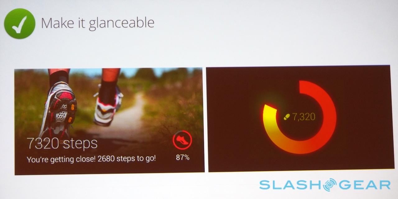
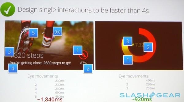
Over-delivering on data is one of the big no-nos Jordan pointed out to developers, showing how even an already minimalistic running app could be trimmed down even further. Single interactions should be faster than four seconds, he suggested.
As for what games might do with those four second chunks of engagement, the key difference between Glass and existing video games – or, indeed, existing head-worn displays, like Oculus Rift – is in how much of distraction the player will welcome.
"With game design we're used to immersion: catch their attention in the game, engross them, and keep them there" Jordan explained. "With Glass that's different, because you're getting in the way of the user's life while they're out there, living it. We need to be thinking about how do we build games that highlight this difference, not fight this difference."
Google has already developed a batch of mini-games for Glass to demonstrate some of the possibilities of a headset packed with sensors and an always-on display. However, the developer advocate argued, what will work best will probably not resemble anything close to mobile gaming as we know it, but instead focus on bracketing person to person interactions.
"The next step in glass gaming design is not going to look like gaming on your phone, or your tablet, or even a board game," Jordan said. "It's probably going to look more like IRL [in real-life] games."
