This Is What Apple Music Looks Like
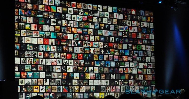
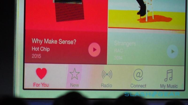
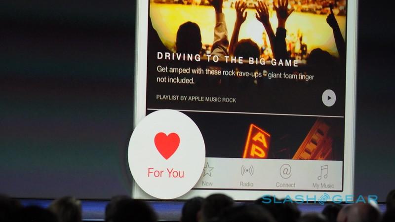
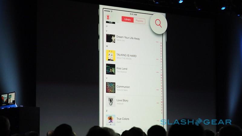
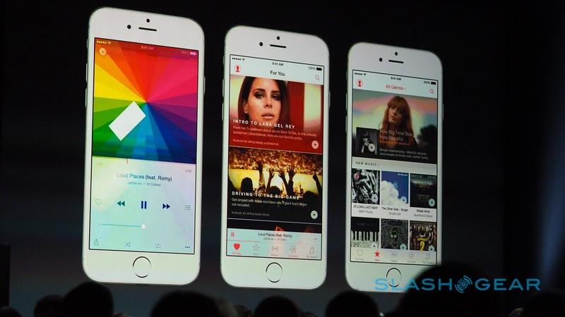
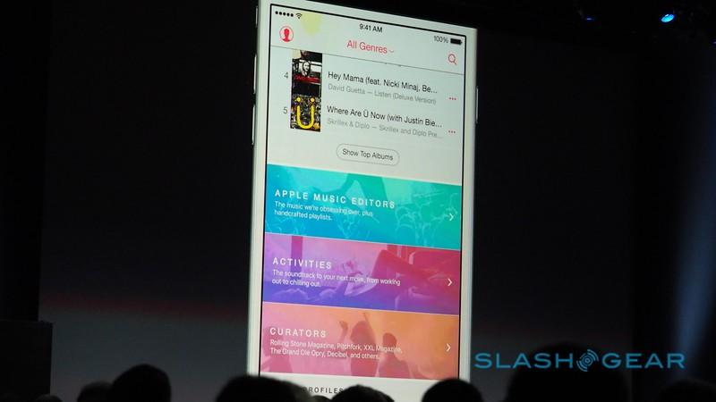
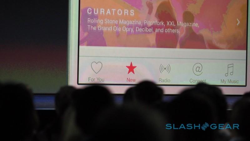
Apple has introduced its anticipated Apple Music service, something it bids as the next evolution in music — something as important as the introduction of the iPod itself, the company suggests. Even better, and quite unexpected, the service will be coming to Android users, too, with all it has to offer being contained in a single app. The service will make recommendations, show recent releases, provide music videos in high definition, and a whole lot more. This is what Apple Music looks like.
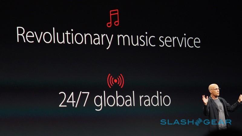
Coming as part of Apple Music will be the Beats One music radio station, which will play music all day long all over the world, broadcasting to 100 countries for a shared single music experience. All of this is contained in a single intuitive app, which packs a lot of content into a robust interface.
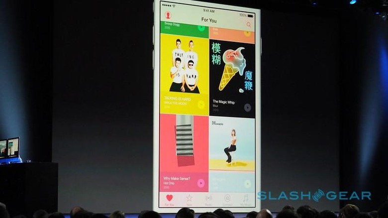
Siri is part of the service, too. "Play 'Born to Run' Siri", she was commanded, and up came Apple Music with the song automatically playing. You can get more specific, too, such as telling her to play the top ten songs in some genre, or the top song for any particular year. Even telling her to play the song from a movie's soundtrack.
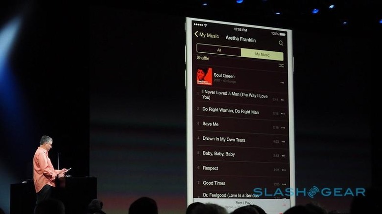
Artist pages are robust, while pulling up any particular album gives you a look the artwork with the tracks laid out linearly below it. Swiping and tapping with take you intuitively to the different features Apple Music has to offer; colors, meanwhile, are carefully used to keep the mass of data from being jumbled.
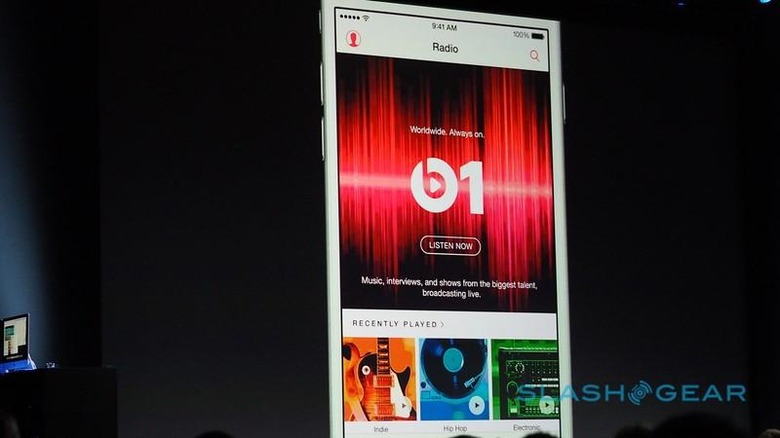
Apple has shown off the upcoming service extensively, and you can see if for yourself in our gallery below. For other Apple news from the WWDC event, be sure to check out the SlashGear Apple Hub for details coming in live!
