This Is The Nexus 9, Android Lollipop's Tablet Vanguard
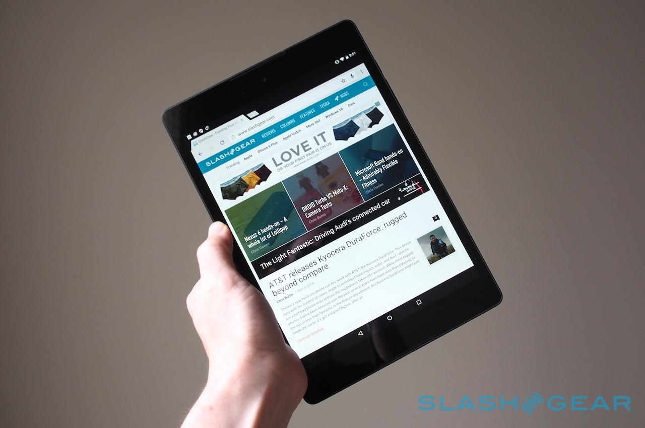
Google's Nexus 9 faces more than a few challenges. Not only does it have the job of following Google's well-esteemed Nexus 7, which for two generations gave Android tablet fans an affordable and bag-friendly option, but it also serves as flag bearer for Android 5.0 Lollipop on a tablet form-factor. Throw in the fact that it also marks HTC's long-awaited re-entry into the slate segment, and that it's the first true 64-bit Android tablet courtesy of NVIDIA's Tegra K1, and that's a whole lot of pressure resting on one 8.9-inch iPad rival. So, how does it hold up?
What this isn't is our full review. While I've been playing with the Nexus 9 since last week, Google only pushed out the final firmware to every reviewer on Sunday afternoon. I've certainly got some early feedback as a result of my time spent with the tablet and Android Lollipop, but we all know what a difference software versions can make, and the Nexus 9 deserves a chance to shine – or otherwise.
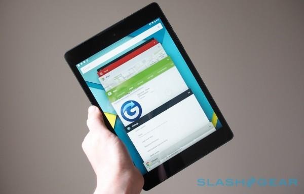
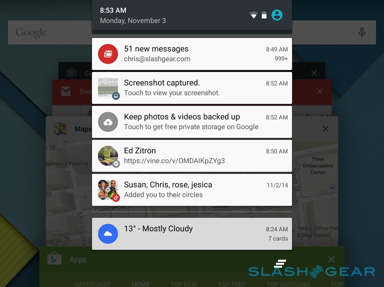
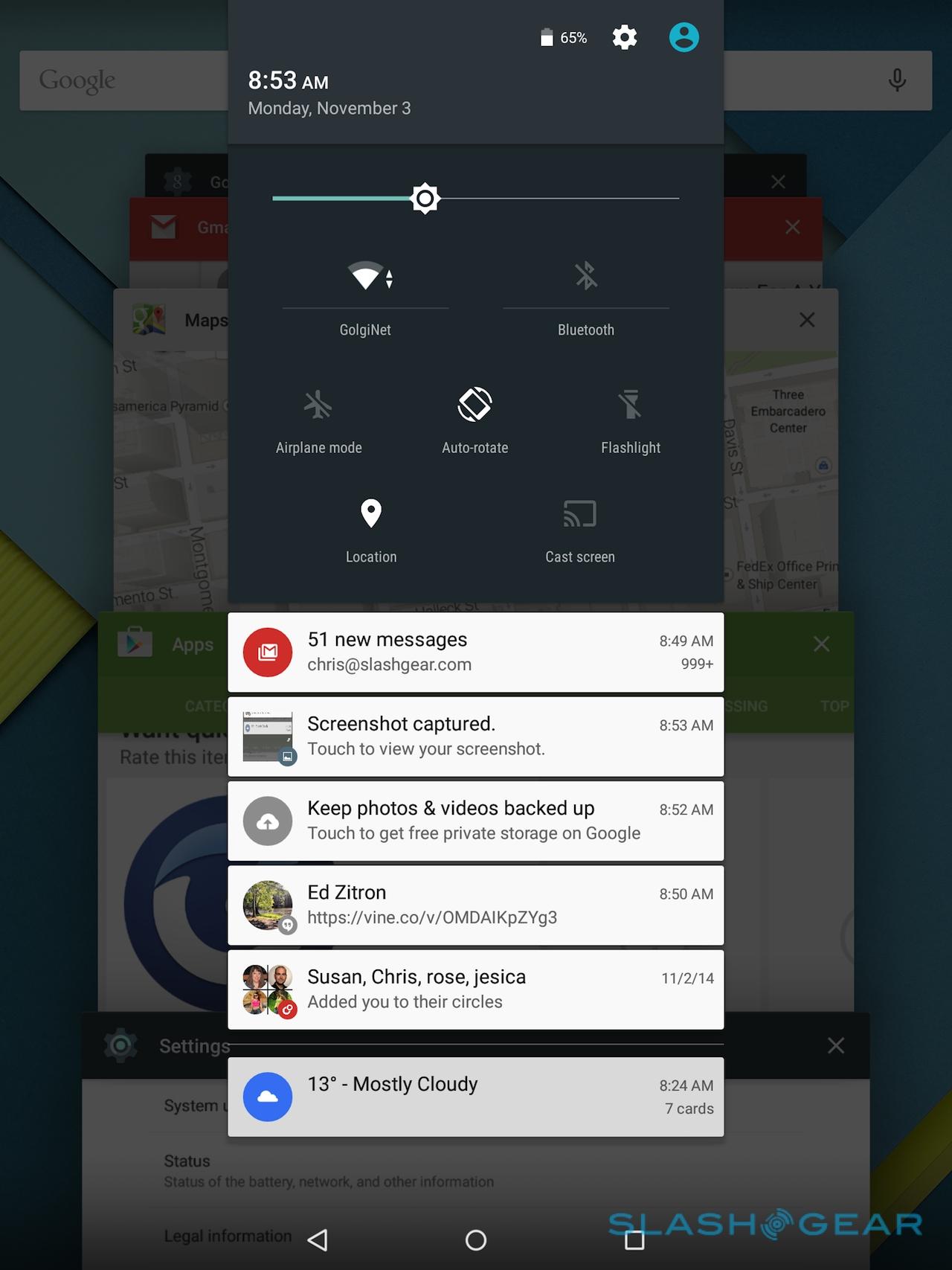
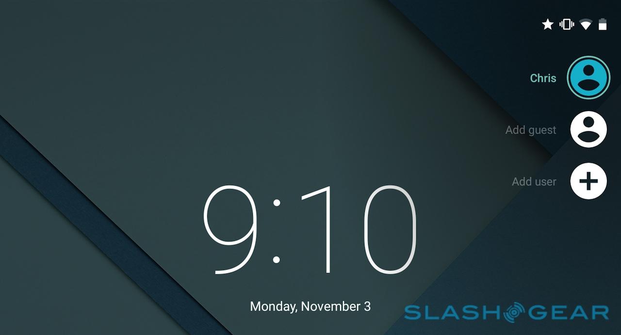
It's not to say there aren't some early highlights. Lollipop is living up to my first impressions of a clean, fresh OS with some well thought-through decisions made around usability. Some of those work particularly well on a tablet, like multi-user support.
You can set up multiple accounts with varying degrees of limitations – such as for your kids, locking down what they can and can't buy from Google Play – or a generic "Guest" account, perfect if your Nexus 9 lives on a coffee table in a communal area and you'd like visitors to be able to use it.
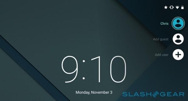
I was quickly able to set up a second account so that guests could access the remote control apps for Hue lighting, Sonos music streaming, and get to Chrome to answer those all-important "which actor was it that played the ape in Planet of the Apes questions, while still keeping my own data like email and Google Drive safely locked away.
Unfortunately, unlike the latest iPads and Samsung's recent Galaxy Tab S models there's no fingerprint biometrics, which would be the obvious streamlining for user accounts: simply swipe or tap your finger, and you have access.
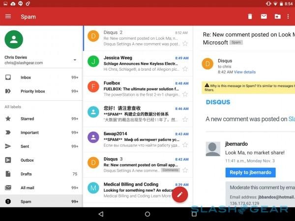
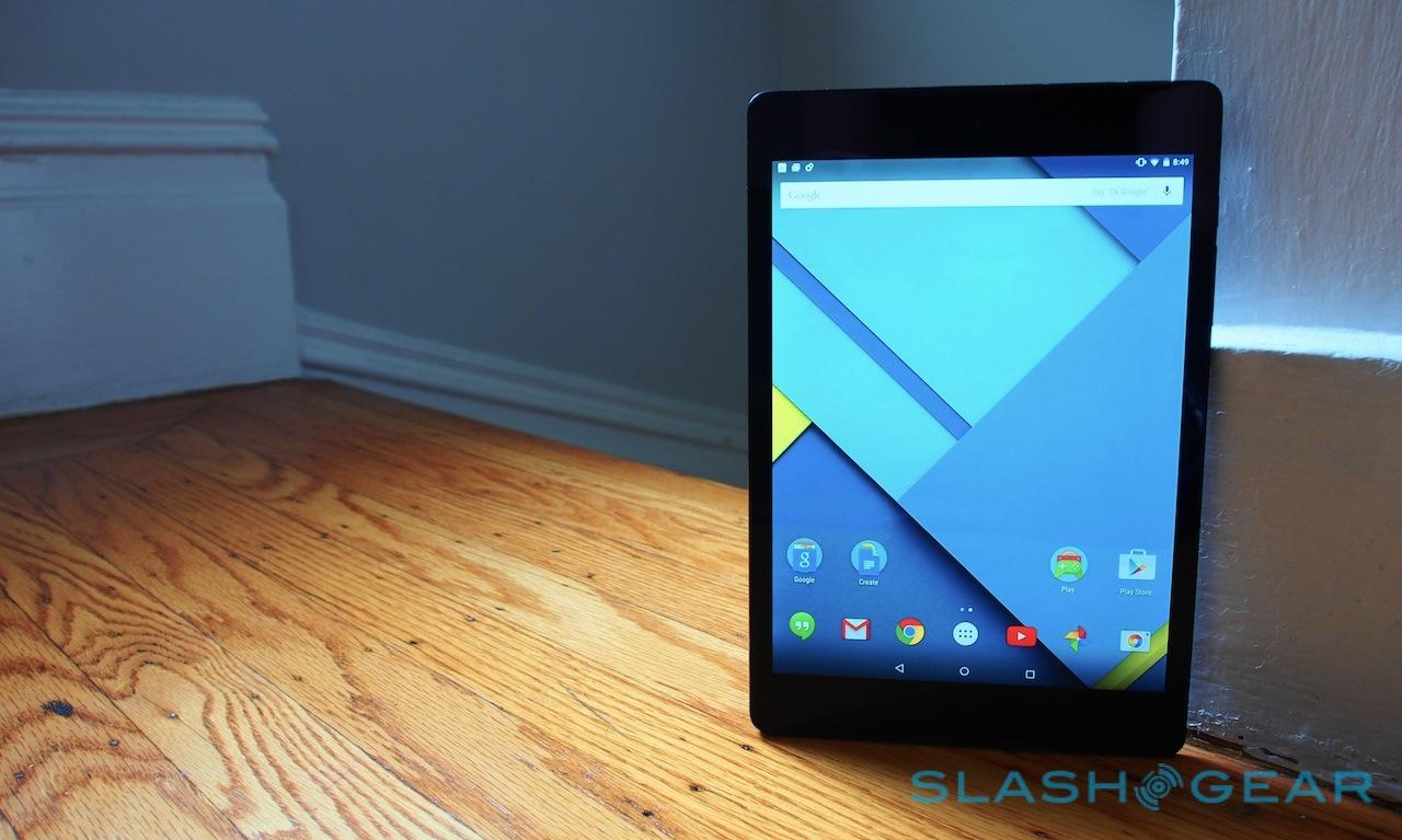
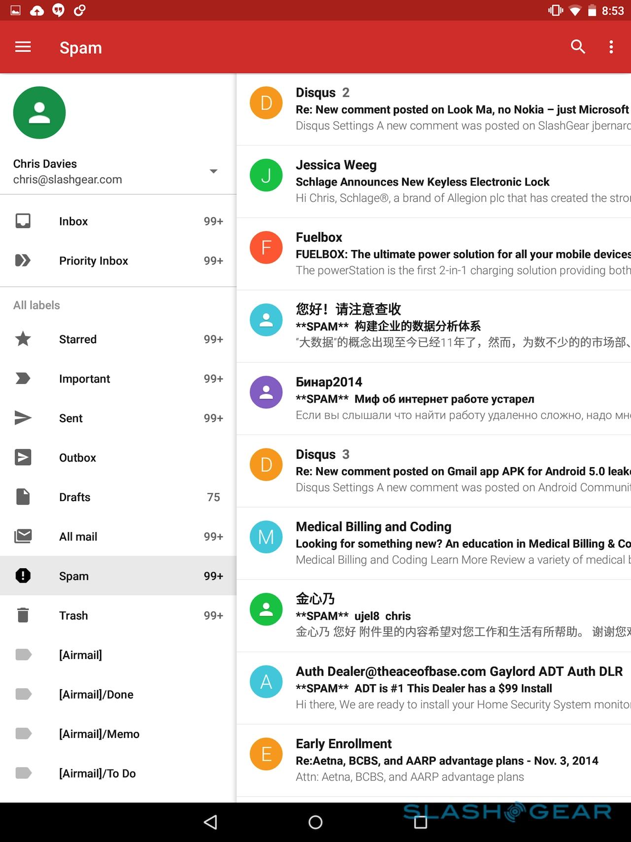
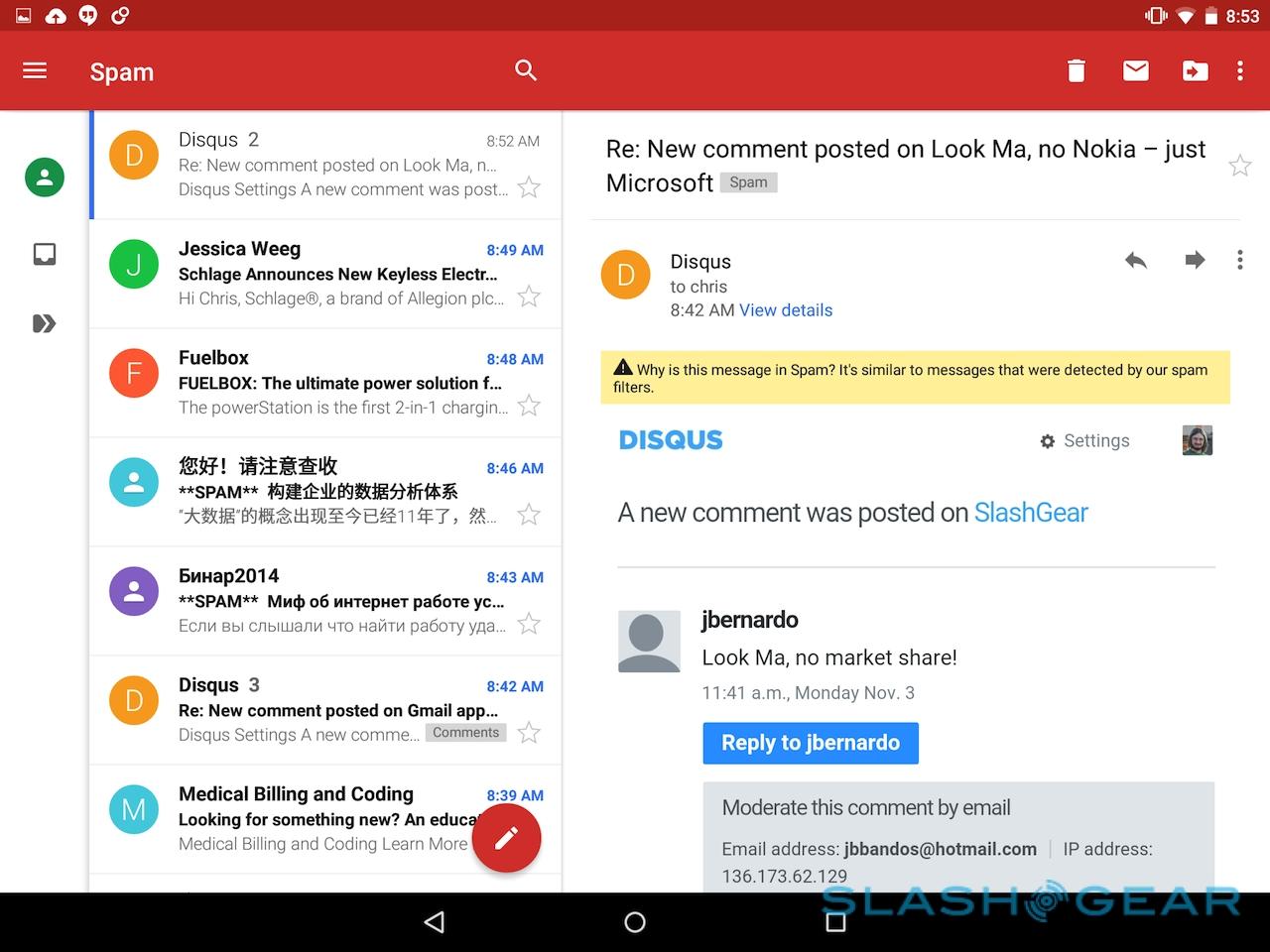
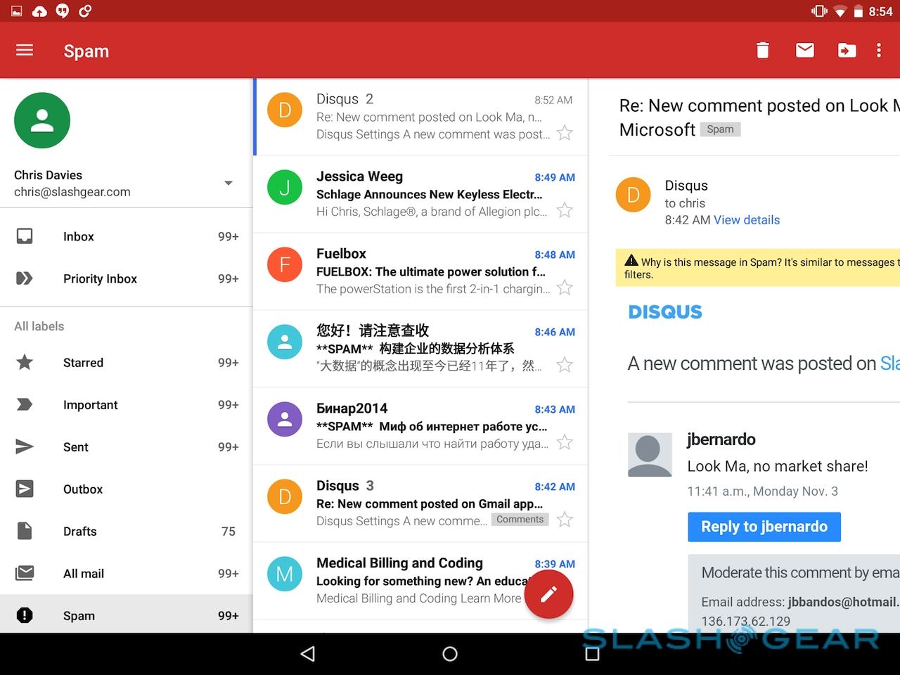
The new Gmail app is also a highlight, and again it's particularly suited to a tablet form-factor. In portrait, the Nexus 9 can show both your folder list and the contents of your inbox; flip into landscape, and you can have three columns, with a preview of the message itself.
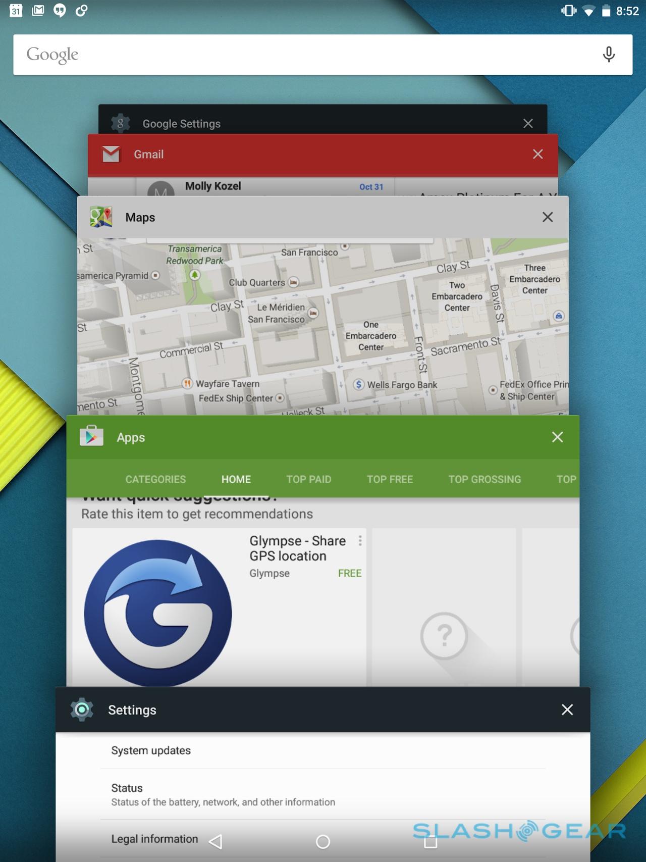
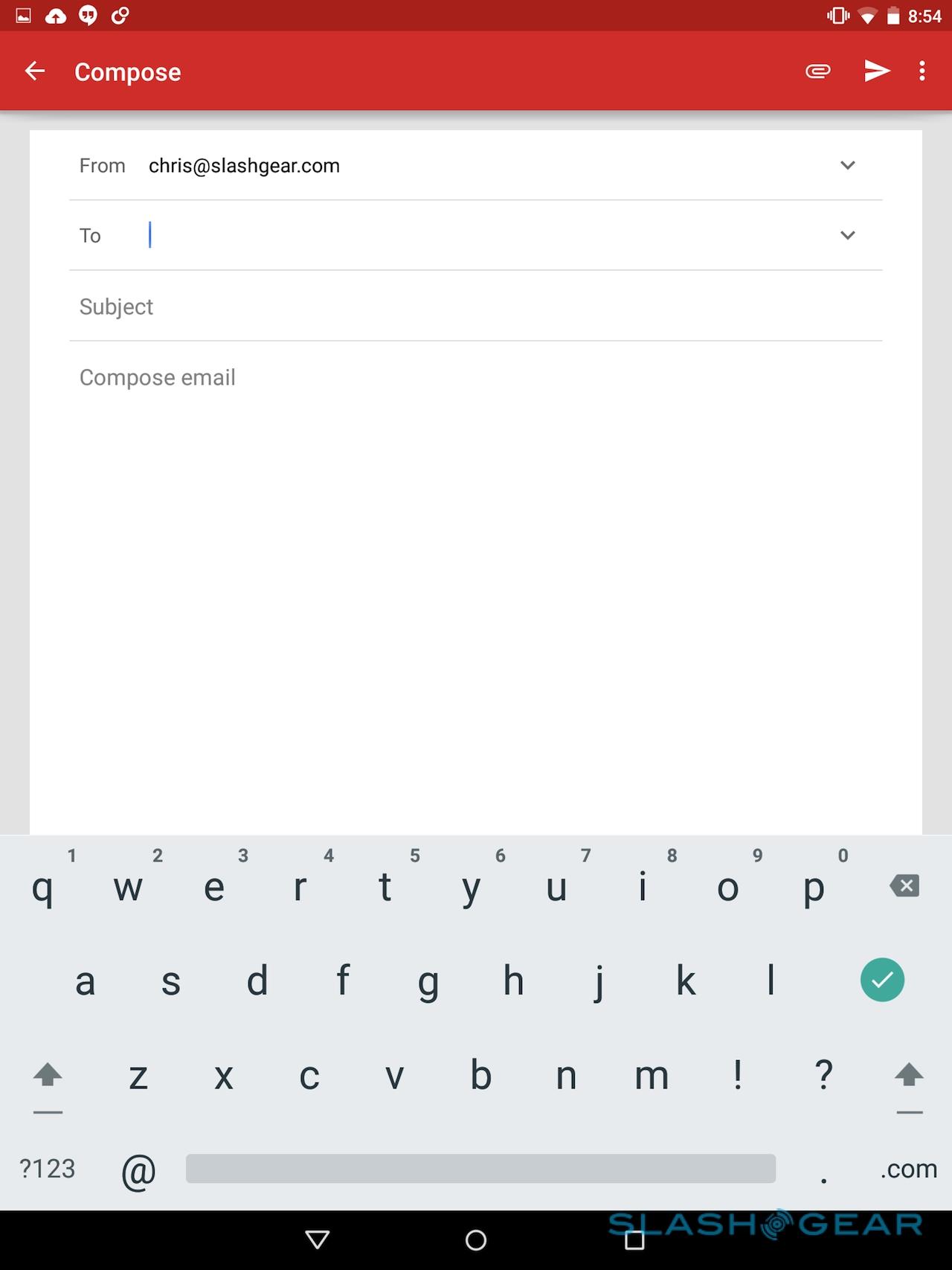
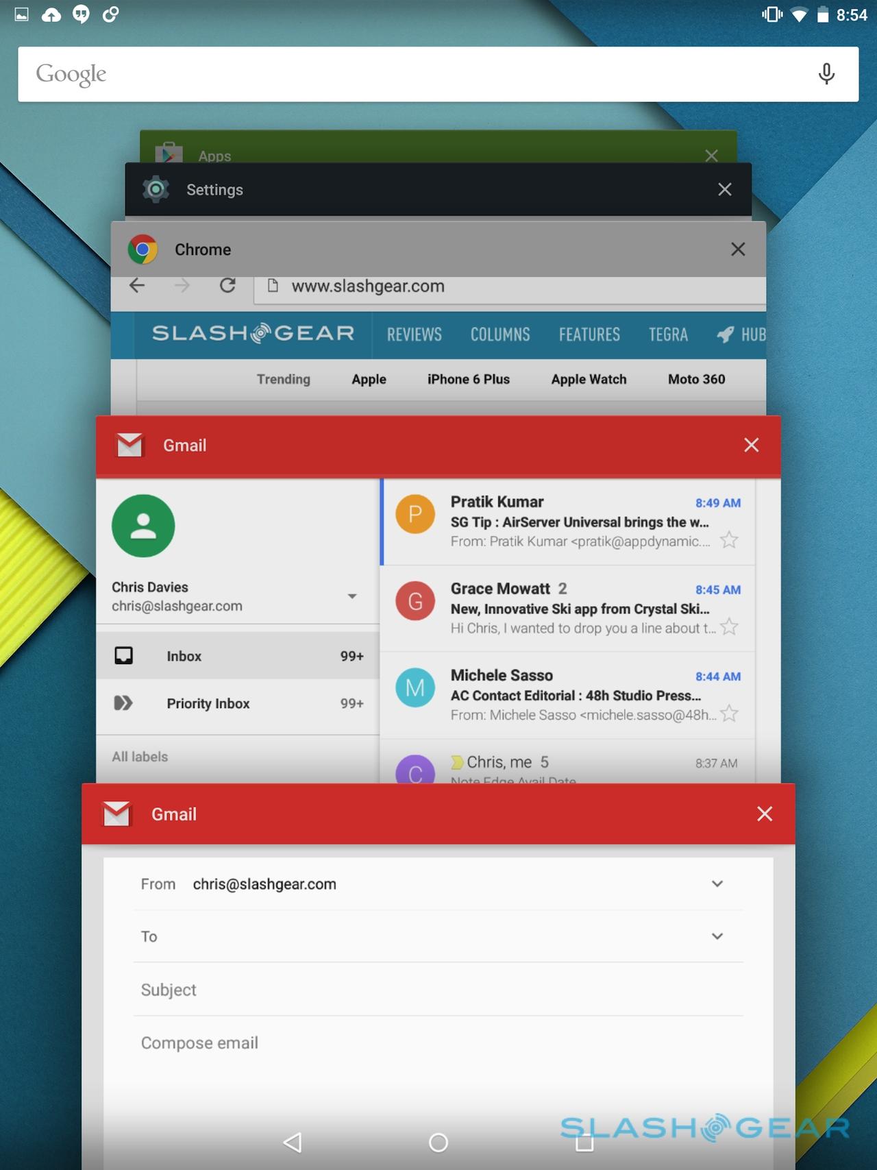
Adding to that flexibility is the fact that the email compose dialog now shows up as a separate window, which means they also get a separate pane in the app switcher. It makes grabbing details from messages in your inbox and a work-in-progress email far more straightforward, unlike pre-Lollipop where you'd have to constantly be pulling your message out of the drafts folder.

Even better is the fact that the standalone Mail app has been merged with the Gmail app, making one single place for your email. Gmail and Google Apps accounts can now live alongside your Outlook, Yahoo, or any other POP/IMAP account, along with Microsoft Exchange. There's a new threaded message view, too, similar to Google Inbox, though the fact that it supports more than just personal Gmail accounts makes it far more useful for me.
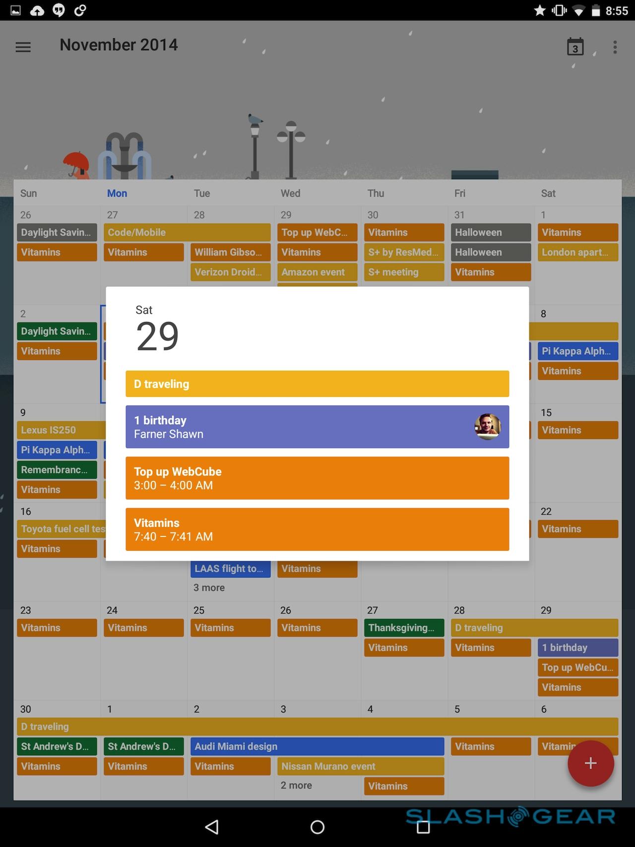
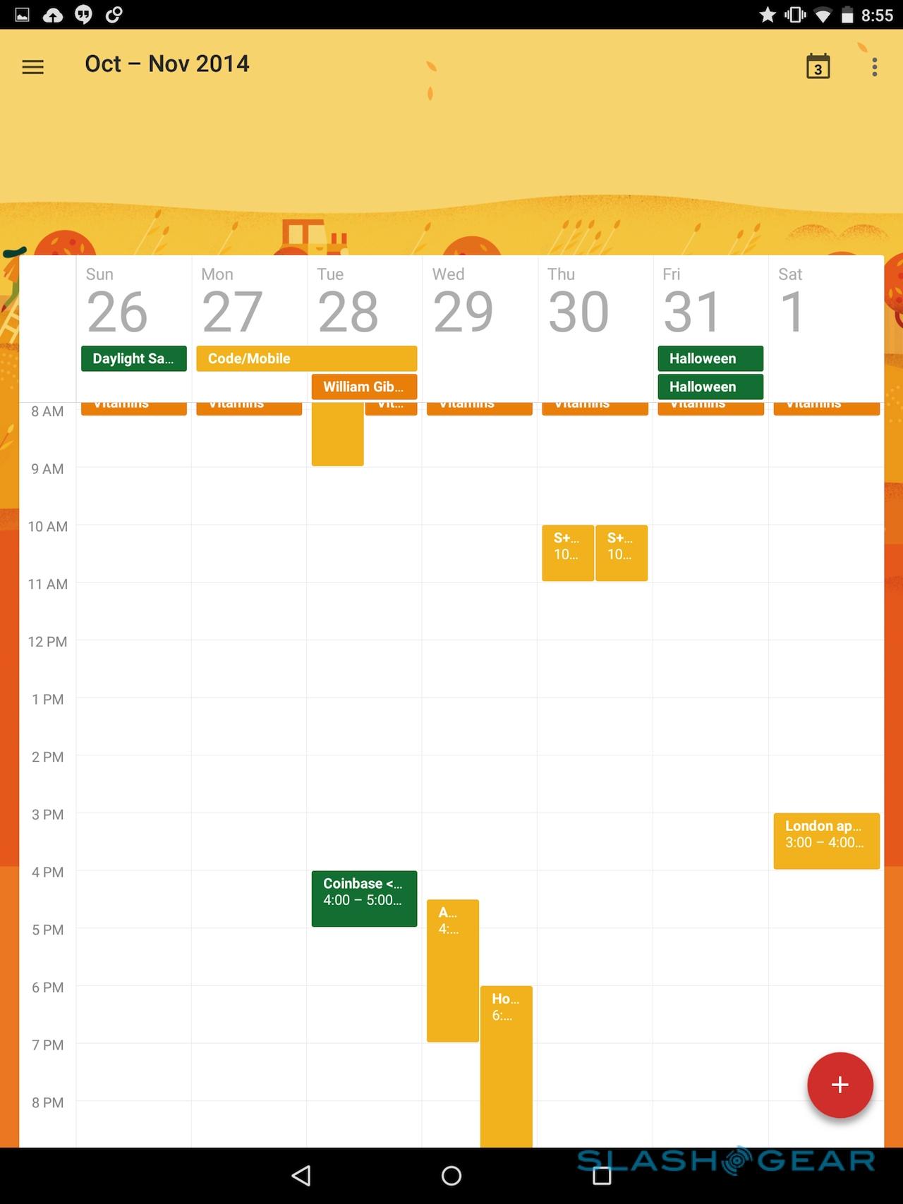
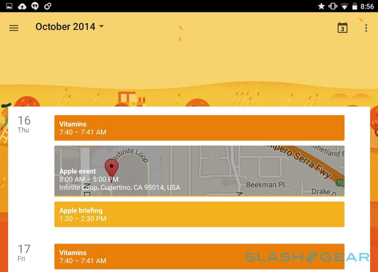
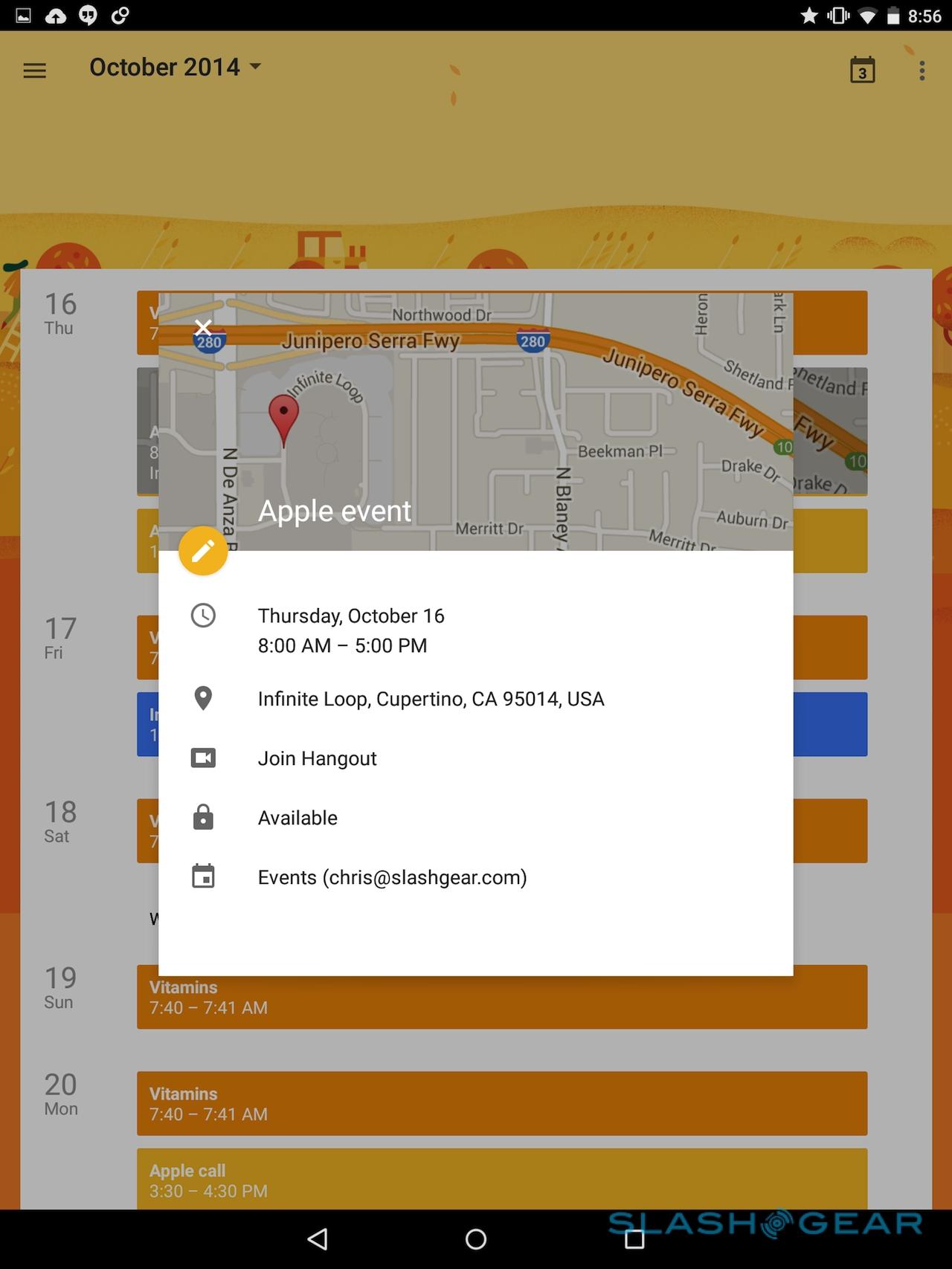
The Calendar app has also come in for a redesign, and it looks frankly far more attractive than a schedule planner has any right to. The Nexus 9's 2048 x 1536 display has plenty of space for the full month view, but it's the schedule list that I particularly like. As well as your color-coded appointments, you get slices of contextual data – like a Google Maps preview – slotted in among them too.
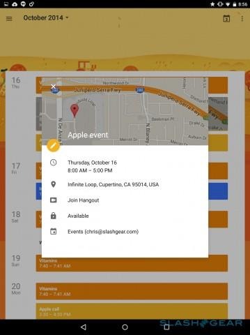
Is it useful? Well, there are still two taps to actually get to the usable map itself – just as in the previous iterations of calendar – but it certainly looks better, and does a stronger job of showing you at a glance when you need to travel and when you just have a reminder on your list for the day. Flip into landscape view and you get both the schedule list and a full date grid for the whole month.
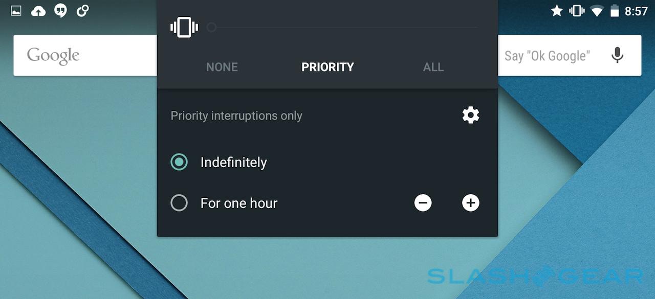
Lollipop isn't short of changes, then, though I'll hold off from judging them completely since Google's new firmware is said to focus in particular on stability. Nonetheless, features like more granular control over what gets silenced in mute mode, and the ability to automatically unlock the tablet when a trusted Bluetooth device is nearby, have great promise for everyday usability.
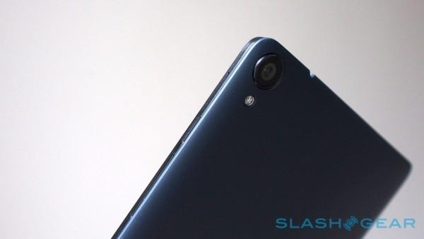
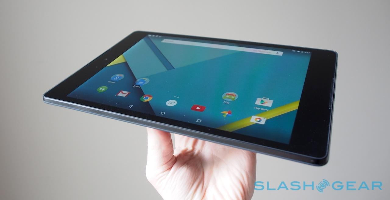
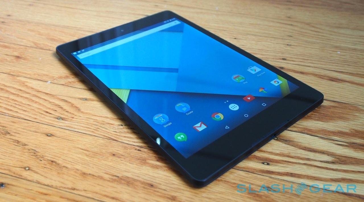
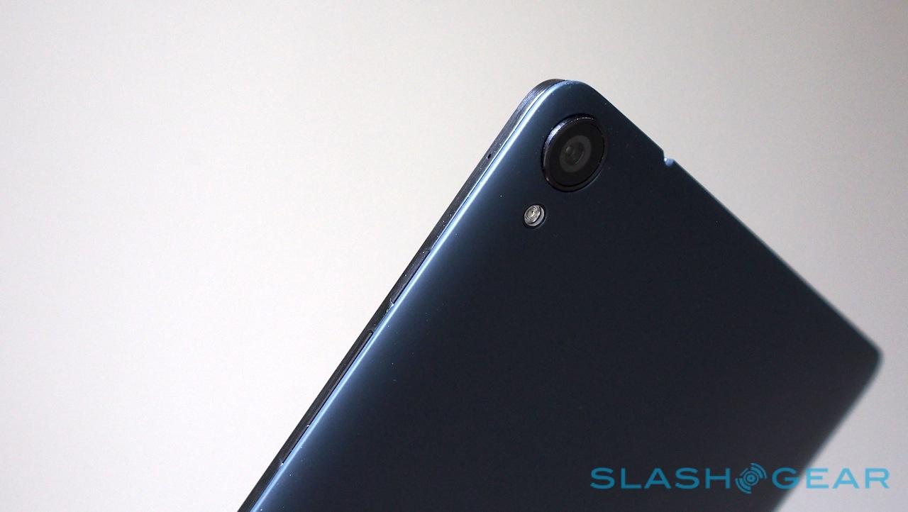
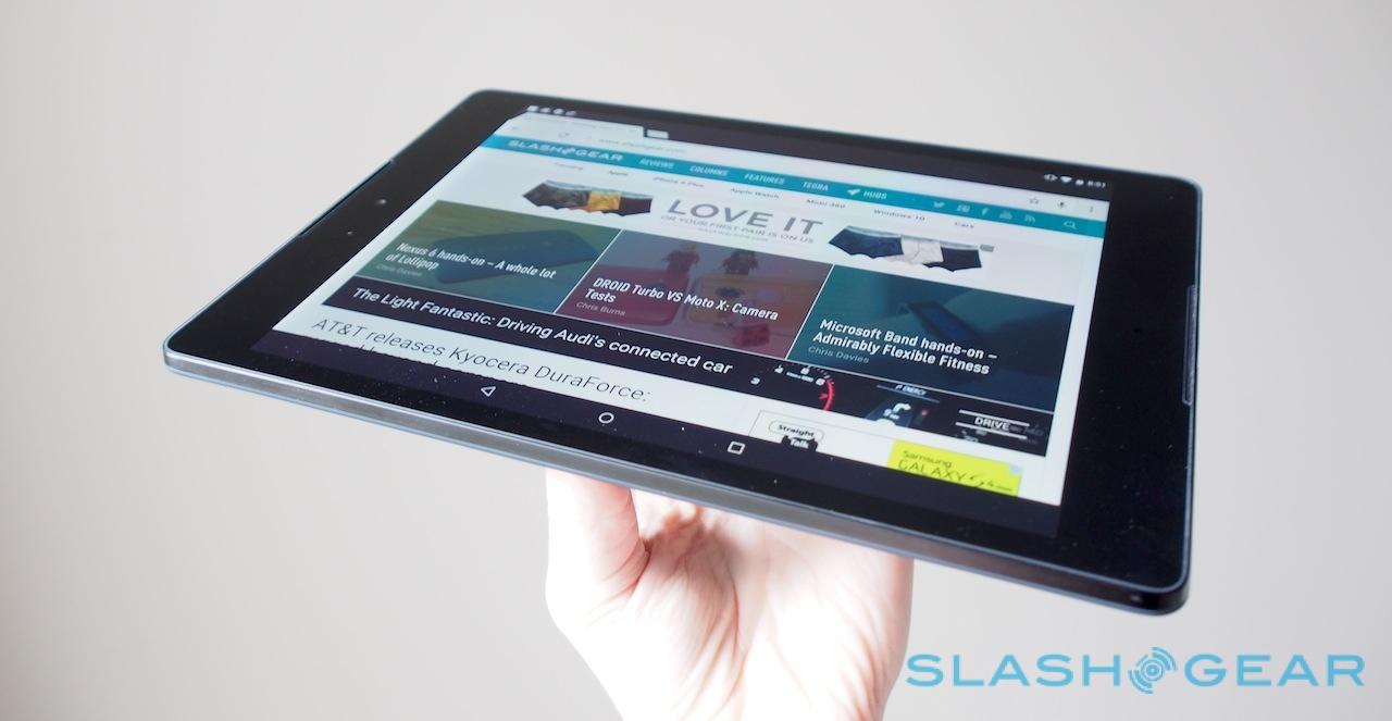
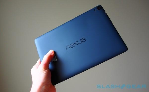
As for the tablet hardware itself, HTC has done a fair job balancing materials. In an ideal world there'd be more metal, perhaps, but the chamfered metal bezel does at least feel crisp and high-quality against your fingertips – even if I find the power and volume keys on the side are a little too recessed for my liking – while the soft-touch rear cover is easily gripped.
HTC's BoomSound speakers deliver a surprising degree of bass; I had to notch down a test Taylor Swift song (played through YouTube, not Spotify) because at maximum volume the treble got a little shrill, but at more moderate volumes it's impressively balanced.
Battery life is likely to be impacted by the new firmware too, since graphics chip performance is also said to be affected. Still, I've had a weekend of on and off mixed-use on a single charge, and Google itself estimates 9.5hrs of WiFi browsing.
In short, it's already shaping up to be a polished, capable tablet, though given the more premium price tag – the Nexus 9 kicks off at $399, though that only gets you a mere 16GB of storage and no microSD slot to add to it – it needs to be just that if it's to compete with iOS and Android rivals. I'll have a full review very soon, to tell you whether it succeeds or not.

