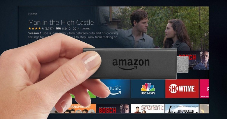
This Is Amazon's New Fire TV UI, And It's A Big Improvement
If Amazon has a content problem with its Fire TV and Fire TV Stick streamers, then it's the best sort of problem to have. In the two and a half years since the first generation set-top box launched, over 300,000 movies and TV shows have been added to the catalog of on-demand titles. That's along with over 7,000 channels, apps, games, and more. After a while, it starts to get a little overwhelming, hence a whole new interface for Fire TV that Amazon is previewing today.
It's the biggest overhaul to the Fire TV user experience we've seen since its April 2014 debut, building on technologies like voice search and Amazon's recommendations engine. The current UI segments different categories – like Prime Movies or third-party apps – into side-scrolling carousels, with the primary navigation at the left. That's something the new interface does away with.
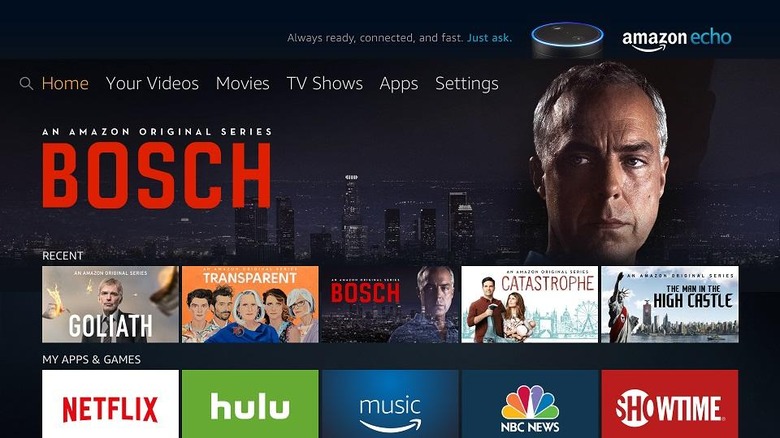
Instead, it's shifted to the top, and pared down into category labels. Amazon tells me it's done in the name of saving space; indeed, the change leaves plenty of space for a new hero section. Not only is it a larger space to preview new TV shows like Amazon's Originals, movies, apps, and games, it can be scrolled from side to side to see other headline titles.
It needn't just be still images, either. Amazon found that Fire TV users were far more likely to dive into a new show if they had a taste of it first – more so than just a still of President Underwood stepping down from Airforce One, or the cast of Transparent staring balefully at the camera – and so the hero picture can actually be a trailer or a sample of gameplay. Initially that will be from a selection of editor's picks, but over time, Amazon tells me, the hero contents will be shaped by what individual users have been watching.
Set into the hero slider is the category switcher, with options for "Your Videos," "Movies," "TV Shows," "Apps," and "Settings". The new addition is "Your Videos," which Amazon says addresses one of the most frequently-heard complaints by owners: that they couldn't readily tell which would be paid content and which was free to stream. Amazon included "Prime Video" flags for shows and movies it offered, but not from other services.
"Your Movies," however, includes everything you subscribe to. If you have a Netflix account, those titles will be included in there; the same with Hulu, and other providers. When you select something to watch, Amazon will default to offering you the free streaming option if available.
So, if a movie would be a paid download through Amazon, but you have access as part of your Netflix subscription, it's the latter which will be offered as the primary viewing method. If there's more than one provider option, Fire TV will offer you the choice; if you return later, to resume playback or watch another episode, it'll default to whatever service you picked before.
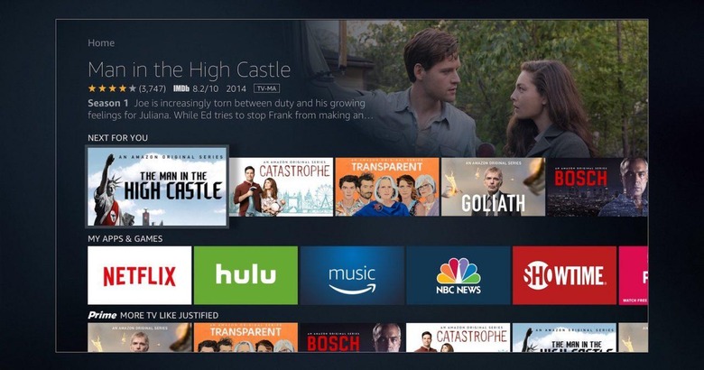
Underneath the hero bar is a redesigned set of side-scrolling categories, like content related to something you've already watched, or favorite apps. Unlike with the current UI, all of the other rows stay on-screen as you scroll – you can easily move up and down just as you do side to side. It looks a lot more like Netflix's app on Apple TV.
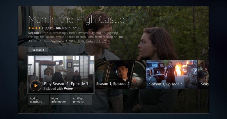
Details on each show or movie have been enhanced, with more information. Since Amazon discovered existing shows were a popular jumping-off point for related content, it's bolstering the "Customers Also Watched" sections too. There'll be more options, along with suggestions by actor and director. Individual actors will have biographical information pulled from IMDb: in the demo I saw, Harrison Ford's page had a brief bio, links to trivia, and then a selection of his movies across various providers.
As for other apps, like games, news, and social media, they fall into the reworked "My Apps & Games" section. That can now be customized, with individual apps reordered and removed from the list. A new Voice View feature reads out the UI wherever you are, useful for visually-impaired users.
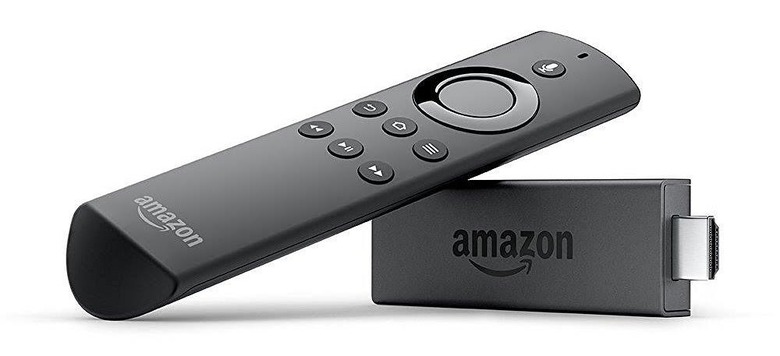
Then there's Alexa. Amazon's voice assistant is already available on Fire TV of course, and indeed the most recent Fire TV Stick comes with the Alexa voice remote as standard, but with the new interface she'll get a lot more powerful.
Not only will you be able to ask for a title, but effectively bypass all of the current button-presses involved in searching, selecting, and hitting play. Asking Alexa to "Play Bosch," for instance, will automatically find the free option, load the relevant streaming app, and begin playback. If you don't have a subscription service that offers it, Fire TV will make a suggestion.
Alexa voice commands will also be used for navigation. You'll be able to say "skip ahead a minute" or any other length of time, as well as as for music tracks from Amazon Music Unlimited.
All in all, from what I saw it's a richer way of navigating the masses of content that streaming providers offer. One of my lingering frustrations with the Fire TV has always been that, if it's not on Prime as part of your subscription, sometimes figuring out if you can access a show or movie from Netflix, Hulu, or similar required digging into those individual apps. Now, Amazon is doing that hard work for you, and that might well mean you get better value from whatever services you're subscribed to.
The Amazon Fire TV update is expected to hit set-top boxes by the end of the year. It'll arrive first on the new Fire TV Stick with Alexa Voice Remote and last generation Fire TV, though Amazon says that, eventually, all of its Fire TV products will get it.
Update: Amazon provided us with a more up-to-date screenshot of the Fire TV home screen, which we've included above.
