This Cool Touch Bar App Polishes MacBook Pro Task-Switching
Apple promised it'd be third-party developers who demonstrated just why the Touch Bar was the right way to make the new MacBook Pro finger-friendly, and now those devs are wading in. Microsoft is expected to push out a Touch Bar enabled version of Office later in the year, and Adobe is readying a Touch Bar Photoshop upgrade too. However, there are equally interesting things coming out of smaller coding studios as well, as the potential for the OLED touchscreen strip is explored.
One such example is TouchSwitcher, the handiwork of macOS app developer Maxim Ananov. He's already developed one app which uses the Touch Bar, with the latest version of HazeOver – a distraction dimmer that helps you focus on whatever app is in the foreground – getting integration with the new strip in its latest update. TouchSwitcher, though, tests out a more simple theory.

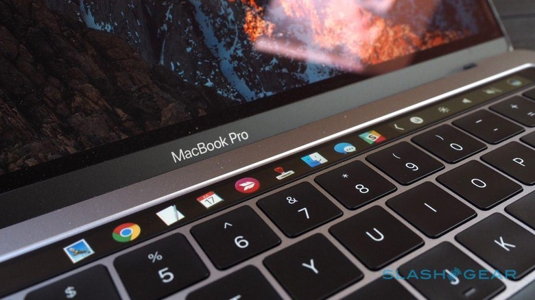
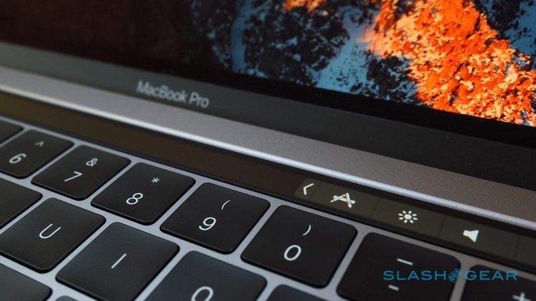
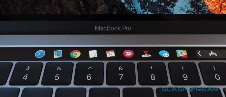
That's whether using the Touch Bar to navigate between apps is quicker or slower than the traditional way of command+tab, or picking from the launcher bar. TouchSwitcher is straightforward, basically putting the command+tabbing interface into the Touch Bar instead. It joins the buttons in the so-called Control Strip that's persistently shown on the right side.
Tap it, and you get a row of icons showing your recent apps. Those used most recently are closer to the right.
Unfortunately, due to the way Apple manages the Control Strip, sometimes the TouchSwitcher icon is replaced by system icons such as for the App Store or iTunes. Ananov says that's a known problem, and that right now the only way to restore it is to relaunch the app itself. If you want to close it manually, you can long-press on its icon in the Touch Bar.

I've been trying it out, and while I'm not sure whether it's necessarily any faster than command+tabbing at first blush, I suspect it's the sort of UI that you'd quickly get used to. While I was fairly skeptical about the Touch Bar initially, over a few weeks with it I've found myself reaching up and tapping more, as my fingers relearn. I'm still of the opinion that those who are familiar with keyboard shortcuts will have the most trouble migrating to Touch Bar controls, which right now is what most of the commands offered seem to replicate.
NOW READ: New MacBook Pro with Touch Bar Review
Still, that's the lowest-hanging fruit, and as developers dive into the Touch Bar – helped, of course, by the first orders of the notebook finally reaching buyers – it's likely we'll see more implementations that move away from just doubling up on what you can already do with a keyboard combo. At some point, we're likely to bump into the restrictions that Apple itself has placed – browser-based webapps, for instance, can't have their own individual Touch Bar controls, and you can't pin macros or Automator workflows to the strip – at which point the Cupertino firm will have to decide what it's willing to be flexible on in order to make the new control surface a success. If you want to try TouchSwitcher out yourself, it's a free download.
VIA Nate Swanner
SOURCE TouchSwitcher
