These Leaked iPhone 8 Photos Will Make You (And Jony Ive) Weep
The newest iPhone 8 prototype design photographed in China looks like a monster. Made from the most basic of off-the-shelf elements, the colors clash and the end result is a situation not unlike the body of Frankenstein's monster. But do not fret – this is not the final design. Instead, it's what someone who's seen an LG G6 thinks Apple's next iPhone looks like – and it looks like a real mish-mash.
If we allow our imaginations to go wacky bonkers for a moment and suggest that this is the next iPhone, there's a bit of an issue going on. First, the front looks like it was designed by LG, and the back looks like an iPhone 4 with its camera array splitting into two, like a cell splitting into two.
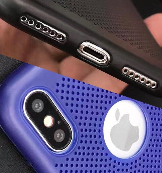
These are the things I see when I look at this device. Each element is separated, like parts of a DIY R2-D2 model. I see these images and I weep for the designers of the actual product. What hath 3rd-party accessory-makers wrought?
iPhone 8 performance SMASHES Android in leaked numbers
It reminds me of some of the dummy models of the iPhone 6 and iPhone 6 Plus before they were made official. Before Apple's final design was let loose, and the public saw how tiny color tweaks and hardware finesse can make a collection of parts look like a single, well designed final product.
The device we're seeing here in photos shared from a user on Weibo show a smartphone with plastic parts.There might be some glass in play here on the front and back, but the rest is almost certainly extremely light. It's a dummy model made for accessory-makers, either made by an accessory maker or a group that profits from selling these sorts of dummies to the press.
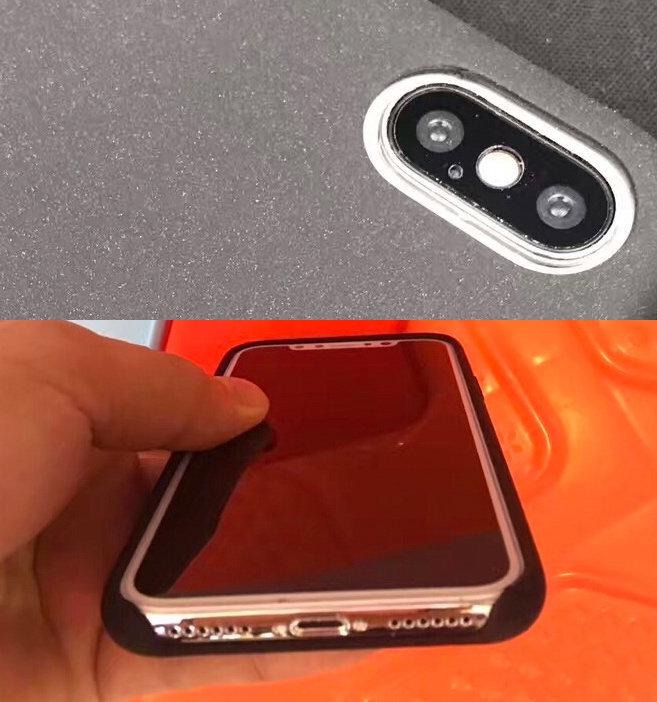
The glass up front and around back are often made of glass (for devices like these) so that accessory-makers can test their latest screen protectors on a material that's basically the same as Apple's final product. It'll be crazy to see backside screen protectors here – but it's a real possibility.
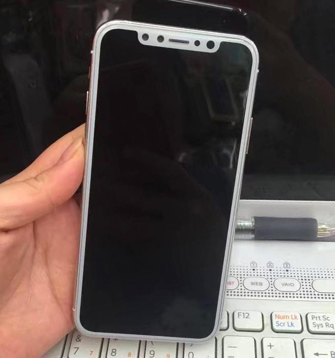
The front side of this device has an ill-conceived border around its display. Apple's iPhones that've used white up front before haven't looked so strange because they've had a large border above and below the display. This makes the color feel less like a border laid on top of the display, and more like part of the device into which the display was laid.
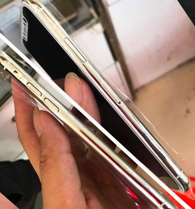
The edge of this design is chrome – shiny, horrible chrome. If Apple releases an iPhone 8 with a chrome rim, I don't think I'll be able to deal. I'll just lose it.
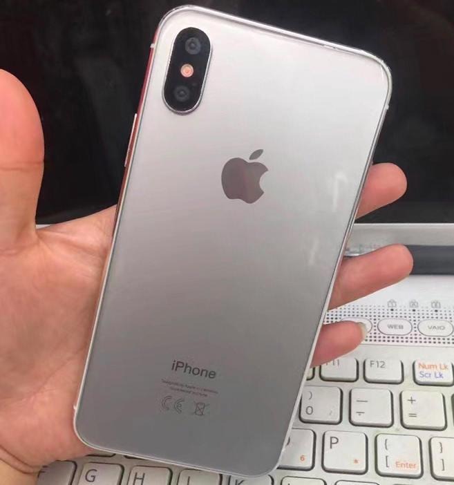
Once the colors are tweaked and the device is ready to be revealed, it'll be clear how important that last step is. The finesse with which Apple finesses their device designs is paramount to the end product being a masterpiece. That's why these images are kinda ugly, too.
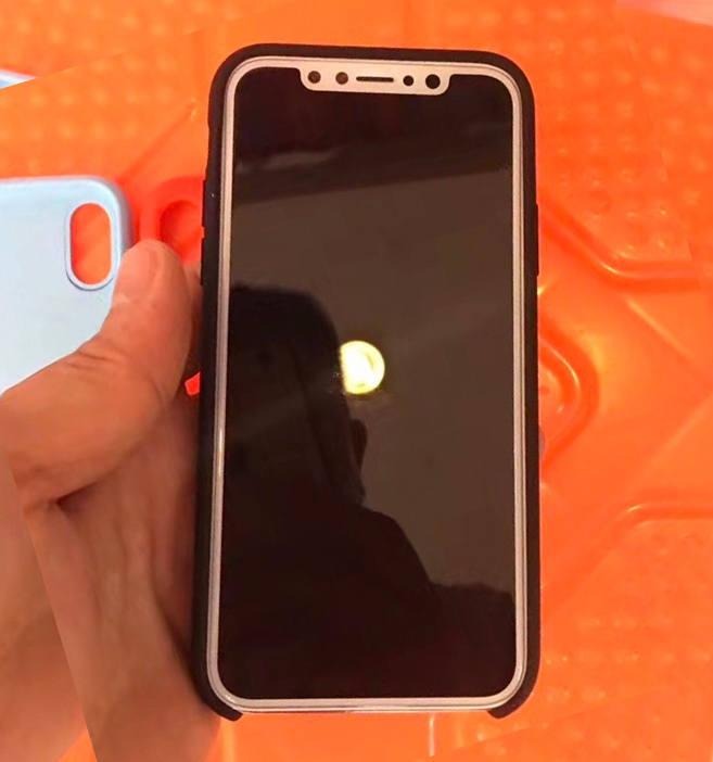
Images above come mostly from Han Han dignified and others – but they seem to start their journey from that one Weibo (of the Han Han). Han Han also posted pictures of the device dummy in a variety of cases, and is known for posting cases. Almost as if he works... at a case-maker! Have a peek at this SlashGear Facebook discussion post to speak about what you're thinking... or just scream into a pillow!
