The Next Microsoft: The Branding Surface Deserves
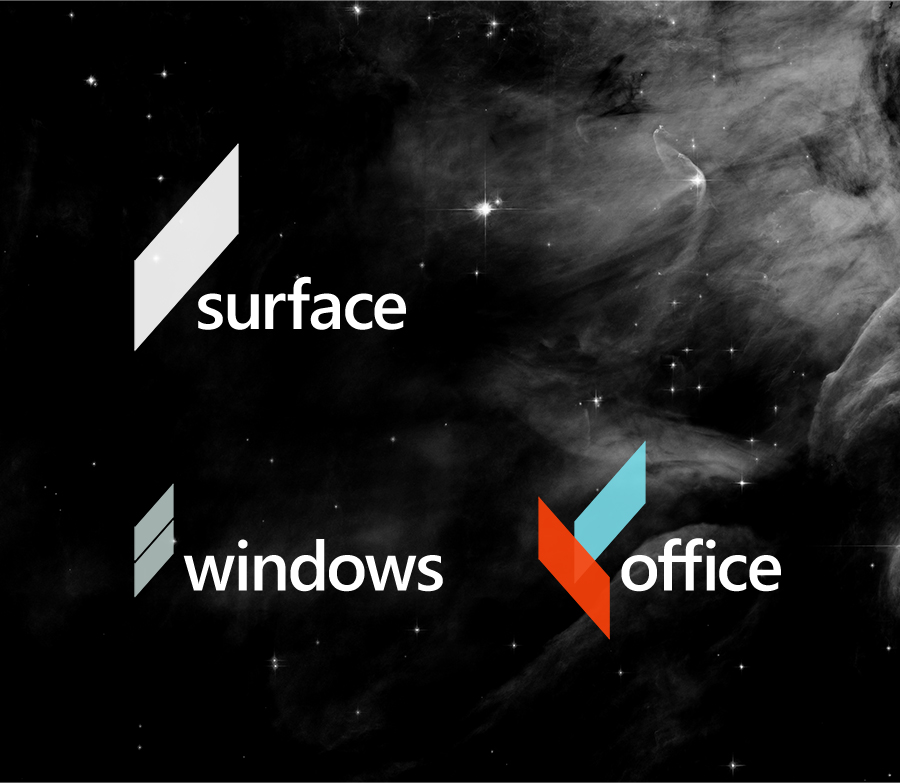
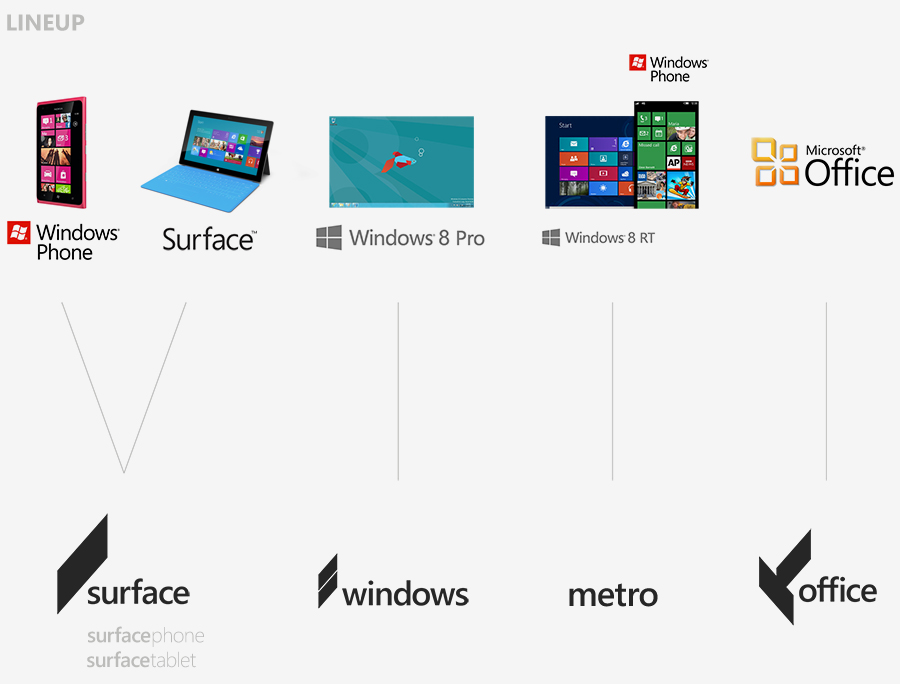
Think Microsoft and what do you get: old, enterprise, and well behind the times, perhaps? Not if one designer has his way; Andrew Kim may not have a contract with Microsoft, but that hasn't stopped him crafting a whole new branding strategy that ditches the "Windows" pane of today and replaces it with a crisp parallelogram Kim calls the "slate", before pulling in Windows Phone, Surface, Office, and Windows under some straightforward new headings.
We've featured Kim's design work before, including his Butterfly smartphone concept all the way back in 2007, and his widely-shared HTC 1 Android phone concept of 2010. "The Next Microsoft" is arguably his best work yet, however, ditching even the 2012 logo refresh for something we could easily see appearing on the front of packaging and in adverts.

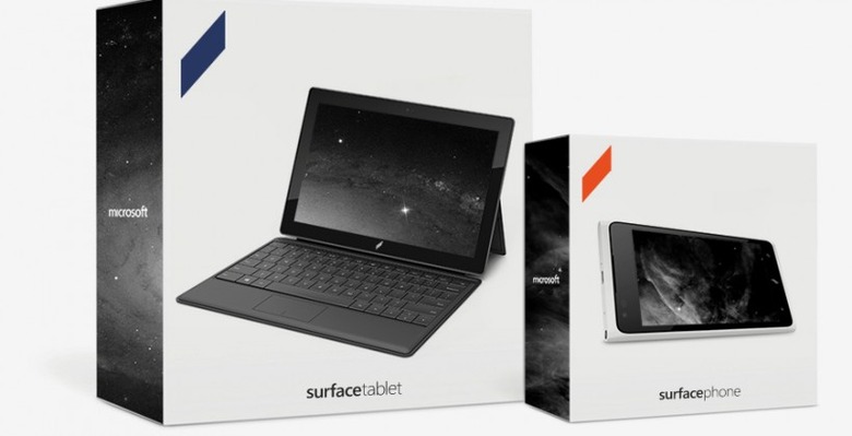
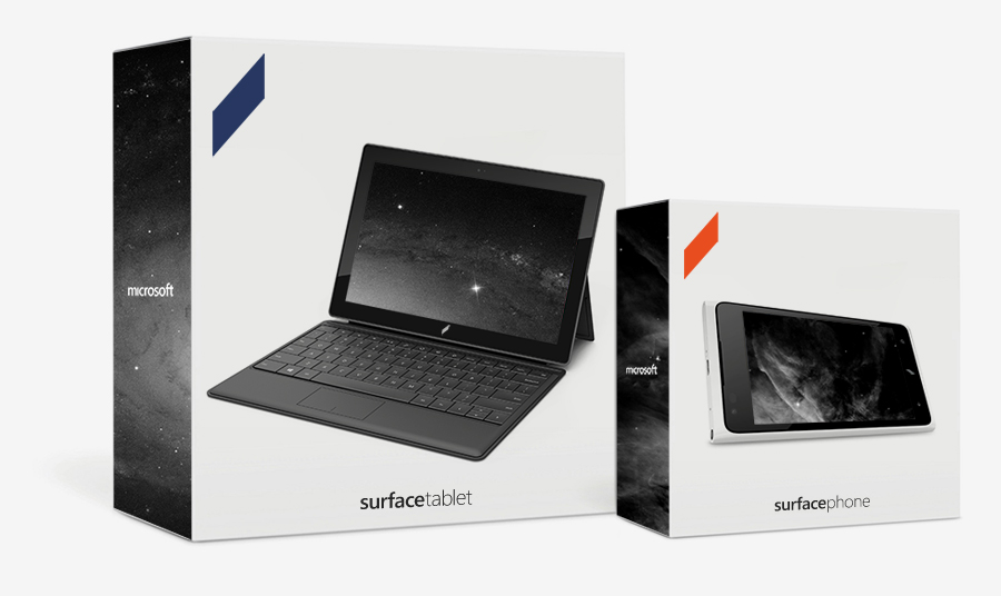
Under Kim's strategy, Windows Phone would be moved in under Surface branding, with a choice of Surface Tablet or Surface Phone. Windows RT would be renamed "Metro" to better differentiate it from Windows 8 Pro, branded simply "Windows", and the Metro UI itself would be cleaned up with some improved color schemes and more intuitive interfaces for things like Wallet.
"I decided that Microsoft needs to be a brand that represents the future" Kim says of the project. "Be slightly aggressive unlike Apple and Google's friendly marketing. Promise to deliver the future today. Be almost science fiction."
Microsoft has shown a new, rather more dynamic side with Surface, even if it has potentially damaged its relationships with OEMs. Now, it could do a lot worse than give Kim a call and chat future brand strategy.
[via Kote Pacheco]


