The "New Facebook" Switch Is Around A Week Away
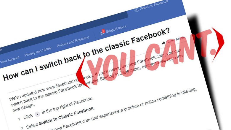
If you're looking for a way to return back to the "old" or "classic" look for Facebook, you might be out of luck by the time you read this article. In September of 2020, Facebook will switch over to the newest in new design languages. If you've not seen this new design yet, don't worry! It'll be delivered to all Facebook users in short order – September, 2020, and no switching back after that!
The big switch for Facebook's graphic design and UI (user interface design) has been in the works for months. It includes a whole bunch of changes that make the site more universally friendly for users on all size displays and for users aiming to access Facebook on mobile devices without the app.
This new mode features a pair of themes, one daytime, one nighttime – or if you prefer, light and dark. This new version of Facebook features Sponsored links in the upper right, Your Pages, and a list of your Contacts. On the left you'll find the Facebook logo and a Search button, your Profile button, links to sections, and Your Shortcuts.
In the center, top of the screen you'll see Home, Your Pages (and Pages You Manage), Watch, Marketplace, and Groups. On the right (top) you'll see a PLUS button for creating new posts, Messenger, Notifications, and a carrot that leads to a whole bunch more links.
Basically the new design gives you "easy" access to the VAST amount of STUFF on Facebook, a never-ending stream of content from people who also live on Facebook and post stuff for people who live on Facebook. The new design makes it far more difficult to escape – so have fun!
Take a peek at the timeline below for more information on the new Facebook and recent Facebook developments from around the tech new universe.
