The Most Absurd Apple Concept Ever
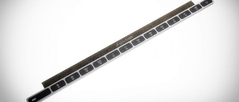
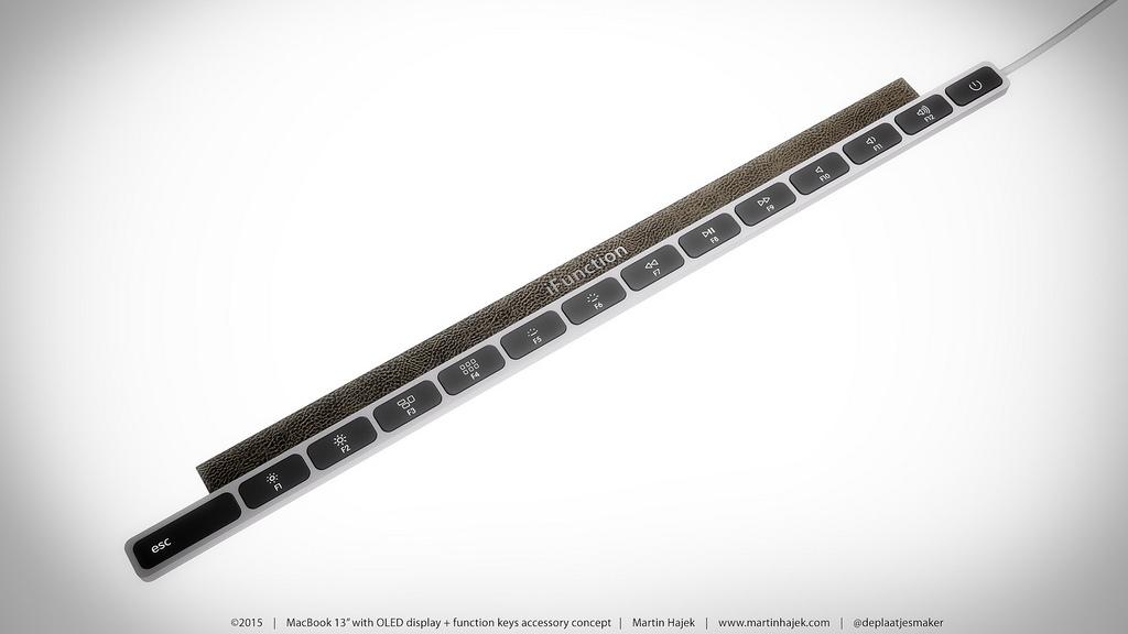
The following images were made by Martin Hajek, an illustrator you likely know well by now if you follow SlashGear closely. If you follow SlashGear's Apple leaks and tips, that is to say. Hajek is the sort of person who has access to blueprints for iPhones well before they're released, taking the data he's got on hand and making what end up being spot-on renderings of Apple devices before they're revealed. Today he's made a row of keys that fit on your MacBook. Why in the world would I need these keys, you might ask.
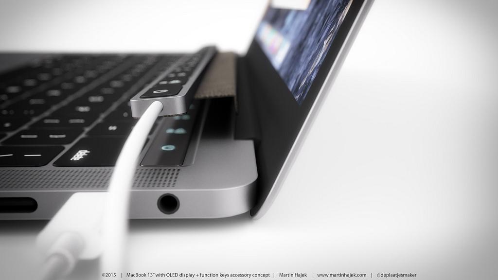
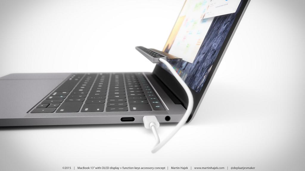
The accessory you see here is necessitated by another concept created by Hajek earlier this month. Made for the "new MacBook", made by Hajek, this physical top row of keys sits on top of the OLED touchscreen otherwise giving the user next-gen functionality.
It's like one step forward and two steps back.
In the gallery above you'll see this new keyboard add-on.
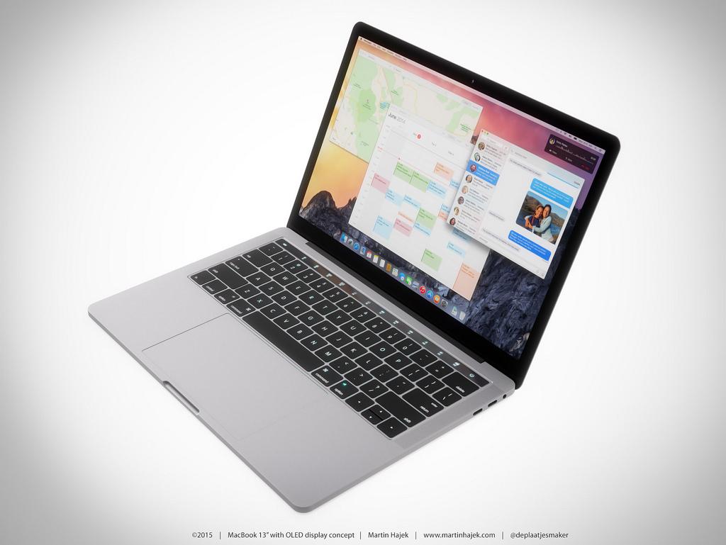
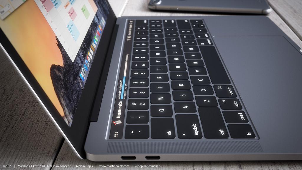
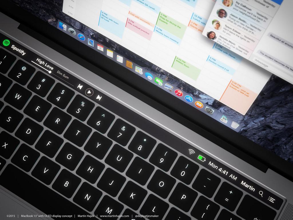
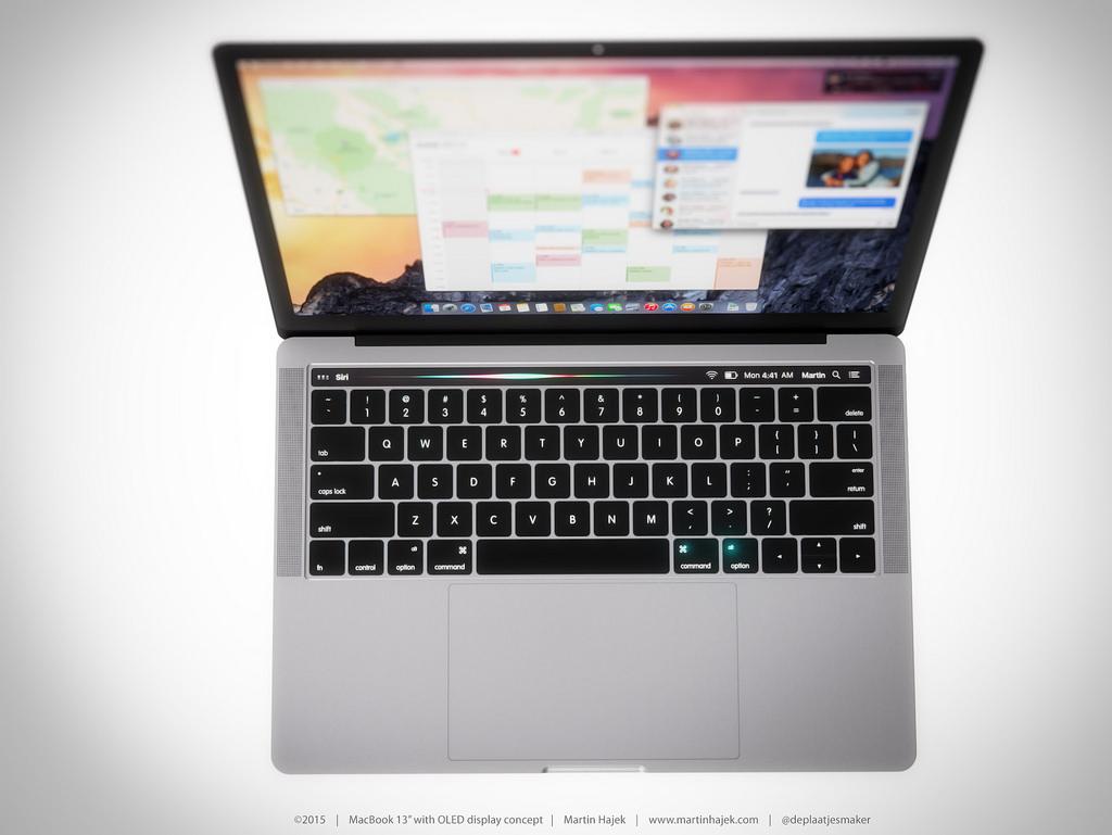
Below you'll see a gallery of images from the original concept for the new MacBook with OLED touch display.
Does it make sense for Apple to create a product that necessitates an additional product? Is this any different from the company creating a new smartphone plug, then creating converter cords for older plugs?
SEE ALSO: 3 things Apple should have "invented" already
Or is this too far out for Apple? Perhaps the difference between an accessory like this and what Apple would do is the existence of 3rd-party manufacturers. This might be an accessory only Logitech could make.
Meanwhile there's always the possibility that something like this could come out of Windows PC-maker camps. When we covered the original MacBook concept from Hajek, it wasn't too far a leap to suggest a company like Razer could create such a notebook.
Not made for everyone – made for those few users that'd be able to take such an oddity and put it to good use. Lots more displays, touch, customization, and all things OLED.
