The iPhone XS Max Puts App-Makers On Notice
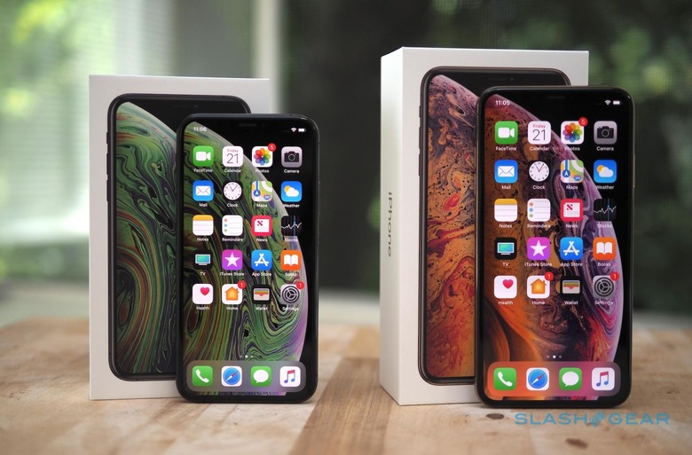
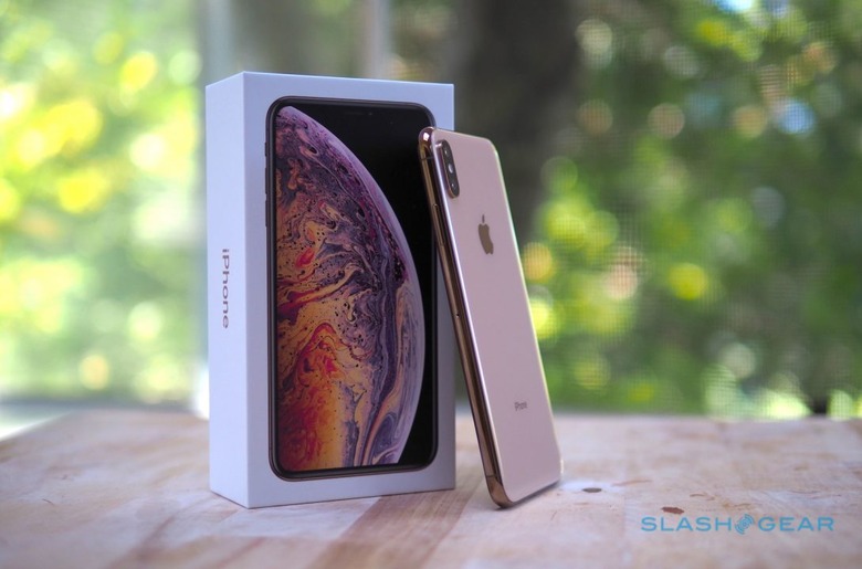
The first surprise I had with the iPhone XS Max was just how much more I preferred iOS 12 on a far larger display than that of the iPhone XS. The second surprise, though, was that not all apps are created equal, particularly when it comes to making the most of a whopping 6.5-inch panel. While the iPhone XS Max may fill your hand, not all software fills its screen.
The biggest touchscreen offered on an iPhone to-date is a double-edged sword. On the one hand, webpages have masses of real-estate to play with, rivaling an iPad Mini for how much you can view in one go. Videos and games look expansive and bright; even more so if they support HDR10 or Dolby Vision, as the new iPhones do.
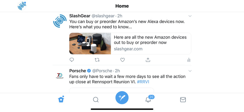
On the flip-side, though, apps which haven't been built with 6.5-inches in mind are very obvious. Flip Twitter's app into landscape orientation, for instance, and you get at most two, maybe three tweets on-screen at once; less if they have attached media. All bracketed with broad white bars of empty space on either side.

Other apps are just... bigger. Great, if your primary motivation for opting for the iPhone XS Max is poor eyesight – I can see this huge screen being a real boon there – but not if you're looking to put every pixel in the Retina resolution to its maximum use. Interfaces designed to be laid out perfectly on a 5.8-inch iPhone XS look off on the iPhone XS Max.
It's not exactly a new situation for iOS developers to find themselves in. Apple stuck with a 3.5-inch display for multiple generations of iPhone, but then things started getting larger as of the iPhone 5. Gradually, panel size and aspect ratio has evolved from handset to handset, with app-makers expected to update their software to make the most of each successive display.
The iPhone XS Max throws down the gauntlet in much the same way that the first "Plus" sized phone, the iPhone 6 Plus, did back in late 2015. Then, iOS developers were faced with a host of new layout opportunities, including the expectation from users that more apps would offer landscape orientation interfaces. Apple's own software led the way, with two-column UIs in the iPhone's Mail app, and a landscape orientation view for the home screen.

As always, there's a stick and there's a carrot. Apple has set developers a deadline for when they need to have apps made with the iPhone XS Max screen in mind: by March 2019, all software must be built with the iOS 12 SDK, and with support for the biggest display. After that, any new apps – or updates to existing apps – will be rejected.
With the iPhone XR on the horizon, though, I suspect developers will be looking to beat that March deadline by as much as possible. Apple's third new smartphone for 2018 may not be quite so large as the iPhone XS Max, but its 6.1-inches are still expansive in iPhone terms. Considering it's widely predicted to be the best-seller of the three new devices, that's a sizable audience who'll be expecting their favorite software to make the most of every pixel they've just paid handsomely for.
