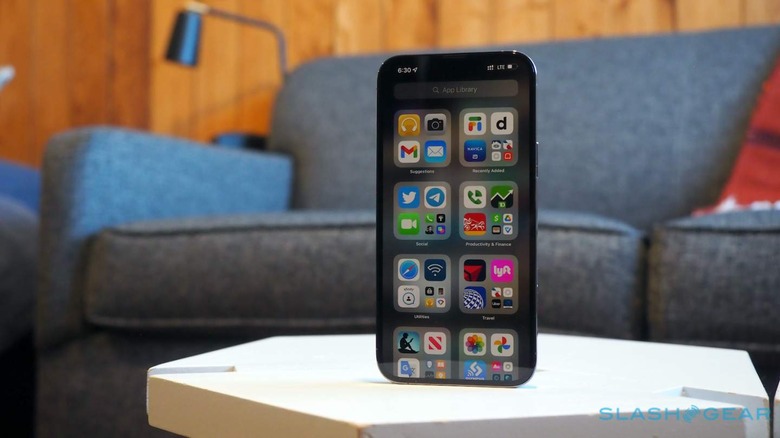
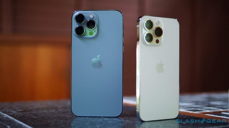
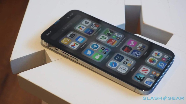
The iPhone 13 Pro Max's 120Hz ProMotion Display Is The Real Deal
Just a few days into using the iPhone 13 Pro Max, and already it's tough to imagine going back to a non-ProMotion display. Apple's first implementation of 120Hz technology may have required some patience before it arrived, but it's a key part of this year's "Pro" devices and a contributor to the Cupertino firm's big boasts about battery improvements.
Now, before someone helpfully reminds me in the comments that 120Hz displays certainly aren't new on smartphones, I'll concur that yes, plenty of Android handsets have offered the screen tech. Apple's delayed gratification here has been a lingering frustration, and it's one still shared by those who buy an iPhone 13 mini or iPhone 13. They still rely on the same, 60Hz refresh rate as before.
Apple brands it ProMotion, borrowing the name from the iPad Pro where it first offered 120Hz displays back in 2017.

What may end up making just as much a difference as the faster screen refresh, though, could be the opportunity for it to crank down low. Apple is, as we've seen on other devices, taking advantage of variable refresh rates: the level depends on what's on screen at the time. If you're playing a graphics-intensive game, for example, the rate will be cranked up.
If you're just reading an ebook, however, or an email, or looking at a photo, a fast refresh rate is wasted. Then, the iPhone 13 Pro and iPhone 13 Pro Max can slow it down to as low as 10Hz. You don't notice it, but it could make a considerable impact on overall battery life.
Exactly how much, of course, will depend on what you typically do with your iPhone each day. The biggest advantage here will probably be for those doing text-heavy tasks. If you're constantly watching video and gaming, not so much.
While Apple may be a relative laggard to 120Hz panels, it's had some saving graces in the past. Biggest among those is that iOS has generally been pretty smooth in its animations already, even on a 60Hz display. The iPhone 13 doesn't look bad next to the iPhone 13 Pro as you scroll around, just like an iPhone 12 Pro Max didn't look terrible.

When you've seen the new screen, however, it's tough to go back. Things are just silkier and more responsive: apps and texts don't blur as you whip your finger through them.
For third-party developers it's another responsibility if they want to keep up with Apple's native software. Tapping into the ProMotion tech for maximum performance and smoothness gains will be available through things like Swift. Even without that, though, things just seem to look... better.
It's one of those features which doesn't really translate well to marketing: you really need to see it to realize why it's an improvement. And, if you've got any friends with recent Android devices, you can be sure that they'll be happy to point out that they've been enjoying 120Hz panels for some time now. My gut reaction, having used some of those and the iPhone 13 Pro and iPhone 13 Pro Max, is that iOS looks a little better, a little smoother, then Android does, which I'm going to put down to the inherent animations in each.
Would I recommend going from the regular iPhone 13 to the iPhone 13, simply for ProMotion? Probably not: as long as you can avoid seeing the new screen, and getting spoiled for the old one. As part of a set of distinguishing factors for why the Pro phones earn their "Professional" branding, however, it's a slick implementation of a feature many have been long-anticipating Apple adding.
