The 4 Best Apps Using Material Design In 2019, So Said Google
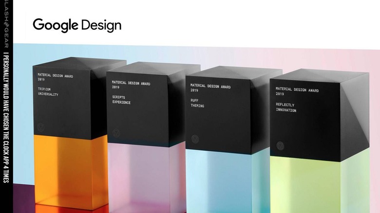
Today we're looking a the 4 best apps awarded by Google for their 2019 Material Design Award. This is an award series the company works with each year to show the world what an ideal app should look like in the Material Design universe. These apps are all made for Android, but aren't necessarily restricted to the Android ecosystem.
Per the Google design library release this week, a new set of Material Design Award recipients are in the mix. We're looking at the 4 apps Google felt were best – most deserving of recognition for their implementation of the Google-favored UI style, Material Design. Since it was first revealed in 2014, Material Design has been the title of the design language Google uses for its software, in all sizes and shapes.
Each of the four apps below was chosen by Google as a good example of one or more of their primary award categories. For example the first on the list wins for "Universality" – which in this case means it's got a strong visual design that's highly accessible across a wide variety of potential users.
1. Trip.com - for Universality
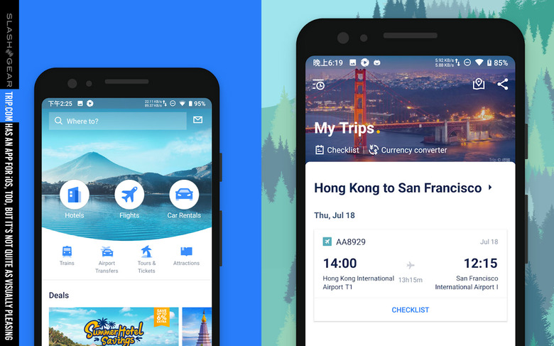
The folks behind the design of the Trip.com app allow successfully visually-sound application of 19 different languages. The hierarchy and font sizing is so precise, so well thought out, that each of the 19 different languages in which this app can be seen ALL look good. They're all readable, like we finally live in a world where all languages are digitized reasonably – what a good world that'd be!
Per Google, "Trip.com's clear visual hierarchy—from layout to imagery and typographic scale—work to put key information front and center." This app is aimed at booking experiences and transport for people aiming to explore their world.
2. Scripts - for Experience
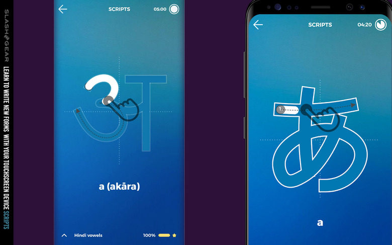
Scripts is a unique app – one made for learning that does not lose focus on the fact that it is being used on a touchscreen device. Extremely well focused design here is vital for the user, as the user uses the app to learn to write a new language.
"In Scripts, users begin by tracing a letterform within clearly defined lines, to internalize the glyph's stroke order and style," said Google. This app really, truly uses the touchscreen of a smart device in ways that not nearly enough other apps take advantage.
1. Ruff - for Theming
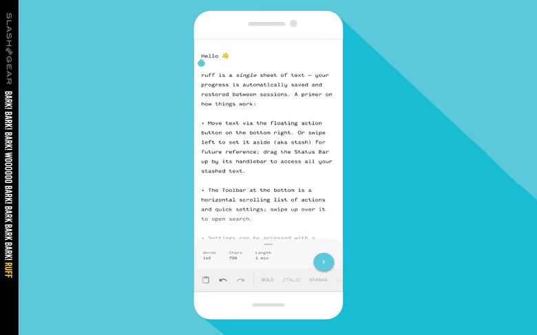
Ruff is a note-taking app that allows the user to select the UI that suits them best. Theming exists within a well-curated cross-section of options, allowing the user to create the experience that they want, while remaining in the Material Design language that should (ideally) result in a solid and positive end result.
As Google says, "Ruff features a typography-forward UI that allows the user to focus on the task at hand—jotting down their notes." You can jot down so very, very many notes – and the experience isn't just focused on how extreme your cloud integration nonsense can be – this is about the here and the now!
1. Reflectly - for Innovation
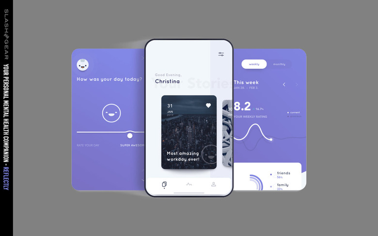
The app Reflectly is designed to be a joy to use. The buttons are fun to press, the transitions between screens are smooth and enjoyable to behold, and the entire experience is friendly. All of this makes Reflectly perfect for its intended use: assisting a user in structuring and reflecting upon daily thoughts and problems. As its creators put it, Reflectly is "your personal mental health companion."
It's not Baymax – but it'll probably make you feel just as warm and snuggly as if Baymax were real. As Google said, "Reflectly's conversational interface is supported by smooth transitions and a creative use of color."
A Note
It's important to note that the above list of apps is in no particular order. They're numbered for reference purposes, but are in no way ordered from best to worst, worst to best, or anything of that nature. These apps can all be found via the Google design library link above.
