SwiftKey 3 Beta Gets UI Upgrade
The custom keyboard interface known as SwiftKey has received a brand new upgrade for all you Beta users out there, complete with user interface changes and bug fixes. We've got our hands on this build for both smartphone and tablet and are having a look at the several changes that have been made here on the 3rd of May (it is indeed called the 3rd of May update) and are finding it to be pleasing on the whole without a doubt. Have a peek at what's next for this predictive beast here and now.
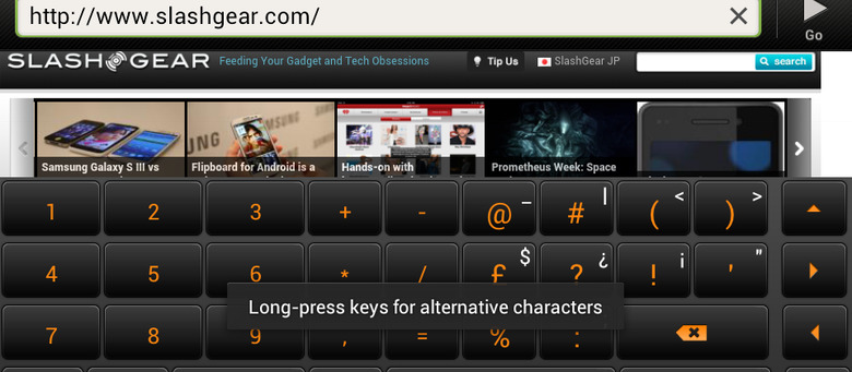
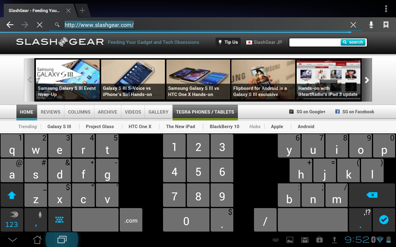
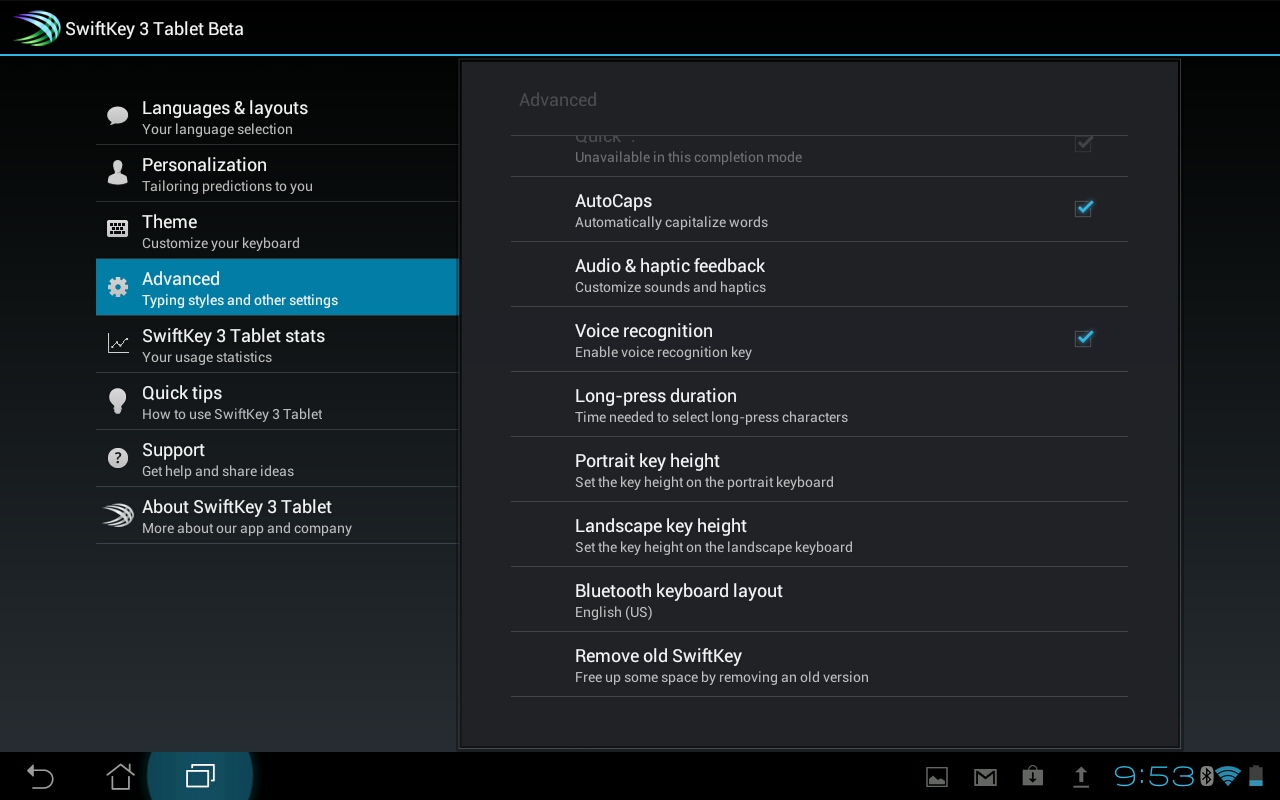
The developers at SwiftKey have shown that they're ready and willing to make all the changes that make sense if the VIP Beta tester community suggests them. What we've got here is a set of changes that take the keyboard on both smartphone and tablet to a new level of excellence with a few simple button location switches as well as enhancements behind the scenes. Have a peek at a set of shots taken from both interfaces here:
These images were shot on the HTC One S and the ASUS Transformer Pad TF300, both of which we've also got reviews of. The changes made to SwiftKey 3 Beta are as thus:
-Improved the UI: there is now a dedicated comma key, and the <123> key is now in the bottom-left corner. And of course you still have the larger spacebar.
-Refined the Smart Punctuation pop-up.
-Reintroduced the Long-press duration setting.
-Improved Smart Space functionality.
-Further reduced lag on some devices.
-Fixed a number of bugs, including the missing decimal point in the numpad and the "What's New" dialog popping up all the time.
You can be part of the beta testing community with SwiftKey by heading to their SwiftKey VIP forums. There you can download early builds for free and help SwiftKey become the keyboard of the Android of the future!


