Surface With Windows RT Review
Microsoft is no stranger to tablets, though with Windows RT and Surface the company is hoping to have its first tablet success. Borrowing frugal processors from the mobile industry and a distilled version of Windows 8, and pairing it with distinctive and high-quality hardware, Microsoft certainly appears at first glance to have ticked the right boxes. Still, in a market where tablets are generally scaled-up smartphones, does Microsoft's pared-back desktop OS do enough to rid its reliance on the keyboard and mouse? Read on for the full SlashGear review.
Hardware
Windows on an ARM processor is new territory for Microsoft. With Windows RT, the field is open for companies like NVIDIA, Qualcomm, Texas Instruments, and others to push the sort of frugal chipsets that are more commonly found in Android tablets, reaping potential benefits in power frugality and reduced heat output.
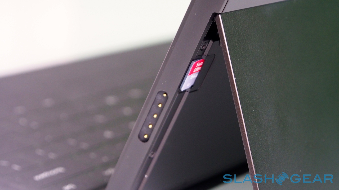
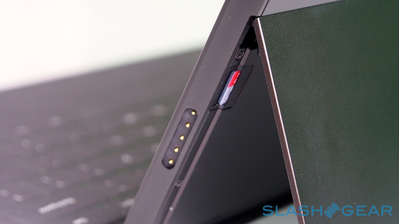
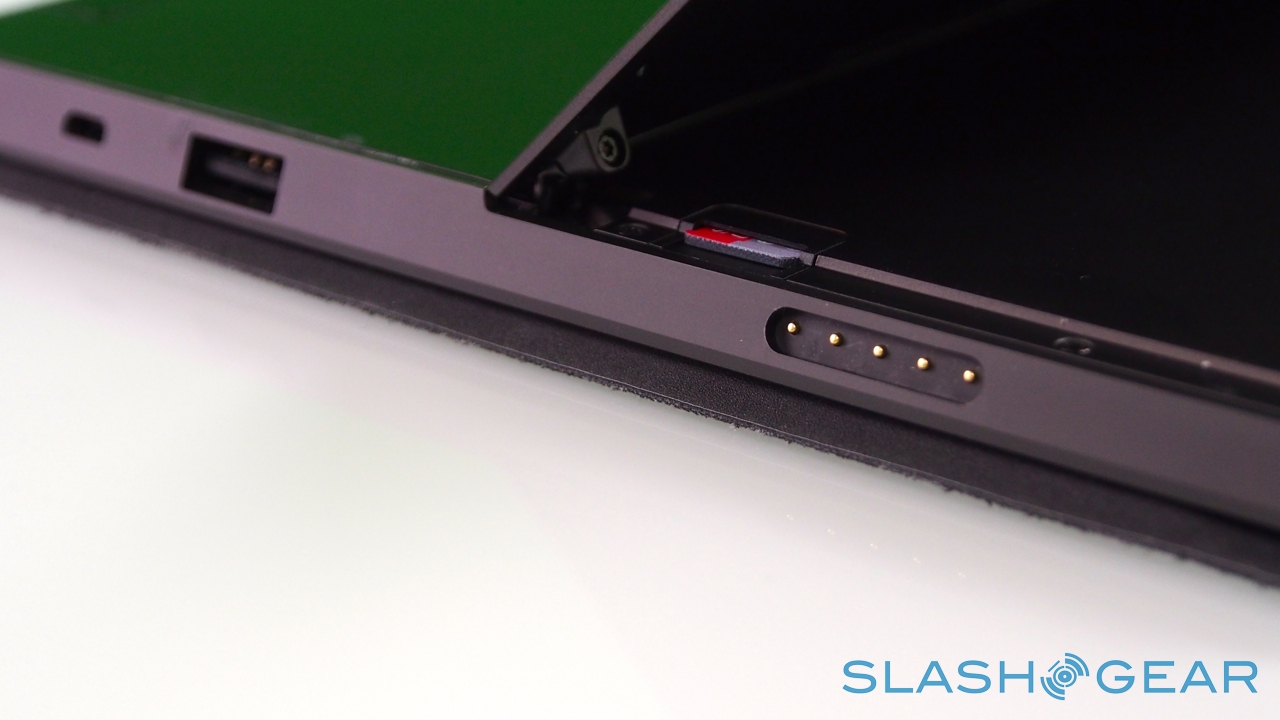
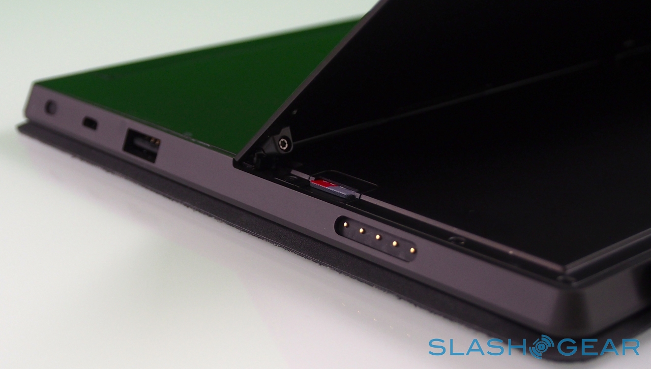
In the case of Surface, Microsoft opted for NVIDIA's quadcore Tegra 3, here paired with 2GB of RAM. It's a chip we're very familiar with from Android phones and tablets, and in fact much of Surface's other specifications are par for the course in the mobile world. A choice of 32GB or 64GB of storage – no 16GB option, though Microsoft prices its entry-level Surface directly against the 16GB iPad 3 – with a microSDXC card slot, WiFi a/b/g/n, and Bluetooth 4.0.

As you'd expect there are stereo speakers – which are on the quiet side, even at maximum volume – and dual digital microphones, an HD video output which, with the right $39.99 dongle, hooks up to an HDMI or VGA connection, and a cluster of sensors: ambient light to control screen brightness, an accelerometer, gyroscope, and digital compass, though no GPS. Microsoft also isn't offering a 3G/4G version of the tablet, claiming that consumer research suggests the vast majority of tablets of a similar size to Surface don't ever get taken outside of the home or office.

LifeCam video recording demo
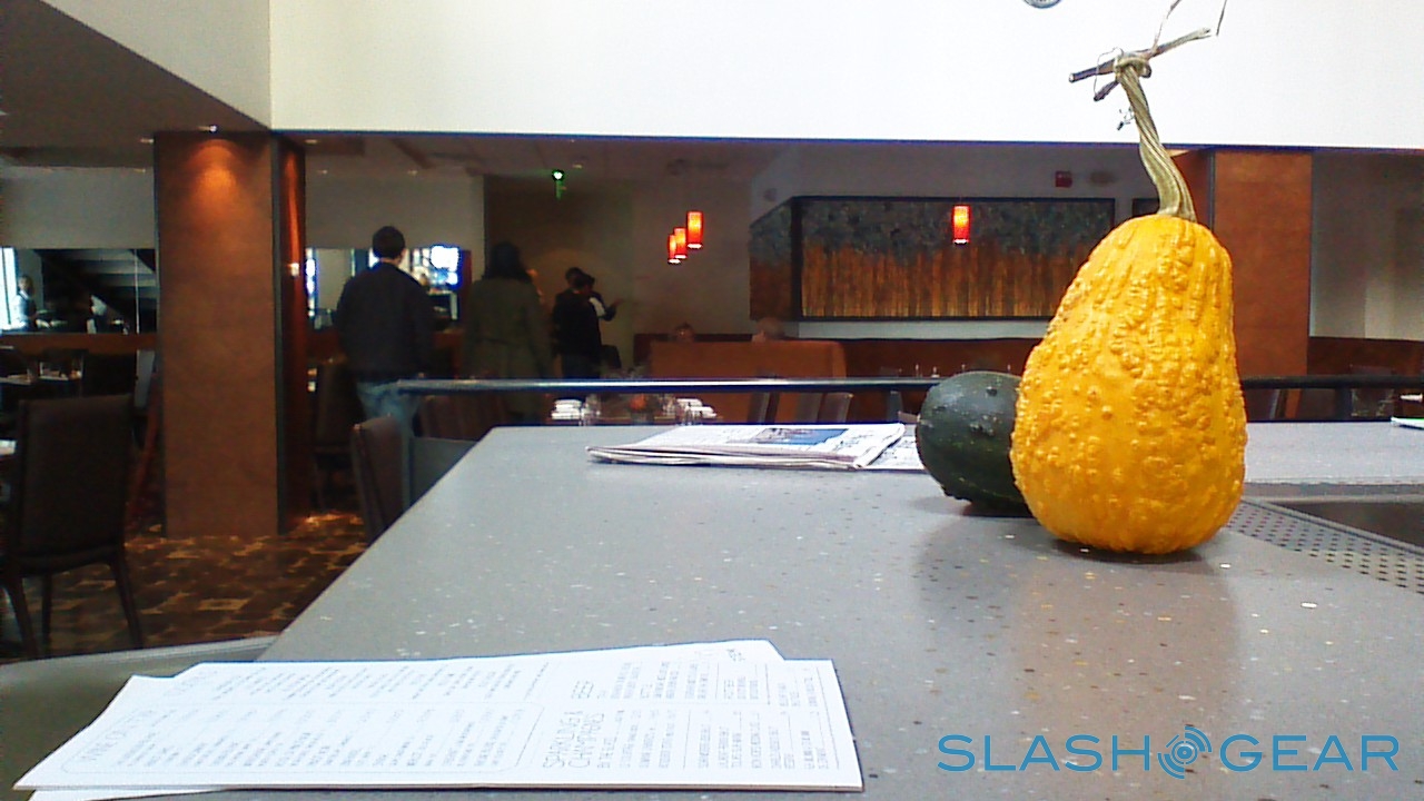
LifeCam photo examples
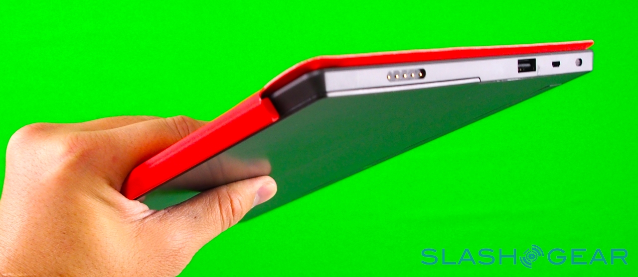
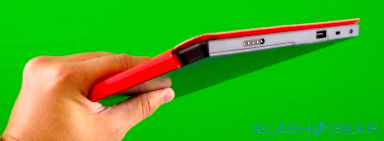
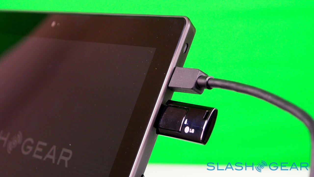
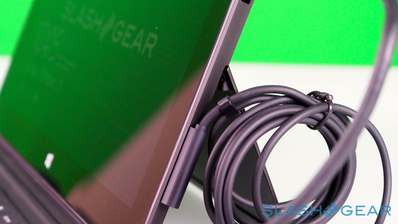
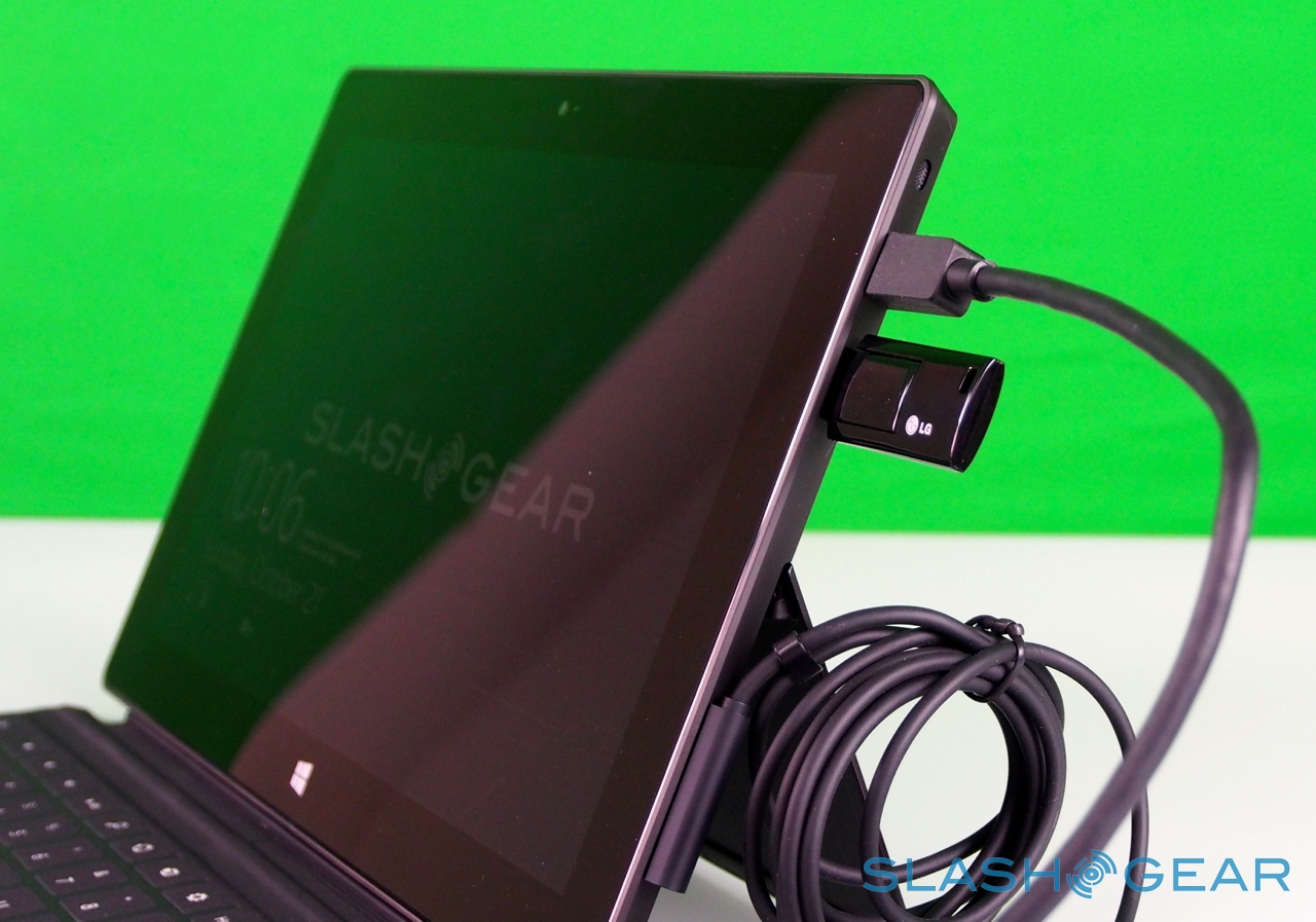
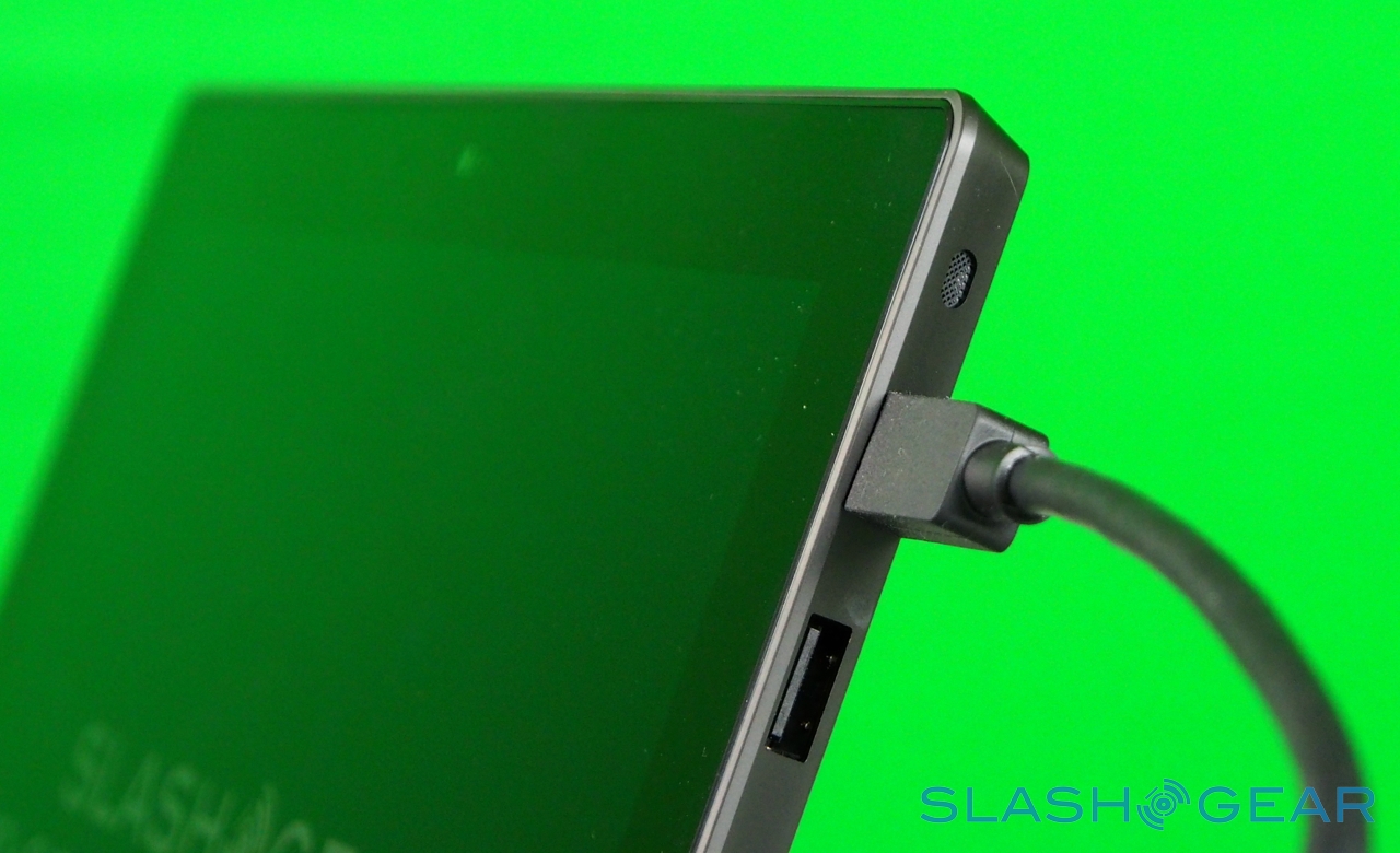
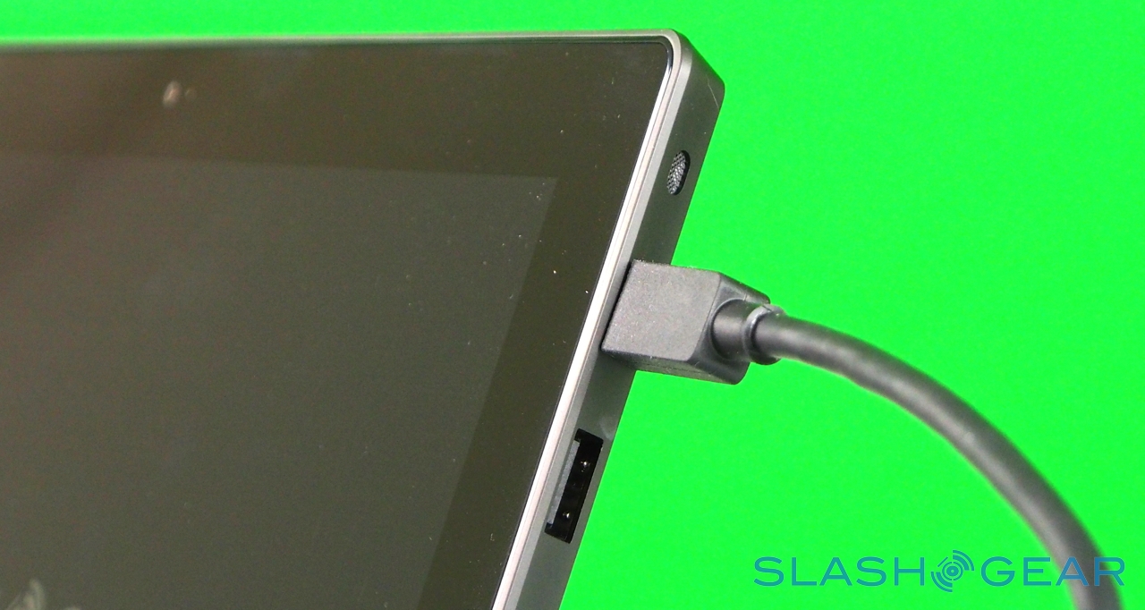
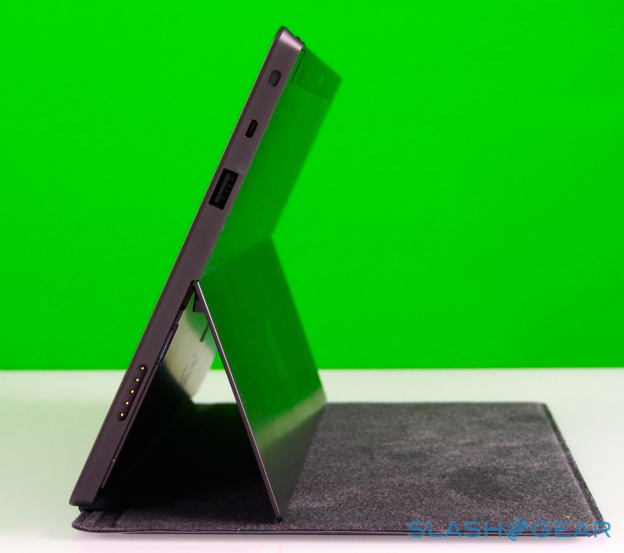
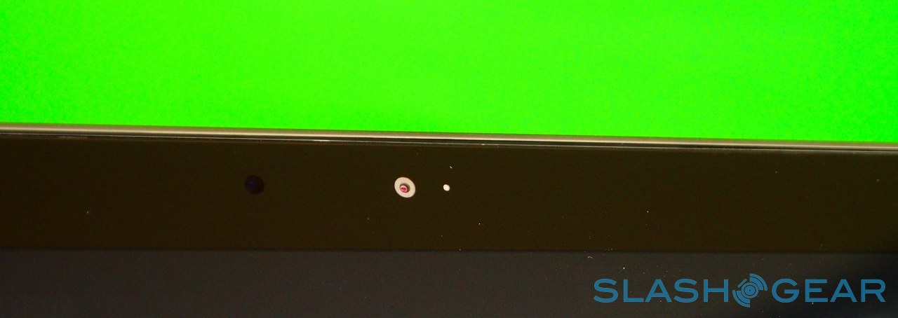
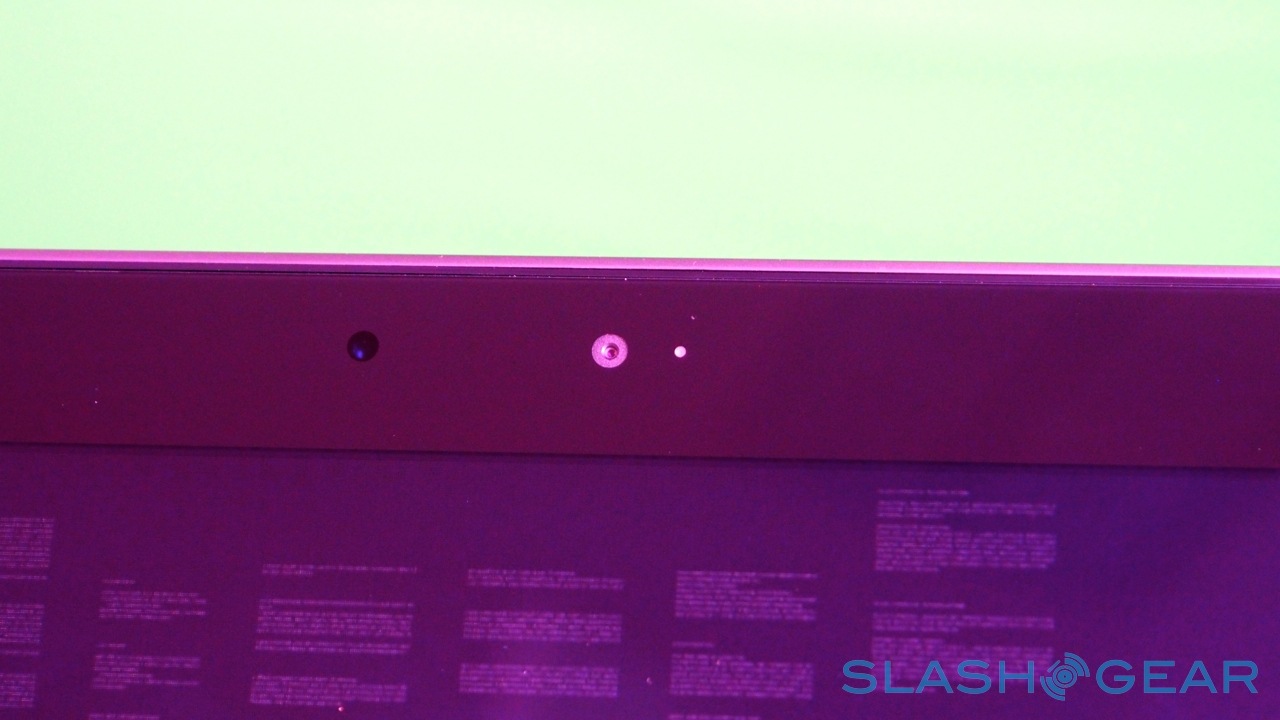
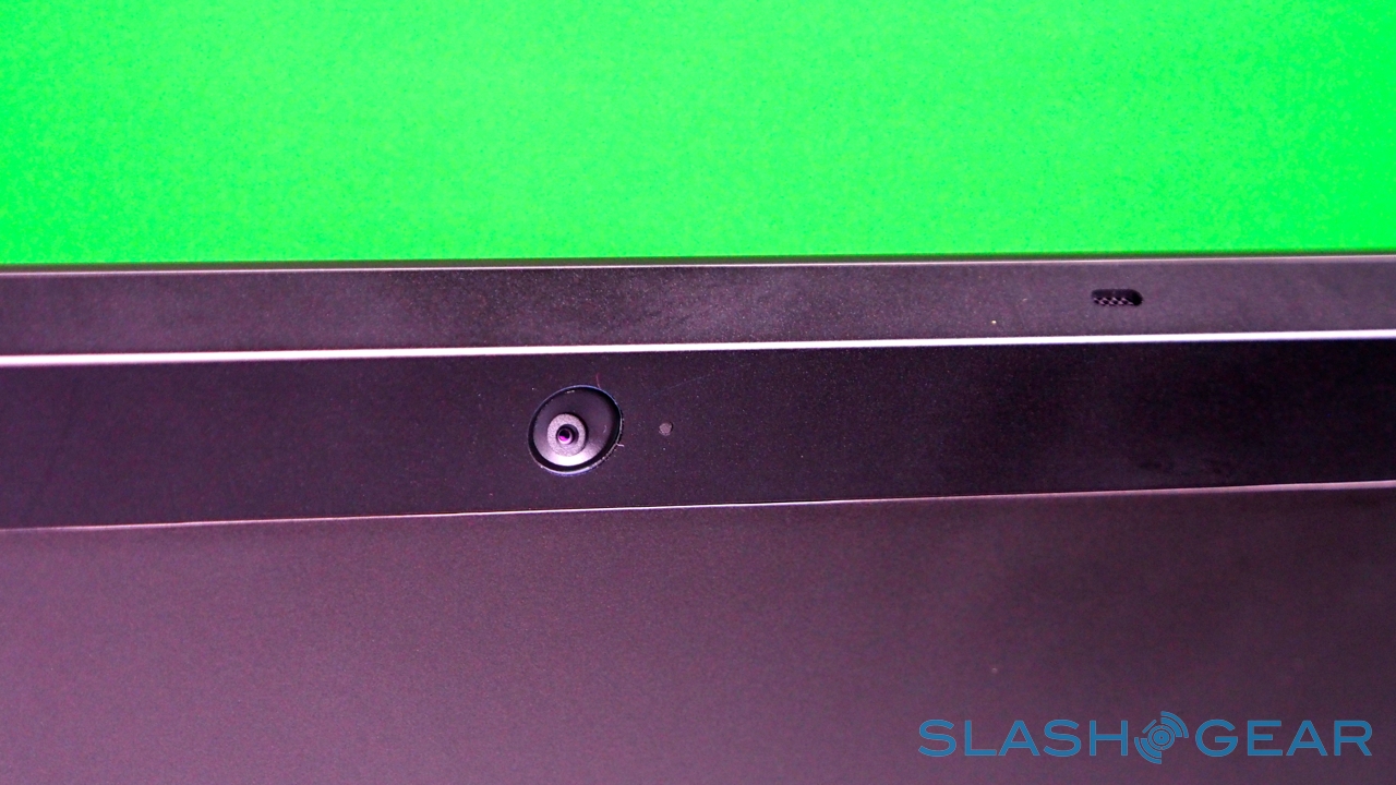
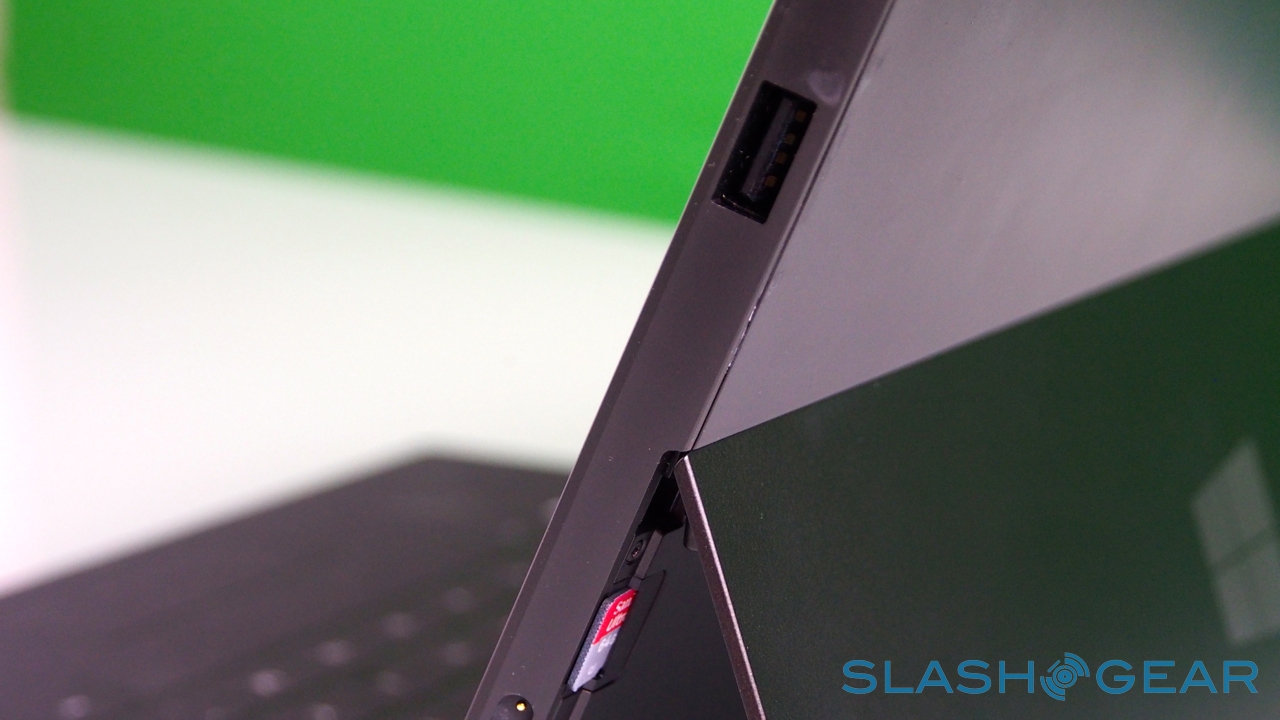
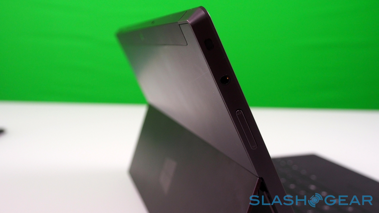
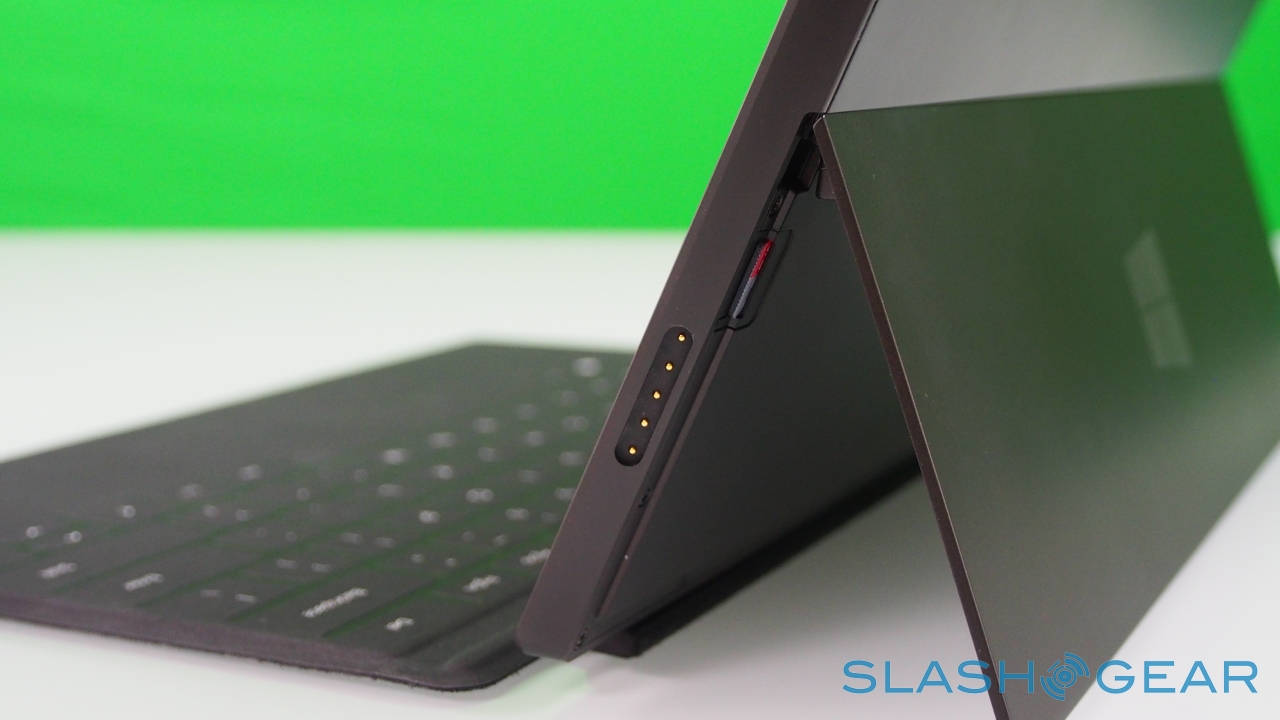
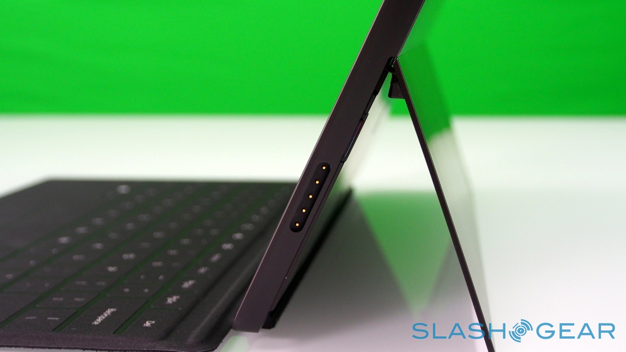
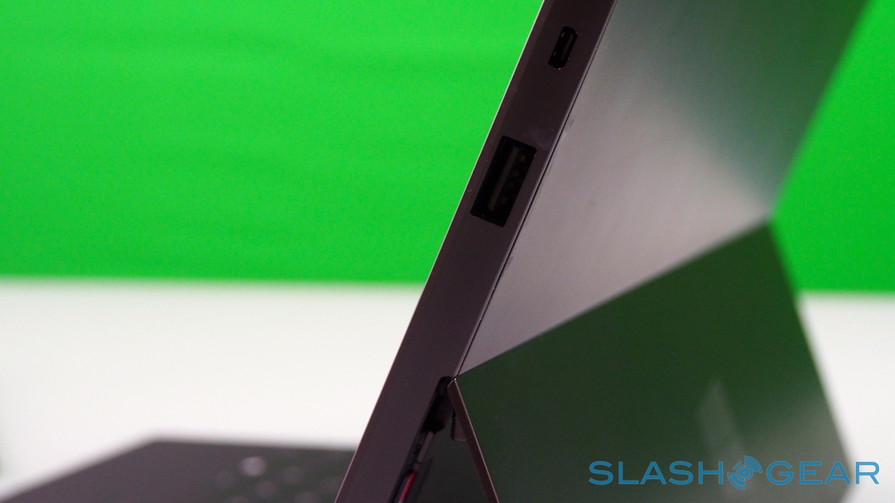
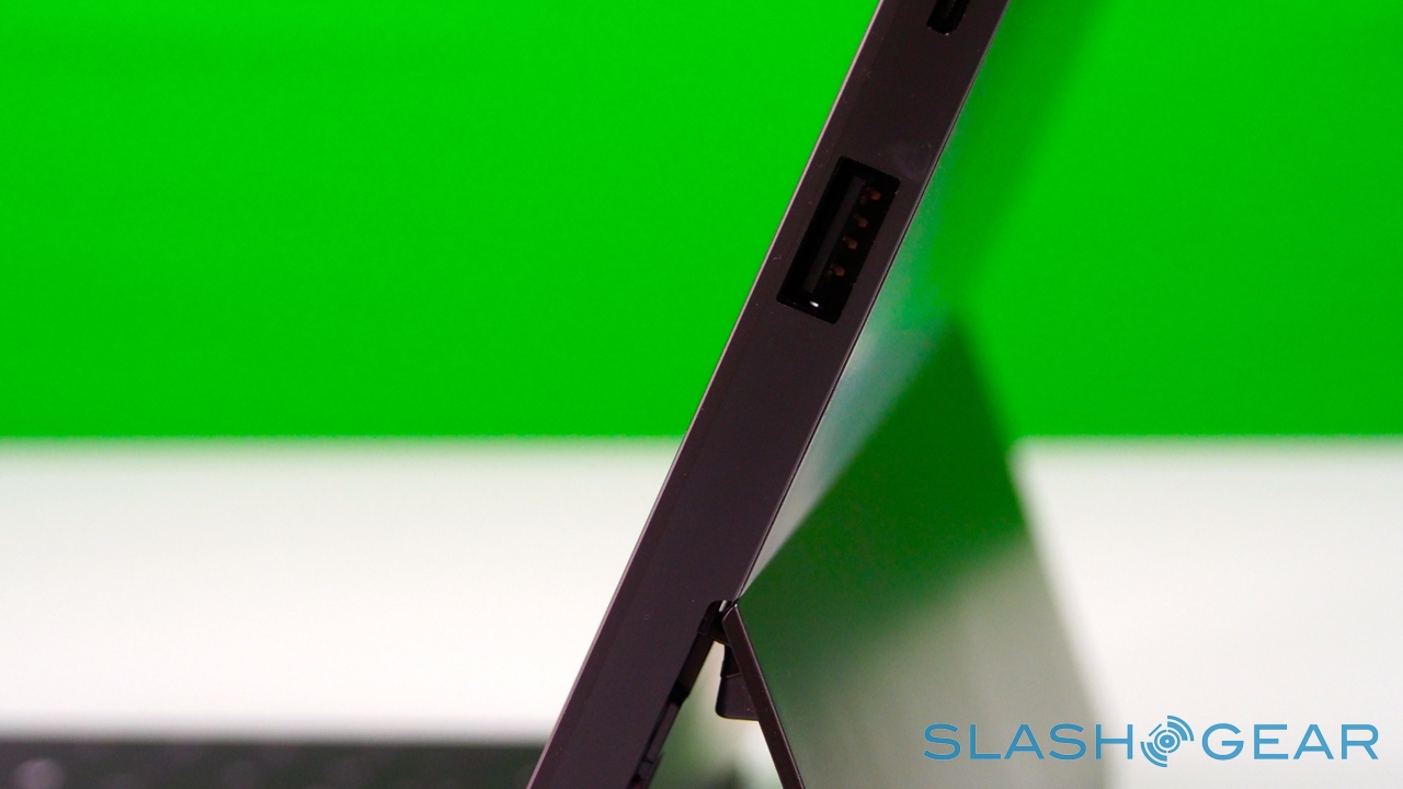
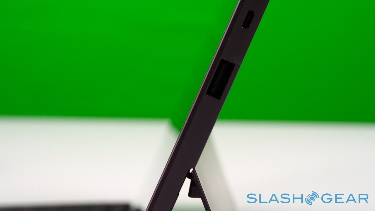
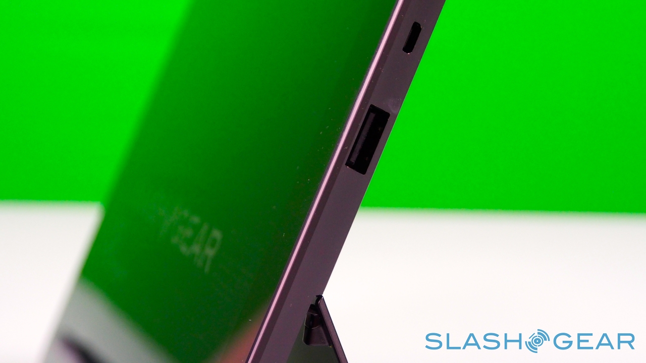
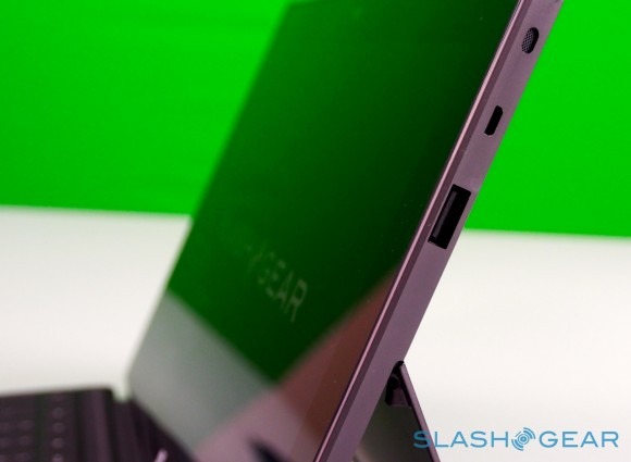
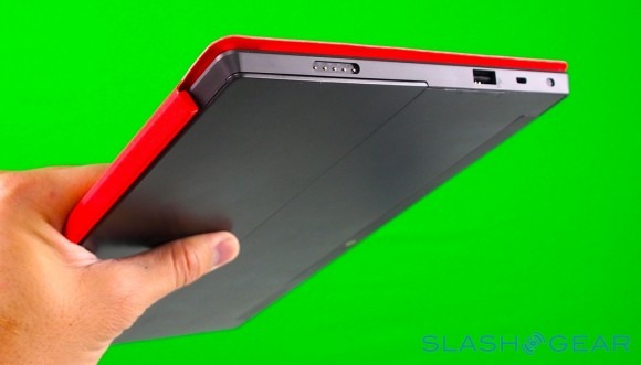
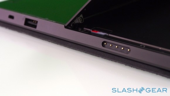
Unlike most rival tablets, however, Microsoft has also outfitted Surface with a full sized USB 2.0 port, opening the door to regular peripherals like printers, keyboards, mice, and other accessories. There's also a "Cover port" which works with Microsoft's magnetically attached keyboard covers – more on which later. Finally, there are front and rear "LifeCam" cameras, each capable of 720p HD video recording.

Microsoft currently has three hardware packages: the entry-level $499 Surface with 32GB of storage and no cover; the $599 Surface 32GB with a black Touch Cover; and the $699 Surface 64GB, again with a black Touch Cover.
Design and Construction
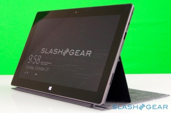
You have to give Microsoft its due when it comes to design and build: the company's hardware division may be best known for its range of simple peripherals – keyboards, mice, and trackpads – along with Xbox, but Surface is another level of focus and thoughtful materials selection. If Microsoft needed to borrow any sort of strategy from Apple in tablets, it was attention to detail, and while Surface is distinctly different in its design and approach to mobile computing to the iPad, both slates share an exacting and rigorous conception.
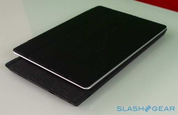
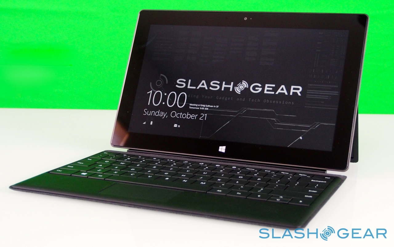
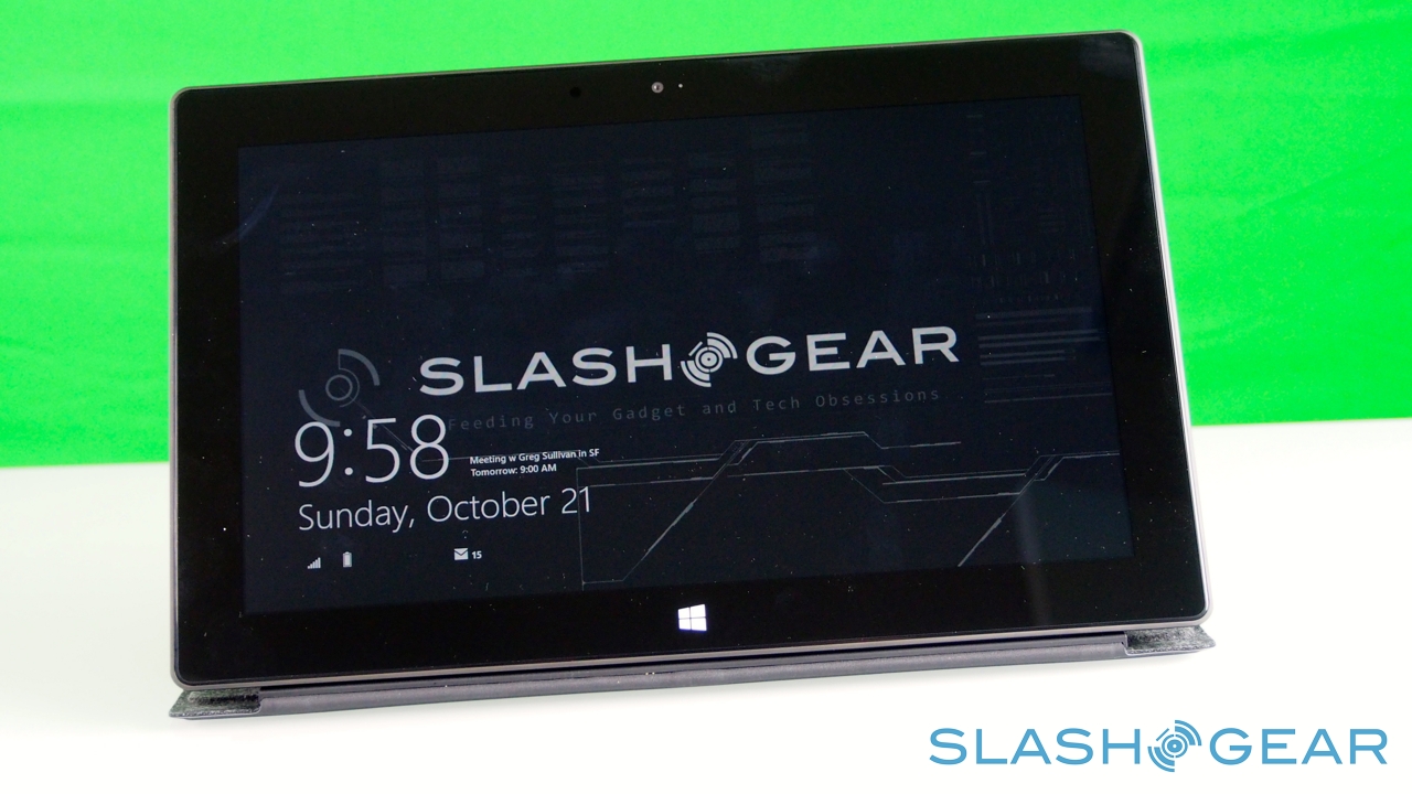
Where the iPad is all curves and tapers, Surface musters angled edges and bevels to make its design mark. It's crisp, and clean, and beautifully cohesive: its 676g weight is evenly spread through the chassis, meaning it doesn't feel top-heavy or biased when you hold it in your hand, no matter the orientation. The "VaporMg" – Microsoft's name for the specially treated magnesium alloy it has used – casing is both smooth and easily gripped, and though it's still early days has proved reasonably resilient against scratches. It's also meant to be fingerprint-resistant, though our unit had little trouble picking up enough prints from us to be a goldmine for law enforcement.
Surface with Windows RT unboxing and Accessories
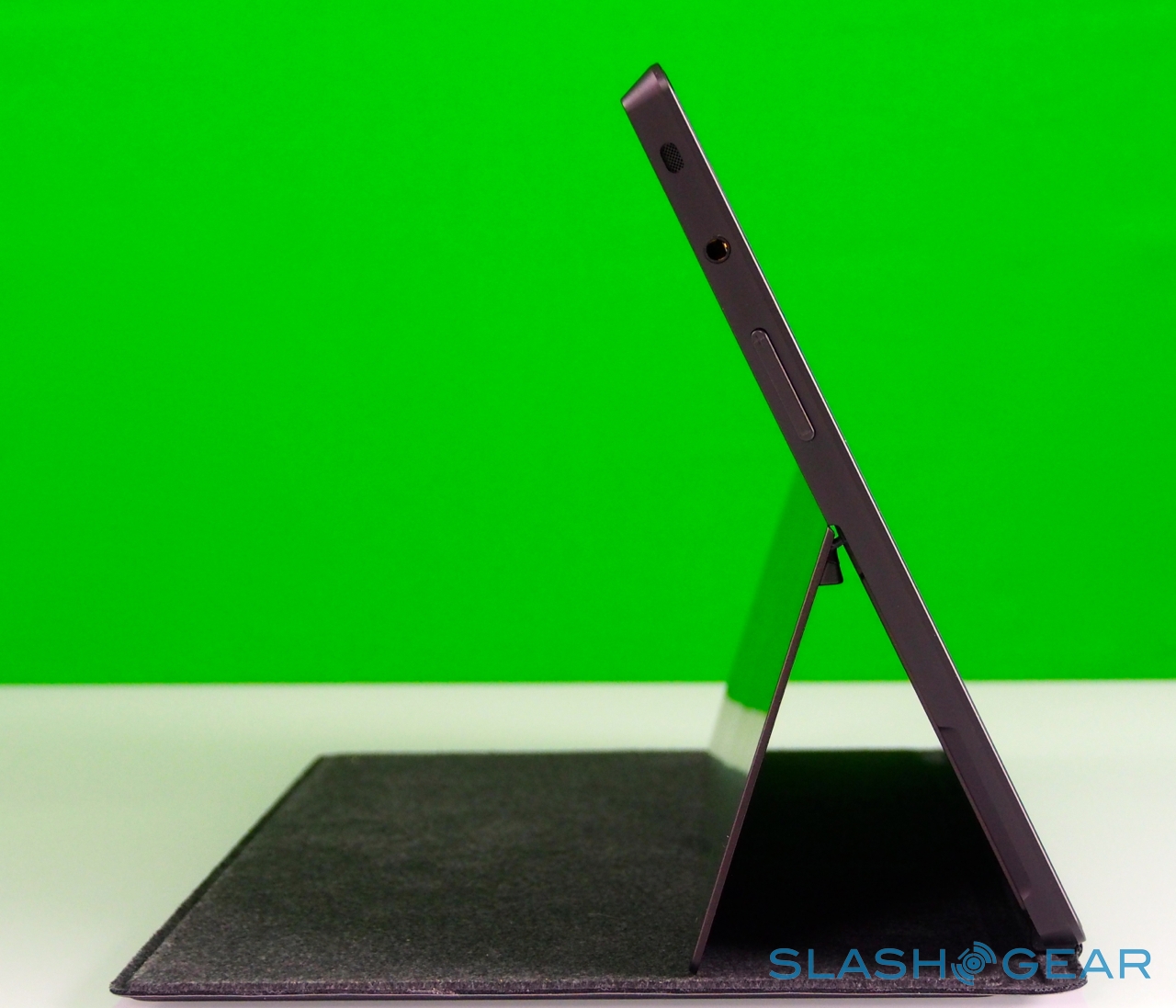
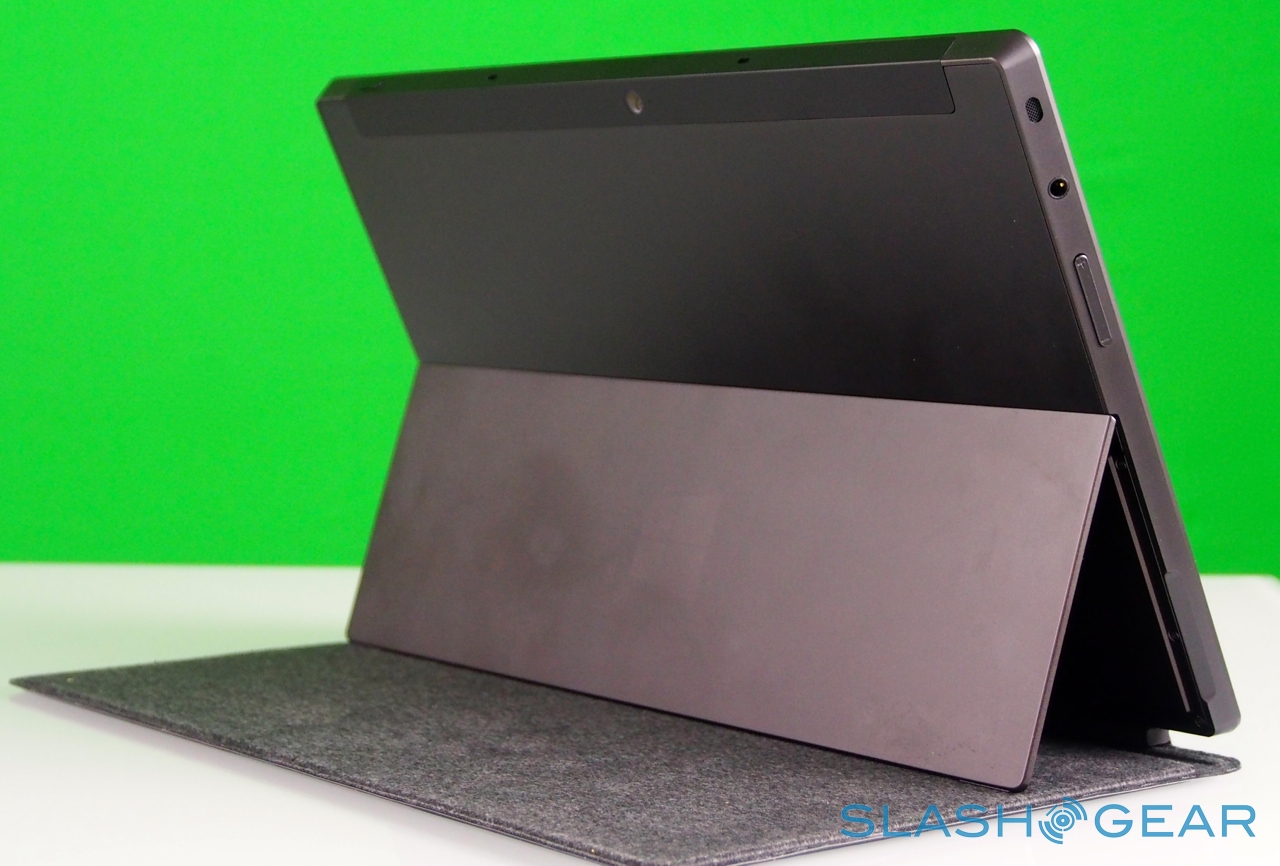
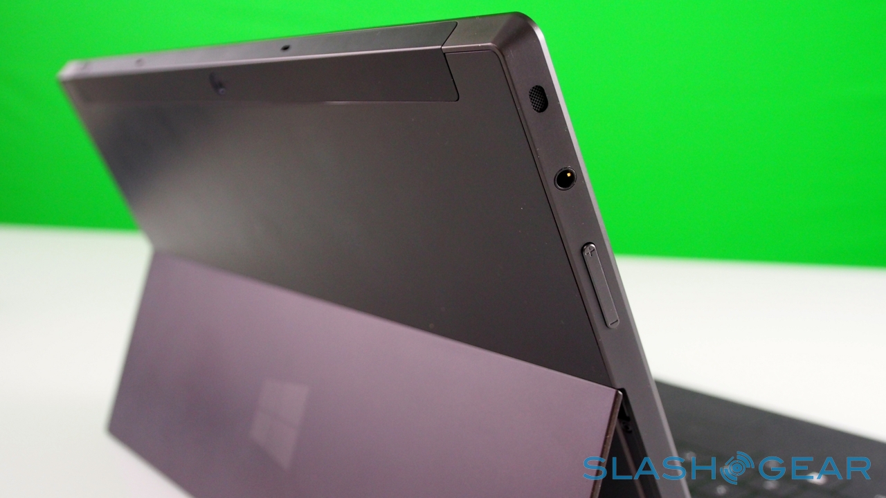
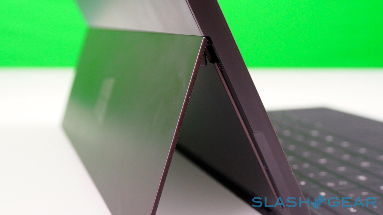
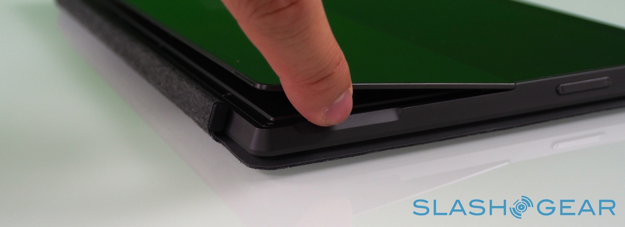
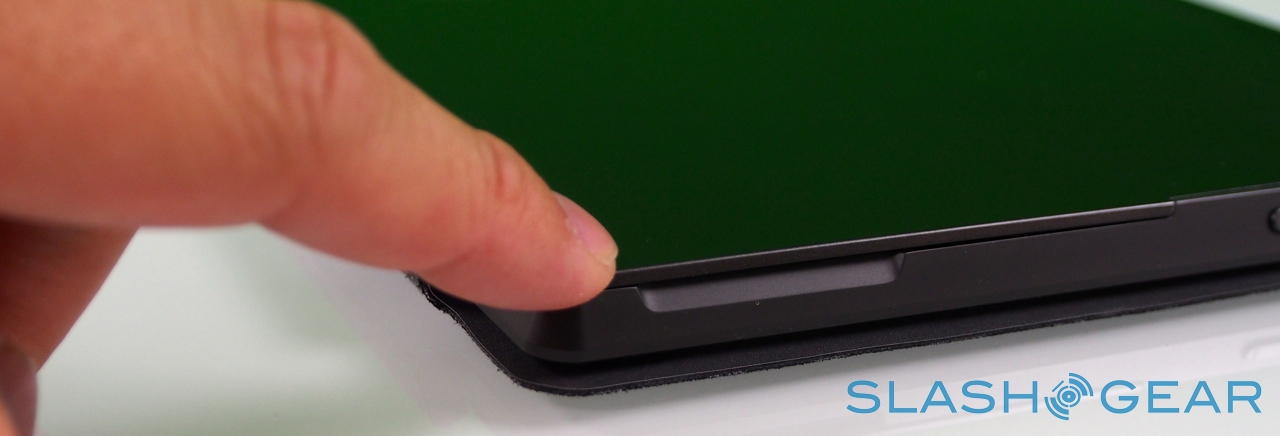
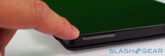
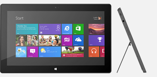
Surface – and Windows RT – seems intended for landscape orientation use primarily, and so Microsoft has fitted the tablet with one of its most distinctive physical features: the pop-out kickstand on the back. Spanning the whole width of the slate, and almost half of its height, the slice of neatly machined metal clicks out with a thunk that's both aurally and physically satisfying, propping up Surface at a 22-degree angle for typing or watching video. Closing it is equally pleasing, with hidden magnets making sure the stand snicks into position without vibration or wobble.
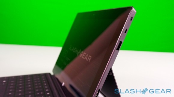
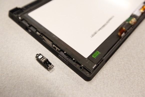
It's not just a design afterthought, either. The rear camera shares the same angle – 22-degrees – as the kickstand, which means that when Surface is standing upright the webcam is pointing straight back, not down at the table. The front camera, meanwhile, points straight out from the fascia of the slate, since users are likely to be looking down at it, even when Surface is stood up.
Display
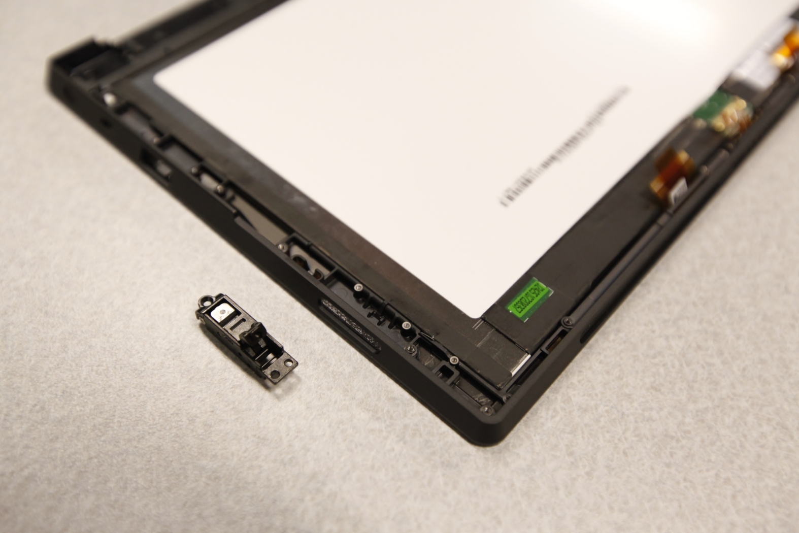
Beyond Windows RT itself, the display is probably the most contentious aspect of Surface. Microsoft opted for a custom-sized 10.6-inch panel that best fit with its keyboard sizing ambitions and the split-pane multitasking of Windows 8/RT, falling in-between the more typical 10.1- and 11.1-inches we've seen on slates from other manufacturers. What the company hasn't done is go beyond the usual 1,366 x 768 resolution, rather than chasing Apple's third-gen 9.7-inch iPad with its so-called Retina Display.
So, while other tablets are chasing pixels so densely packed you can hardly make them out individually in normal use, Microsoft refuses to join the resolution arms race despite complaints that Surface isn't at least HD (oddly, even Microsoft seems to quietly agree on some level, since the Surface with Windows 8 Pro due in a few months time has a 1920 x 1080 display instead). Instead, it's relying on "ClearType HD", the latest iteration of Microsoft's subpixel rendering system.
ClearType in fact dates back to late 1998, though it was only turned on by default in Windows from Vista onwards. It works by individually controlling each of the three subpixels – the red, green, and blue segments – in each overall pixel, and in the process effectively tripling the resolution of the screen. So, rather than just treating each LCD pixel (e.g. block of three subpixels) as a whole, ClearType can individually turn on or off each subpixel, allowing for more granular control.
Perhaps unsurprisingly, ClearType met with mixed reactions. On the one hand, it allows for a greater degree of detail than the on-paper resolution of the display would imply; however, because each of the pixels is a different color there is color fringing introduced. Depending on which subpixel is active, that fringing might be red, green, or blue. Some users find the fringing more noticeable; others complain of fuzziness around text. During our testing, at least one person using Surface found reading extended amounts of text could trigger headaches.
Happily other aspects of the display treatment are more successful all round: for instance, optically bonding the LCD and cover glass so as to reduce the distance between the two layers, increase the amount of light transmission, and cut out internal reflections that can lead to glare. It's a process that's increasingly being seen on smartphones, but has been slower to appear on larger devices like tablets due to the cost and complexity of the lamination process.
Overall, then, it's a mixed bag. If your eyesight and ClearType HD play nicely together, then the combination of that and the optically bonded panel help bypass the need for the sort of huge resolutions Apple and Samsung are chasing on tablets. It's worth remembering that more pixels require greater backlighting and thus a bigger battery (which adds weight, bulk, and takes longer to charge) too.
However, zoom in on graphics in the browser on the Surface and, side by side with an iPad 3, the difference in resolution is clear. It's the same when you're viewing photos in the gallery app: the Surface screen just doesn't look as good.
Windows RT
To say there's a lot of confusion about Windows RT is an understatement. Microsoft's decision to split Windows 8 into two versions – one "full" build for the sort of x86 processors from Intel and AMD that Windows has been running on for years, and one pared-back version for ARM chipsets – makes sense in many ways, but poor communication as to the differences between the two means there are bound to be some tears early on.
Although there are numerous factors that separate Windows 8 and Windows RT, the biggest difference is in how software is handled. Windows 8 gets the full gamut of apps, whether they're from the Windows Store – the on-device app store – or loaded separately, just as Windows users have been installing software for years now. The OS works with so-called "legacy" software; that is, apps designed and released when older versions of Windows were current.
Windows RT, however, is a cleaner break with the past. It doesn't even try for compatibility with older apps, with no backward-compatibility. If you want software, it will have to be available in the Windows Store, though obviously with Internet Explorer onboard you have access to webapps too.
Muddying the waters somewhat is the fact that Windows RT still allows access to the traditional desktop, even if you can't load traditional software to it. This is primarily of use with Microsoft Office Home and Student 2013 RT Preview edition, preloaded on Surface, and the key app which uses the more familiar interface. Still, in a way, it's as if the iPad had an option to peel away the iOS interface and reveal OS X underneath, only an OS X that you couldn't really do much with. There's no escaping the feeling that Microsoft left the desktop in place in Windows RT simply because it hadn't had time to refresh Office with the Metro-style interface; indeed, no third-party apps will be allowed to use it.
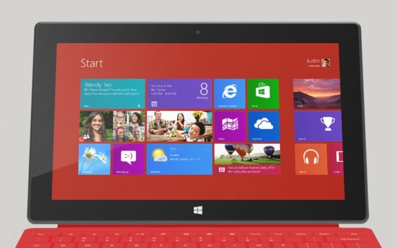
So, Surface is a balance between two environments, and they do a good job of reminding where Microsoft struggled with tablets in the past. The Live Tile based homescreen, and apps designed specifically to fit in with it, are clean, clear, and easy to use: the epitome of finger-friendly. As on Windows Phone, they can pull in updates from social networks, the calendar, and other sources, and cycle through those new tidbits automatically. You can pin new apps, bookmarks, contacts, or other content to the homescreen; organize your icons into groups and subgroups; pinch-zoom to see your entire app landscape.
Swipe from the right edge into the middle of the display and you get the Start bar, with a button for the homescreen – mimicking the hardware Windows button below the display – as well as Search, Share, Devices, and Settings shortcuts. Swiping up from the bottom of the screen summons the contextual menu, its contents varying depending on what app you're using at the time. A swipe in from the left flicks through the stack of open applications, in order of their most recent use.
Somewhat confusingly at first, Microsoft has gathered the search functionality into a single, unified hub. When you open the dialog, you can choose to either search across all areas, or to narrow your query down to a specific app, or the Windows Store, or for a particular setting. In addition to local content, you can access files plugged into the Surface's full-sized USB port, such as from a thumb-drive. Unlike iPad, which isn't really set up to handle external storage, Surface and Windows RT have no problem mounting an external drive and copying files to and from the slate's own storage. Alternatively, if you've a folder full of videos, photos, or music, you can play them directly from the external drive itself.
If the new interface is a lesson in touchscreen usability, the legacy desktop shows why Microsoft has struggled for so long with its tablet software. For all its UI finessing, you can draw a line between Windows in traditional mode back to Windows XP: small text that is tricky to accurately hit with a fingertip; drag'n'drop that all too often results in a prematurely dropped file or folder. Those prior versions of Windows were designed for mouse navigation, and while it works well with the trackpad on the Touch Cover and Type Cover, it's simply not intended for fingers to stab at with any degree of accuracy.
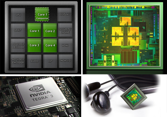
Overall, performance has proved solid from the Tegra 3 chipset. The Metro-style interface is slick and responsive; apps open without delay or lag; and the slide-in dialogs like search appear on a single swipe despite what the current app is doing. Microsoft's multitasking system works similarly well, pulling in an adjustable second panel to the side of the current app, for side-by-side work or play. It's particularly useful for keeping an eye on Twitter messages or Skype chats while otherwise browsing.
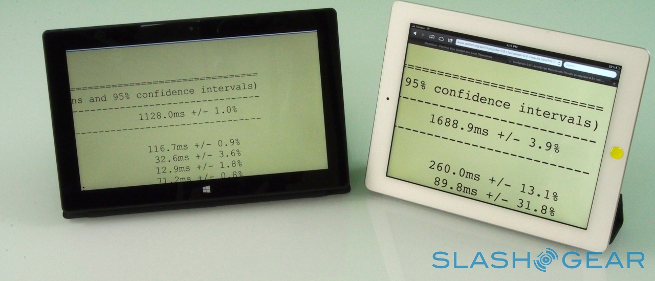
You'll be spending a lot of time in the browser, since the Windows Store still lags behind in titles compared to iOS and Android, and webapps are a good alternative (or, indeed, the only option in many cases) to native code, so it's a good thing it's fast. Side by side with the iPad 3, the SunSpider browser benchmark test came in with a score of 1,128.0ms on Surface and 1,688.9ms on the iPad (faster is better). HTML5 apps and sites run very well, and streaming sites like Netflix have no issues whatsoever.

There's limited Flash support – in fact, only those sites Microsoft decides simply have to use Flash to give a good experience get to access it – and, while Windows 8 users will have the choice of the Metro-style IE10 browser or the regular IE10 browser on the desktop, the latter with full Flash support, those running Windows RT have the same Flash limits in both variants. That, and the fact that Microsoft's Flash access policy demands it actively add permission on a site-by-site basis, means most of the time Flash is a no-go on Surface.
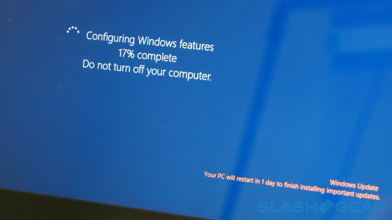
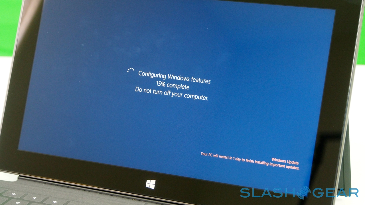
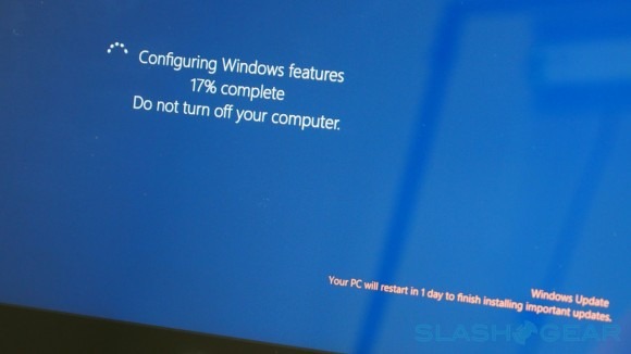
That arguably puts RT – and Surface – somewhere in-between iPad and Android tablets for flexibility. For what it's supposed to do, Windows RT does well. Problem is, Microsoft has done a pretty appalling job of explaining what it's supposed to do. The baseline guidance is that with RT you miss out on Windows Media Player and Media Center, lack the ability to create HomeGroups and join Domains, and can't install apps from anywhere other than the Windows Store. On the flip side, it promises instant-on and inescapable Windows Update and Windows Defender, automatically keeping Surface up-to-date and secure.
How much of those messages actually make it through to consumers is questionable, though, and the at-a-glance similarity between Windows RT and Windows 8 is unlikely to help differentiate between the platforms in stores. Surface Pro will span the divide when it arrives in early 2013, but we can envisage early confusion about the limitations and advantages of Windows RT overshadowing its strengths.
It's fast and straightforward to use, the live tiles are convenient, and the first batch of apps made according to Microsoft's Metro-style specifications are distinctive, but many users come to Windows – irrespective or unaware of version – expecting to be able to use the legacy software they're familiar with. And, unless the developers of that software have cooked up a Windows RT version, they'll be out of luck.
Touch Cover and Type Cover
Windows-based tablets have a long history of working well with keyboards. In fact, slate form-factors have been the Windows tablet minority so far: more common is the so-called hybrid or convertible, usually consisting of a rotating touchscreen that can flip around and then fold flat on top of the keyboard, switching a notebook into a (usually chunky) slate.

Times change, however, and keyboards have become optional accessories not integral parts of the tablet experience. Nonetheless, Surface and its keyboards have been closely developed: one of the reasons Microsoft chased a screen size larger than 10.1-inches was because it reduced tablet width and therefore made the keyboards cramped.
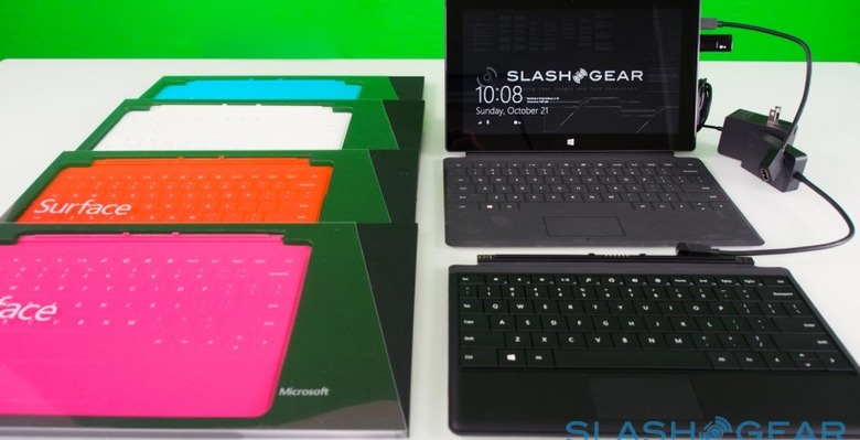
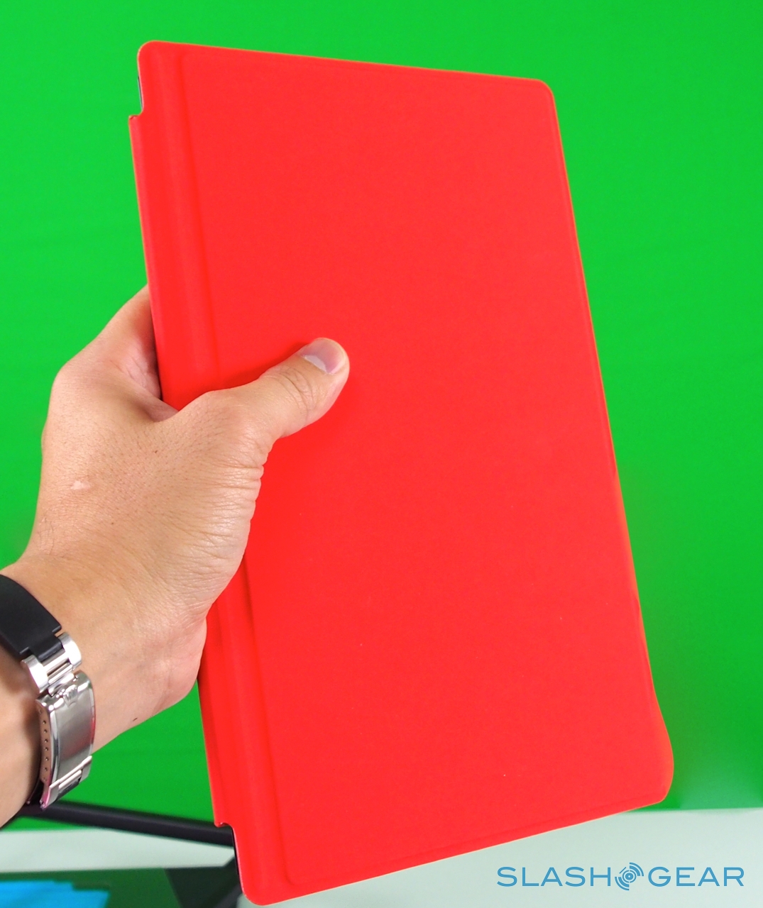
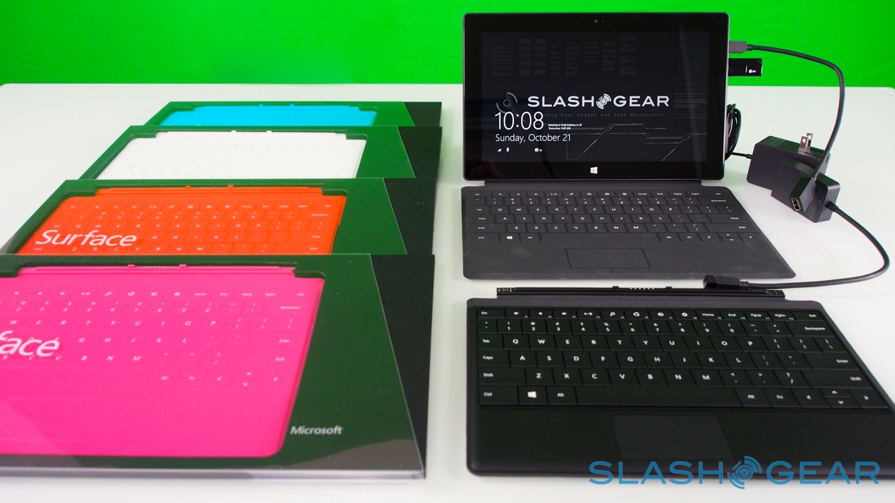
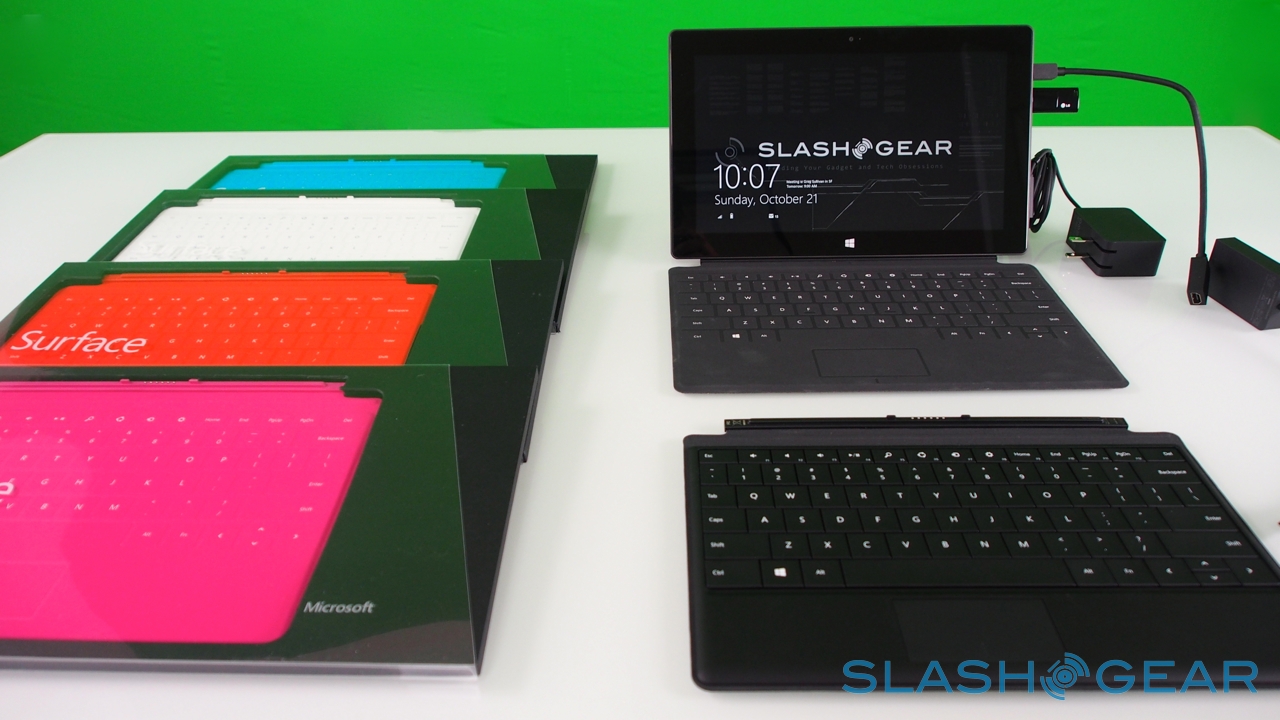
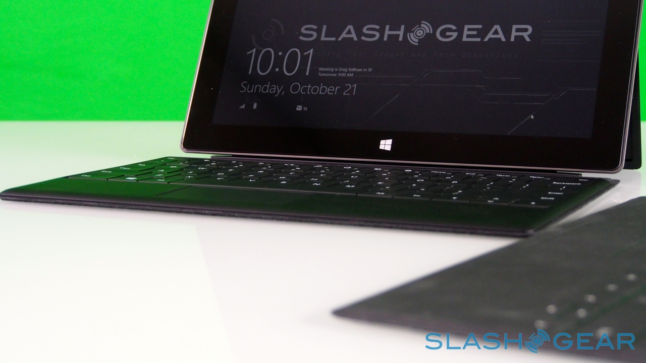
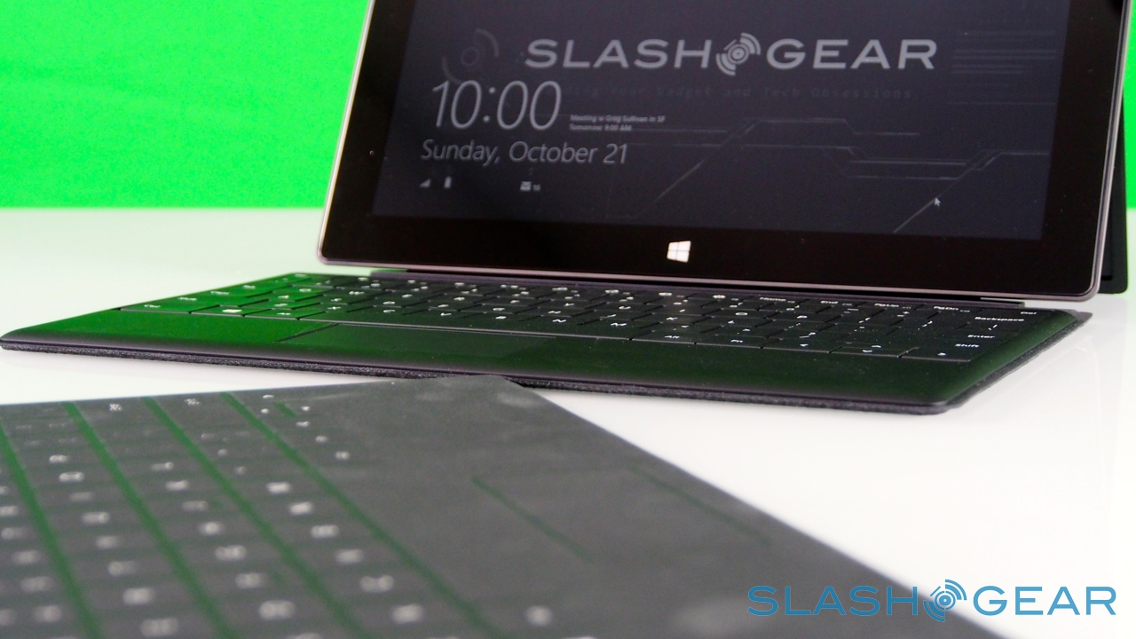
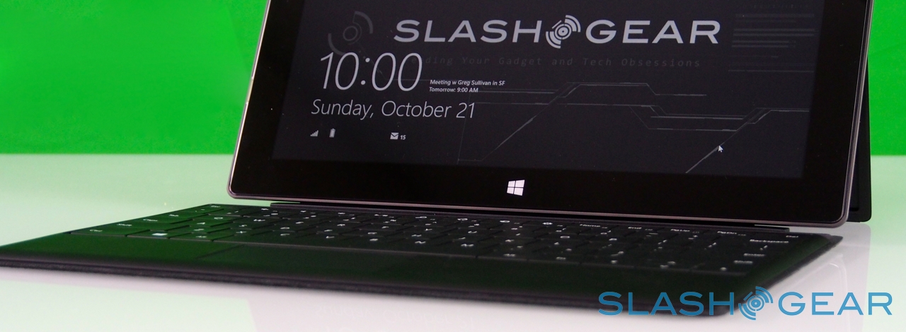
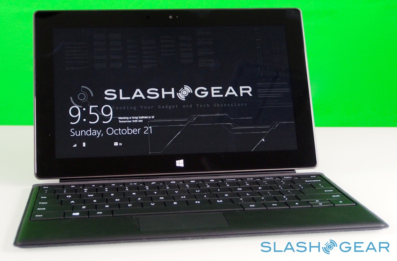
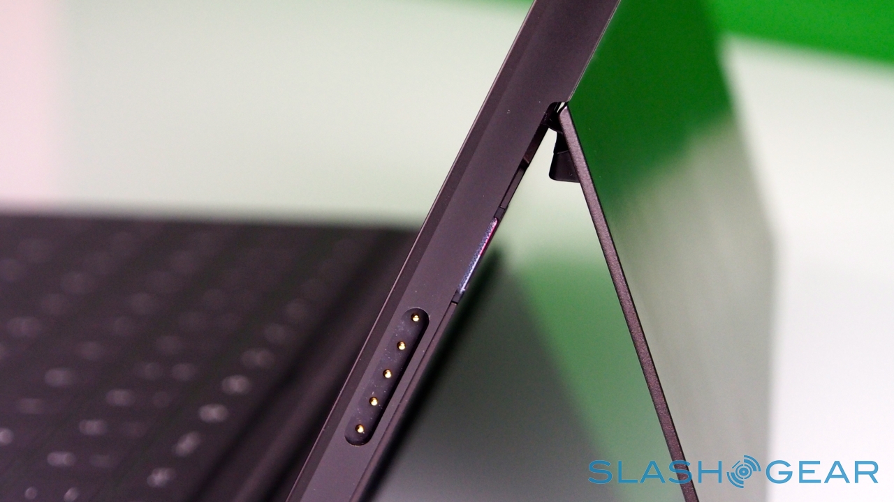
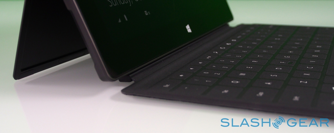
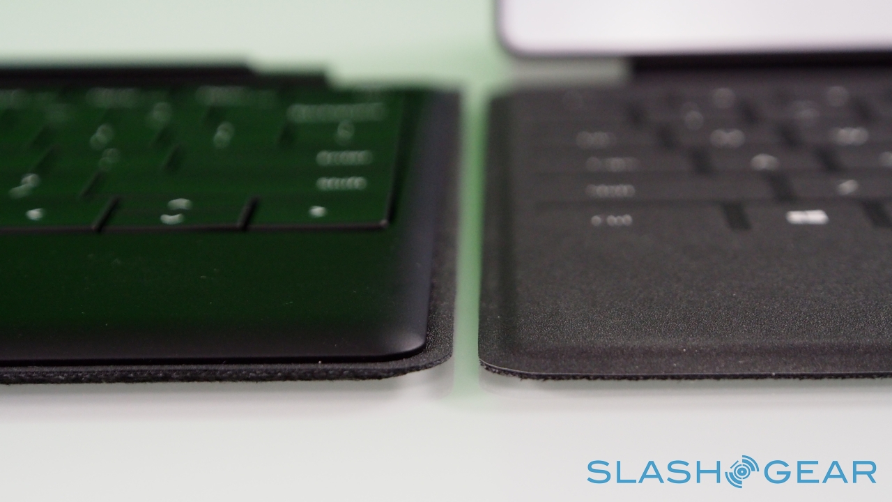
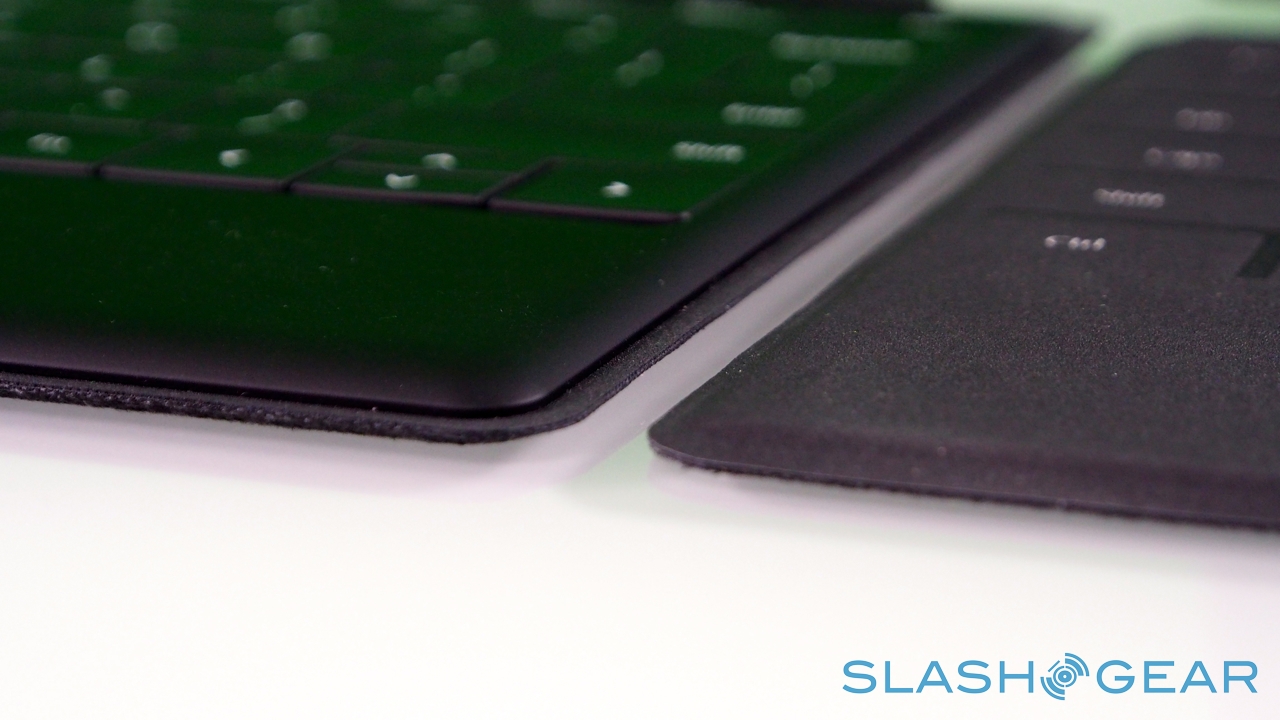
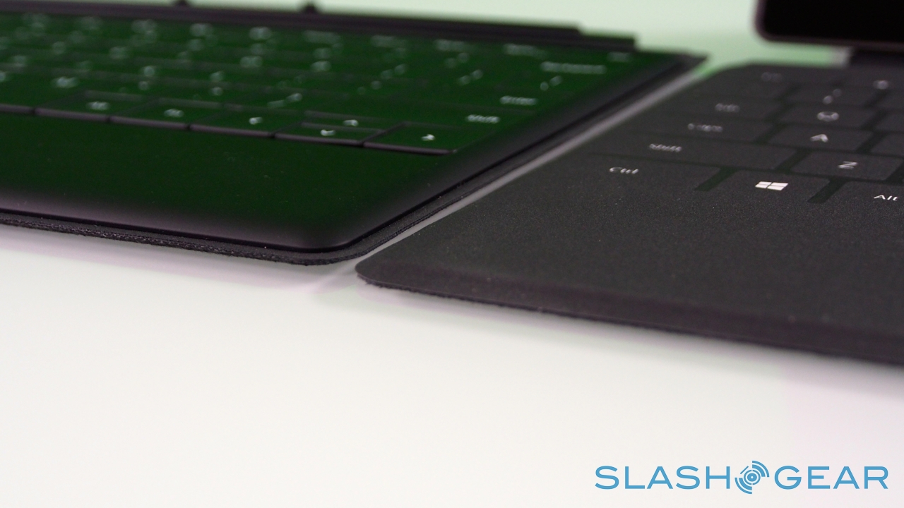
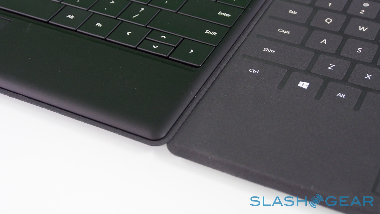
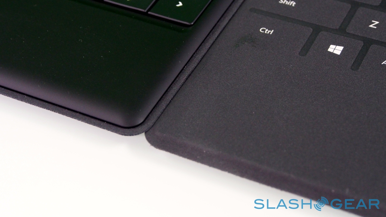
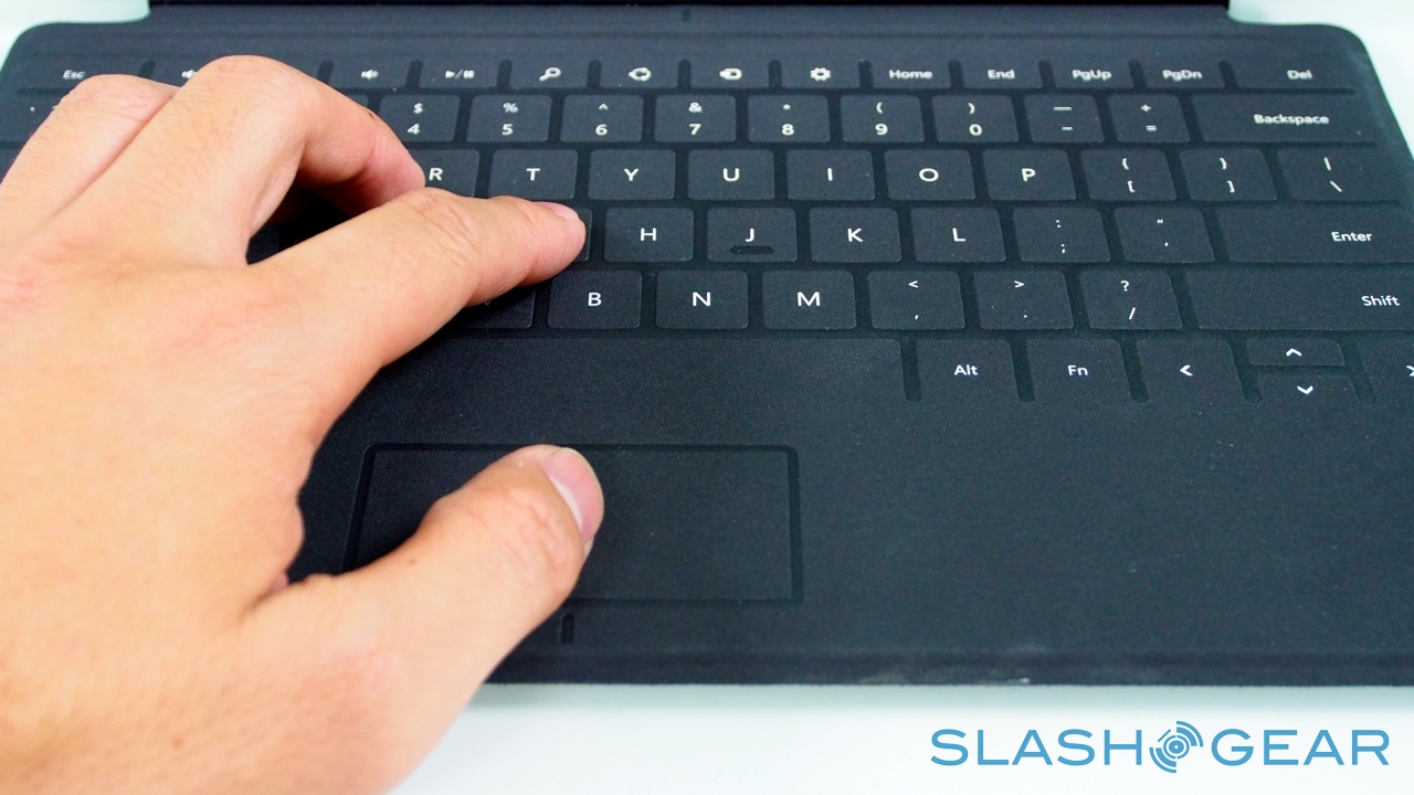
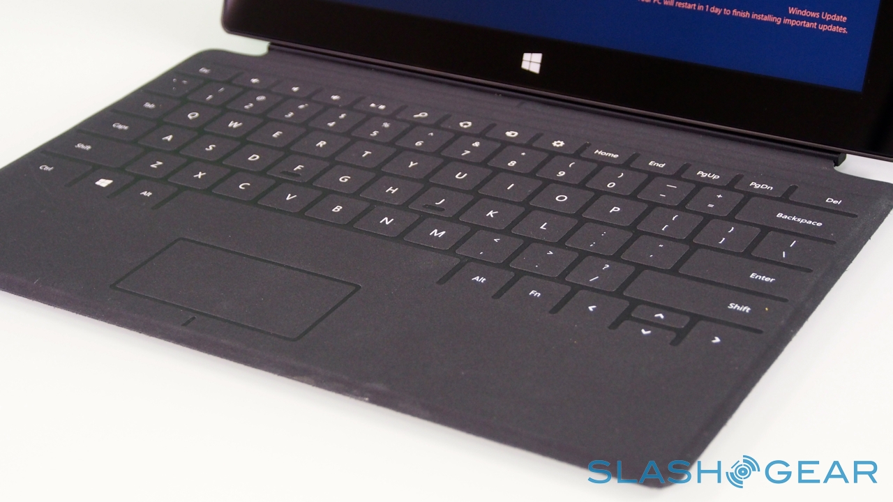
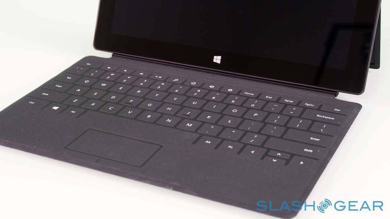
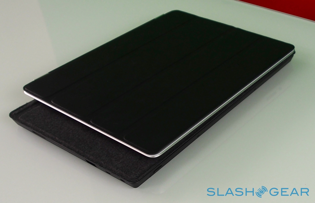
Right now, there are two keyboards to choose from, Touch Cover and Type Cover. The Touch Cover is the thinner of the two, a 3mm-thick slice of touch-sensitive fabric and plastic that docks to the bottom edge of Surface and functions as both a protective cover for the fascia and as a method of faster text entry. Microsoft says it put in several months of experimentation to ensure the magnetic clasp was both sturdy enough that you could dangle Surface from it, but still be so readily detached that a three-year-old could do it (something we tested ourselves).
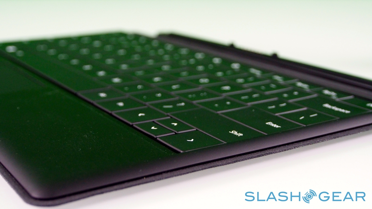
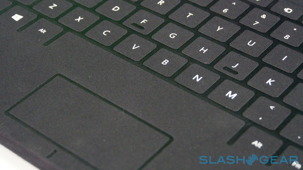
There are no moving parts, only the outlines of keys laser-etched onto the plastic. Inside, pressure sensors track each touch of your fingers – all ten can be tracked individually at any one time – and decide whether the weight being applied is indicative of your hands resting on the 'board or actively pressing a key. That point is around 40g of pressure, apparently, though Surface also uses the touch sensitivity to track whereabouts you're consistently hitting the keys, so that it can continue to register key-presses even if you're not dead-on with your aim.
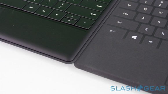
It's not a perfect alternative to a traditional keyboard, but it's functional and – while we're now reasonably speedy with on-screen 'boards – if you stick with it you can reach higher speeds than when typing on glass. There's a little give and a little textural feedback involved, and together they're sufficient to coax a few more words-per-minute out. Microsoft claims it takes less than a week to grow familiar with the system, and that in time you can reach roughly double the speeds of a traditional on-screen layout, and though we didn't quite achieve that sort of rate we were still able to punch out longer emails and other messages in relative comfort.

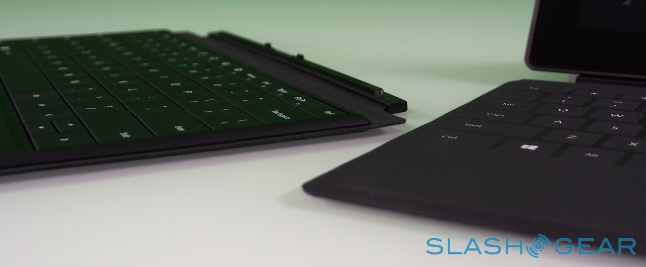
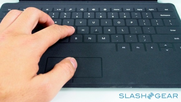
Those who simply can't get the hang of a zero-profile keyboard have the Type Cover to opt for instead. Twice as thick, at 6mm, it has mechanical keys – albeit with minimal travel – and adds 0.55lbs to the weight of the Surface, versus the 0.46lbs of the Touch Cover. You get a full five row 'board, as well as function keys that double as media and navigation shortcuts, plus a trackpad; as with the Touch Cover, closing it on the screen automatically puts Surface into standby.
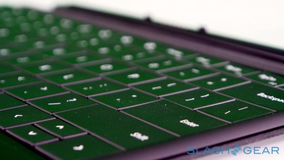
Even with the extra depth, this is no buckling-spring keyboard. The feel when typing is akin to some of the more recent ultraportable notebooks: key-travel is noticeably curtailed, though we could quickly achieve a faster rate – with fewer errors – than with the Touch Cover. The broad spacebar is a particular boon.
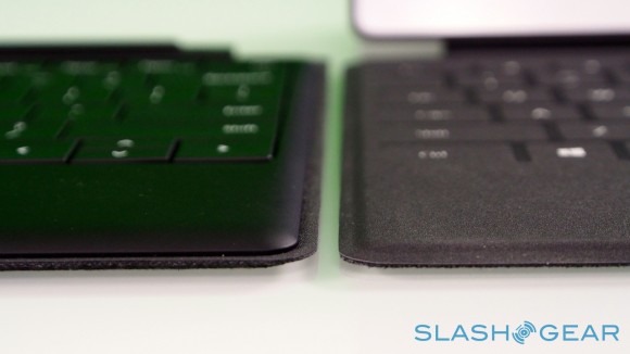
Perhaps the biggest drawback is availability; Microsoft's launch bundles mean that the only way to buy a Surface with the Type Cover but not the Touch Cover is to opt for the 32GB model. There's no way to buy the 64GB variant without the Touch Cover too. Alone, the Type Cover is $129.99 (versus $119.99 for the Touch Cover).
Battery
Microsoft rates the 31.5 Wh battery Surface is equipped with for "all day battery life"; it's a nebulous term, though it translated to real-world performance reasonably well. With heavy use, we managed a full day out of the slate, with a mixture of web browsing, some app use, local and streaming media, and a little camera work. It's a good, solid showing for the Microsoft slate.
Where things get shaky is in standby time. While we're used to plugging in our smartphones overnight, every night, tablets can be more sporadic in their usage. The expectation is that they can hold onto a reasonable charge for a more extended period, so that there's juice available whenever you pick them up from the coffee table.
On that front, Surface falls behind its better rivals. Whereas you can leave an iPad unused for a few days, and come back to it with a fair expectation of having power left, Surface proved more profligate with its standby power. One time, we left it with a claimed 30-percent left on the battery meter, and after around 6hrs – with no active use in that time – it ran itself down and shut off.

Microsoft is still undoubtedly finessing its power management firmware, and it's entirely possible that a software fix could stem the more aggressive flow of battery life. As it stands, it's not an insurmountable problem, nor a deal-breaker – like we said, when active Surface posts admirable runtimes – but it's something you're forced to consider in your everyday use.
Wrap-Up
In the end, it all comes down to ecosystem. If you're already invested in Microsoft then it's a good solution: if you're a Windows Phone user, or an Xbox 360 gamer, or simply have a background with Windows 7, then Surface will likely fit into your world more smoothly than an iPad or Android tablet might. If you've considered subscribing to Xbox Music, Microsoft's streaming audio service, then Surface makes sense there, too, considering cross-platform apps for that haven't been released yet.
Personal reactions of ClearType HD aside, it's hard to be too critical of Microsoft's hardware. The Surface team has cribbed some of Apple's notorious attention to detail and applied it with its own spin, and the result is a well-constructed slate with legitimately useful design elements like the kickstand. You could argue that the focus on the Touch Cover and Type Cover are Microsoft proving reluctant to let go of physical keyboards, but using Surface without them is undoubtedly practical and their convenience (and the fact that Office is preloaded, albeit in preview form) means you get the best of both worlds.
Windows RT will undoubtedly prove the sticking point. That it comes late to the tablet game and thus with fewer apps than competing platforms is a given. That there are some for whom Windows itself is anathema is no surprise. However, the poorly-explained – and not easy to ascertain at first glance – differences in abilities between RT and Windows 8 will need time to bed down before Surface finds its niche. That will happen, but with headaches along the way, and it may not be until Surface Pro arrives with its higher-resolution screen and digital pen that Microsoft's tablet gets the respect it deserves.
