Surface Pro 3 Review
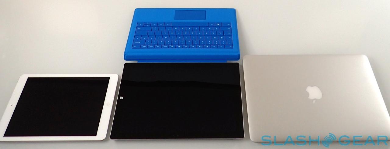
The Surface Pro 3 is something special. Microsoft has refused to give up on its concept of one device that's both a tablet and ultrabook, and its ramped up the trash-talk, too, calling out the MacBook Air and iPad by name when it launched the third-generation Windows 8.1 machine. Thing is, this may not just be hot air: bigger but lighter, faster but slimmer, the Surface Pro 3 might well be the hybrid Microsoft has been promising all this time. More importantly, it could well convince me – as an unabashed Mac and iPad user – that the Surface Pro 3 is now competitive. Read on for my full review.
Design
Let nobody tell you Microsoft can't make good hardware. Every generation of Surface has been impressively pure in its design language, and to be blunt, Microsoft puts most Windows notebook and tablet OEMs to shame.
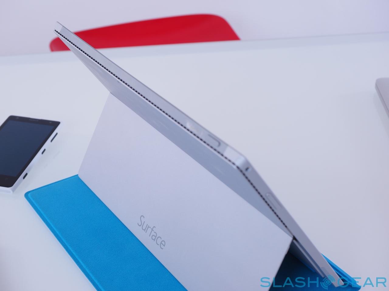
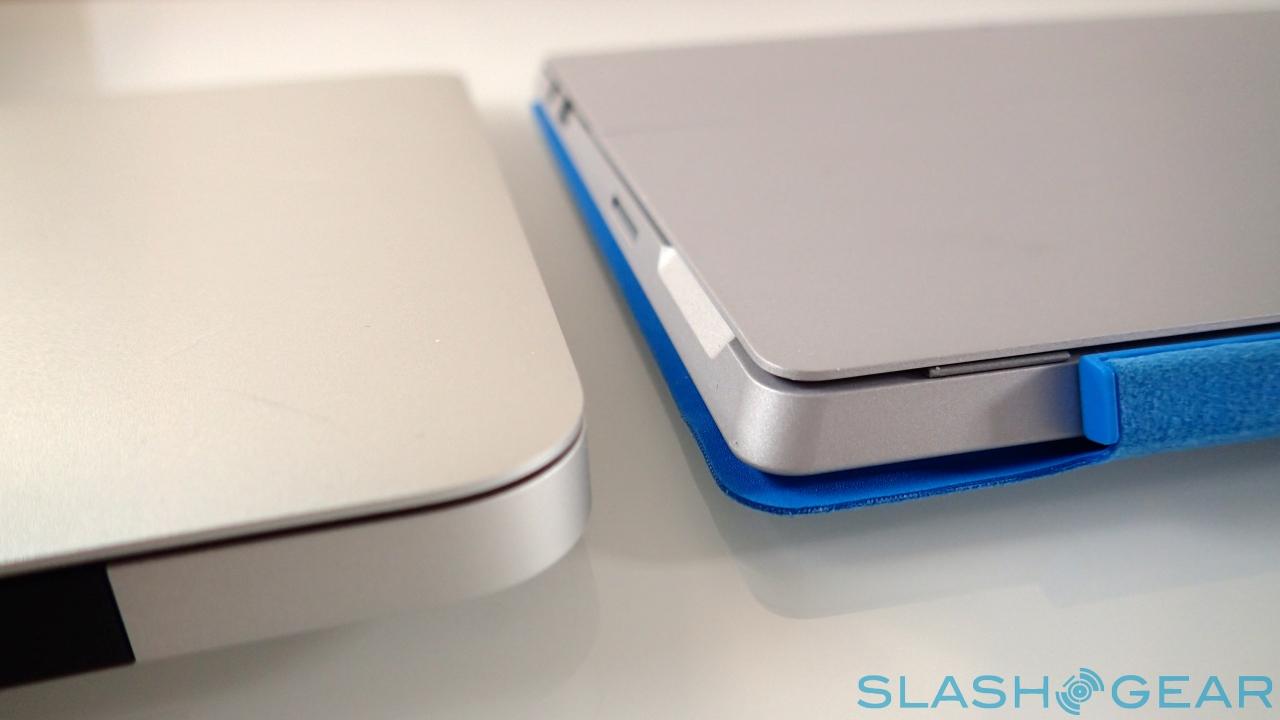
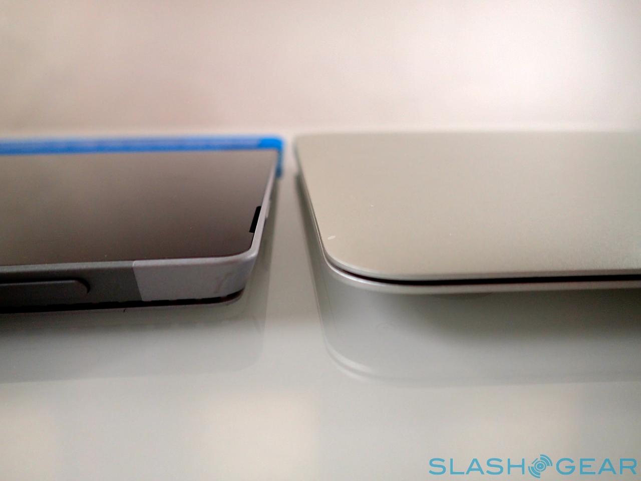
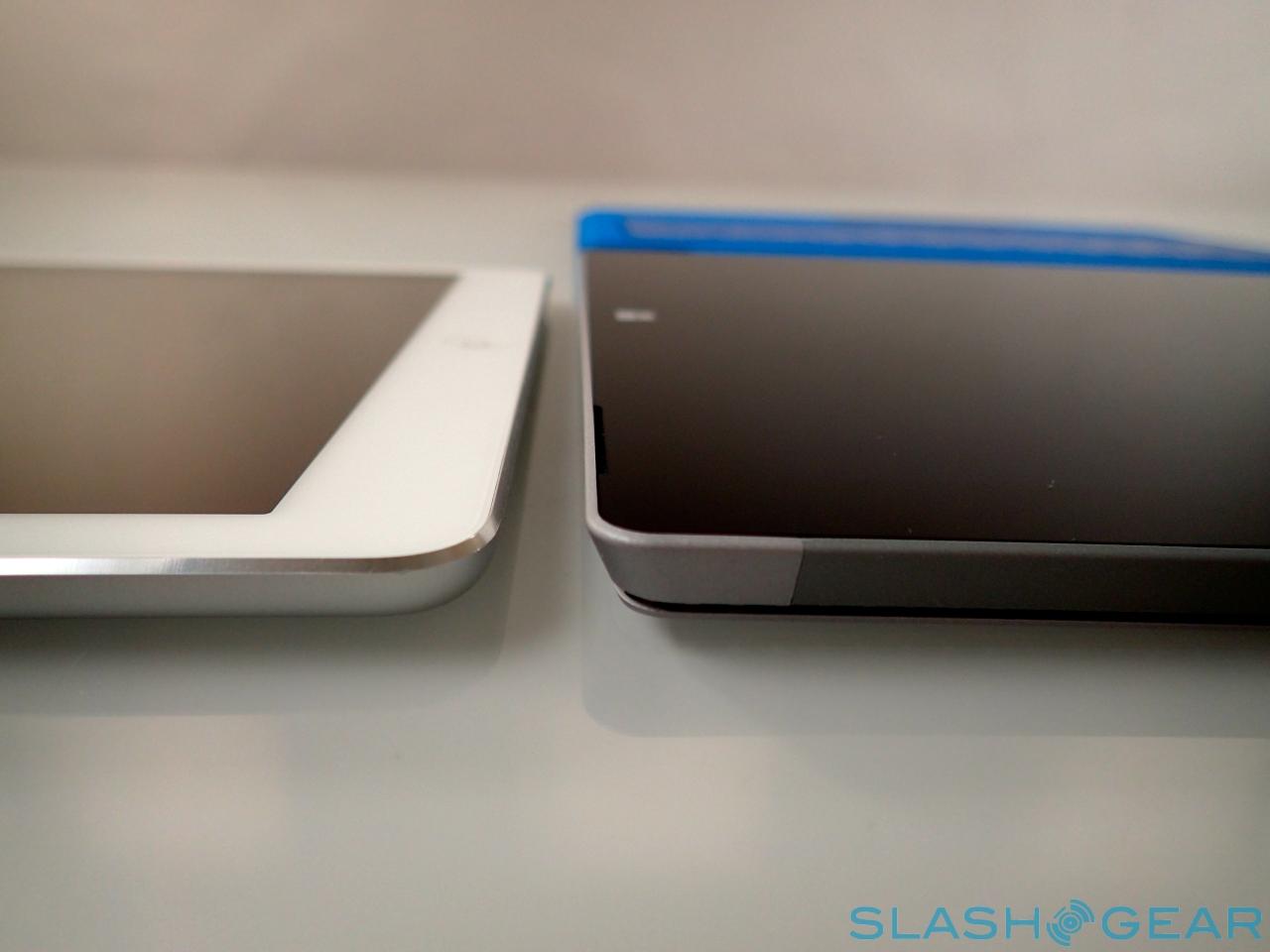
The Surface Pro 3 goes even further, taking the best of the Surface 2 and Surface Pro 2 and blending them into a satisfying whole. You still get the sturdy, beautifully crisp magnesium alloy metal casing, but now it's as thin as you'd expect from the Surface 2 – at 0.36-inches – while still accommodating the hardware of a full notebook.
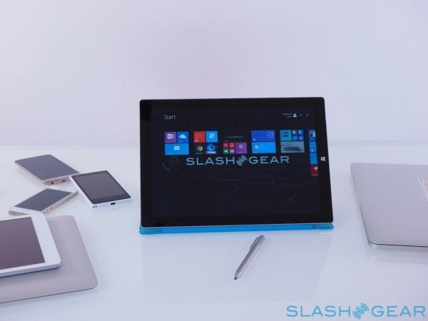
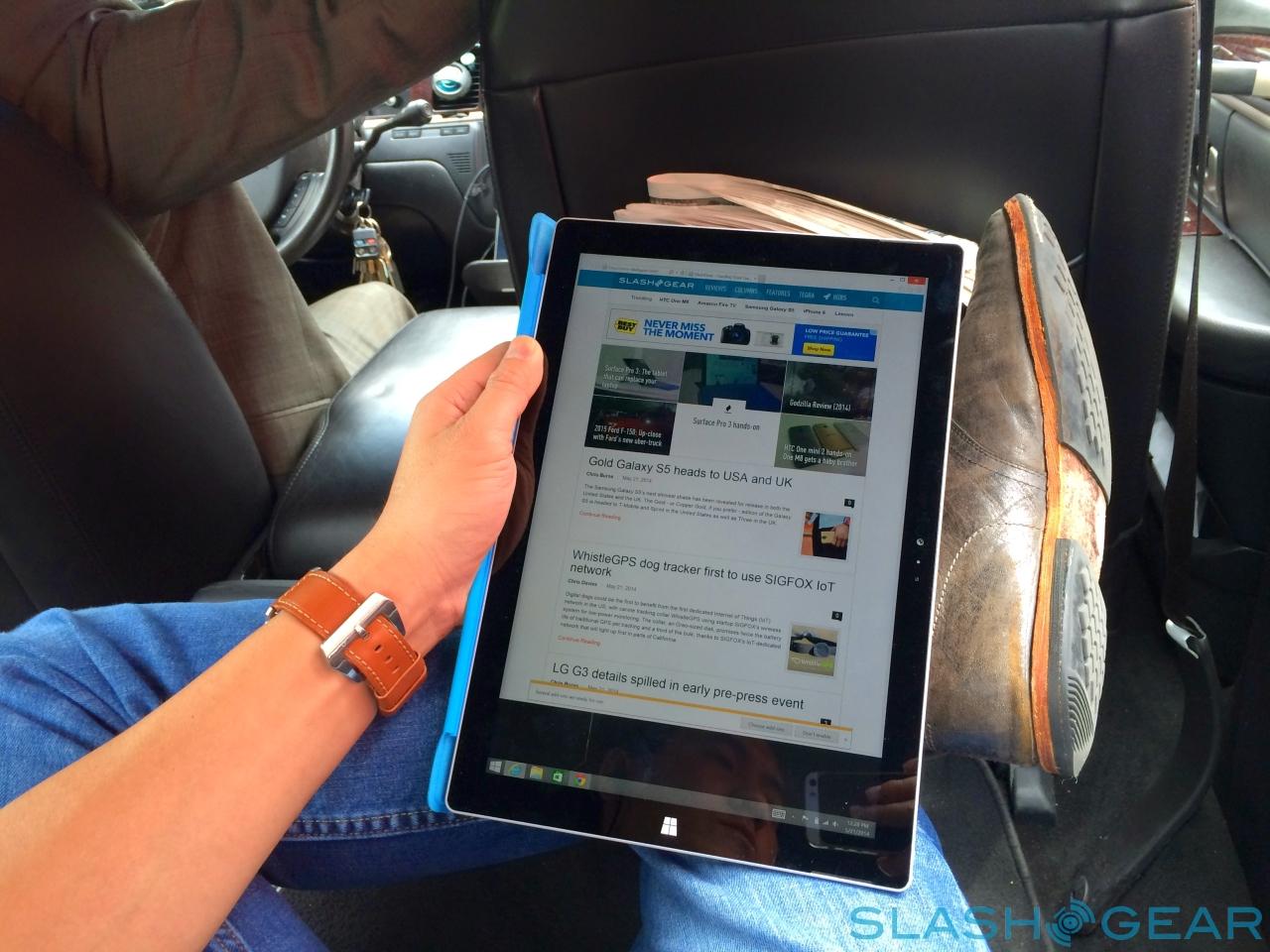
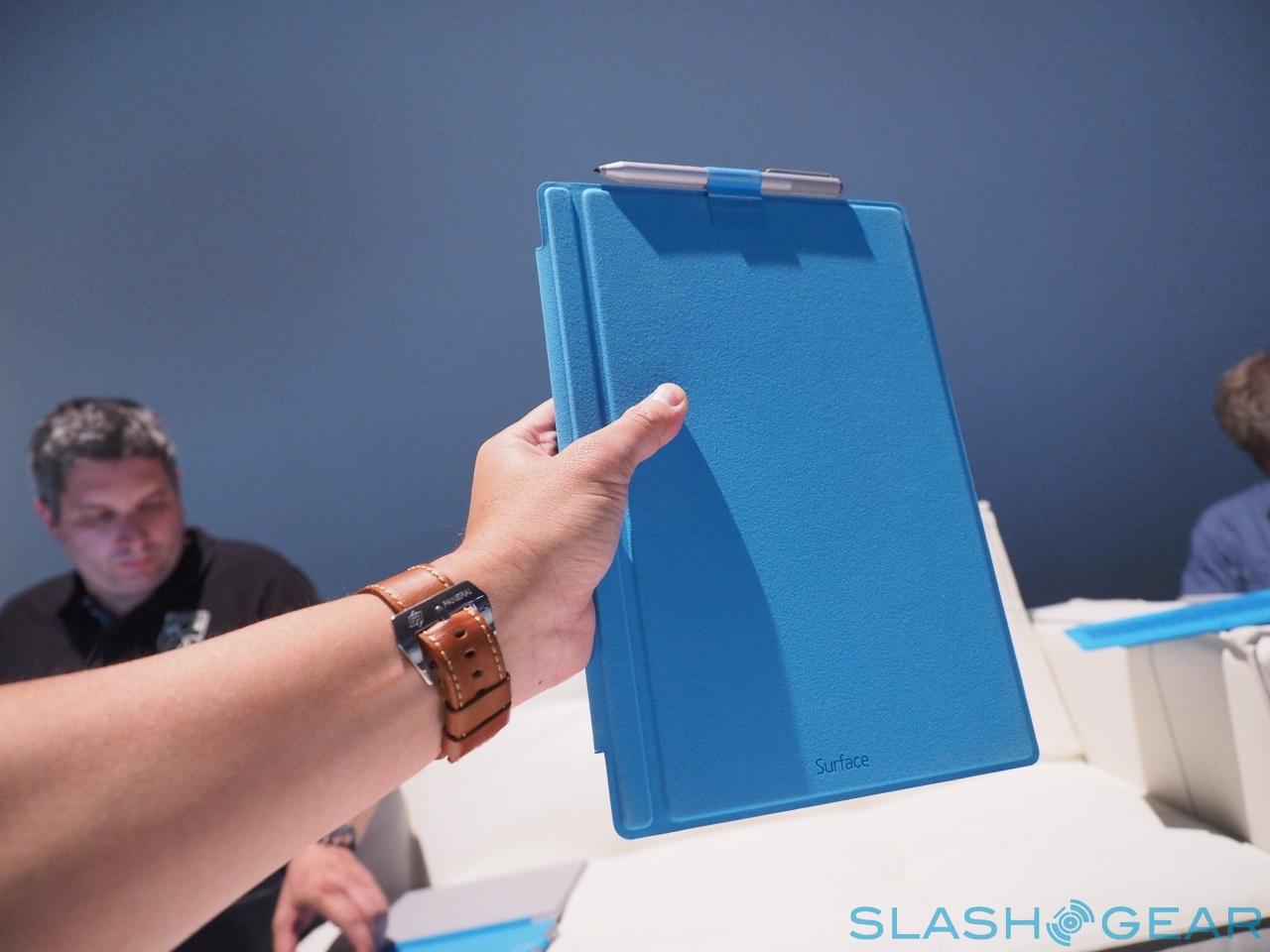
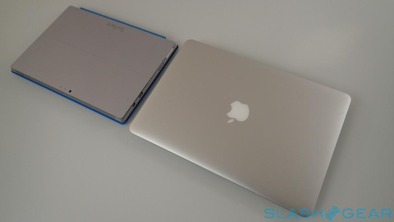
It's no small achievement. Without the Type Keyboard in place, the Surface Pro 3 measures in at 11.5 x 7.93 x 0.36 inches and 1.76lbs. It's the slimness that you notice the most, along with the 3:2 aspect ratio of the display leaving the tablet akin to a legal pad in your hand. Admittedly it's a legal pad that, after a period of use, I didn't want to continue holding in single-handed, but it's well suited to cradling in the crook of your arm.
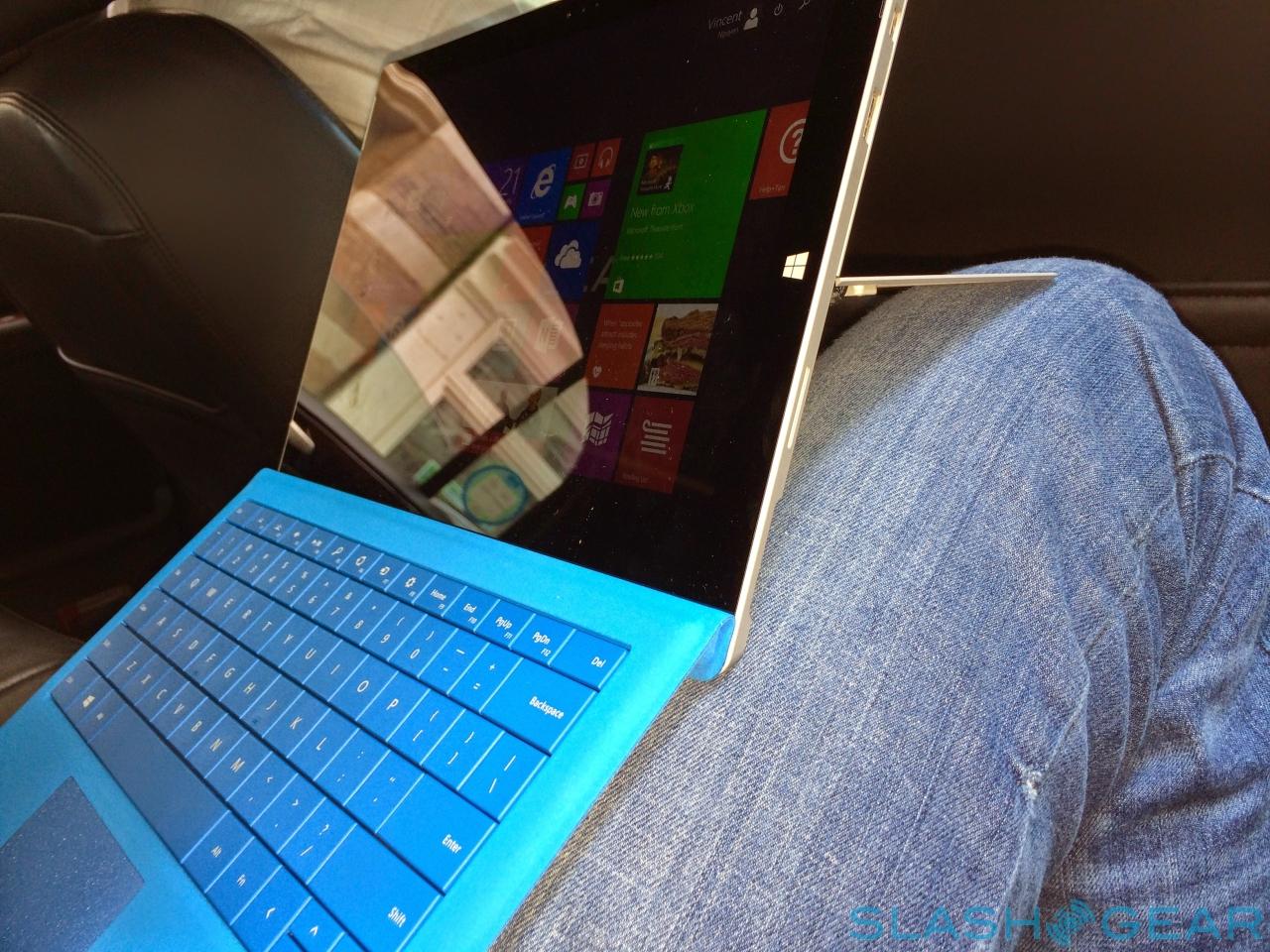
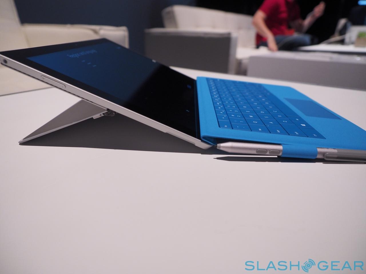
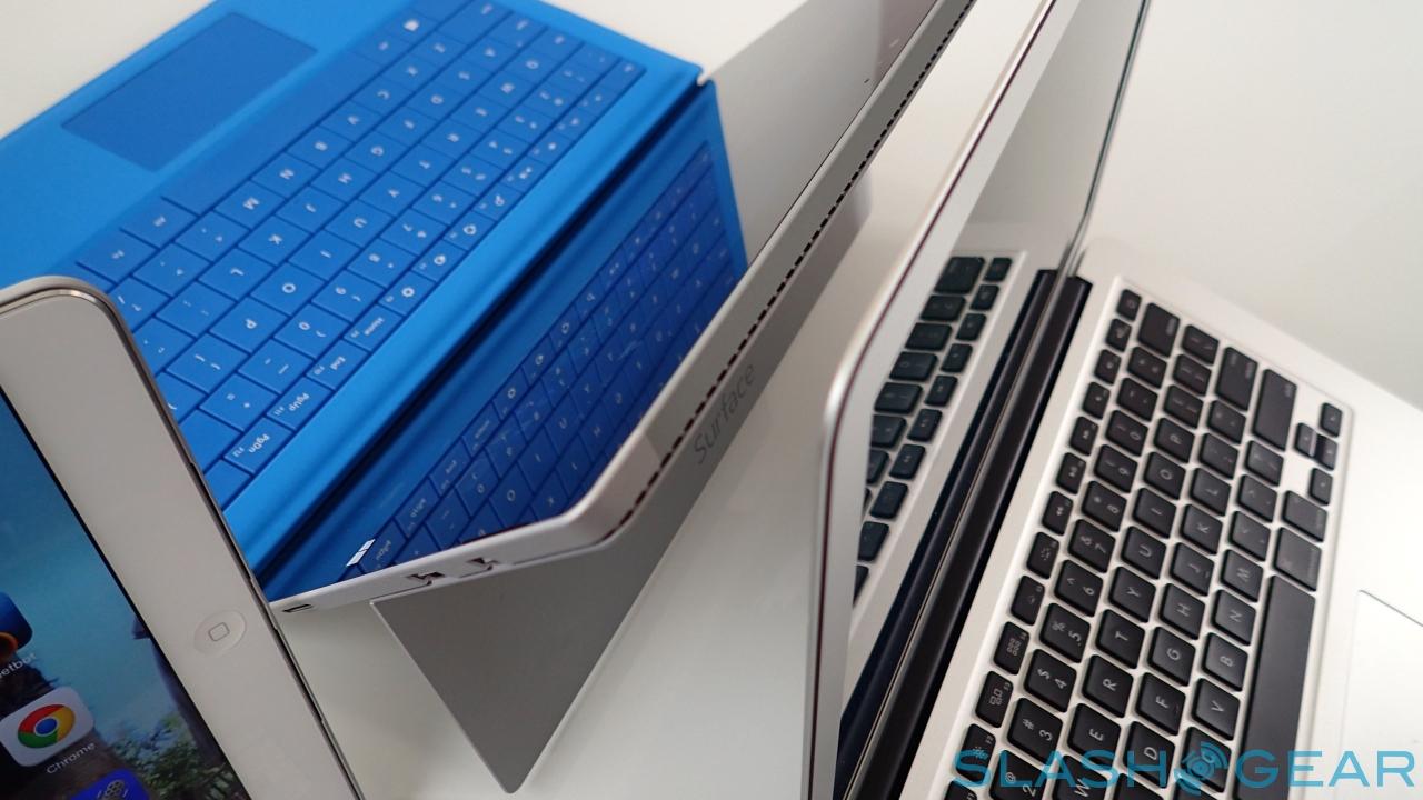
The kickstand is something I've wished tablet manufacturers would "borrow" from Microsoft's design team since the first generation Surface, and it gets supercharged for the Surface Pro 3. Whereas the previous-gen version had two positions it could click reassuringly into, this new model can be pushed back all the way to 150-degrees: enough to elevate the tablet at a gentle angle more akin to an artist's slate.
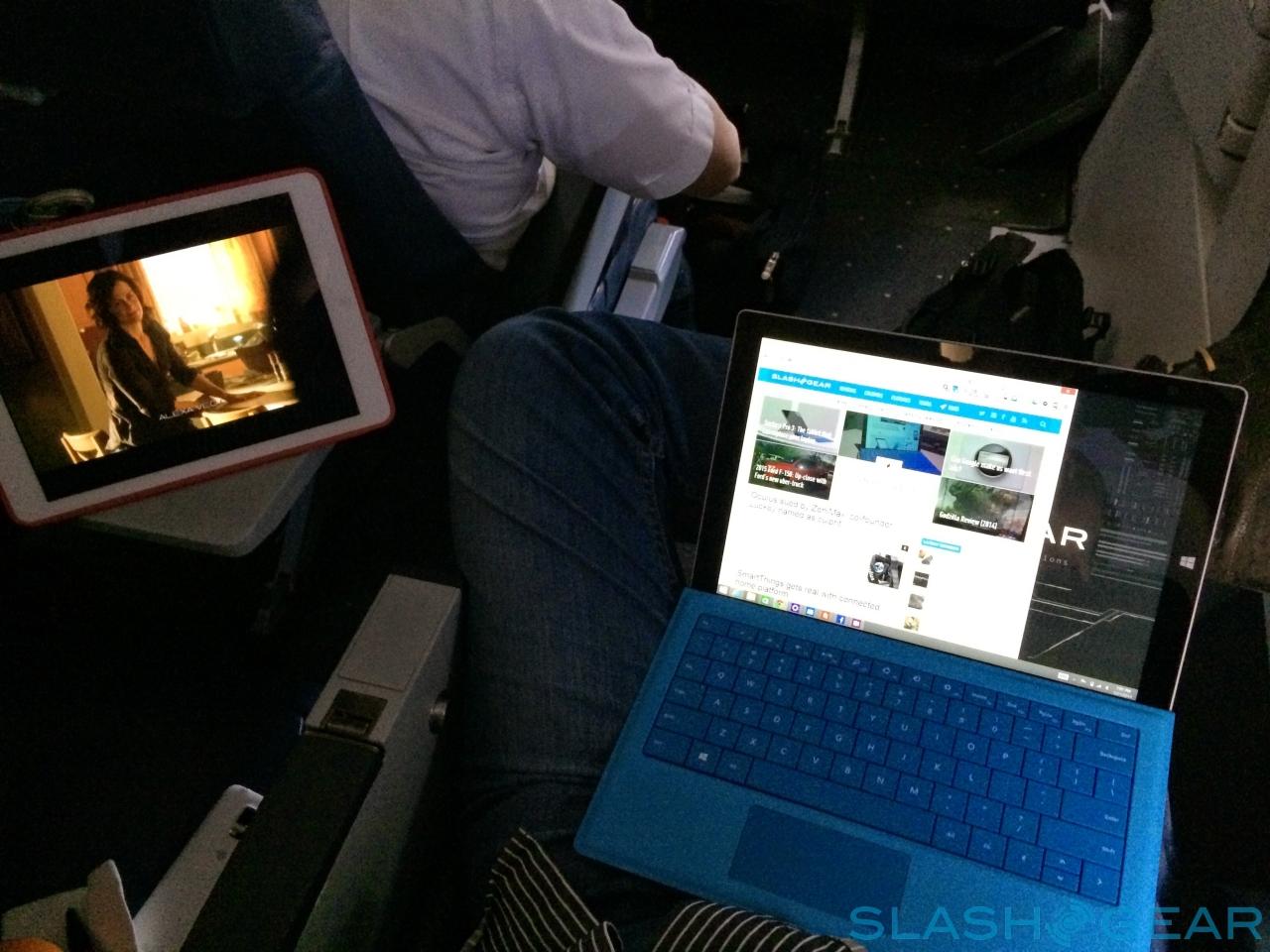
At the other extreme it can be propped up for presentations or watching videos, as well as for fitting on even small airline tables. The new Surface kept me entertained and productive on an international flight, fitting even when the person in the seat in front reclined.
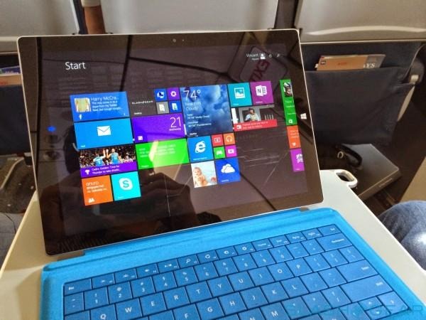
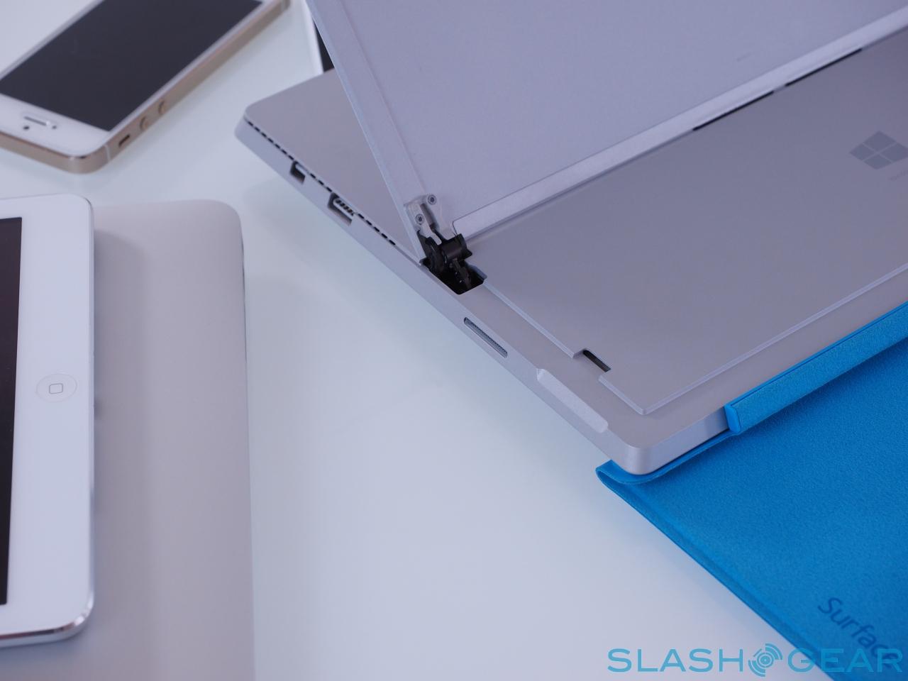
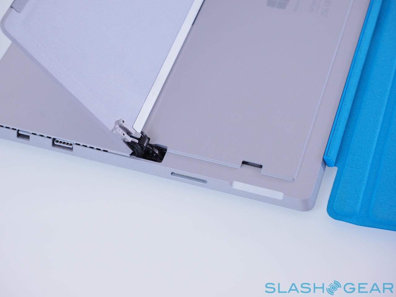
That flexibility would all be undermined if the hinge itself was weak or flimsy, but Microsoft's engineers have really hit the spot with the mechanical aspect. The combination of solid looks and that subliminally tactile resistance add up to a part I'm pretty confident will last as long as the components inside stay relevant.
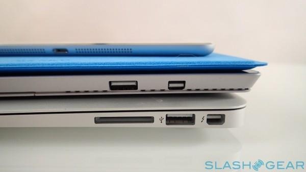
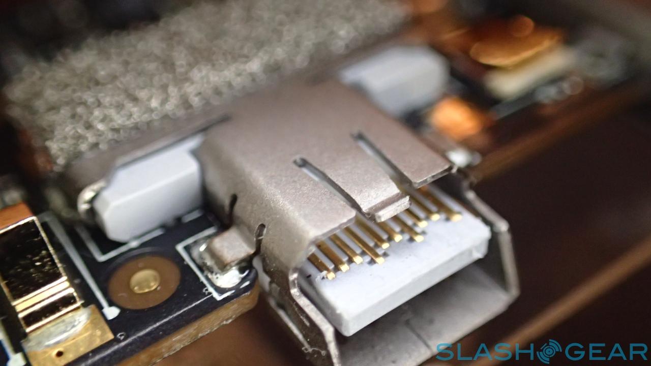
Considering Microsoft has accommodated an entire ultrabook – keyboard aside – into a thin slice, perhaps I should be more forgiving about the ports, but connectivity is undeniably sparse. Look around the tablet and you find a single USB 3.0 and a Mini DisplayPort, along with a microSD card slot nestling under the stand, a headset jack, and the proprietary magnetic Cover Port on the bottom edge.
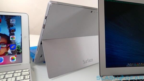
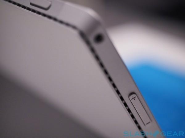
There's also a redesigned charging port, which now clicks into place without the uncertainty of whether it's charging, as was a common complaint about the old model. Stereo speakers sit under small slits on the sides, and there's a crisp cut-line that runs the tablet's periphery and acts as a gap for the fan to operate through.
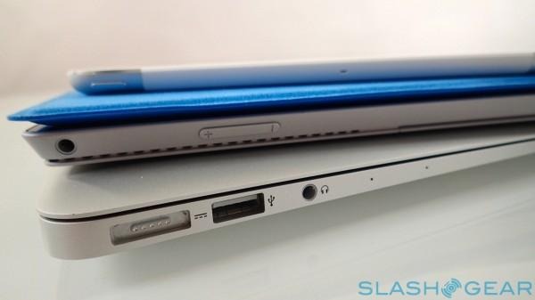
The volume rocker is on the upper left edge, while the Windows key has shifted from the bottom bezel to the right. I did find that I could occasionally hit it with my palm when I was using the Surface Pen and resting my palm on the edge.
Hardware and Performance
This is a full Windows 8.1 PC. Perhaps that's an obvious thing to point out, but it bears repeating all the same: Microsoft has worked design magic in putting up to a Core i7 computer into a form-factor you might more realistically expect to pack a low-power ARM chip.
Our review unit is actually a Core i5 version, and Microsoft will offer a Core i3 at the budget end of the range, too. The entry-level Surface Pro 3 also comes with just 64GB of flash storage (128GB is an option, as well as being the standard storage for the low-tier Core i5; more expensive models get either 256GB or 512GB) which I feel is on the low side, though a microSD card can at least help with that. Memory is either 4GB or 8GB, tier depending.
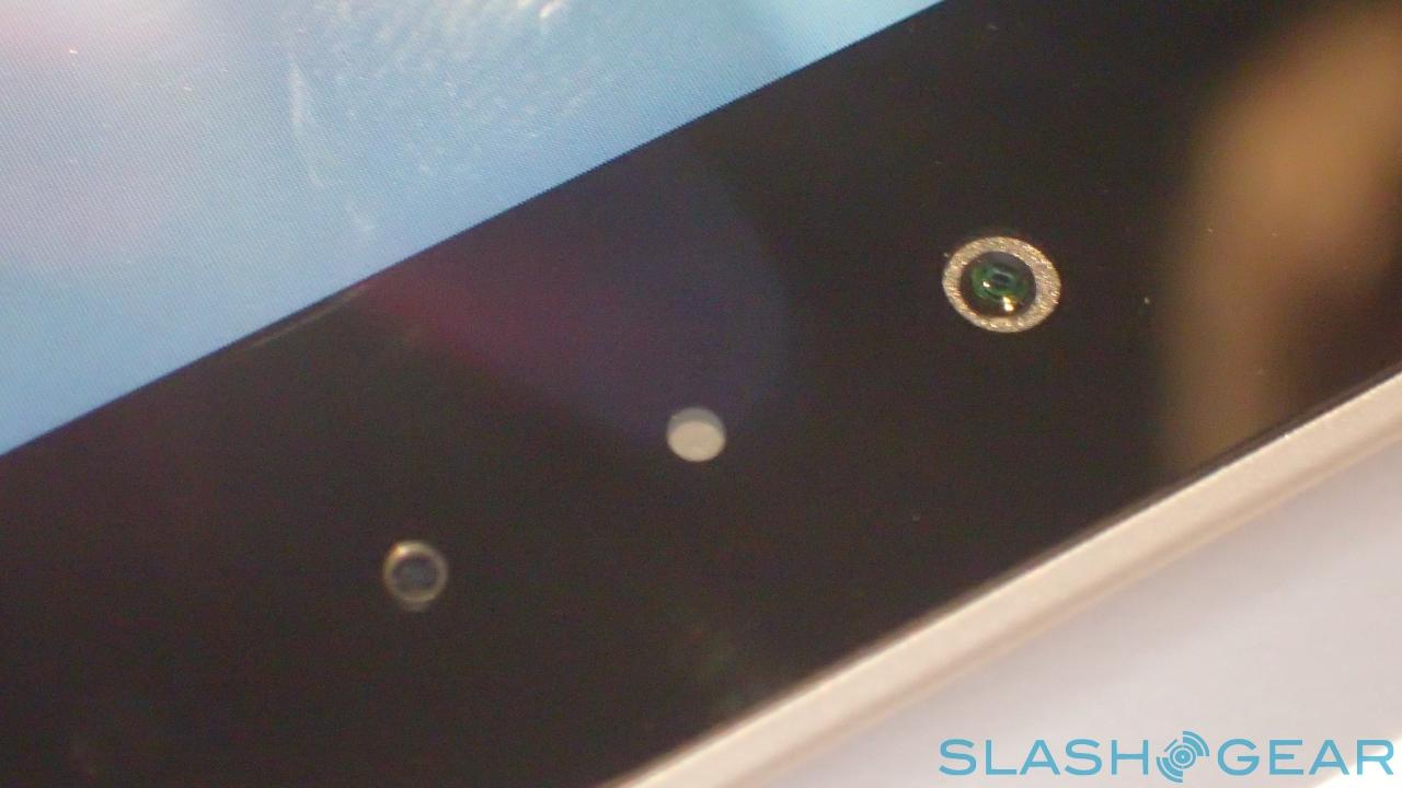
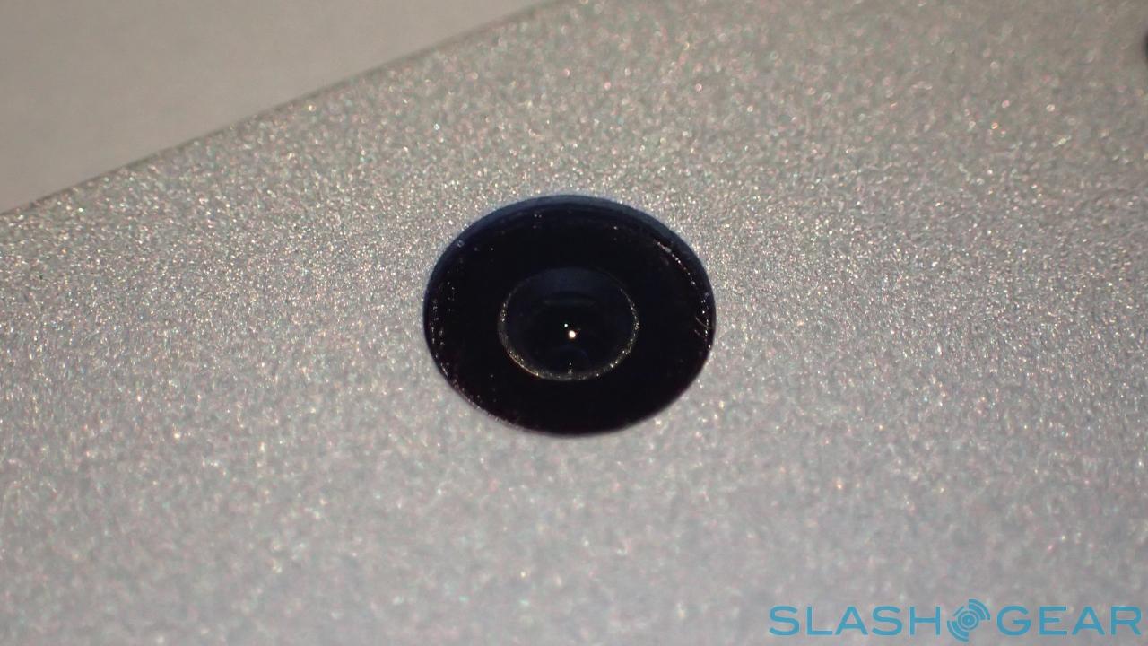
The rest of the specifications straddle the worlds of notebook and laptop. There's WiFi a/b/g/n/ac along with Bluetooth 4.0 LE, stereo microphones, and 5-megapixel cameras front and back, but also a digital compass, ambient light sensor, accelerometer, gyroscope, and magnetometer.
Conspicuous by its absence is a LTE option (and with it the GPS capabilities that usually comes with a modem chipset). Microsoft undoubtedly has research confirming that Surface Pro buyers don't actually want integrated 4G in any great number, but I still think it's a missed opportunity, and gives Apple and others an easy hit over the Windows tablet. Yes, you can tether to a phone – a Windows Phone if you're feeling brand-loyal – but it's never quite as convenient as simply picking up your tablet and knowing it's already online.
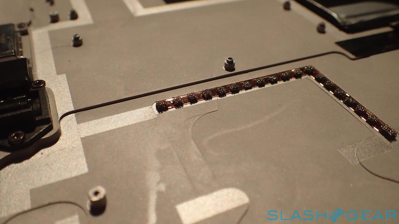
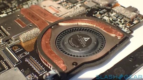
Microsoft is particularly proud of its cooling system, claiming that it's all but inaudible during normal use. Graphics-intensive tasks, like exporting HD video, did provoke some fan noise, but no more than I'd expect to hear from a regular ultrabook. At times – such as during extended Full HD video sessions – the back of the Surface could get warm to the touch, but never uncomfortably so.
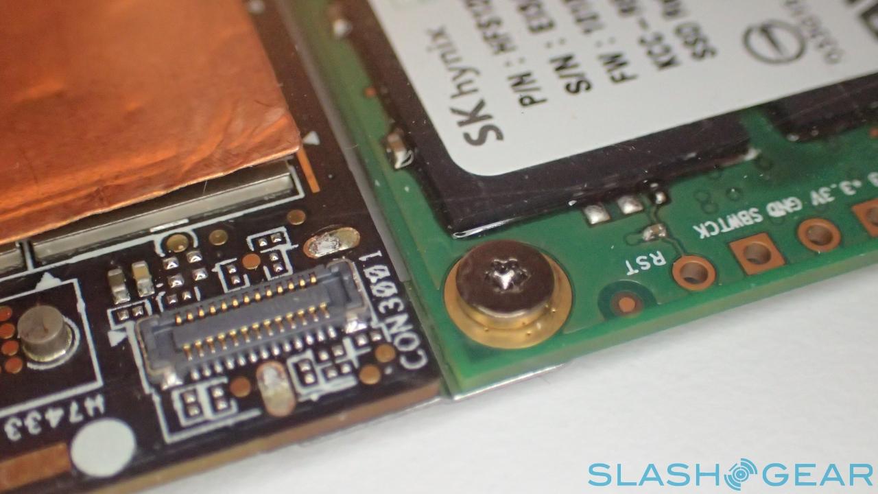
In benchmarks, the Surface Pro 3 did solidly, though not outstandingly. Our Core i5 unit scored 2,900 in Geekbench 3's single-core test, and 5,608 in the multi-core test. The Samsung SSD inside managed sequential read rates of 479.7 MB/s, and write rates of 230.7 MB/s. In the SunSpider test of browser JavaScript performance (where faster is better), Microsoft's own Internet Explorer considerably out-scored Google's Chrome, completing in 111.9 ms versus 333.6 ms.
As for battery life, Microsoft quotes up to nine hours. In my experience, with mixed use, I saw more like 7-8 at most, though dropping the backlight and sticking to low-power tasks like word processing would probably prolong things some.
Display and Surface Pen
I've struggled to criticize Microsoft's choice of display panels over the past generations of Surface, albeit taking some issue with the ClearType text rendering on the first-gen Surface RT, which tried – and failed – to offset the underwhelming resolution. The Surface Pro 3 steps the game up another notch, however, being a full 2160 x 1440 resolution and 12-inches in size.
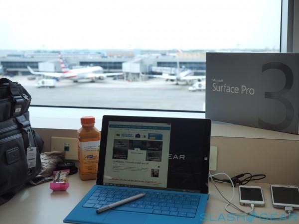
Both factors are vital in their own way. Display size has always been a limiting factor for me with Windows tablets: the 10-inch Surface Pro 2 and its predecessor were simply too small to be fully productive. The combination of a few extra inches and that 3:2 aspect ratio make a vast difference on that front, and the Surface Pro 3 finally feels like it's made for proper content creation.
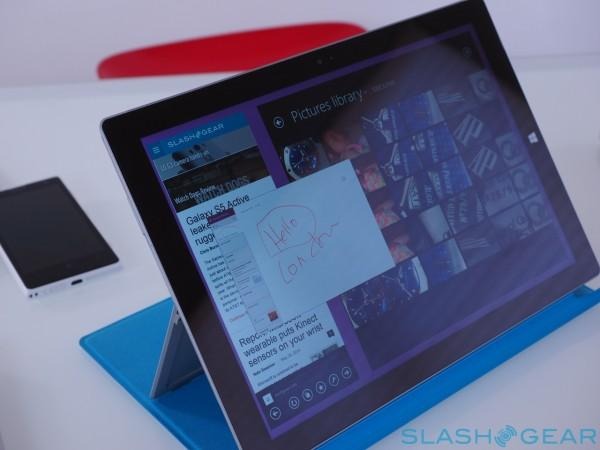
That's where the second part of this one-two punch comes in: the resolution. At 216ppi it's certainly not the most pixel-dense display I've used, but it's high enough that Windows 8.1's split-screen functionality is not only usable but practical. Having two apps running side-by-side makes a legitimate difference, and it's easy to swipe a finger across the responsive multitouch screen and resize the panes.
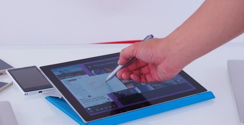
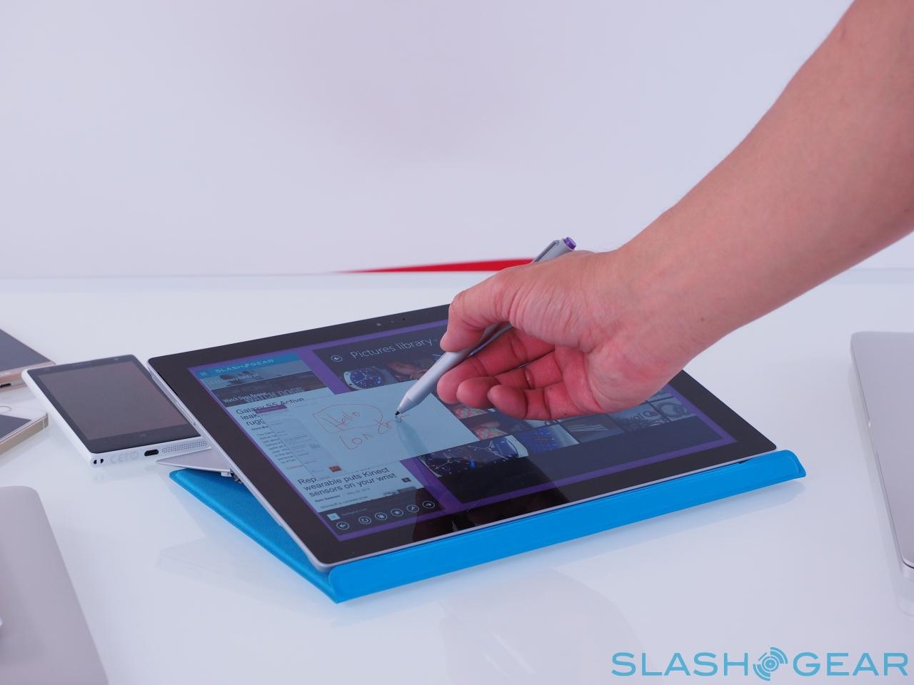
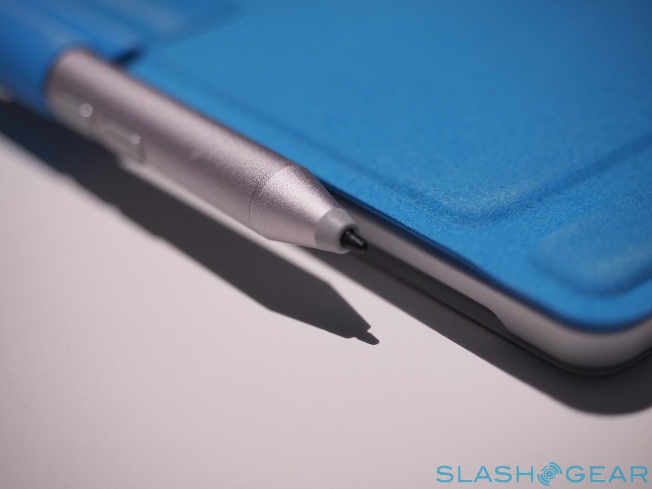
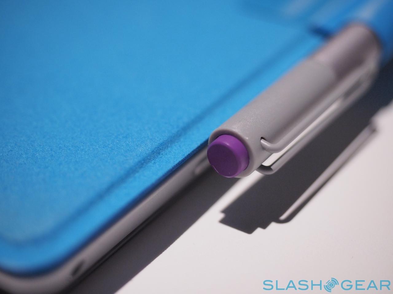
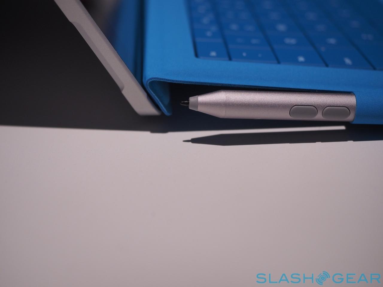
Your finger isn't the only way of interacting with the Surface Pro 3, however. Microsoft will include the Surface Pen in the box, a smooth, sleek aluminum stylus with a purple eraser/button top and a smooth-writing nib.
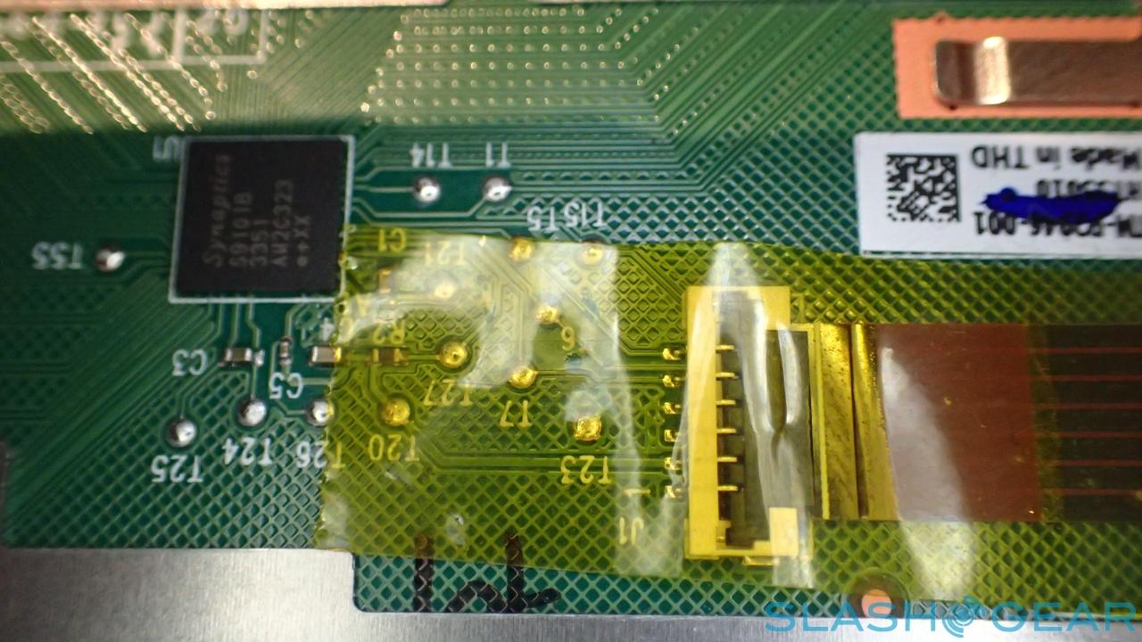
Whereas Microsoft previously used Wacom digitizer technology, the new tablet marks a switch to rival N-Trig: the company's touchscreen and pen components were thinner, helping keep the bulk down, as well as bringing the LCD panel closer to the Gorilla Glass top. In fact, there's admirably little parallax between the point where the nib touches the screen and where the digital ink is left trailing.
N-Trig comes with a couple of compromises, though. For a start the pen requires power, unlike Wacom's passive stylus, and in fact the Surface Pen demands two separate power sources: one for writing and the other for the button, which connects independently to the nib via Bluetooth 4.0. There are also fewer levels of pressure sensitivity – 256, versus Wacom's 1,024 – which I can live with, but Microsoft's decision to omit a proper silo for the pen is less forgivable.
Instead, you get a little fabric loop which sticks to the body of the tablet or the Type Cover, and into which you're meant to jam the Surface Pen when you're not using it. In practice, though, I found it tough both to get the pen safely tucked away and to pull it free quickly, not something you want when you're trying to jot down a quick note. Yes, not providing an internal nook into which the pen can slot helps keep bulk down, but it also left me considering simply leaving the stylus behind altogether.
It would be a shame to do that, too, since the pen is one of the best features of the Surface Pro 3, not least because of the way Microsoft has integrated it with the software. In fact, the combination of tablet, stylus, and OneNote leaves the Surface Pro 3 probably the closest we've ever been (and may ever be) to Microsoft's ill-fated Courier.
OneNote has long supported handwritten text and diagrams in notes, in addition to useful features like being able to search handwritten notes as if they were typed. However, the Surface Pro 3 turns the button on the pen into a OneNote trigger, bringing the tablet out of sleep mode when clicked, and automatically opening up a new, blank note.
If you've got the camera app open, meanwhile, and click the Surface Pen's button, it'll not only snap an image but save that to a new note for you to annotate. Everything gets backed up in OneDrive.
Adobe's version of Photoshop for Surface isn't ready yet – I was impressed by the launch demo, but will need to wait and see how it performs in the real world first – but I tested ArtRage 4 which supports the Pro 3. The Microsoft tablet makes for a great sketching and painting tool, and my kids particularly liked using both fingers and the Surface Pen to create their own art.
My only concerns with the pen are around support and drivers. N-Trig has left some tablet owners frustrated in the past, with slow-to-update drivers leaving patchy accuracy and some apps not recognizing a stylus at all. Meanwhile, there were times – such as when trying to use the Surface Pen to adjust the split-screen multitasking layout with certain software – where what was happening on-screen lagged considerably behind the pen's own nib. Hopefully the fact that the Surface is Microsoft's own handiwork will mean the driver situation will keep pace with future updates.
Type Keyboard
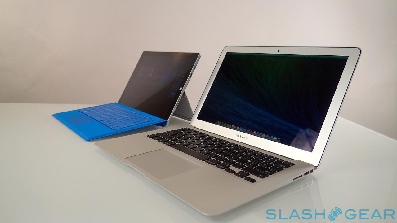
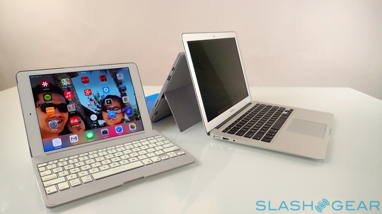
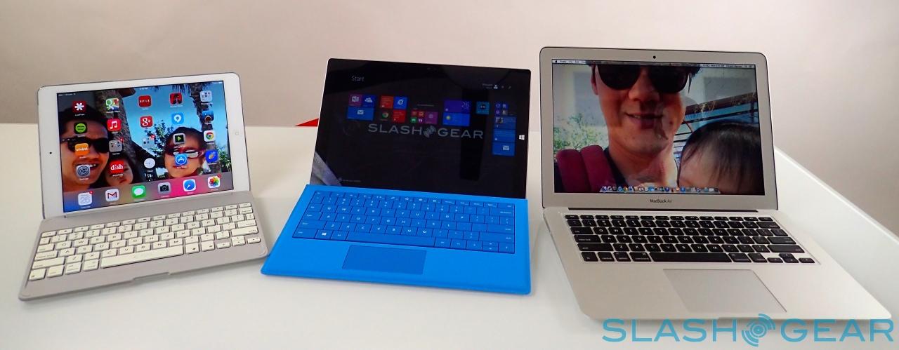
If there's a key controversy about the Surface range, it's epitomized by the Type Keyboard. Microsoft's argument is that many people want a tablet that also does duty as a notebook, and conversely many people want a notebook that also has the ergonomic flexibility of a tablet. Such buyers might normally opt for something like an ultraportable notebook and a tablet – Microsoft wasn't shy in name-checking the MacBook Air and iPad during its launch event – but the Surface Pro 3 tries to be both things at once.
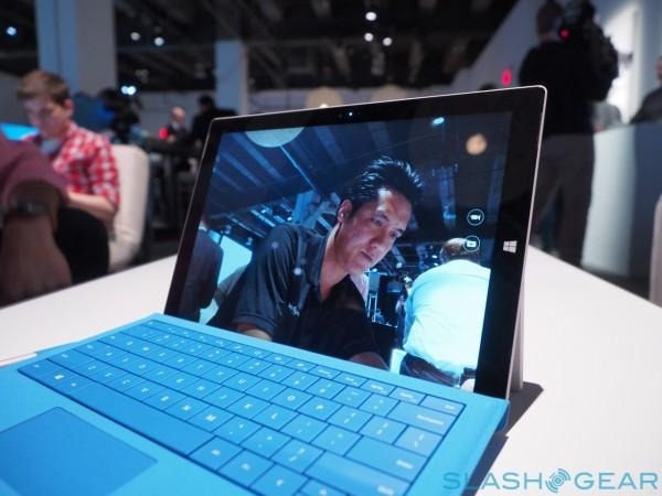
The argument against that depends on whether each part is fit for purpose. If the tablet is too heavy and cumbersome when handled without the keyboard, then it's unlikely to be used. If the keyboard is too small, or is underwhelming when typing, then the combination doesn't meet its minimum requirement for productivity.
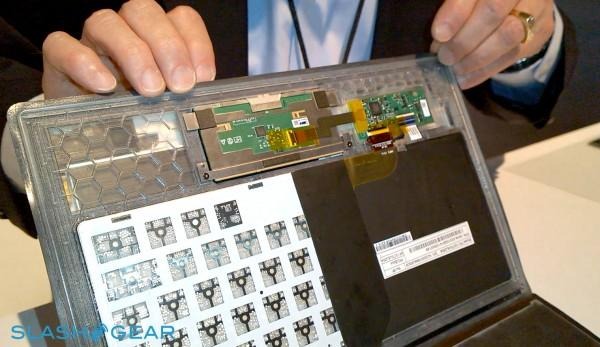
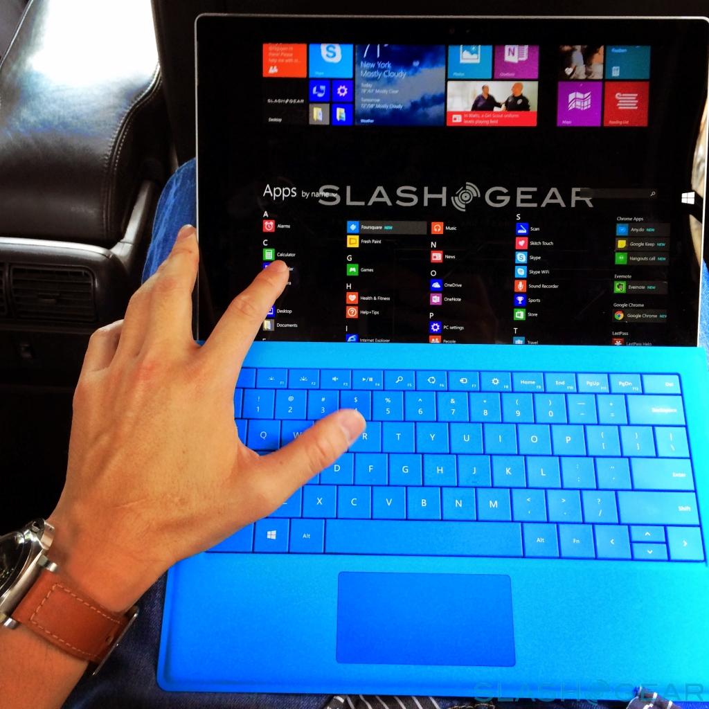
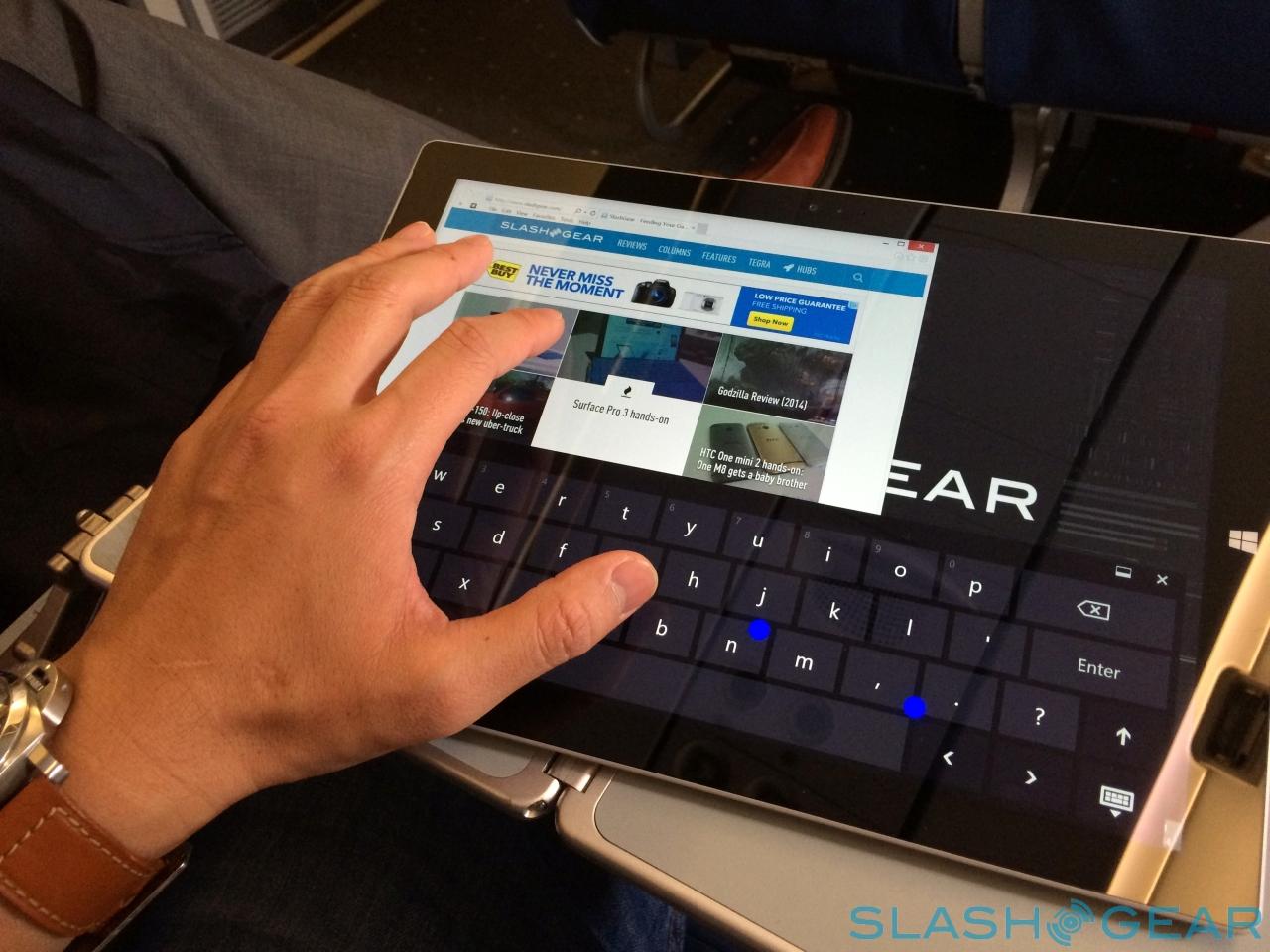
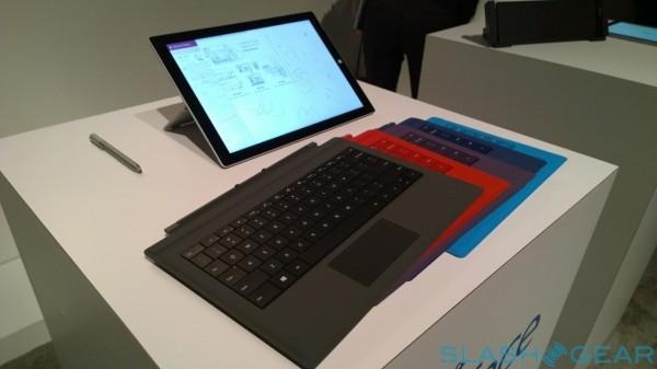
I've actually always been a believer in Microsoft's concept – if not its delivery, at least so far – and the Surface Pro 3 with the Type Cover comes closest to satisfying it. Like the Type Cover of the second-gen Surface, the keys are backlit; the bigger screen means the layout can be wider, however, for more comfortable typing, and the trackpad is larger and smoother.
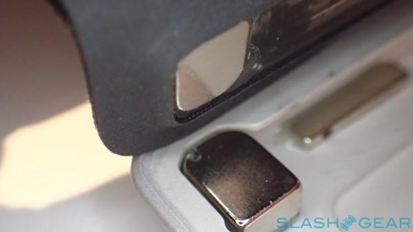
Meanwhile, by adding a second hinge right next to the usual one, the Type Cover can clip up against the lower bezel of the tablet, bracing for greater stability on your lap or desk.
Microsoft comes close to hitting its goal – the closest it's been in three generations of hardware – but it's not quite there yet. The secondary magnet strip is a great idea and does make the whole arrangement more stable, but unfortunately the keyboard itself is underwhelming compared to a regular laptop 'board. The keys are a little noisy and plasticky, and have limited travel, and while Microsoft has certainly improved the trackpad from the dire example the Type Keyboard had before, it can still be jerky and struggle with two-finger scrolling.
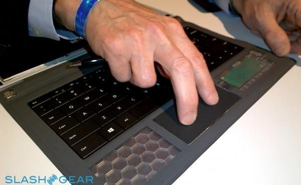
Is it usable? Sure. Would I far prefer a regular keyboard when I'm at my desk? Definitely, and of course you're free to use USB or Bluetooth peripherals – and indeed plug in a second display using the Mini DisplayPort. Microsoft will eventually offer a Desktop Dock with ethernet, more USB 3.0 ports, and other connections, though it'll be a $199.99 addition. If you just want ethernet, a USB adapter will be $39.99.
The most galling thing about the Type Keyboard is its price, however: or, more accurately, the fact that despite Microsoft all but describing it as an essential part of the Surface Pro 3 experience, it still charges $129.99 for it. Honestly, it should be in the box to begin with.
Wrap-Up
I'm frankly astonished by how attached to the Surface Pro 3 I've become in the time I've been using it. The previous two iterations were classic examples of spending considerable time and effort on beautifully delivering a flawed idea: too limited in size for a notebook, and too bulky for a tablet. That Microsoft has managed to address, at least in part, those issues is worthy of genuine praise.
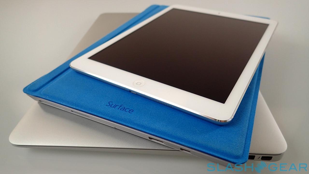
The lingering question is whether that attachment is enough to get me to leave the MacBook Air and iPad Air I would normally carry in my bag at home. My reluctance is compounded by how much of my daily workflow operates in OS X and iOS; were I instead primarily a Windows 8.1 user, I'd have no qualms about replacing separate notebook and laptop with the Surface Pro 3.
Don't overestimate the potential cash savings in going that route, however. The range may start at $799, but that's really $928.99 since you want the Type Cover. In reality, if you're serious about your notebook use then you'll probably want a Core i5 version, which means – with keyboard – you're looking at $1,128.99 at least. Your hand might be forced by the fact that the Core i3 and i7 models won't ship until August, anyway.
Surface already has a small but vocal following, and the Surface Pro 3 is not only the best of the range, but among the best Windows 8.1 computers I've tried. The combination of useful pen functionality, flexible positioning, solid performance, and beautiful design is a compelling one, though I suspect its price will keep it a niche device.
