Surface Pro 3 Hands-On
Microsoft is aiming for third-time lucky with its tablet ambitions, unveiling the Surface Pro 3 this morning. Rather than the smaller Windows 8 slate many expected, the Surface Pro 3 actually got bigger, with a new 12-inch display and a redesigned keyboard and pen which Microsoft argues makes it the only real hybrid for content consumption and creation. Read on for some first-impressions.
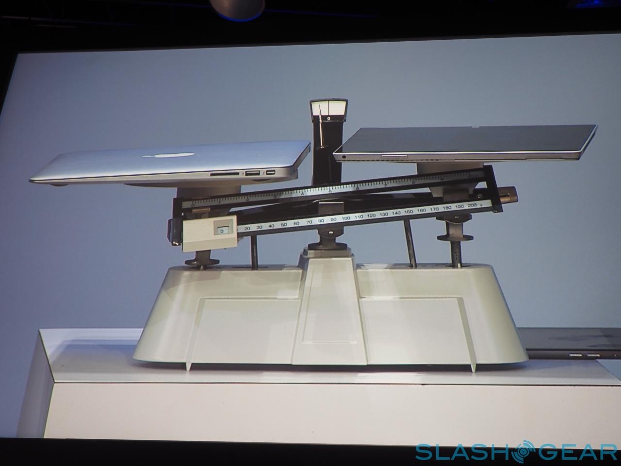
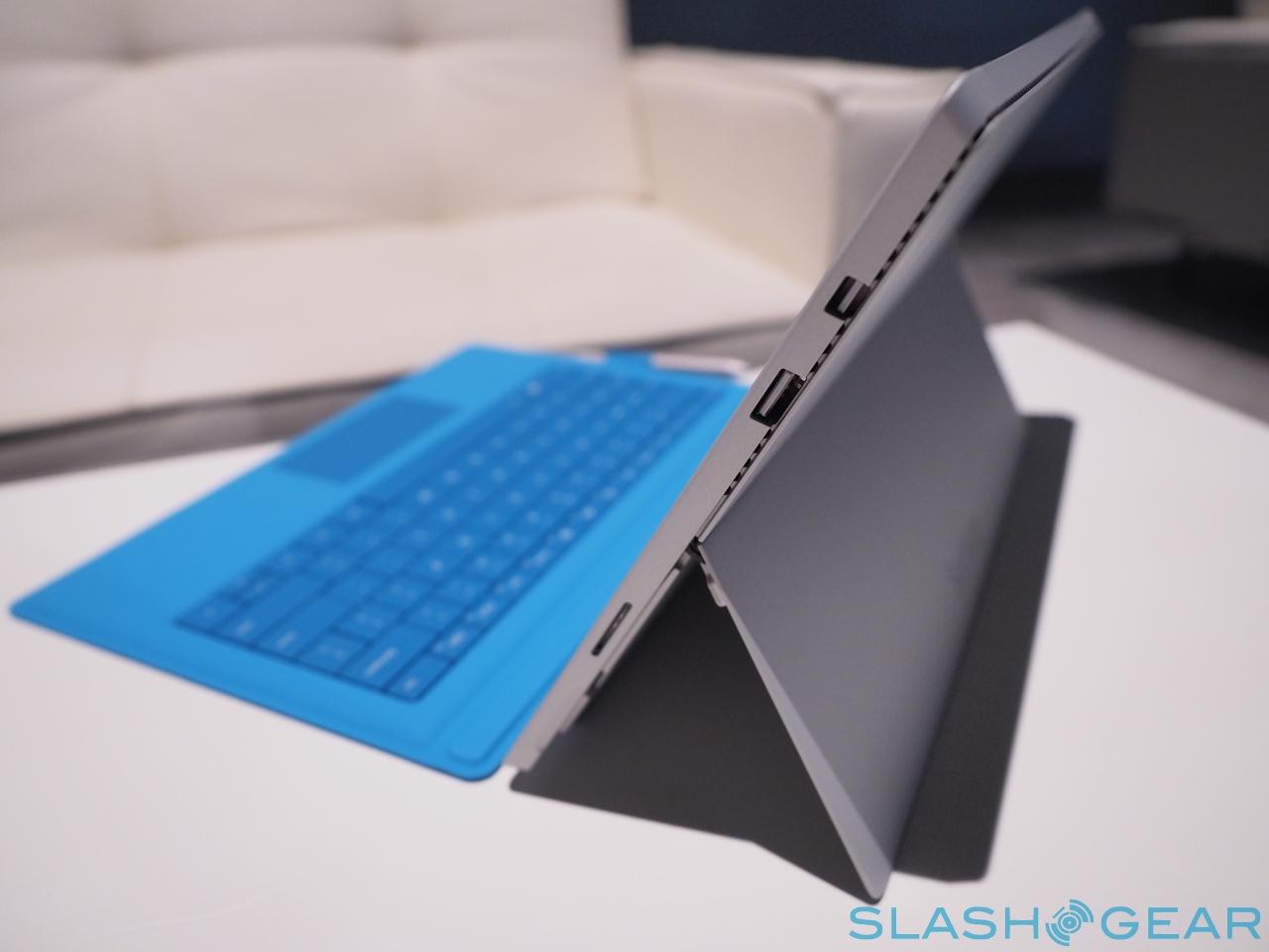
It's certainly lighter in the hand than you might first expect when you pick it up, with the 9.1mm-thick metal chassis and 12-inch display turning out to be fairly comfortable to hold, even single-handed. That 800g would probably add up over a few hours of use, however, and force the Surface Pro 3 into the crook of your arm.
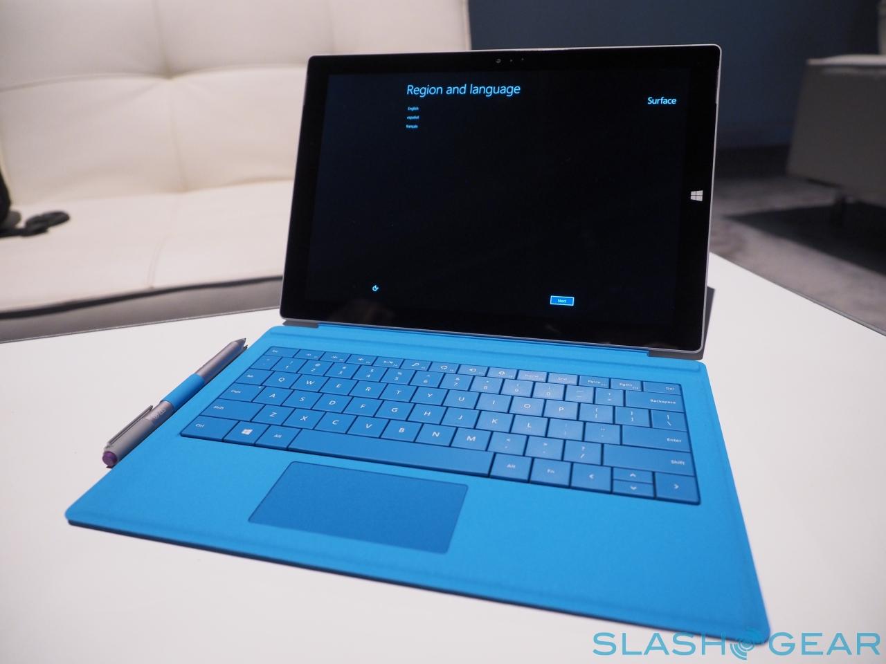
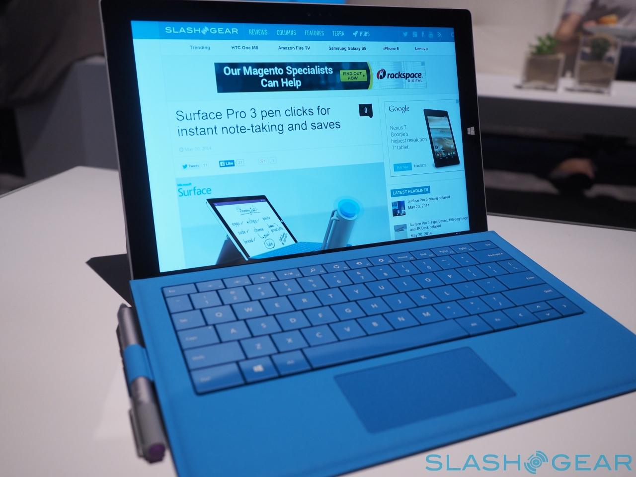
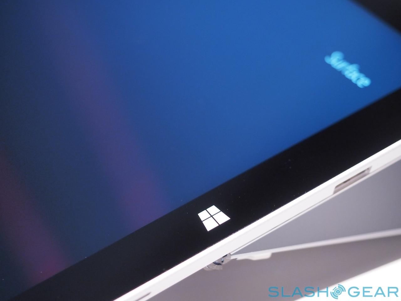
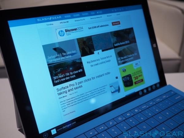
The display – running at 2160 x 1440 – is bright and beautiful. We've been fans of previous Surface and Surface Pro displays, but the Pro 3 steps it up a notch with extra detail. ClearType fonts don't look as blurry around the edges as they have done in the past, too, which is a considerable improvement. The 3:2 aspect ratio means flipping into portrait orientation doesn't leave you feeling like you're holding a long, narrow display.
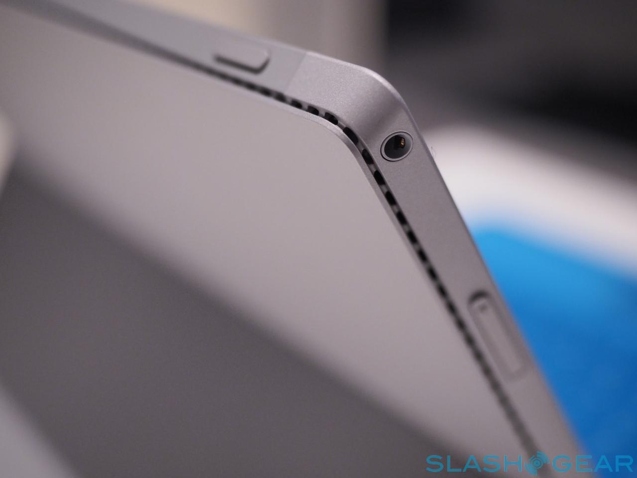
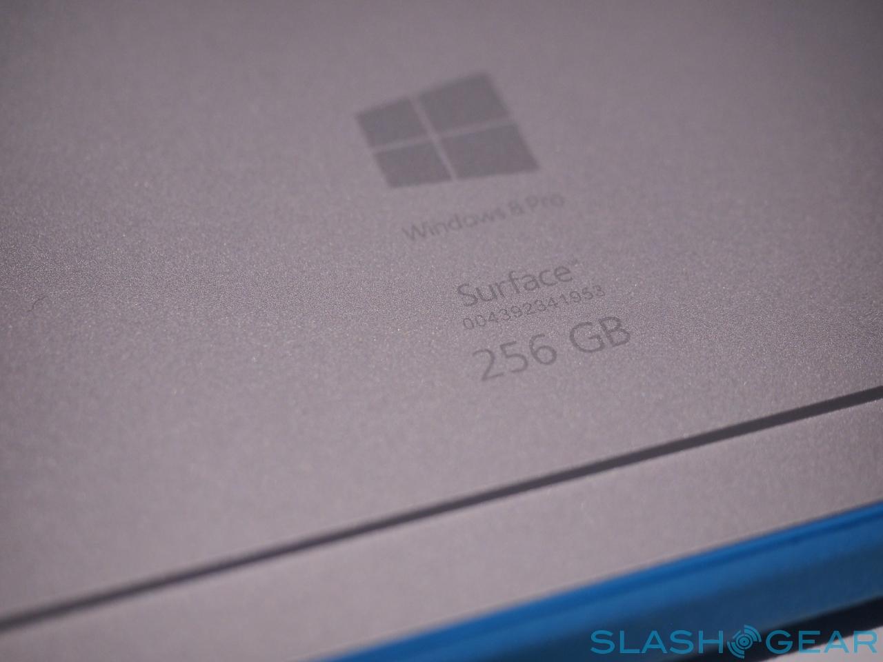
Inside there's still a fan, though Microsoft says that it's effectively silent during regular use. It's certainly been quiet during our early testing, though with Core i5 and Core i7 processor options – our Surface Pro 3 review unit has a Core i5 chip, 8GB of memory, and 256GB of solid-state storage – it remains to be seen how hot the tablet might get. Apps like Photoshop now optimized for touch, which Adobe brought out on stage especially for the Surface Pro 3 reveal, are likely to push the limits if used properly, too.
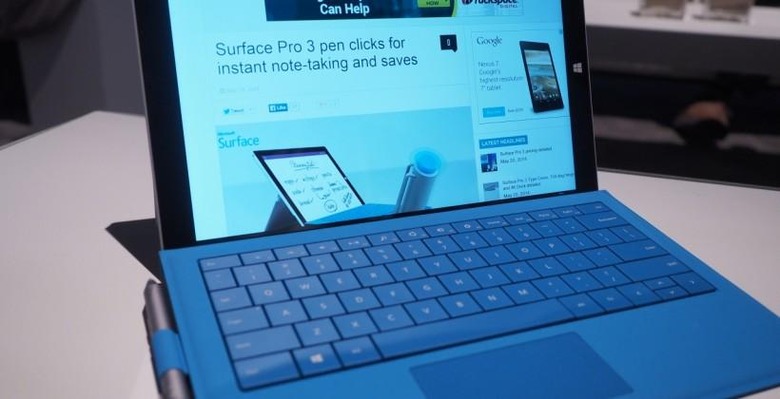
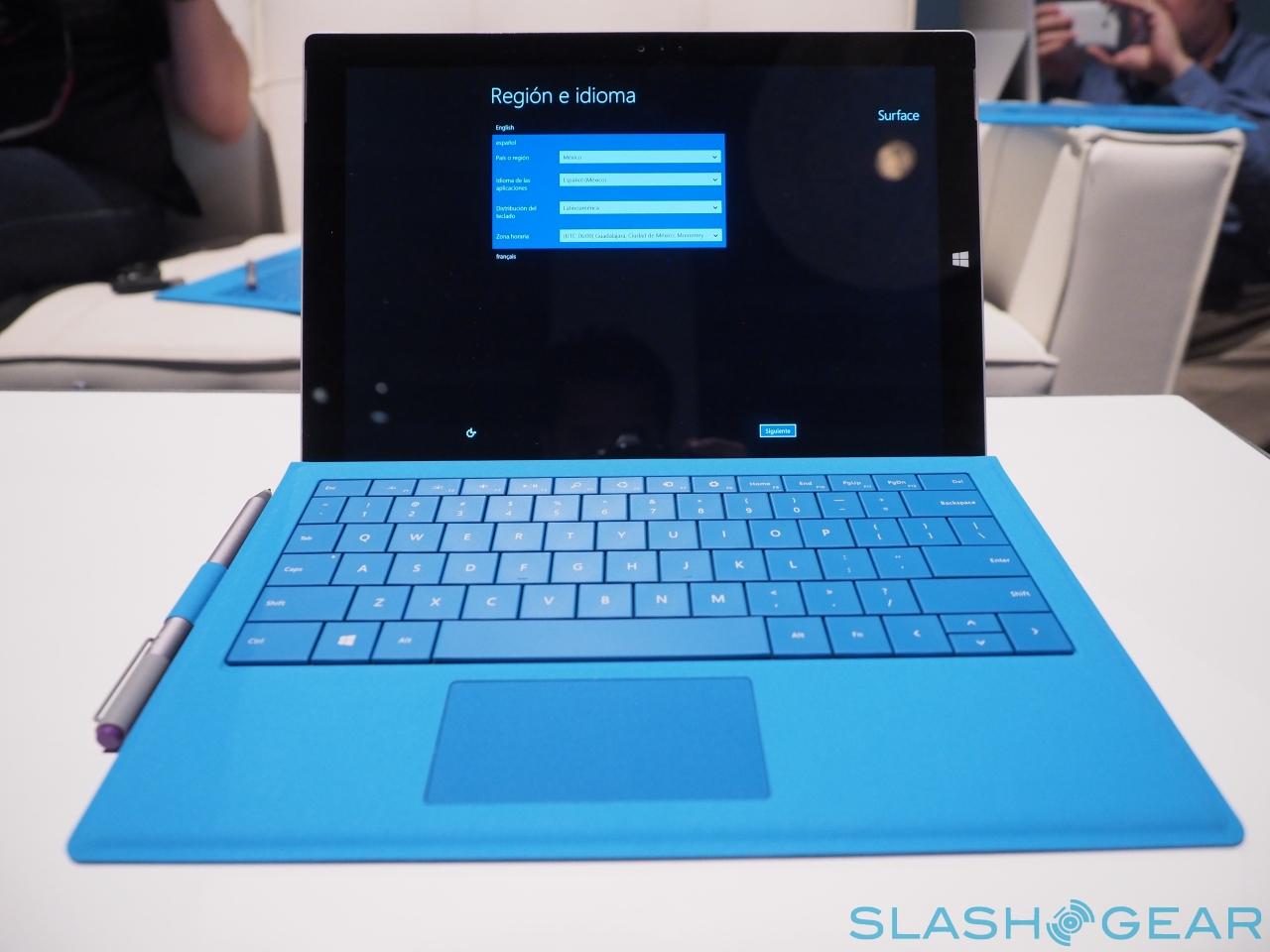
The Type Keyboard – now with a larger, smoother trackpad – has similar key-feel as before, with the buttons now backlit; your fingertips do skate across the touch-surface more readily, as Microsoft promised they should. More importantly, the new magnetic mount and the highly adjustable stand do make it more stable on the lap.
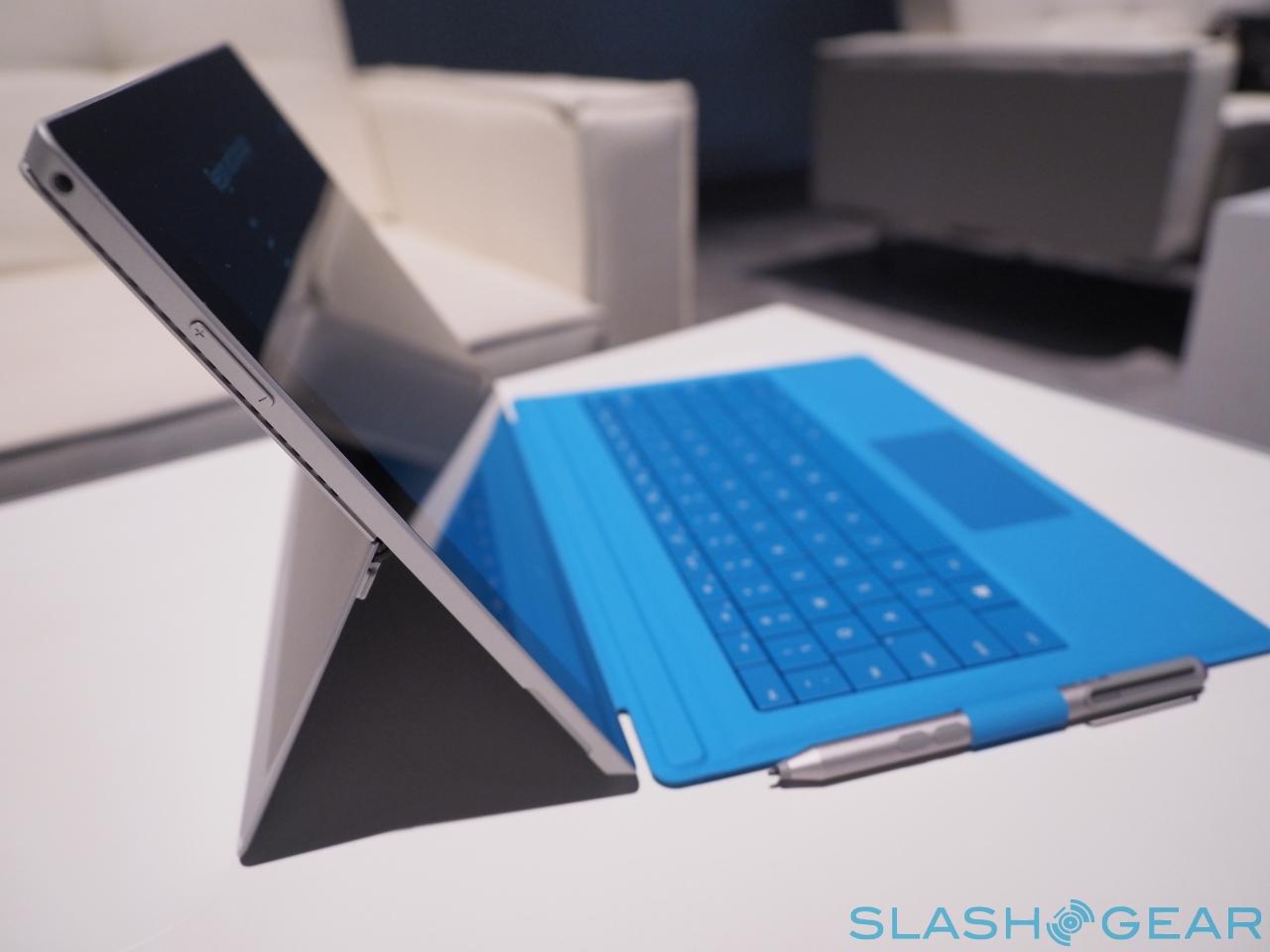
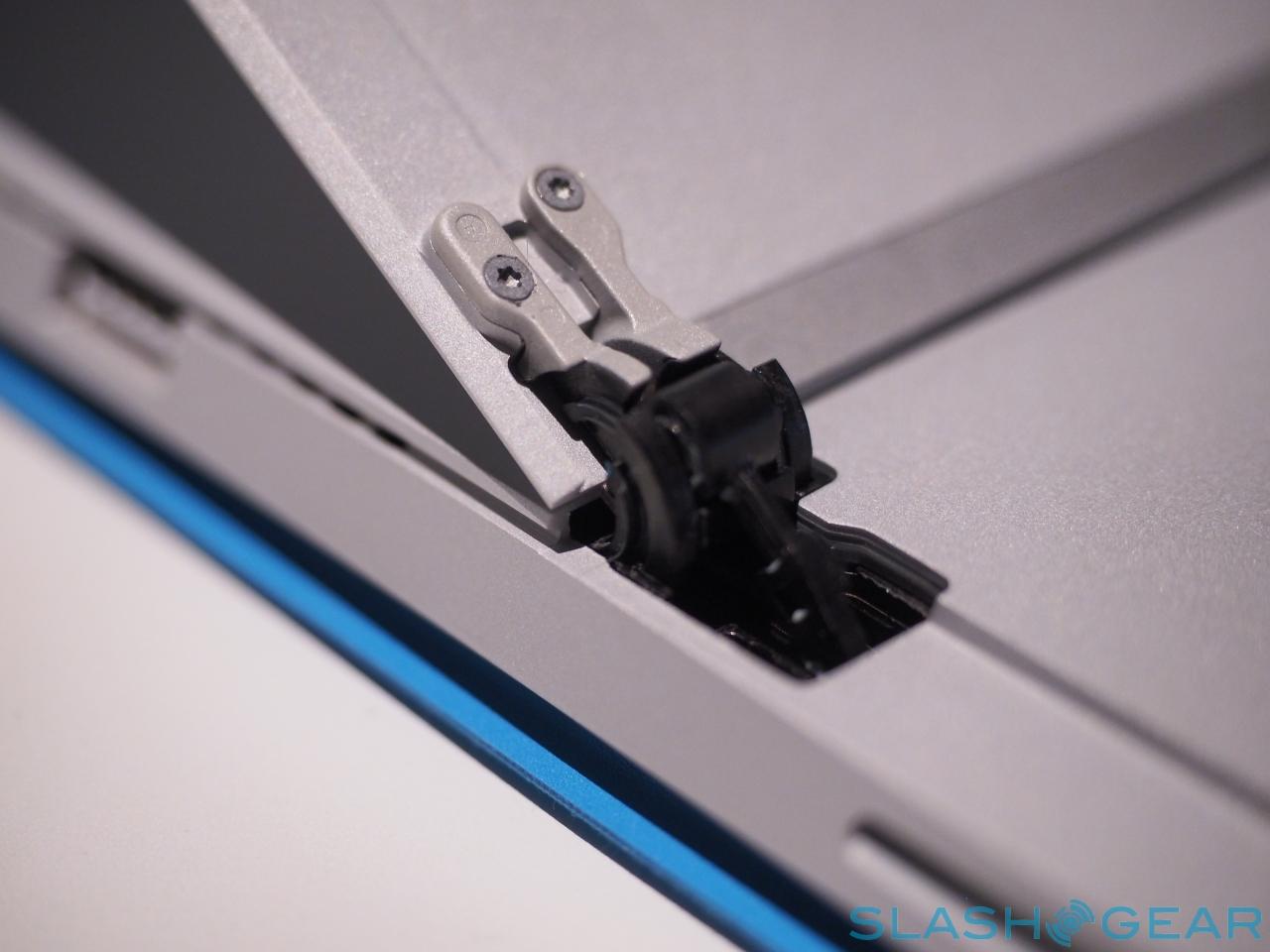
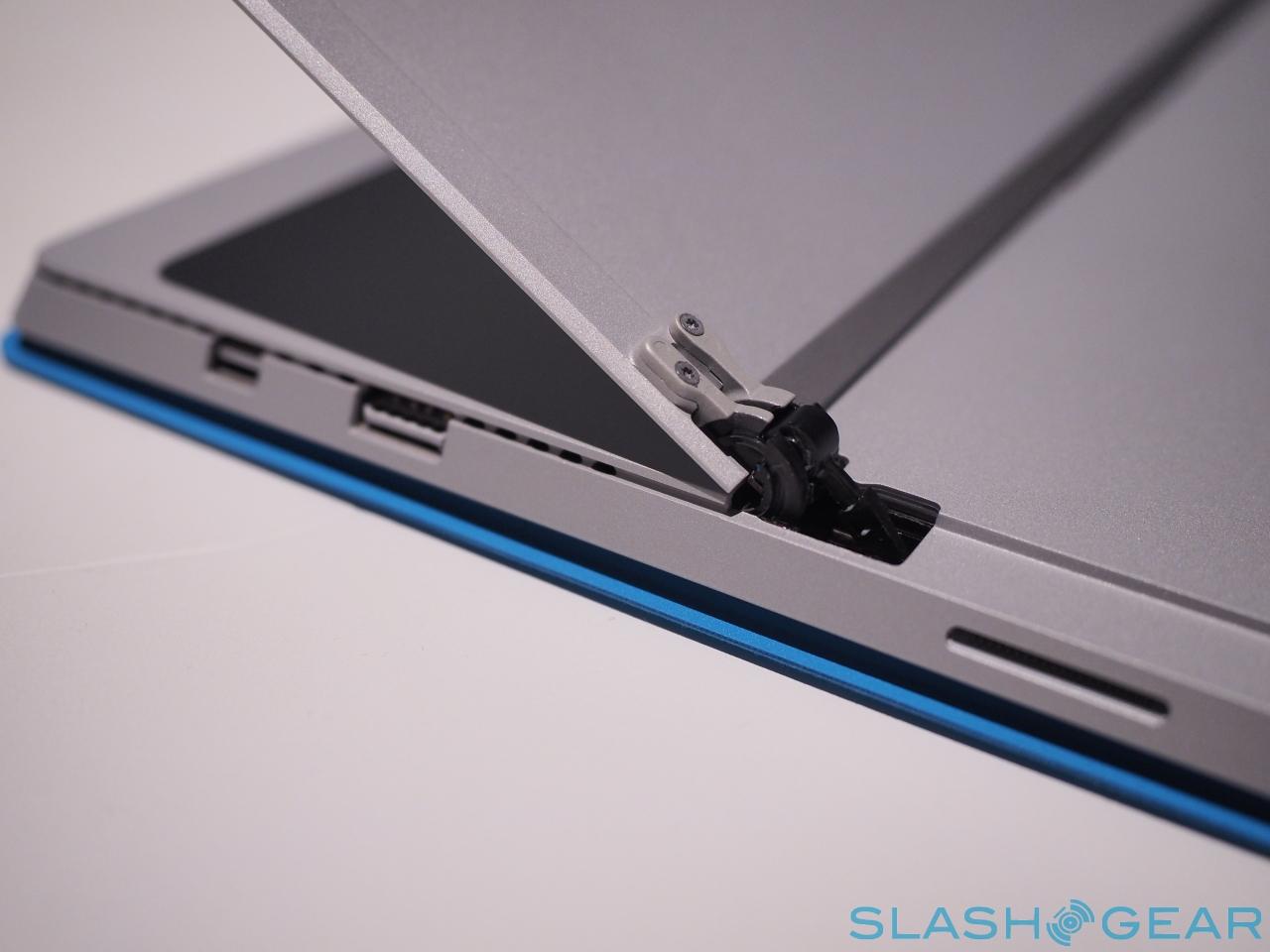
In fact, Microsoft's stand is a particular triumph. Apparently the result of around three years of work, it's a great balance of support and yet easy adjustment, opening and closing smoothly. Pushed all the way back, to around 150-degrees, it almost turns the Surface Pro 3 into a tiny all-in-one desktop, though it's probably going to be more useful for note-taking than collaboration.
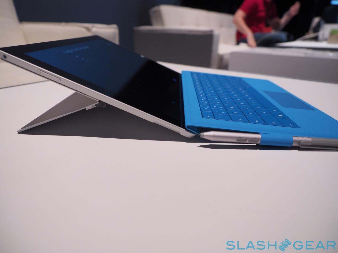
Push the keyboard up, slightly, toward the body of the tablet, and it hinges and clings magnetically to the bottom edge of the slate. It's a small movement, but it has a big impact on both how stable the tablet feels, and how comfortable typing is. Rather than the floppy fabric hinge most of these keyboard-covers suffer from, the Surface Pro 3 becomes twist-free, while the keys themselves are elevated to a more ergonomic angle that helps disguise the short travel.
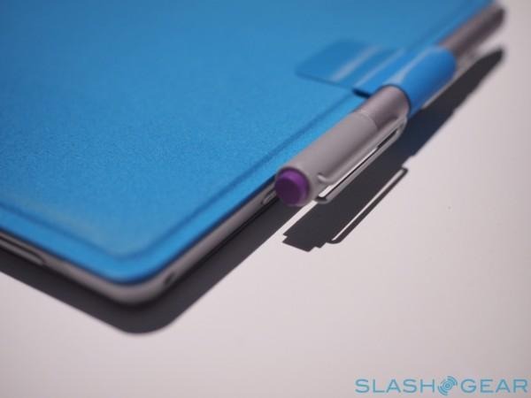
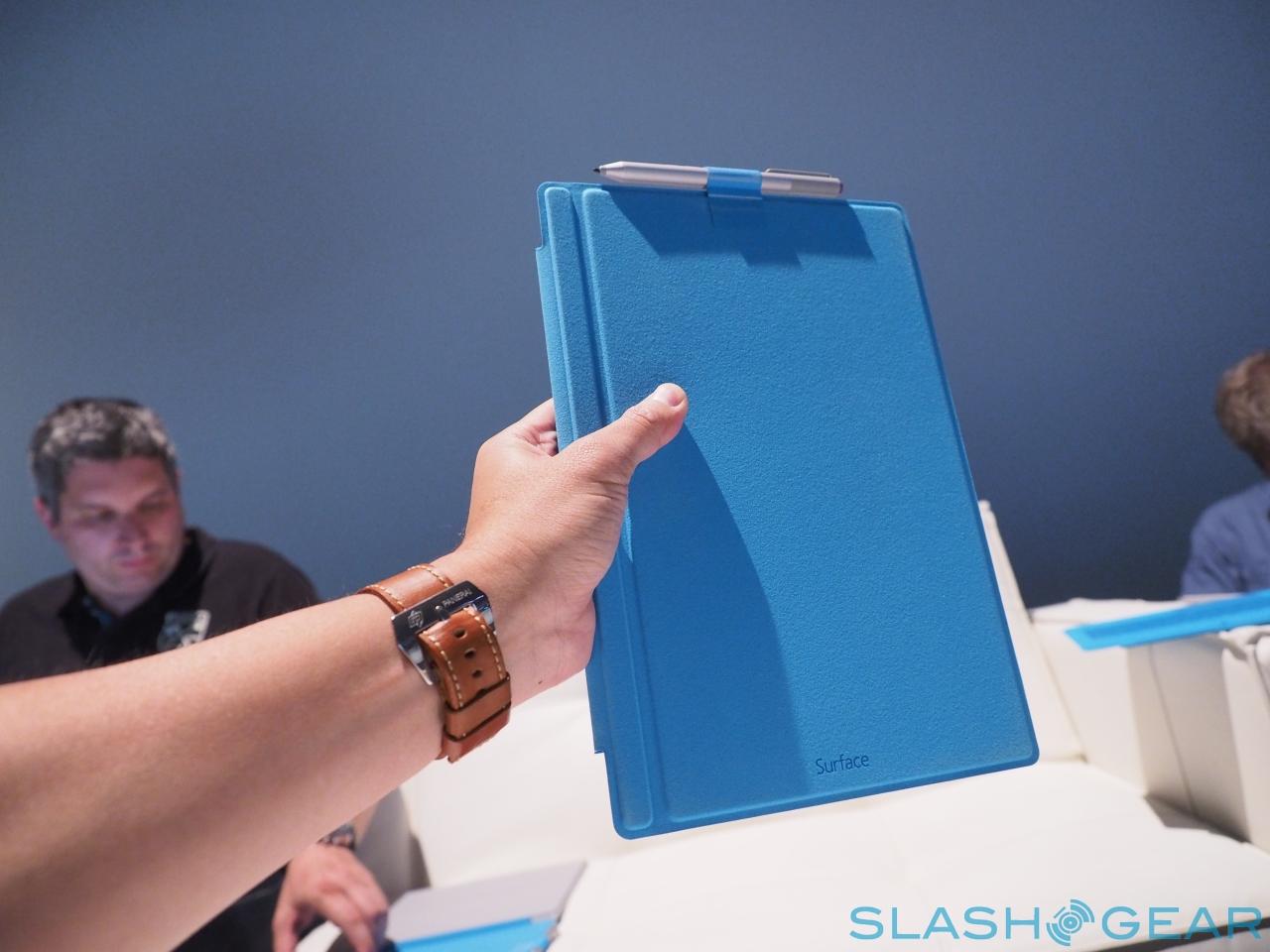
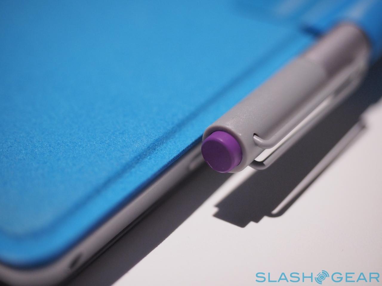
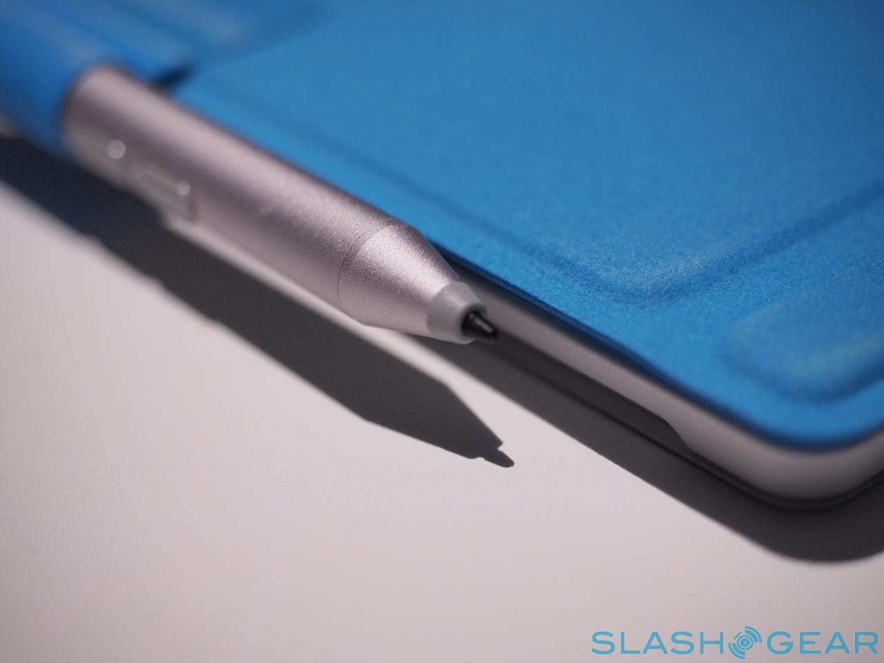
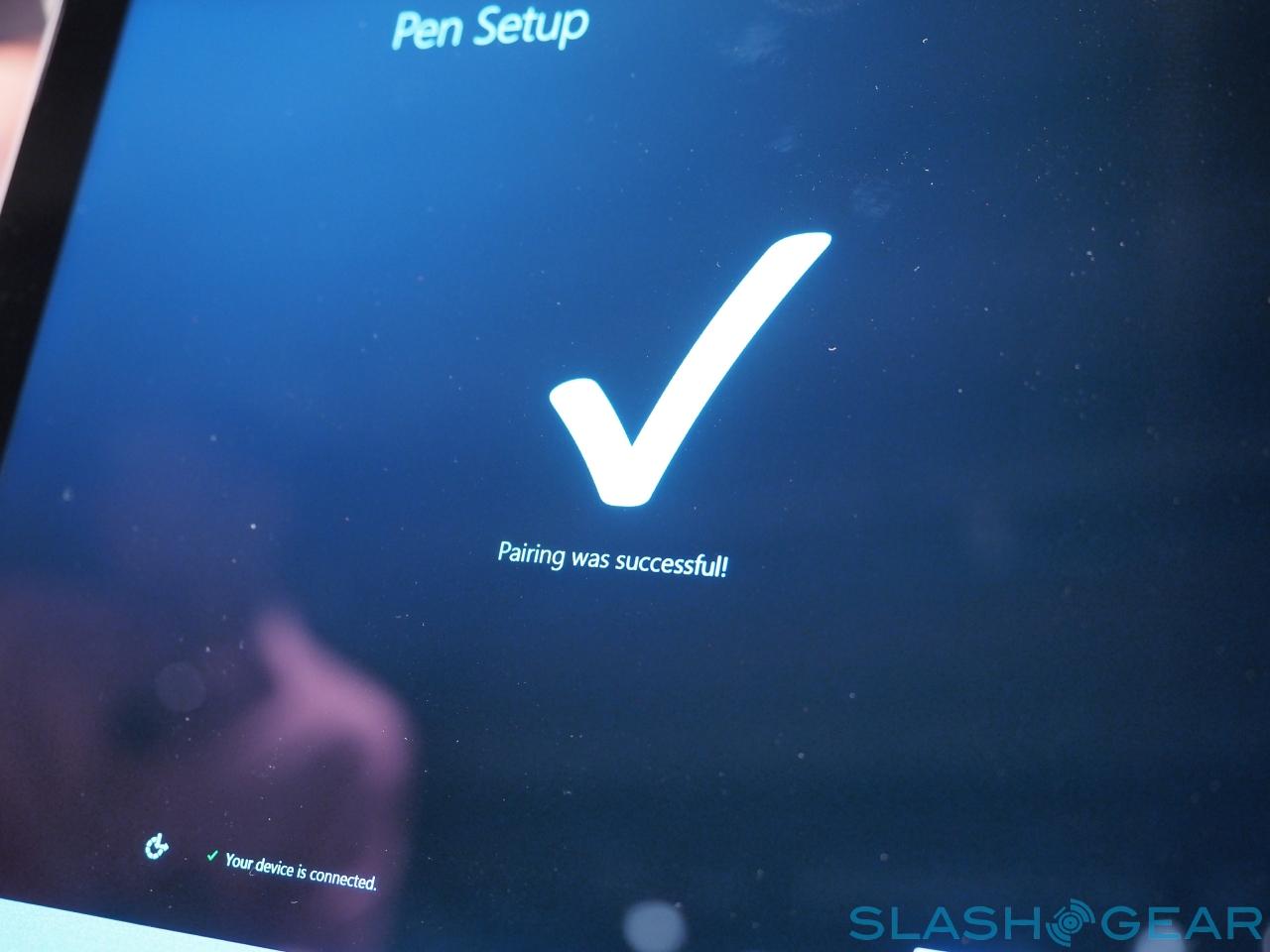
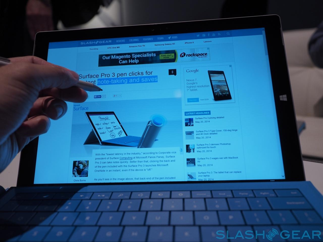
On the side of the keyboard there's a loop for the pen, which Microsoft is insisting on not referring to as a stylus. It feels good in the hand, nicely weighted and not at all cheap, unlike some digital pens we've seen with tablets in recent years. Microsoft has jumped ship from Wacom to N-trig to supply the digitizer technology this time around, but most importantly the digital inking is smooth and free-flowing. We were able to get some tight cursive and precise sketching down, with minimal parallax (where the pen nib doesn't line up with the on-screen ink).
In fact, given how useful it is, it's a shame there's nowhere in the Surface Pro 3 to actually dock it. Keeping the dimensions down has meant no room for a pen silo, and so if you want to carry the pen you'll need to tuck it into a fabric loop on the side of the Type Keyboard. If you decide not to go for the keyboard – which is sold separately, mind – there's nowhere on the tablet to actually carry the pen.
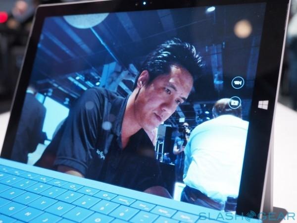
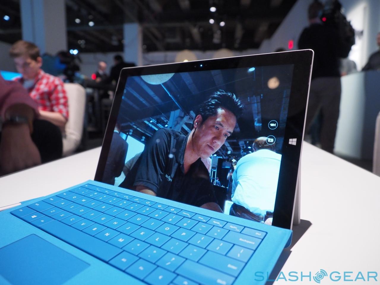
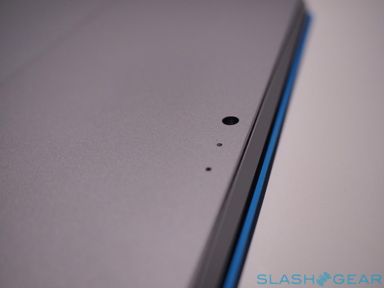
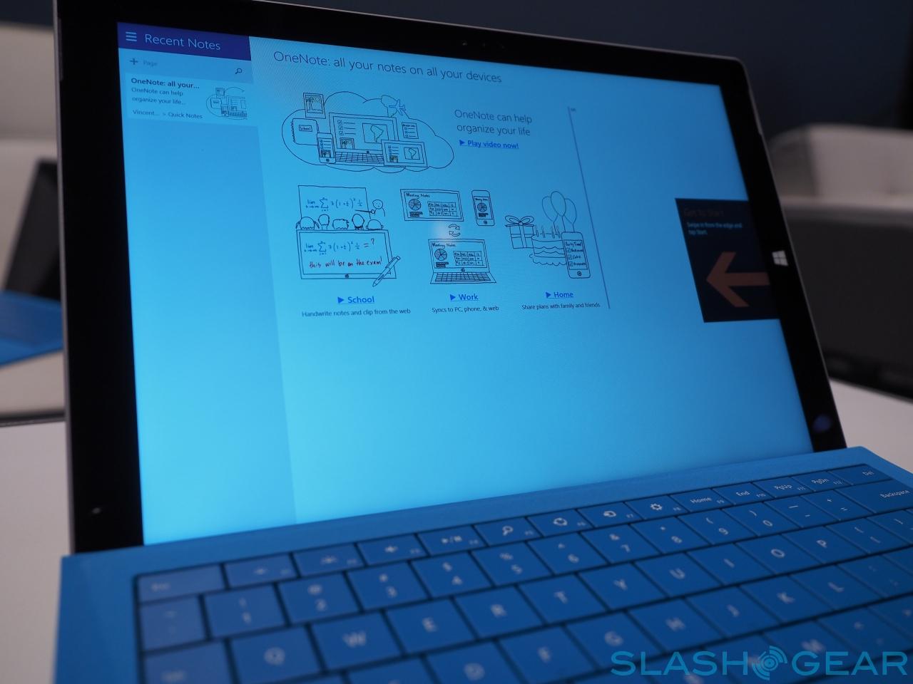
As before, there are two cameras, front and back. Each uses the same 5-megapixel sensor with 1080p video recording, and in theory the shutter can be remotely triggered with the button on the pen, and the snapshot automatically imported into OneNote for annotation. Unfortunately that feature isn't present on our unit yet, and will be added in later with a firmware update; we're guessing it'll be ready in time for the tablet shipping from June 20th.
What remains to be seen is how many people will actually pay for all this. Microsoft's pricing kicks off at $799, true, but if you want the Type Cover that's an extra $129.99. The upper-tier Core i5 version we've been playing with actually comes in at $1,299; if you need a Core i7 processor, you're looking at pricing from $1.549.
That's a hefty chunk of cash, even for a well-constructed slate. We'll be putting it through its paces for the full SlashGear review very soon, to see if it's worth the price.
