StumbleUpon Changes Repeat Digg Blunders Of Old
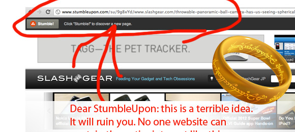
There's some heavy changes going on out there in the world of content sharing, and StumbleUpon is feeling the sting of taking a gamble on keeping customers. What the content sharing site has done in its most recent update pushed sites to the background while it sticks its own menu bar in the foreground, this effectively taking away the element of freedom that StumbleUpon users had for so long been able to tout over similar sites. What StumbleUpon leaders had hoped to accomplish with this change is a click-retention ratio that would drive their own site into the record books – instead its cutting down their support from all sides.
What you've got here instead of a link in StumbleUpon that, like most other sites, leads out out to the 3rd party site as it should, is a inward link. This link shows you a window of the content you're supposed to be seeing without actually bringing you to the link. To actually get to the link, you'd have to cut and paste the end of the StumbleUpon URL like a chump and make it so yourself. Back when Digg implemented a similar system with the DiggBar, then-CEO Kevin Rose backtracked to the point of saying that "[It's] bad for the Internet."
God knows he'd say the same thing about this if he were in a position to make a comment. We're seeing massive revolt on this change by StumbleUpon in social networks as well as in mails to our tip line, so I personally would like to suggest this to StumbleUpon: cut it out. At least make it an opt-in option, or the sites whose SEO and hit readers you're destroying with this measure as well as your users who for so long have remained loyal to you will jump out and you'll fail. Mark my words.
