SteamOS Controller Redesign Up Close: Buttons Galore
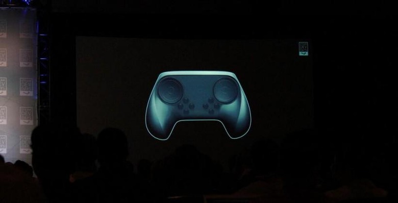
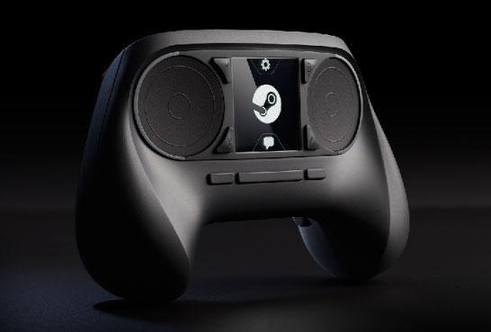
Back at Steam Dev Days in January of this year, Valve first showed off a glimpse of their redesigned SteamOS controller. After deciding it was silly to include a touchscreen on the gamepad, the original controller was tossed out, and the most recent generation began. "Most recent" as in – there've been many, many prototypes, but this one is the closest we've gotten to the final product.
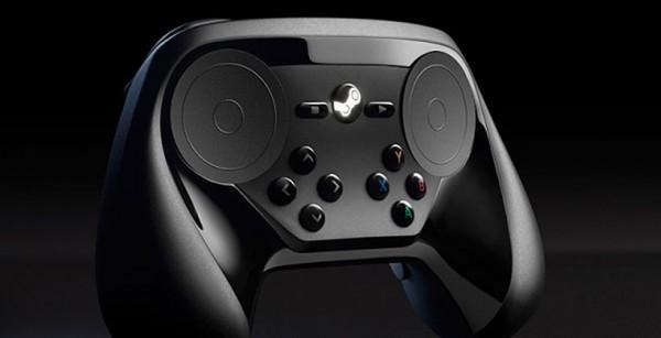
This controller looks rather similar to what we saw in January, coming in with two touchpad controls and a set of 8 buttons not unlike what you'd find on a traditional DualShock or Xbox controller – up down left right and YXBA turn in to black buttons here.

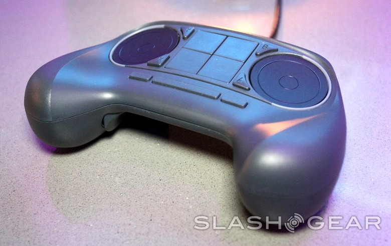
What was a slightly more simple image presented earlier this year has become a whole lot more solid. The image from earlier this year comes from Leszek Godlewsi while Engadget found the image you're seeing today, and the image with SlashGear on it was captured at CES 2014.

Our Full Steam Machine 2014 starting lineup detailed the collection alongside the controller this year as well. Below you're seeing an image of what the controller looked like when Valve originally introduced SteamOS last year.

The presentation shown here shows off everything having to do with the Steam Controller as presented earlier this year at Steam Dev Days. Here you'll see how developers are integrating the Controller API into their games as well as information having to do with public beta testing of the different controllers so far.
Stay tuned as we continue to watch Valve for changes in this key piece of hardware. It is this, after all, that's a whole half of the equation when it comes to SteamOS being released to the public. The other half is SteamOS – the operating system – itself. See more in our interview with iBuyPower's Marketing Manager Rickey Lee by the name of Steam Machine OEMs: Ready when you are, Valve.
