Spotify's New UI Is For New Users Only (For Now)
Today it was revealed that Spotify's newest user interface for Android and iOS is mostly for new users – for the moment. Users discovered this via Reddit, where user experiences are shared and screenshots are compared. We tried a method shared by users there, and surprise! A new account with the newest version of the app yields a new UI, but switching back to an old account brings the UI back to the old look.
To test the new dual-interface situation, delete your Spotify app. If you're on Android, you can just try deleting your cache and saved data via Apps in Settings. But deleting the whole thing is easier, especially since you won't then have to log out. Once you've downloaded the app after having deleted the app, continue on.
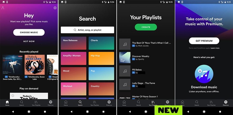
Log in with a new account into this new Spotify app. You'll need to create this account from scratch – and don't worry about the email and details, you won't have to verify anything. Once you're in, you should see some rather lovely new ways to interact with Spotify.

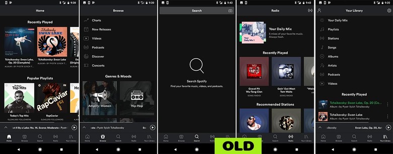
Above you'll see screenshots of the new UI. Below you'll see what it all looks like if you then log out and log in with your primary account. Everything switches back to pre-update. We can only assume that this means the update is switching out to new users as soon as the transfer of data for each individual account is complete. Until then, only new users have access to new functionality.

If you log out with the newly created account and immediately log back in with your Premium account, you might still see the new UI, including a tab that suggests you do not have a Premium account. Once you close the app and open the app again, you'll see the old UI (with your Premium features) once again.
