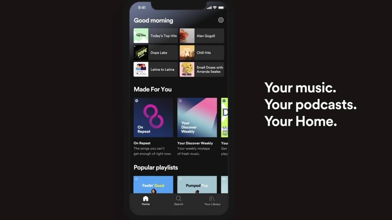
Spotify App's New Home Screen Puts Your Favorites On Top
Music streaming has become a really big and profitable business and each service offers a slightly different experience to stand out from the crowd. Some let you manage your own playlists will others only offer "stations". Some let you upload tracks you already owned while others only have access to music in its collection. Almost all of them, however, let you mark certain lists or music as your go-to selections and Spotify's new home screen for its mobile apps will let you get to those faster.
Some might find the update not even worthy of an announcement, much less a fancy video describing what has changed. It is, however, one of those small changes that actually have a big impact on how you use the app. Whereas the old screen looked rather cluttered. This time, the focus is on you, the user.
The top part of the screen has buttons for accessing your favorite content, be music or podcasts. It can be your favorite morning workout music, something new you've been playing on repeat, and more. Spotify also says that the screen and content changes as the day changes, though the most prominent example seems to be what you're greeted with depending on the time of day.
Of course, Spotify won't be Spotify if it didn't have some recommendation system attached to it. In fact, those six buttons at the top are recommendations themselves. The lower half of the screen is instead reserved for new music Spotify recommends you try out to expand your horizons.
Spotify has flipped the switch on the new Home Screen but since it's a server-side update, all you can really do is wait for it to hit your device. The new layout is available on both mobile phone and tablet Home screens.
